A Masked Input field is a special input that visually obfuscates characters to protect sensitive information by masking them with a circular shape.
Usage
When to use
To give users a way to show and hide sensitive information.
When a form input with the ability to mask its value temporarily is needed.
When not to use
For passwords, use the Password input instead.
Masked input vs Password input
The Masked Input is a text field designed to protect sensitive or confidential information while allowing users to show or hide the input value as needed.
The password input is a specific type of form control designed for the secure entry of passwords. The value is always masked or hidden to prevent others from reading the entered characters easily. Unlike the Masked Input, the password input has specific attributes to enhance the security and confidentiality of passwords.
Usage examples
Use the Masked Input to protect sensitive values like secret keys or tokens.
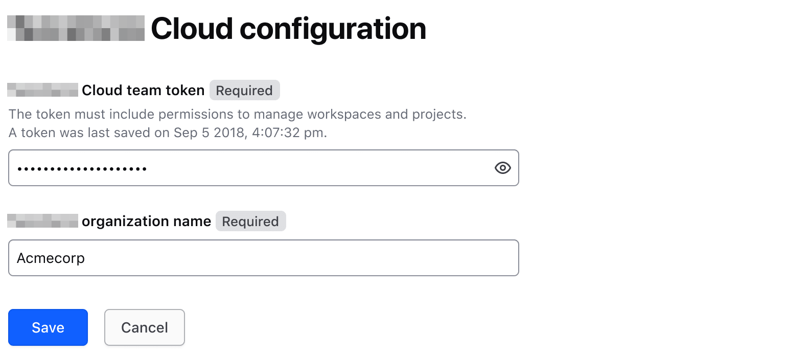
Use the Masked Input to protect sensitive values like variables and certificates from unintended exposure.
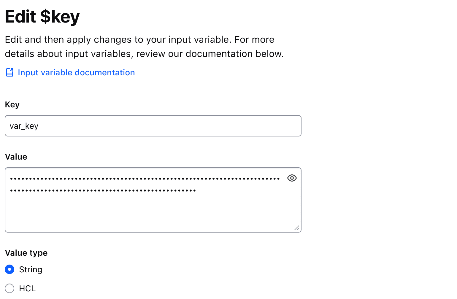
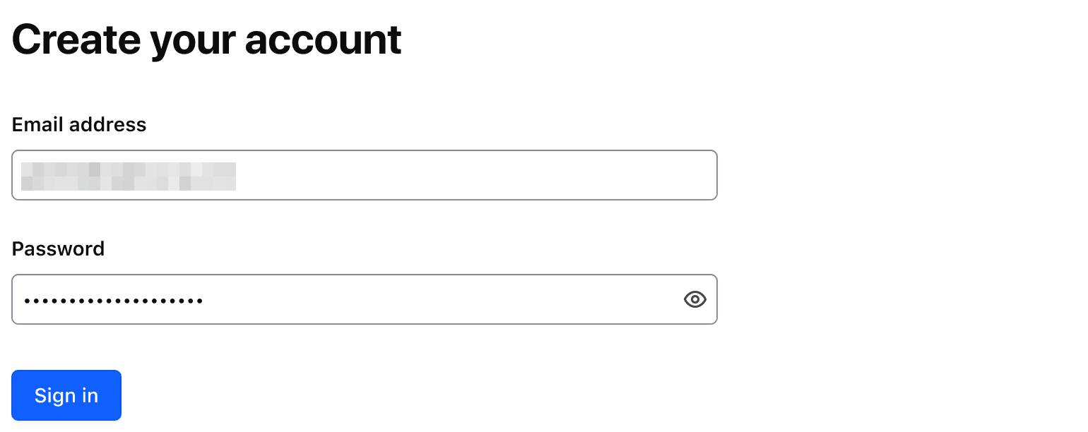
Don’t use a Masked Input for password input. Use the Password input.
Multiline
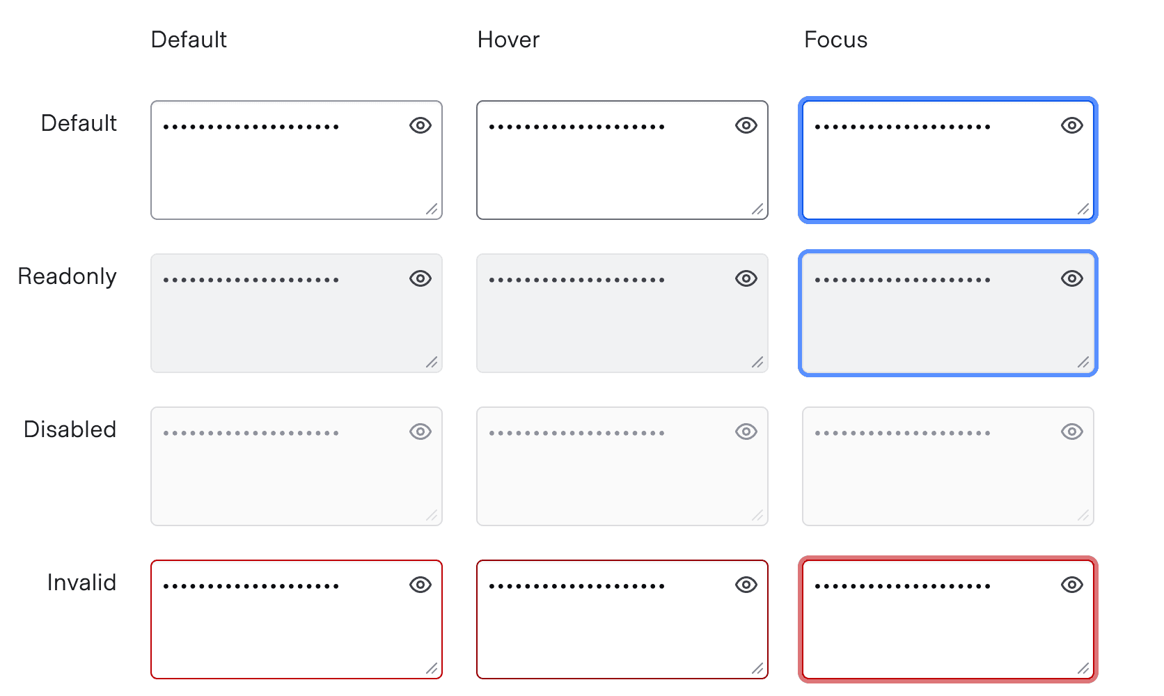
A multiline Masked Input holds textual content over several lines, e.g., a Terraform variable. It is the same field, with a textarea in place of the single-line input.
Required and optional
For complex forms, indicate required fields. This is the most explicit and transparent method and ensures users don’t have to make assumptions. Read more about best practices for marking required fields in forms.
For shorter, simpler forms, indicate optional fields instead.
Copying the Masked Input value
A Masked Input can carry a Copy Button beside it, so users can copy the value to their clipboard without revealing it. Refer to the Copy Button usage guidelines for more details around copying content.
Character Count
Use a character count to communicate the current length of the value in an input and whether it meets or exceeds the length requirements of the field.
Default messages
Which requirements the field has decides the message: it names the relationship between the current length of the value and the maximum length, the minimum length, or both.
The default messages provide a consistent pattern: they state the length requirement and show how close the user is to meeting it.

Custom messages
A custom message in the character count is supported and can be used when a product or application-specific message or term is required, e.g., "registry" or "workspace".
Avoid presenting duplicate information between the helper text and the character count. Helper text should be used to provide persistent requirements while character count represents more of a progress indicator towards a length requirement.

Don’t use the character count to display static details about the field. Use helper text to provide extra details about the information being requested and the character count to communicate the user’s progress toward meeting the requirements.

Error validation
For error validation recommendations, refer to the Form patterns documentation.
How to use this component
There are two ways to use <i80-masked-input>:
- the field: give the element a
labelattribute and it renders the input control with its toggle button, a label, helper text, and error messaging (in a wrapping container). - the base control: leave the
labelout and write your own<input>or<textarea>inside the element, which is kept as it is.
We recommend using the field as it provides built-in accessibility functionality. Use the base control to achieve custom layouts or for special use cases not covered by the field.
The field
The basic invocation requires a label: the label attribute. This creates:
- a
<label>element with aforattribute automatically associated with the inputIDattribute. - an
<input type="text">or a<textarea>control with an automatically generatedIDattribute.
<i80-masked-input label="Terraform Cloud team token" name="demo-team-token"></i80-masked-input>Input value
Pass a value to pre-populate the input. By default, the content is visually obfuscated ("masked") and users can make it visible using the associated toggle button.
<i80-masked-input label="Terraform Cloud team token" name="demo-team-token" value="036215df4996ca649928d8864b4df9e42cba0d6d"></i80-masked-input>Add the visible attribute to show the content unmasked from the start. From script, the masked property reads and sets the same state, and the element fires an i80-visibility-change event whenever it changes.
<i80-masked-input label="Terraform Cloud team token" name="demo-team-token" value="036215df4996ca649928d8864b4df9e42cba0d6d" visible></i80-masked-input>Multiline
Add the multiline attribute to render a <textarea>. Adjust its height either with the rows attribute or by setting a custom height.
<i80-masked-input label="Private key" name="demo-private-key" multiline>
  <textarea name="demo-private-key" rows="4">-----BEGIN RSA PRIVATE KEY-----
MIIBOgIBAAJBAKj34GkxFhD90vcNLYLInFEX6Ppy1tPf9Cnzj4p4WGeKLs1Pt8Qu
KUpRKfFLfRYC9AIKjbJTWit+CqvjWYzvQwECAwEAAQJAIJLixBy2qpFoS4DSmoEm
o3qGy0t6z09AIJtH+5OeRV1be+N4cDYJKffGzDa88vQENZiRm0GRq6a+HPGQMd2k
TQIhAKMSvzIBnni7ot/OSie2TmJLY4SwTQAevXysE2RbFDYdAiEBCUEaRQnMnbp7
9mxDXDf6AU0cN/RPBjb9qSHDcWZHGzUCIG2Es59z8ugGrDY+pxLQnwfotadxd+Uy
v/Ow5T0q5gIJAiEAyS4RaI9YG8EWx/2w0T67ZUVAw8eOMB6BIUg0Xcu+3okCIBOs
/5OiPgoTdSy7bcF9IGpSE8ZgGKzgYQVZeN97YE00
-----END RSA PRIVATE KEY-----</textarea>
</i80-masked-input>
Copy button
To allow users to copy the input value to their clipboard, add the copy-button attribute.
<i80-masked-input label="Terraform Cloud team token" name="demo-team-token" value="036215df4996ca649928d8864b4df9e42cba0d6d" copy-button></i80-masked-input>Helper text
You can add extra information to the field using the helper-text attribute. When helper text is added, an aria-describedby attribute is automatically added to the input control, associating it with the automatically generated ID of the helper text element.
<i80-masked-input label="Terraform Cloud team token" helper-text="The token must include permissions to manage workspaces and projects." name="demo-team-token" value="036215df4996ca649928d8864b4df9e42cba0d6d"></i80-masked-input>Required vs. optional
Use the required and optional attributes to add a visual indication that the field is "required" or "optional".
<i80-masked-input label="Terraform Cloud team token" helper-text="The token must include permissions to manage workspaces and projects." name="demo-team-token" required></i80-masked-input>
<i80-masked-input label="Terraform Cloud team token" helper-text="The token must include permissions to manage workspaces and projects." name="demo-team-token" optional></i80-masked-input>
Validation
To indicate a field is invalid, set the error attribute to the message: it shows the error and marks the control invalid. Use invalid on its own to mark the control without showing a message.
<i80-masked-input label="Terraform Cloud team token" name="demo-team-token" value="036215df4996ca649928d8864b4df9e42cba0d6d" error="The provided token is not valid"></i80-masked-input>Custom control ID
If a custom ID is needed for the control instead of the automatically generated one, write the <input> yourself inside the element, carrying that id.
<i80-masked-input label="Terraform Cloud team token">
  <input type="text" name="demo-team-token" id="tfc-token">
</i80-masked-input>
Additional aria-describedby
Set aria-describedby on the element to connect one or more extra elements describing the field to the control. Those ID values are merged with the ones the element generates for the helper text and the error message.
The token is stored encrypted.
<p id="my-extra-element-ID">The token is stored encrypted.</p>
<i80-masked-input label="Terraform Cloud team token" name="demo-team-token" aria-describedby="my-extra-element-ID"></i80-masked-input>
HTML native attributes
The element passes name, value, placeholder, minlength, maxlength, pattern, autocomplete, rows and form on to the control it creates, so you can add specific native behaviors that are not exposed directly. For anything else, write the <input> or <textarea> yourself inside the element and it is kept as it is, with all of its attributes.
<i80-masked-input label="Terraform Cloud team token" name="demo-team-token" minlength="40" maxlength="40"></i80-masked-input>Custom width
By default, the input control width is set to fill the parent container.
Pass a custom width for the control using the width attribute.
<i80-masked-input label="Terraform Cloud team token" name="demo-team-token" width="250px"></i80-masked-input>The base control
The base control is intended for rare cases where the field can’t be used and a custom implementation is needed. Most of the details for the field also apply here, but see the Attributes for more details.
Write the control yourself inside the element and it is kept as it is, so give it its own accessible name — here an aria-label:
<i80-masked-input>
  <input type="text" name="demo-team-token" value="036215df4996ca649928d8864b4df9e42cba0d6d" aria-label="Terraform Cloud team token">
</i80-masked-input>
With the multiline attribute the control is a <textarea>. You can adjust its height either by using the rows attribute or by setting a custom height value.
<i80-masked-input multiline>
  <textarea name="demo-team-token" rows="5" aria-label="Private key">-----BEGIN RSA PRIVATE KEY-----
MIIBOgIBAAJBAKj34GkxFhD90vcNLYLInFEX6Ppy1tPf9Cnzj4p4WGeKLs1Pt8Qu
KUpRKfFLfRYC9AIKjbJTWit+CqvjWYzvQwECAwEAAQJAIJLixBy2qpFoS4DSmoEm
o3qGy0t6z09AIJtH+5OeRV1be+N4cDYJKffGzDa88vQENZiRm0GRq6a+HPGQMd2k
TQIhAKMSvzIBnni7ot/OSie2TmJLY4SwTQAevXysE2RbFDYdAiEBCUEaRQnMnbp7
9mxDXDf6AU0cN/RPBjb9qSHDcWZHGzUCIG2Es59z8ugGrDY+pxLQnwfotadxd+Uy
v/Ow5T0q5gIJAiEAyS4RaI9YG8EWx/2w0T67ZUVAw8eOMB6BIUg0Xcu+3okCIBOs
/5OiPgoTdSy7bcF9IGpSE8ZgGKzgYQVZeN97YE00
-----END RSA PRIVATE KEY-----</textarea>
</i80-masked-input>
Attributes
<i80-masked-input> renders this component. Everything it understands:
| Attribute | Values | Default | Notes |
|---|---|---|---|
label, helper-text, error, invalid, required, optional, disabled, readonly |
As Text Input. | ||
name, value, placeholder, minlength, maxlength, pattern, autocomplete, rows, form |
Passed to the created control. | ||
multiline |
boolean | Renders a <textarea> instead of an <input>. | |
visible |
boolean | Starts revealed instead of hidden. | |
copy-button |
boolean | Adds a button that copies the value to the clipboard. | |
width / height |
CSS length | Width of the control, height of the textarea. | |
aria-describedby |
id list | Merged with the helper text and error ids the element links. | |
masked |
property | true |
Whether the content is hidden. Events: i80-visibility-change (detail.masked), i80-copy (detail.ok, detail.text). |
The tag keeps any native element you write inside it, so a server-rendered form, link or button works as it is. See Web Components for loading i80.js and the reference for these examples running.
Anatomy
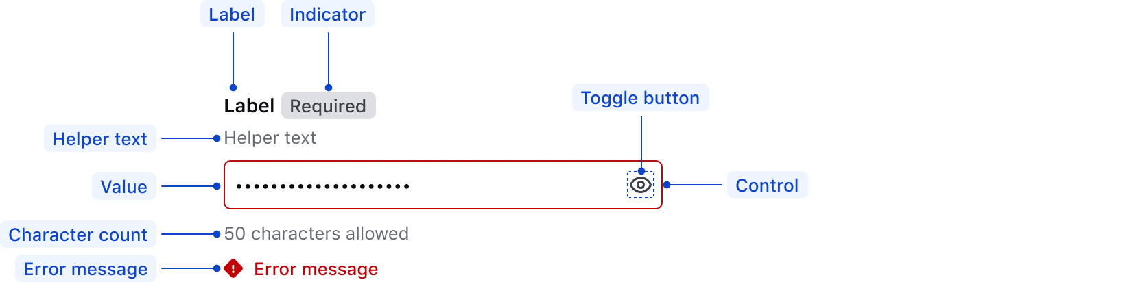
| Element | Usage |
|---|---|
| Label | Required |
| Indicator | Optional |
| Helper text | Optional |
| Placeholder/Value | Optional |
| Toggle button | Required |
| Control | Required |
| Error message | Triggered by system |
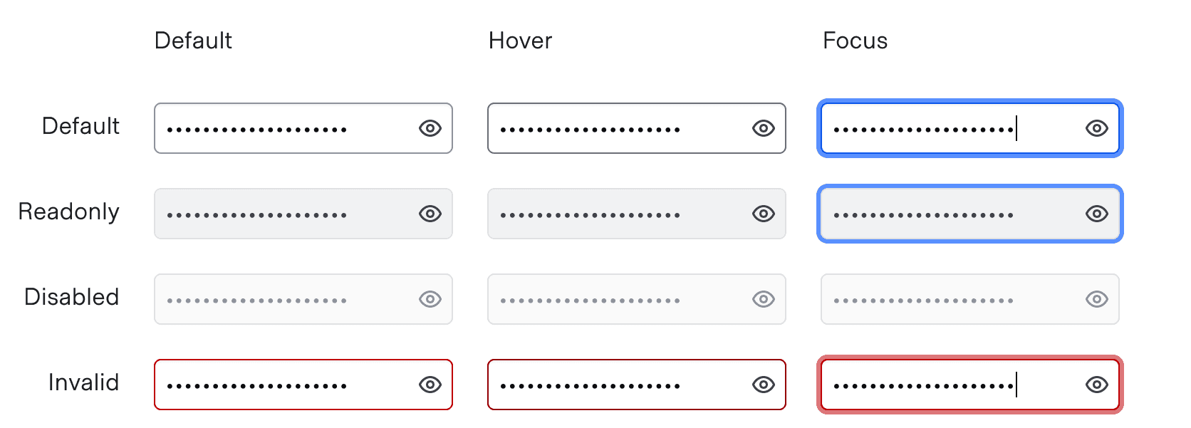
States
Multiline
For general content recommendations, refer to our Primitives documentation.
Keyboard navigation
Focus on the input

Move focus to the toggle button

Activates toggle to show/hide the input value

The toggle button sits right after the control in the markup, so it is the next stop after the input; with copy-button, the copy button follows it. Both are real buttons with an aria-label, and each state change (“Input content is visible”, “Copied to clipboard”) is announced from a live region, so a screen reader user hears what happened.
Conformance rating
A labelled field
An <i80-masked-input> with a label is conformant when used as directed. For that reason, give the field a label whenever you can.
A field without a label
A field is not conformant until it has an accessible name. If you leave the label attribute off, put an aria-label on the element instead, or write your own <label for="…"> and <input> (or <textarea>) inside the tag; the element keeps the control you wrote, and the toggle button still points at it.
Known issues
The helper text and the error are announced through aria-describedby, and a screen reader reads only their text. A link inside them is not announced as a link, so a keyboard user has no way to reach it from the announcement. Put links in the surrounding page content rather than in a label, helper text or error message.
Applicable WCAG Success Criteria
This section is for reference only, some descriptions have been truncated for brevity. This component intends to conform to the following WCAG Success Criteria:
-
1.3.1
Info and Relationships (Level A):
Information, structure, and relationships conveyed through presentation can be programmatically determined or are available in text. -
1.3.2
Meaningful Sequence (Level A):
When the sequence in which content is presented affects its meaning, a correct reading sequence can be programmatically determined. -
1.3.4
Orientation (Level AA):
Content does not restrict its view and operation to a single display orientation, such as portrait or landscape. -
1.3.5
Identify Input Purpose (Level AA):
The purpose of each input field collecting information about the user can be programmatically determined when the input field serves a purpose identified in the Input Purposes for User Interface Components section; and the content is implemented using technologies with support for identifying the expected meaning for form input data. -
1.4.1
Use of Color (Level A):
Color is not used as the only visual means of conveying information, indicating an action, prompting a response, or distinguishing a visual element. -
1.4.10
Reflow (Level AA):
Content can be presented without loss of information or functionality, and without requiring scrolling in two dimensions. -
1.4.11
Non-text Contrast (Level AA):
The visual presentation of the following have a contrast ratio of at least 3:1 against adjacent color(s): user interface components; graphical objects. -
1.4.12
Text Spacing (Level AA):
No loss of content or functionality occurs by setting all of the following and by changing no other style property: line height set to 1.5; spacing following paragraphs set to at least 2x the font size; letter-spacing set at least 0.12x of the font size, word spacing set to at least 0.16 times the font size. -
1.4.3
Minimum Contrast (Level AA):
The visual presentation of text and images of text has a contrast ratio of at least 4.5:1 -
1.4.4
Resize Text (Level AA):
Except for captions and images of text, text can be resized without assistive technology up to 200 percent without loss of content or functionality. -
2.4.6
Headings and Labels (Level AA):
Headings and labels describe topic or purpose. -
2.4.7
Focus Visible (Level AA):
Any keyboard operable user interface has a mode of operation where the keyboard focus indicator is visible. -
3.2.1
On Focus (Level A):
When any user interface component receives focus, it does not initiate a change of context. -
3.2.2
On Input (Level A):
Changing the setting of any user interface component does not automatically cause a change of context unless the user has been advised of the behavior before using the component. -
3.2.4
Consistent Identification (Level AA):
Components that have the same functionality within a set of Web pages are identified consistently. -
3.3.1
Error Identification (Level A):
If an input error is automatically detected, the item that is in error is identified and the error is described to the user in text. -
3.3.2
Labels or Instructions (Level A):
Labels or instructions are provided when content requires user input. -
4.1.2
Name, Role, Value (Level A):
For all user interface components, the name and role can be programmatically determined; states, properties, and values that can be set by the user can be programmatically set; and notification of changes to these items is available to user agents, including assistive technologies.
Support
If any accessibility issues have been found within this component, let us know by submitting an issue.
0.1.0
Første i80-version (fork af upstream, se core/UPSTREAM.md).