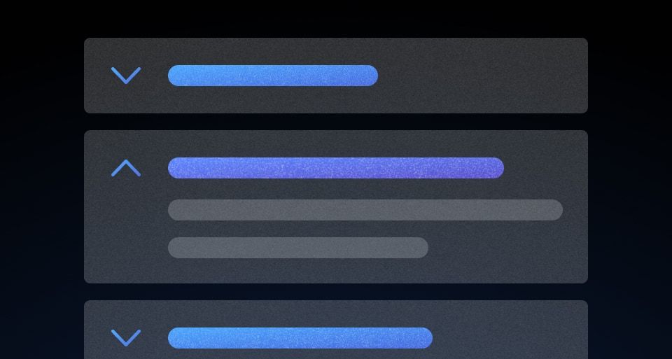
The Reveal is used to show and hide additional details and content not critical to the main flow.
Usage
When to use
- To hide additional information until it is relevant to users.
When not to use
- To hide information critical to the user’s task.
- To contain complex or advanced content.
Toggle text
- Ensure that the text clearly describes the content that will be revealed when the toggle is triggered.
- Keep the text short, clear, and concise. Avoid long sentences.
- Use action-oriented language, when possible, to convey that there is additional content to be shown, e.g., “Show more options”.
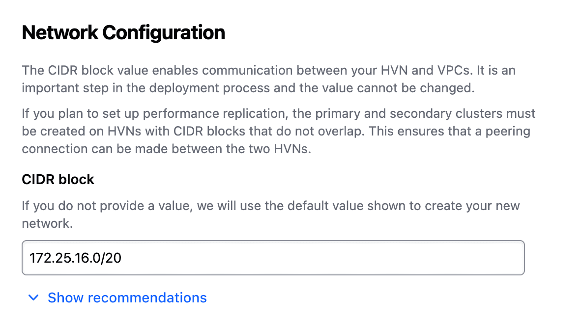
Don’t use vague or unrelated text to describe the content.
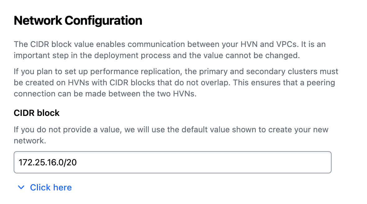
Use meaningful text that relates to the content inside.
Content type
The Reveal component should be used for hiding and showing simple content. For complex content and advanced functionality, consider using an Accordion.
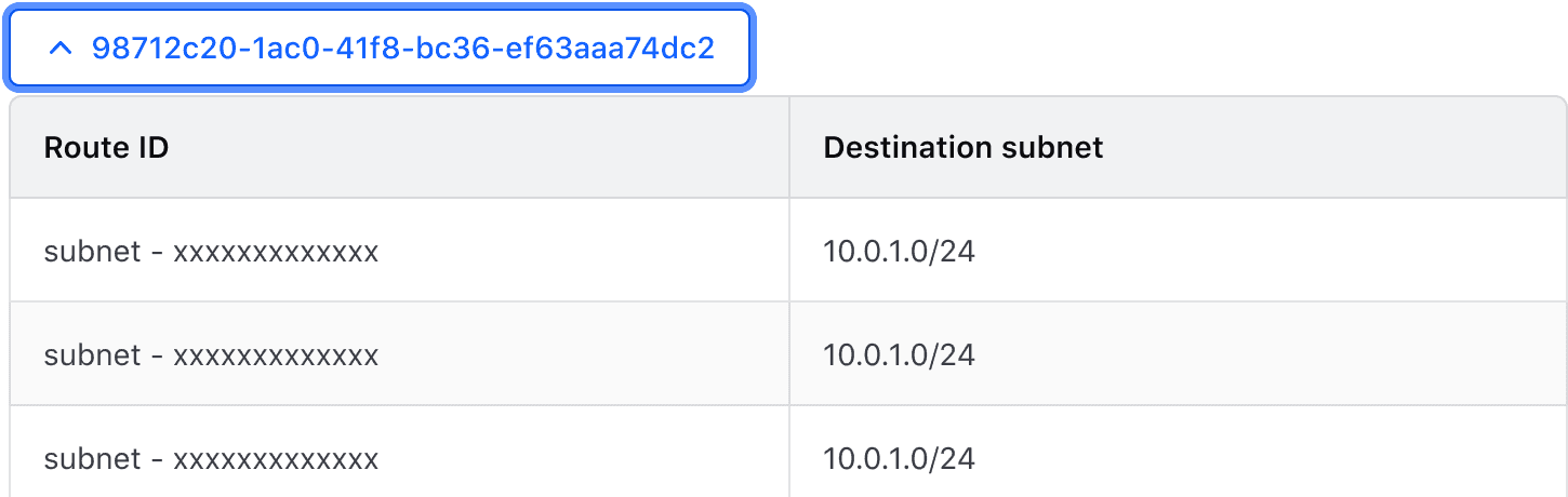
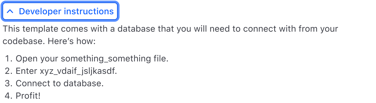
Spacing
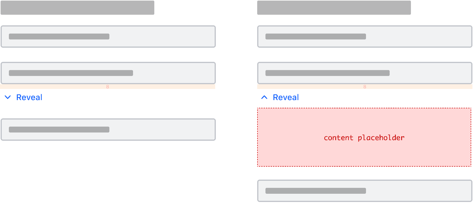
When using the Reveal to contain information related to a single element within a group or section, we recommend leaving 8px between the Reveal and the element it relates to.
In cases where surrounding elements already have margin or padding added, you may want to reduce or remove the spacing entirely.
- When used to show and hide information not directly associated with a single element but an entire section or group, we recommend leaving 24px between the Reveal and the section it relates to.
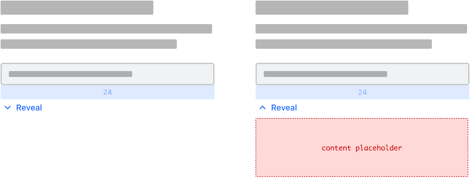
- If you need to adjust the spacing, always ensure it is slightly tighter compared to the spacing between other elements and components in the group, section, or page.
How to use this component
<i80-reveal> renders a button that triggers the display of the content written inside it. That content can consist of either plain text or HTML and can include interactive elements such as links. The text attribute gives the button its label.
<i80-reveal text="Toggle me">Additional content</i80-reveal>Text when open
Set text-when-open to display different text on the toggle button while the content is open.
<i80-reveal text="Open me" text-when-open="Close me">Additional content</i80-reveal>Open on page load
Add the open attribute to display the content on page load instead of initially hiding it.
<i80-reveal text="Toggle me" open>Additional content</i80-reveal>Attributes
<i80-reveal> renders this component. Everything it understands:
| Attribute | Values | Default | Notes |
|---|---|---|---|
text |
text | Show more |
The button's label. |
text-when-open |
text | the text value |
A different label while the content is open. |
open |
boolean | Open on page load. Property: open. Method: toggle(). Event: i80-toggle with detail.open. | |
described-by |
id | Points the button's aria-describedby at other text on the page. |
The tag keeps any native element you write inside it, so a server-rendered form, link or button works as it is. See Web Components for loading i80.js and the reference for these examples running.
Anatomy
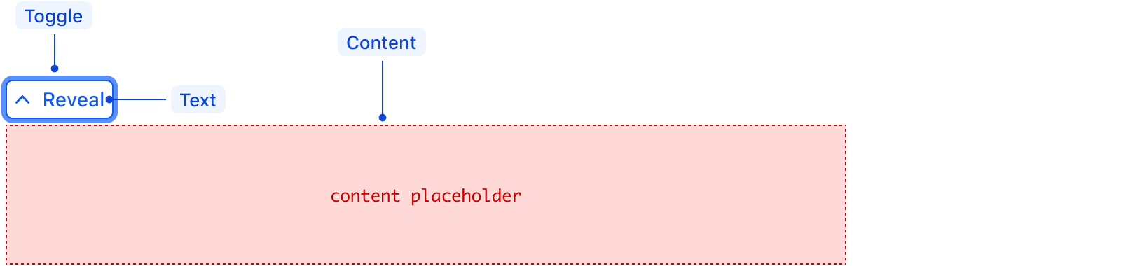
| Element | Usage |
|---|---|
| Toggle | Required |
| Text | Required |
| Content | Required |
States
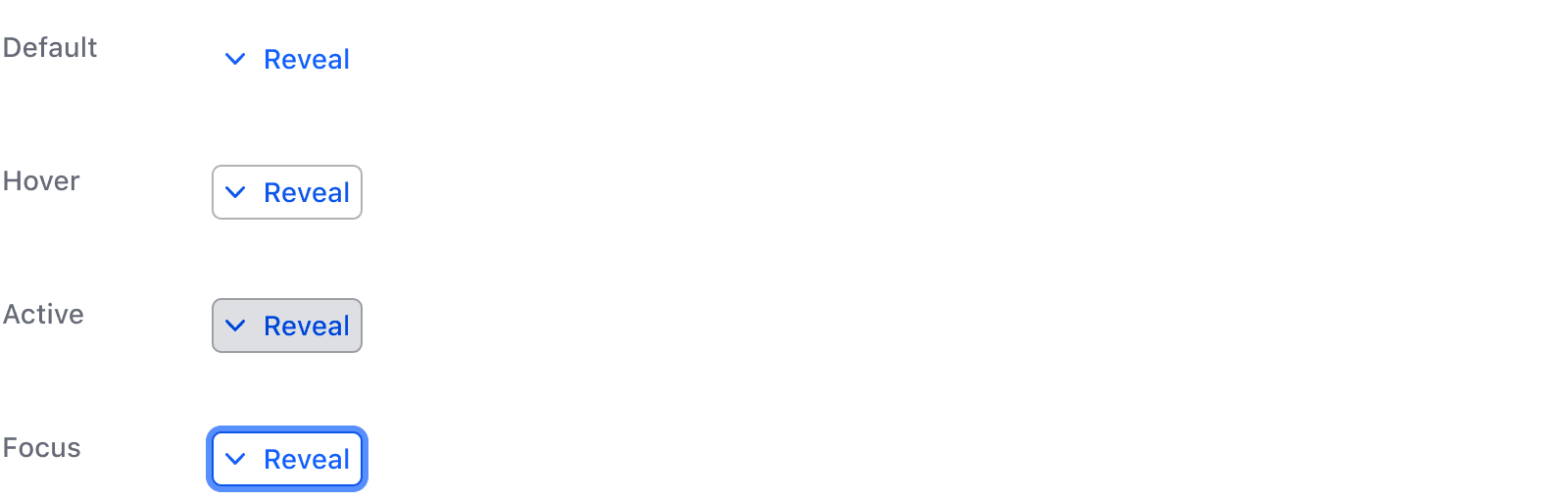
isOpen
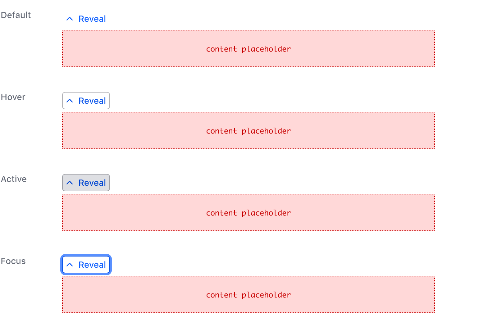
Conformance rating
Reveal is conformant as long as the toggle keeps one name. Give it text alone and the button says the same thing whether the content is open or closed, which is what an accessible name should do — the aria-expanded state is what changes. Add text-when-open and the name changes under the user as they use it, which is not conformant.
For improved accessibility, point the described-by attribute at the id of the text the toggle belongs to; the element puts that id in the button’s aria-describedby, so a screen reader reads what is being revealed and not just “Show more”.
Applicable WCAG Success Criteria
This section is for reference only. This component intends to conform to the following WCAG Success Criteria:
-
1.1.1
Non-text Content (Level A):
All non-text content that is presented to the user has a text alternative that serves the equivalent purpose. -
1.3.1
Info and Relationships (Level A):
Information, structure, and relationships conveyed through presentation can be programmatically determined or are available in text. -
1.3.2
Meaningful Sequence (Level A):
When the sequence in which content is presented affects its meaning, a correct reading sequence can be programmatically determined. -
1.4.1
Use of Color (Level A):
Color is not used as the only visual means of conveying information, indicating an action, prompting a response, or distinguishing a visual element. -
1.4.10
Reflow (Level AA):
Content can be presented without loss of information or functionality, and without requiring scrolling in two dimensions. -
1.4.11
Non-text Contrast (Level AA):
The visual presentation of the following have a contrast ratio of at least 3:1 against adjacent color(s): user interface components; graphical objects. -
1.4.12
Text Spacing (Level AA):
No loss of content or functionality occurs by setting all of the following and by changing no other style property: line height set to 1.5; spacing following paragraphs set to at least 2x the font size; letter-spacing set at least 0.12x of the font size, word spacing set to at least 0.16 times the font size. -
1.4.13
Content on Hover or Focus (Level AA):
Where receiving and then removing pointer hover or keyboard focus triggers additional content to become visible and then hidden, the following are true: dismissible, hoverable, persistent (see link). -
1.4.3
Minimum Contrast (Level AA):
The visual presentation of text and images of text has a contrast ratio of at least 4.5:1 -
1.4.4
Resize Text (Level AA):
Except for captions and images of text, text can be resized without assistive technology up to 200 percent without loss of content or functionality. -
2.1.1
Keyboard (Level A):
All functionality of the content is operable through a keyboard interface. -
2.1.2
No Keyboard Trap (Level A):
If keyboard focus can be moved to a component of the page using a keyboard interface, then focus can be moved away from that component using only a keyboard interface. -
2.4.3
Focus Order (Level A):
If a Web page can be navigated sequentially and the navigation sequences affect meaning or operation, focusable components receive focus in an order that preserves meaning and operability. -
2.4.6
Headings and Labels (Level AA):
Headings and labels describe topic or purpose. -
2.4.7
Focus Visible (Level AA):
Any keyboard operable user interface has a mode of operation where the keyboard focus indicator is visible. -
2.5.3
Label in Name (Level A):
For user interface components with labels that include text or images of text, the name contains the text that is presented visually. -
3.2.1
On Focus (Level A):
When any user interface component receives focus, it does not initiate a change of context. -
3.2.4
Consistent Identification (Level AA):
Components that have the same functionality within a set of Web pages are identified consistently. -
4.1.2
Name, Role, Value (Level A):
For all user interface components, the name and role can be programmatically determined; states, properties, and values that can be set by the user can be programmatically set; and notification of changes to these items is available to user agents, including assistive technologies.
Support
If any accessibility issues have been found within this component, let us know by submitting an issue.
0.1.0
Første i80-version (fork af upstream, se core/UPSTREAM.md).