The Page Header is a presentational component that displays the main title of a page, breadcrumb, page metadata, and page-level actions.
Usage
When to use
- To display the title or topmost heading within a page.
- To communicate metadata pertaining to the page; e.g., status, description, subtitle, etc.
- To highlight page-level actions and functions.
When not to use
- To communicate page-level information anywhere other than the top of the page.
Title
Displays the title or topmost heading of the page. We recommend not exceeding 50 characters in length, but in the case of a longer value (e.g., a user or automatically generated value) the title will wrap to multiple lines.
Breadcrumb
Displays a Breadcrumb to communicate the application hierarchy and location to the user.

Icon Tile
Displays a IconTile as a visual indicator for the content of the page, object, or product branding.
For consistency and to avoid competing visually with the title, only the medium size of the IconTile is supported in the Page Header.

Badges
Displays i80 Badges to communicate high-priority metadata like the status of the page and metadata that is subject to change. We recommend using a maximum of three Badges within the Page Header and prioritizing the most contextually relevant metadata.

Use badges to express similar or related metadata pertaining to the page content.

Don’t use more than three badges within the Page Header. Instead, explore ways to express additional metadata in the generic area of the component or move the content to the main page.

Subtitle
Displays a subtitle beneath the title to communicate metadata that does not change frequently or is not subject to changes within the application. Common examples of this are organization name, project name, unique IDs, resource names, etc.

Don’t use full sentences in the subtitle, use a description instead.

Description
Displays a description beneath the title and subtitle to communicate more detailed information about the page, link out to external documentation and resources, and capture more generic information about the page. Not all pages need a description, especially if the title is explicit enough.
We recommend limiting the Page Header description to 1–2 sentences. If a longer description is required, consider linking to external documentation or moving more detailed content to an interstitial component like a Flyout.

Don’t include overly complex details, long-form content, or instructions in the description. This can add too much visual weight to the Page Header and can detract from the content on the main page.

Instead, link to more complex content using an Inline Link with an optional icon to indicate the scope of the link (internal resource, external resource, etc).
Custom content
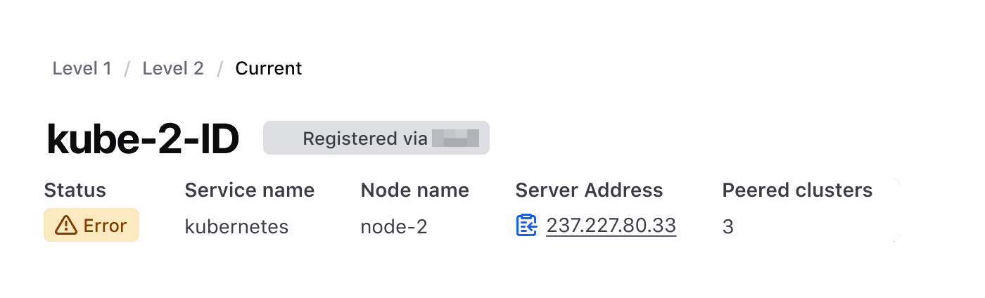
If it is necessary to include additional metadata, key/value pairs, multiple page-level statuses, or other structured content, write it inside the Page Header: anything without a slot sits under the title as metadata.

Key/value pairs as custom metadata
Representing metadata with a set of key/value pairs is common in i80 products and can be useful when communicating relational information between products, versioning, and other structured data.
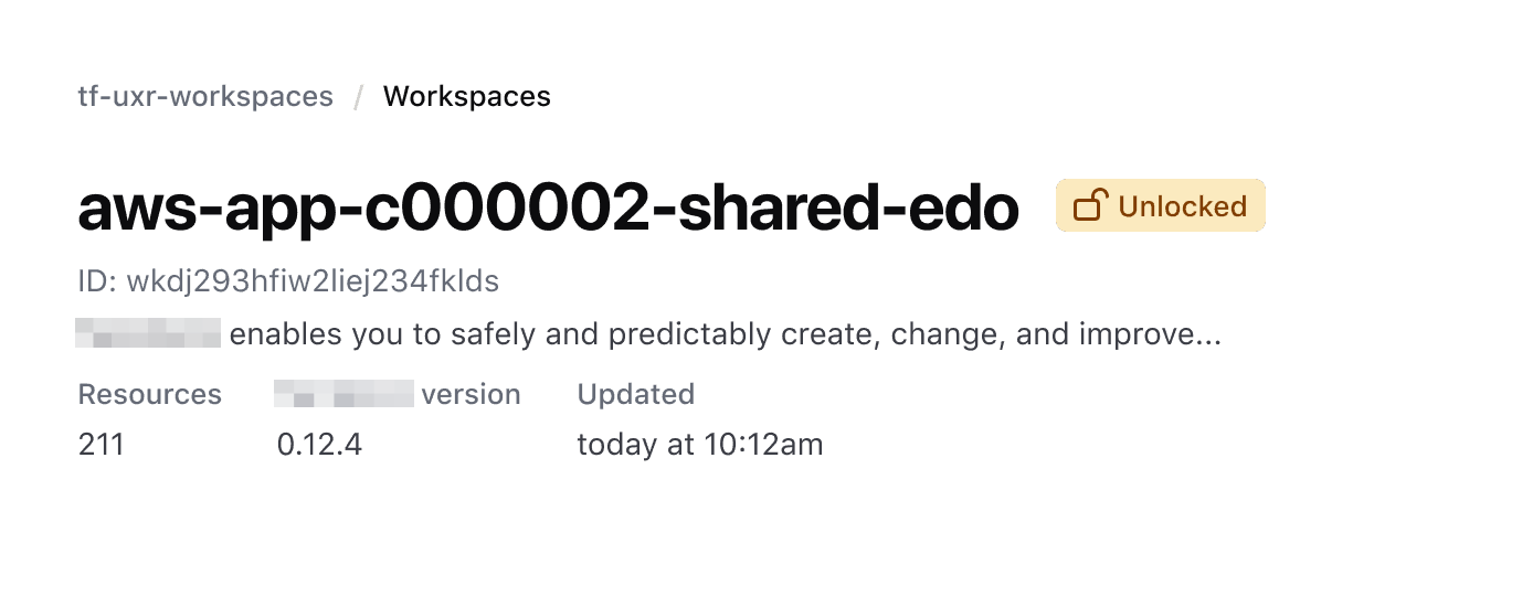
We recommend not exceeding more than four key/value pairs; this can result in unnecessarily complex content within the Page Header. Instead, move this content to the page.
Actions
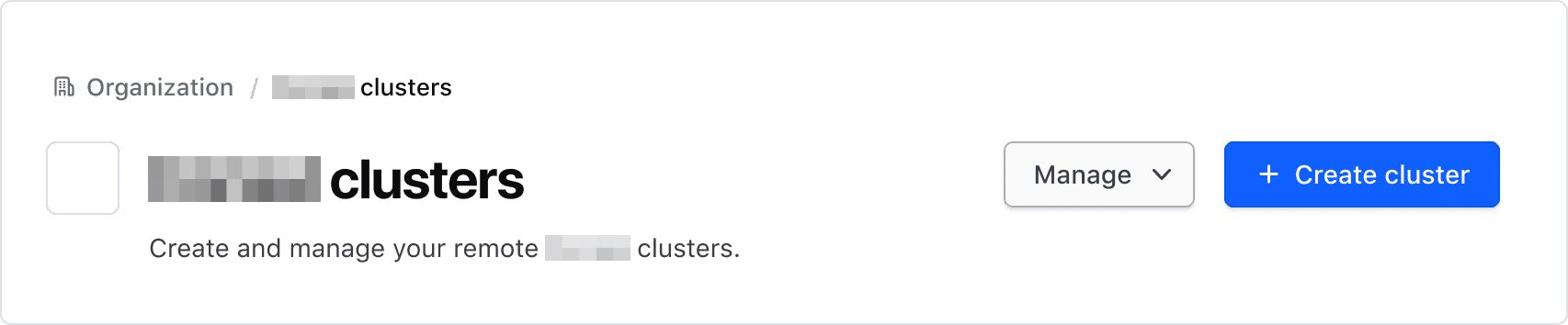
Use Buttons and Dropdowns in the Page Header to highlight functions and actions that impact the page as a whole. Examples of this include:
- Creating new objects that are listed within the page.
- Surfacing management details like connecting to an API.
- Pausing or refreshing a service pertaining to the page.
Primary button
Use a primary Button in the Page Header to highlight the most important flow or action on the page. Examples of this include:
- A flow that creates an object that is related to the page, e.g., creating a new cluster or adding a new user.
- Launching or deploying a specific product instance.
Secondary button
Use a secondary Button in the Page Header when highlighting actions that are less important than the primary action, such as editing the content on a page, managing access, etc.
Tertiary button
A tertiary Button should be used sparingly in the Page Header, but can be used to highlight low-priority actions like terminal instructions or to trigger a component like a Flyout to enhance the content on the main page.
Depending on the intended function, consider consolidating a tertiary Button into a Dropdown.

Dropdowns
Use a Dropdown in the Page Header to combine multiple secondary functions, tasks, or elements that assist the user in managing the information or objects on the page. Examples of this include:
- Copying API credentials to manage the object remotely.
- Editing or changing settings.
- Deleting or deactivating an object.
- Linking to documentation.
When used in these scenarios and paired with a primary button, use a secondary Dropdown.
Use a primary Dropdown when the same action can be done in multiple different contexts. For example, taking the same action through a different interface or path; GUI, CLI, or API call.
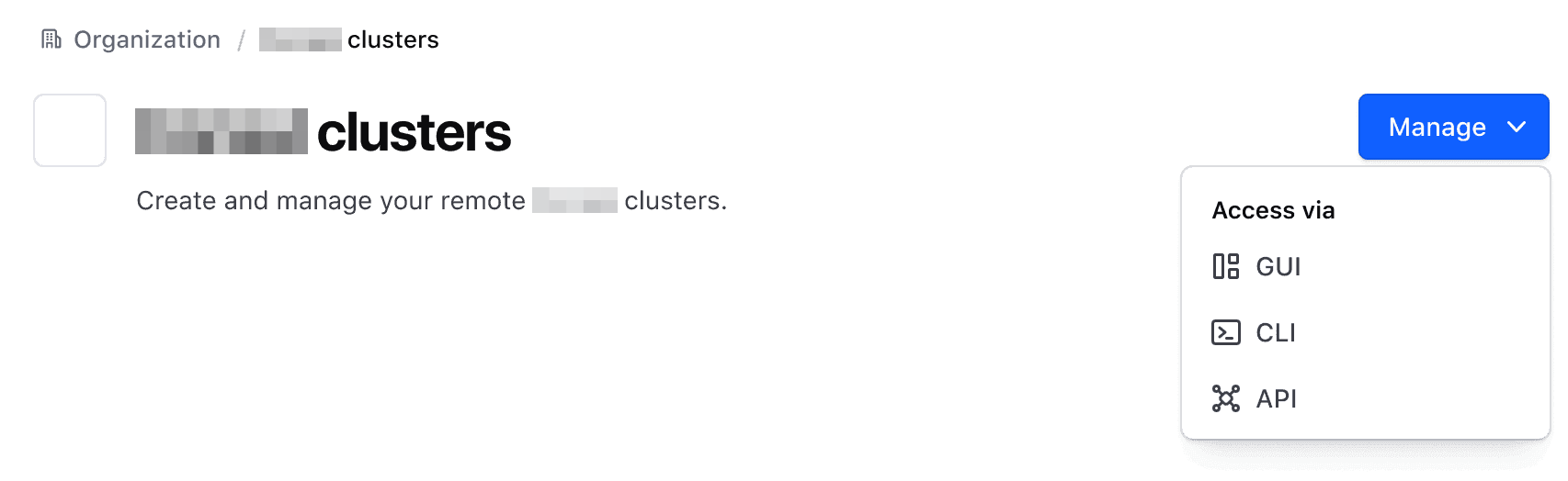
Don’t use a primary color Dropdown when combining different, unrelated actions. Instead, use the secondary color.
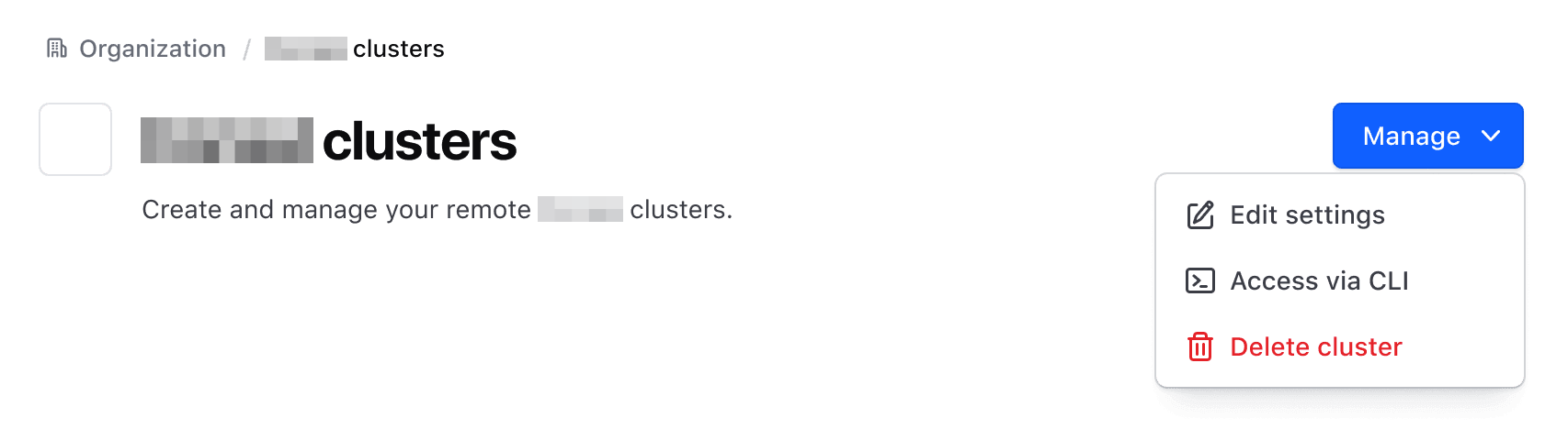
Action color and pairing
While the Page Header supports up to three actions, we recommend limiting the number of actions to two for most pages. These actions should generally consist of a primary action (e.g. "Create" or "Deploy") and a secondary action (e.g., "Manage").
For more details on how to combine, order, and organize buttons, refer to the Button order, organization, and alignment pattern documentation.
Don’t pair two primary actions in a Page Header. Instead, communicate the highest priority action for the user with a primary Button or Dropdown and other actions with a secondary Button or Dropdown.

Size
The component supports a basic level of fluidity and responsiveness out of the box.
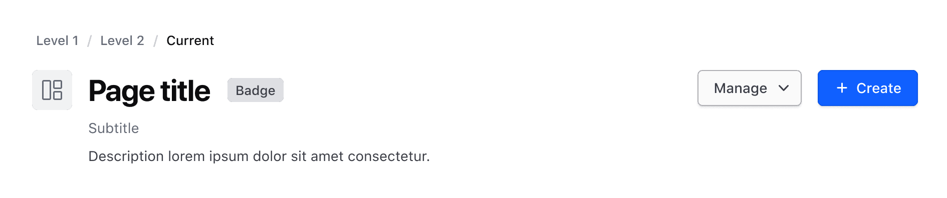
Large
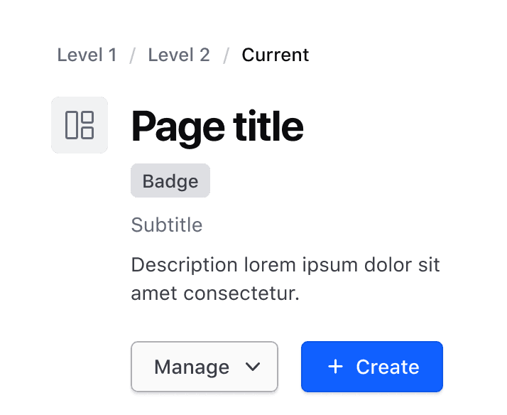
Small
Responsiveness
The Page Header has two sizes; large which accounts for the majority of desktop sizes and large tablets, and small which accounts for smaller tablet and mobile devices. The core difference between each variant is the vertical stacking of elements.
The component stays fluid and responsive in several ways:
- By default, the component will fill the page layout it is used within. It does not have any padding or margin explicitly applied, allowing it to adapt to different layout and spacing methods.
- The component has breakpoints by means of container queries (at
768pxand one at400px) that account for the majority of content within the component and stack elements in a single column as the container shrinks. - Elements displayed inline with each other (e.g., title and badges) have
flex-wrap: wrap;set to wrap elements when the available space is reduced.
How to use this component
A simple invocation of the component requires a contextual <PH.Title> which yields its content within an <h1>.
<i80-page-header title="Page title"></i80-page-header>Contextual components
The Page Header uses a number of contextual components that either yield their content or render a specific i80 component.
<i80-page-header
  title="Page title"
  subtitle="Page subtitle"
  description="Description of the page"
  icon="server-cluster"
  icon-color="pink">
  <i80-breadcrumb slot="breadcrumb">
    <i80-crumb href="#organization" icon="dashboard">Organization</i80-crumb>
    <i80-crumb href="#project" icon="file-text">Project</i80-crumb>
    <i80-crumb icon="server-cluster">Clusters</i80-crumb>
  </i80-breadcrumb>
  <i80-badge slot="badges" icon="award" color="highlight">Status badge</i80-badge>
  <i80-button slot="actions" color="primary" icon="plus">Create</i80-button>
</i80-page-header>
Custom content
Pass custom metadata to the component with a generic contextual component that yields its contents.
<i80-page-header title="Page title" icon="folder">
  <i80-dropdown slot="actions" text="Manage" color="secondary">
    <i80-dropdown-item href="#one">Item One</i80-dropdown-item>
    <i80-dropdown-item href="#two">Item Two</i80-dropdown-item>
    <i80-dropdown-item href="#three">Item Three</i80-dropdown-item>
    <i80-dropdown-separator></i80-dropdown-separator>
    <i80-dropdown-item href="#delete" color="critical" icon="trash">Delete</i80-dropdown-item>
  </i80-dropdown>
  <div style="display: flex; align-items: center; justify-content: center; width: 350px; height: 36px; background: #eee">
    generic metadata
  </div>
</i80-page-header>
Attributes
<i80-page-header> renders this component. Everything it understands:
| Attribute | Values | Default | Notes |
|---|---|---|---|
title |
text | The page's name, in an <h1>. | |
title-tag |
h1 … h6 | h1 |
The heading level. |
subtitle |
text | A faint line under the title. | |
description |
text | A sentence about the page, under the subtitle. | |
icon |
icon name | Shows an icon tile beside the title. | |
icon-color |
neutral · brand · coral · pink · green · sky · purple · blue · yellow · teal | neutral |
The tile's colour. |
slot="breadcrumb" · slot="badges" · slot="actions" |
Above the title, next to it, and at the end of the row. |
The tag keeps any native element you write inside it, so a server-rendered form, link or button works as it is. See Web Components for loading i80.js and the reference for these examples running.
Anatomy
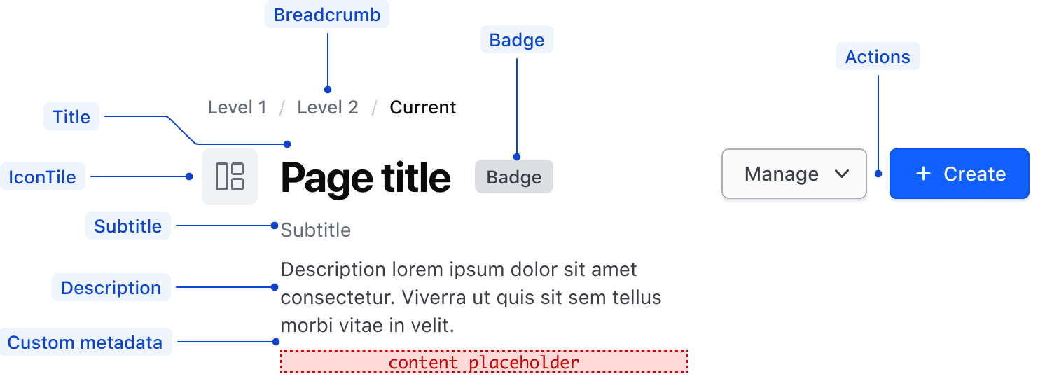
| Element | Usage |
|---|---|
| Title | Required |
| Breadcrumb | Optional, but recommended for any page except top-level landing pages |
| IconTile | Optional |
| Badges | Optional |
| Subtitle | Optional |
| Description | Optional |
| Custom metadata | Optional |
| Actions | Optional, supports either one, two, or three actions |
Conformance rating
When used as recommended, there should not be any WCAG conformance issues with this component.
Applicable WCAG Success Criteria
All of the success criteria that applied to the components used in building this component will still apply and should be listed on the component’s accessibility documentation. Additionally, a few specifically relevant (potential) additions:
-
1.3.2
Meaningful Sequence (Level A):
When the sequence in which content is presented affects its meaning, a correct reading sequence can be programmatically determined.
Support
If any accessibility issues have been found within this component, let us know by submitting an issue.
0.1.0
Første i80-version (fork af upstream, se core/UPSTREAM.md).