What is an icon
An icon is used to provide additional meaning to text and, in some rare contexts, meaning on its own.
You can see all the available icons ("glyphs") in our icon library, also known as Flight Icons library.
Types
There are four types of icons: Outlined, Filled, Off, and Contained.
Outlined
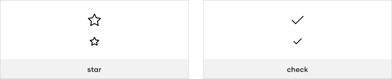
Outlined icons are icons with a standard outline.
Use Outlined icons by default.
Filled
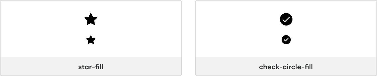
Filled icons are icons with a solid fill and are indicated by -fill in the icon name.
Use Filled icons to show a toggled state or for contrast with Outlined icons.
Indicating a toggled state
For objects that can be toggled on/off, show the Outlined icon for off and the Filled icon for on.

Using for contrast
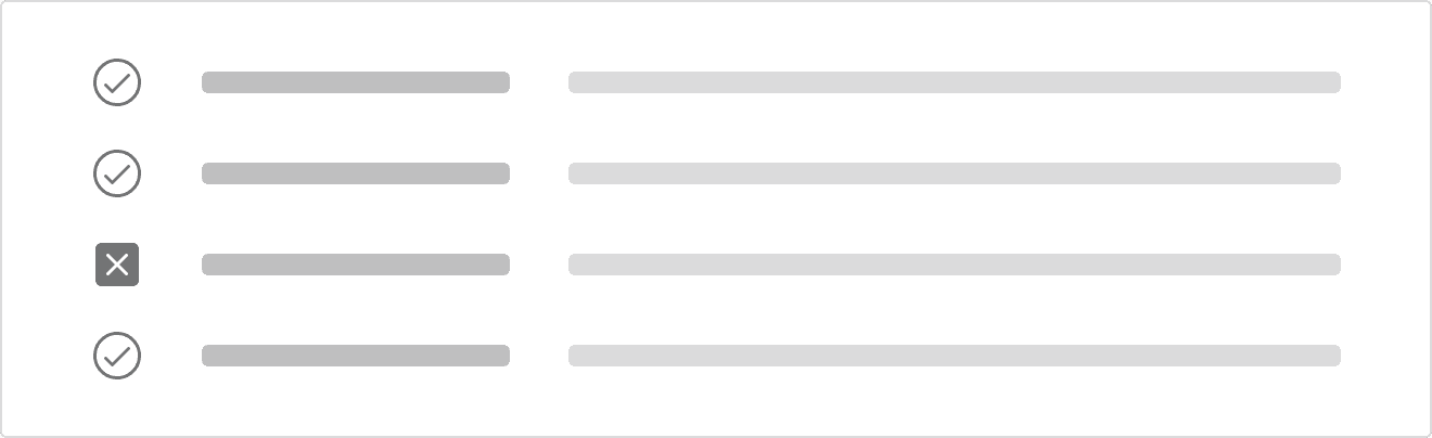
If contrast against other icons is important, use Filled for the more important icon(s).
For example, when showing one failure in a list of 20 otherwise successful builds, use x-square-fill while keeping the remaining icons in the Outlined style so the failure is more prominent.
Off
Off icons are icons including a strike-through and are indicated by -off in the icon name.
Use Off icons to indicate something is disabled, unavailable, or will return a toggled icon off.
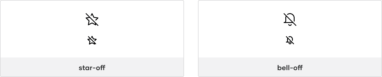
Indicating a disabled or unavailable icon
When needing to indicate an action is disabled or unavailable, consider pairing an Off icon with the color style Foreground/Disabled and cursor property value not-allowed.
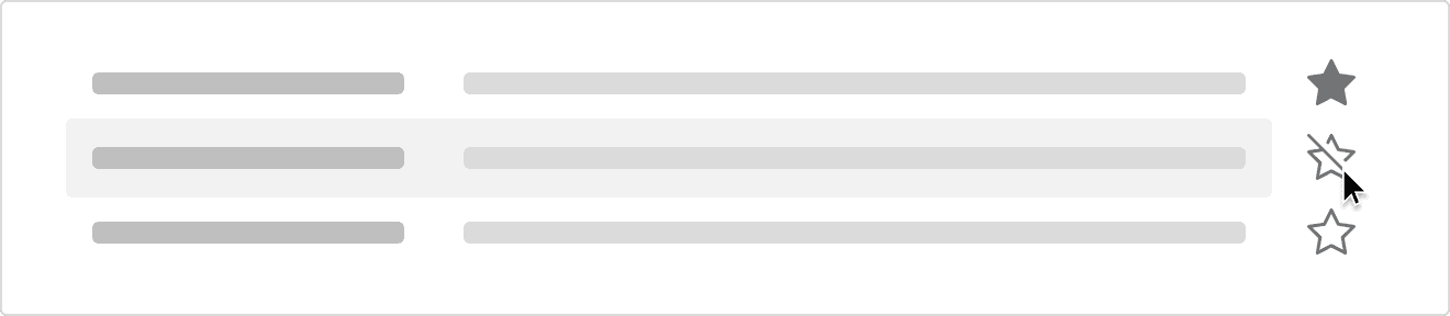
Return toggled state back off
If an object is toggled on and it can be toggled off, consider showing the Off icon on hover to indicate that clicking the icon again will toggle the object back off.
Contained
Contained icons are icons with a containing shape and are indicated by their shape type in the icon name, e.g., -circle, -square, etc.
Use contained icons for emphasis in the hierarchy.
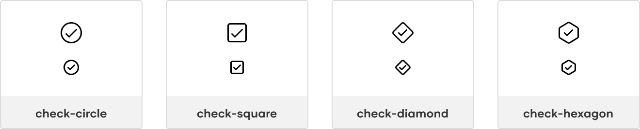
If an object can have multiple states, use a Contained icon for the overall parent state and the Outlined icon(s) for the children’s state(s).

Animated
Animated icons are icons with an animated effect that show a transition between two states.
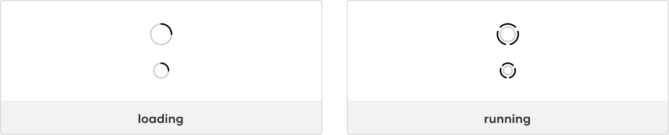
Use animated icons to communicate activity happening in the background. For example, when an object is updated, the loading icon could appear after the save action is triggered, indicating that the changes are in progress.

Sizes
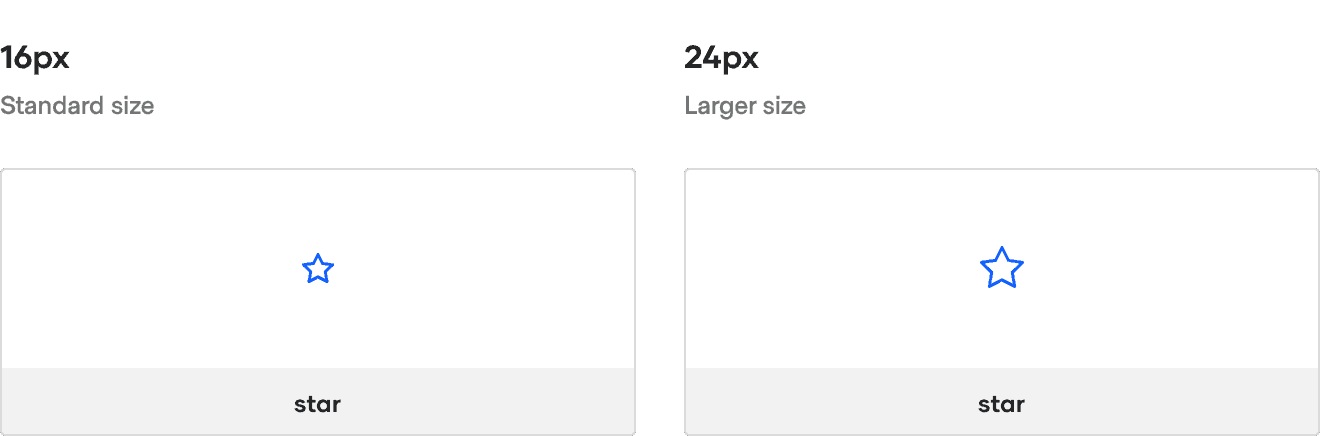
Icons are optimized for two icon sizes: 16px and 24px.
Use 16px icons by default in product interfaces and 24px icons for empty states.
States
Icons frequently represent different states within product interfaces, most commonly as states of an object or states of feedback.
States of an object
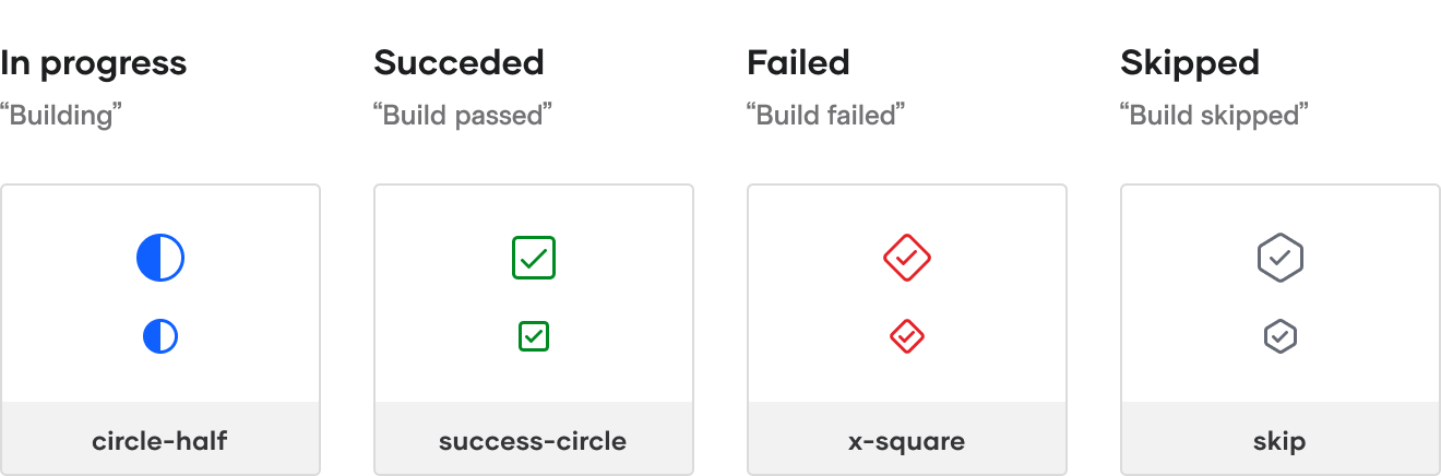
Some objects can return a state, e.g., a Build, Run, Cluster, etc. Objects are typically displayed in lists or as cards and include their state when presented to the user.
States of feedback
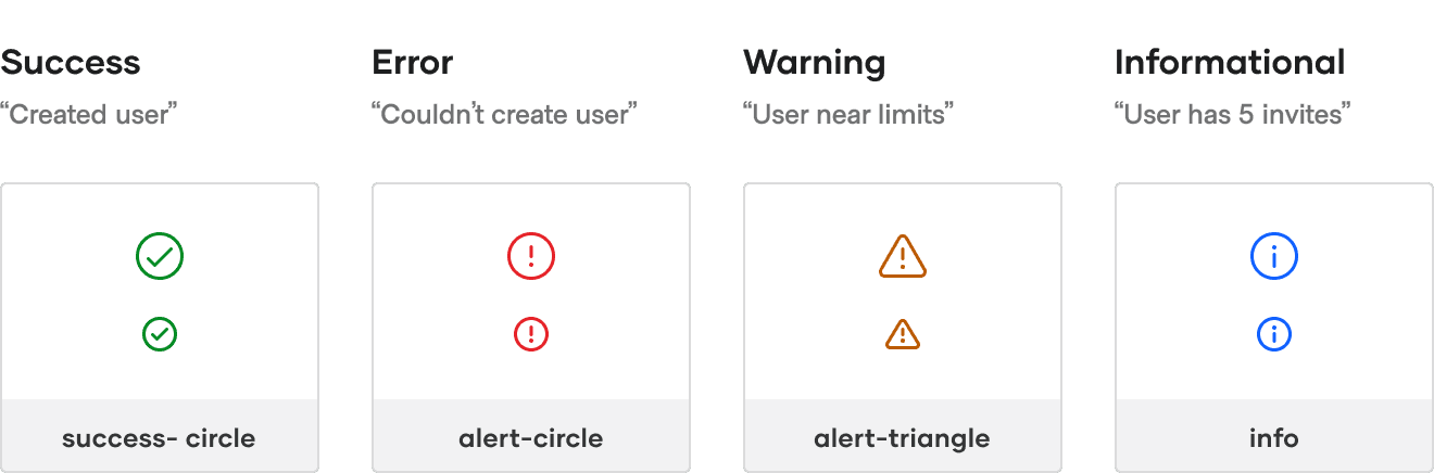
Feedback is presented in response to user interaction, such as a displaying a success message after submitting a form or a warning when a user nears their usage limit.
Common icons
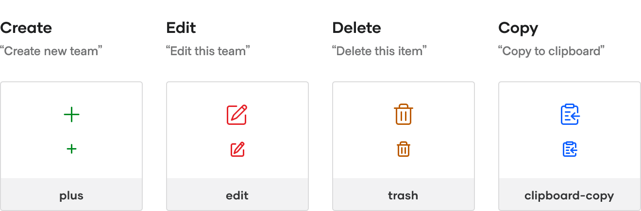
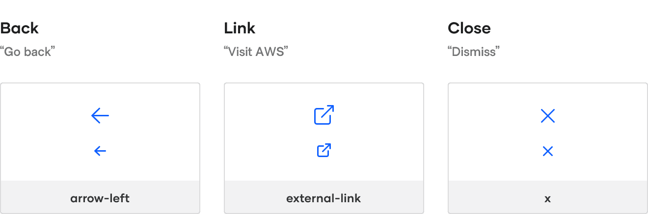
Some icons represent common actions within our products.
Editing actions
Navigation actions
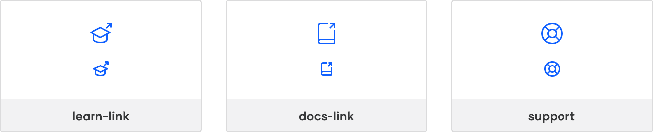
Help actions
Use
learn-linkwhen linking to tutorials.Use
docs-linkwhen linking to documentation pages and installation guides.Use
supportwhen referencing i80 support.
How to use this component
<i80-icon> needs a name matching an existing name in the Icon library:
<i80-icon name="alert-circle"></i80-icon>An icon without a title is hidden from assistive technology, so it cannot carry meaning on its own and must be used inside an element that already has an accessible name. Give it a title when the icon is the only thing conveying the information: it then becomes an image with that name. See the Accessibility section for more details on how to best use it in different contexts.
Size
Icons come in two sizes, 16 and 24 pixels, drawn for that size rather than scaled to it.
<i80-icon name="zap" size="24"></i80-icon>With stretched the icon fills its container instead, which is how an icon follows the size of the text or the box around it.
<div class="doc-icon-demo--constrain-max-width">
  <i80-icon name="zap" size="24" stretched></i80-icon>
</div>
Color
An icon is currentColor by default, so it takes the colour of the text around it. The color attribute overrides that, either with one of the semantic colour names:
<i80-icon name="zap" color="success"></i80-icon>or with a design token:
<i80-icon name="zap" color="var(--i80-color-brand-coral-brand)"></i80-icon>or with any CSS colour value:
<i80-icon name="zap" color="rebeccapurple" inline></i80-icon>
<i80-icon name="zap" color="rgb(46, 113, 229)" inline></i80-icon>
Filled and outlined
Many icons come in an outlined and a filled version, named name and name-fill. Use the filled one where the icon has to hold its own against a coloured background or at a small size.
<i80-icon name="triangle" inline></i80-icon>
<i80-icon name="triangle-fill" inline></i80-icon>
Animated icons
The loading and running icons animate on their own; nothing needs to be loaded for that.
<i80-icon name="loading" size="24"></i80-icon>Where the animation would distract — in a table of many rows, or behind a button that is already showing progress — use the static version instead.
<i80-icon name="loading-static" size="24"></i80-icon>Aligning icons
An icon has a block display value by default (changeable with the inline attribute), so it behaves like a block element. If you want to horizontally align it in relation to other sibling elements, you will have to use CSS to achieve the expected result.
For example, to visually center an icon with a generic text node, you will need to use a parent flex container with align-items: center.
Attributes
<i80-icon> renders this component. Everything it understands:
| Attribute | Values | Default | Notes |
|---|---|---|---|
name |
icon name | One of the Flight icons, e.g. plus, trash, external-link. | |
size |
16 · 24 | 16 |
|
color |
token name or CSS colour | currentColor |
A foreground token (action, success, warning, critical, faint …) or any CSS colour. |
title |
text | Makes the icon an image with this accessible name. | |
inline |
boolean | Aligns the icon with the surrounding text. | |
stretched |
boolean | Fills its container instead of using the fixed size. |
The tag keeps any native element you write inside it, so a server-rendered form, link or button works as it is. See Web Components for loading i80.js and the reference for these examples running.
Conformance rating
When used as recommended, there should not be any accessibility issues with this component.
Browser accessibility support
Accessibility support for SVGs is inconsistent across browsers and assistive technology. Currently, the best practice is to hide the SVG from assistive technology with aria-hidden="true", which is what <i80-icon> does when you give it no title. An icon like that is decorative: it has to be used in context, next to text that carries the meaning, and never on its own.
Activity report
<h2>
  Activity report
  <i80-icon name="activity"></i80-icon>
</h2>
If you put an icon inside a native element like a <button> and there is no text beside it, the element has nothing to be named by, so add an aria-label yourself:
<button aria-label="Check activity" type="button">
  <i80-icon name="activity"></i80-icon>
</button>
Give <i80-icon> a title instead and it stops being decorative: the SVG becomes role="img" with that title as its name. Use it when the icon really is the content — a status mark in a table cell, for instance — and not when the text beside it already says the same thing, or a screen reader will read it twice.
Resources
Here is a list of resources that are associated with our I80 icon component.
Icon Library
A list of all icons our component supports.
I80 support
If you are unable to find a specific icon, or notice a problem with an existing one, reach out to I80 support.
Request an icon or report an issue
0.1.0
Første i80-version (fork af upstream, se core/UPSTREAM.md).