Tabs allow users to move between different views within the same context at the same level of hierarchy, e.g., UI vs. CLI, macOS vs. Windows vs. Linux, etc.
Usage
When to use
- To move between different views within the same context.
Use Tabs to break up content that is related to each other and is on the same hierarchical level.

When not to use
- For navigation, consider AppSideNav, Standalone Links, or Breadcrumb.
- As a stepper or progress bar for multi-step workflows, consider a stepper, using the Stepper Indicator.
- To see multiple content areas at the same time or to fully collapse the content area, use Accordion.
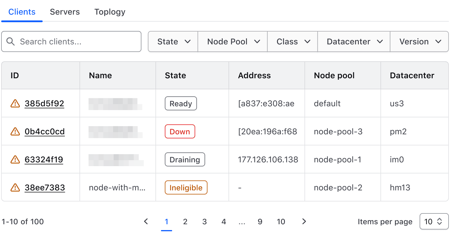
Don’t use Tabs for primary or secondary navigation.
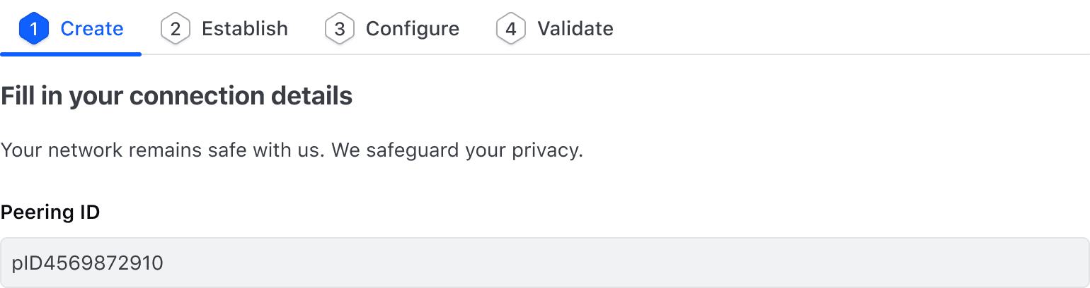
Don’t use Tabs for sequential content.
Tab best practices
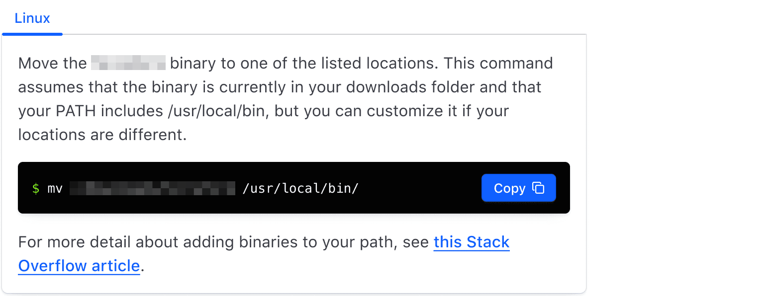
We don’t recommend using a singular Tab; instead consider using a heading.
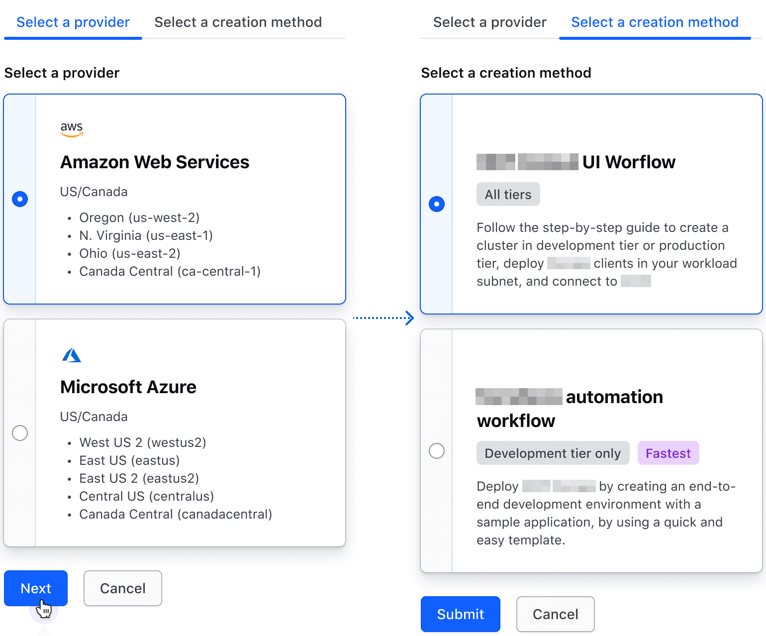
Don’t trigger a Tab change via an external action, such as a submit or next button. Tab changes should only be triggered by the Tab itself as that is the expected user interaction.
Sizes
Medium tabs are the default and work best in most contexts. Large tabs can be used to emphasize important sections, enhance clarity, and convey hierarchical distinction.

Choosing sizes
Mixing different tab sizes is not recommended and can negatively impact the natural page hierarchy. Choose tab sizes intentionally and align them with the hierarchical importance of the information they represent.
We recommend structuring Tabs to reflect the intended hierarchy of the content they contain:
- Large Tabs sit higher in the page hierarchy and can be used to express more important content, but should be used more sparingly.
- Medium tabs are more adaptable in most scenarios and naturally occupy the same hierarchy as most page content.
Spacing
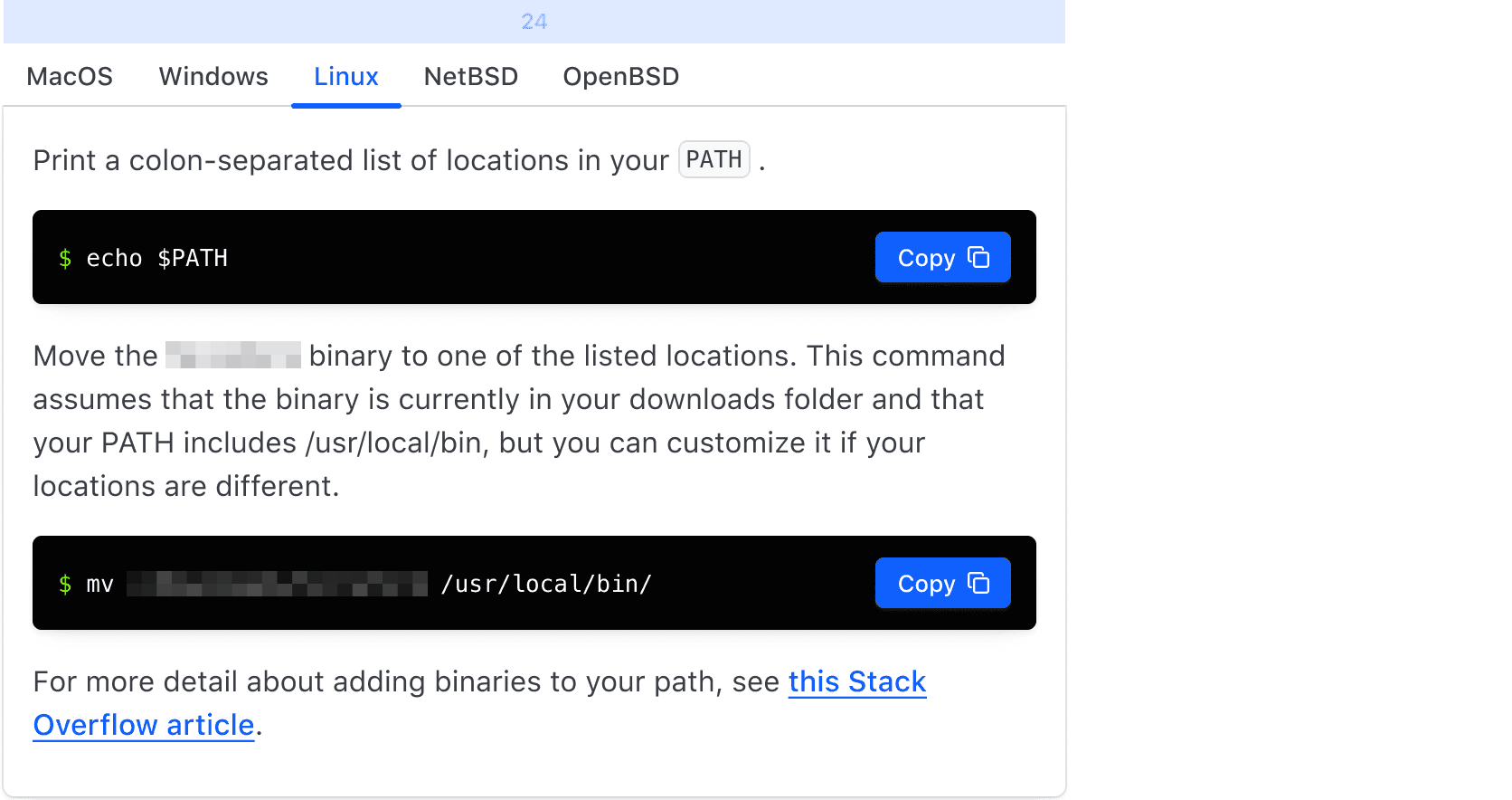
Contained
When the content area consists of a contained component (e.g., table, card, etc), we recommend:
- 24px above tabs
- 0px between the tabs and the content area
- Top & right border-radius of the content area be set to 0
- The content area should be flush on the left & right with the tabs
Nested
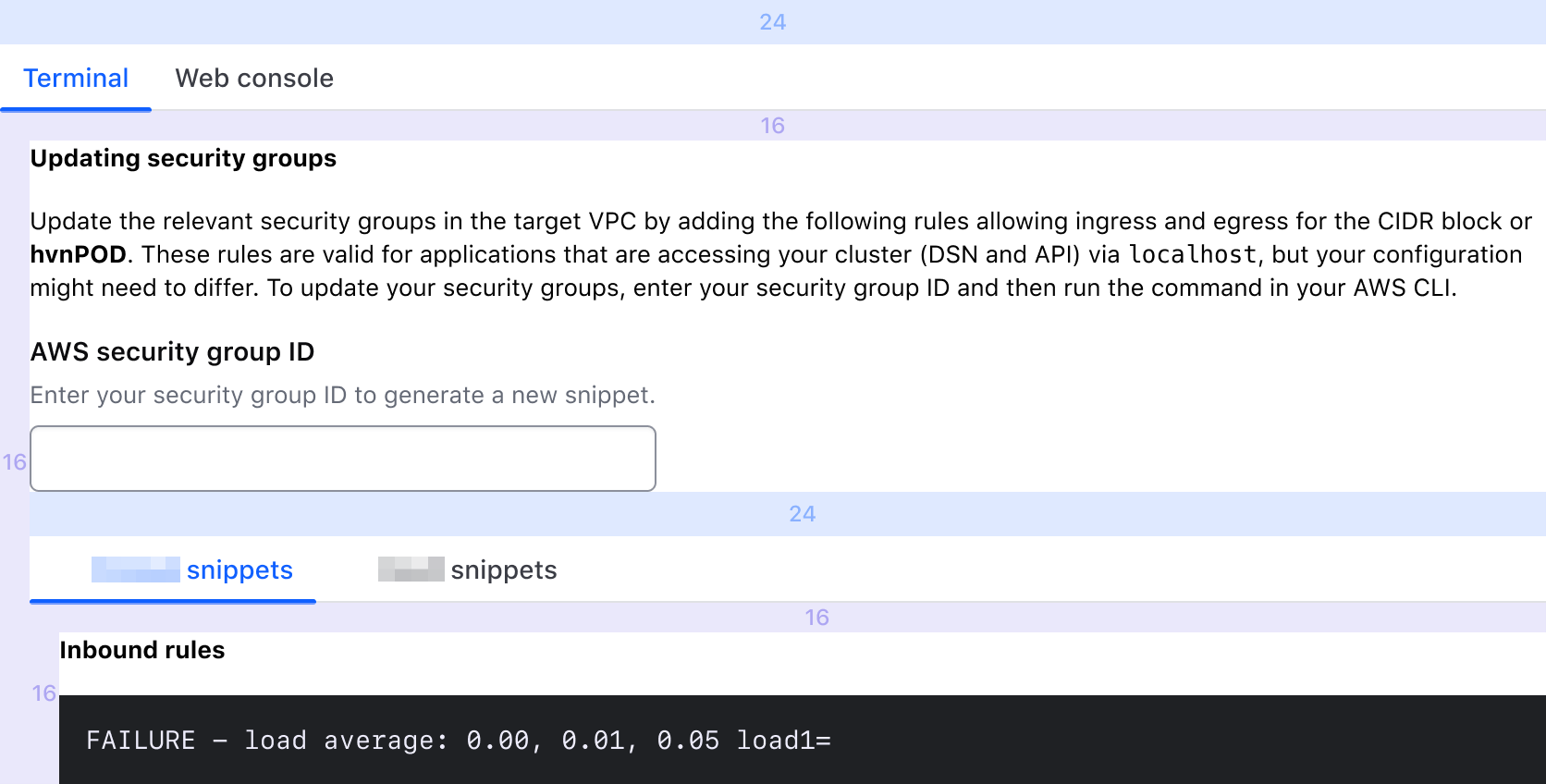
We don’t recommend using a nested tab structure, but if you must, don’t go beyond 2 levels of nesting. If finding that you need to go beyond 2 levels of nesting, consider using another navigation pattern or re-evaluating the information architecture of your product.
When nesting tabs, regardless of if your content area consists of contained or non-contained components; we recommend:
- 24px above each Tabs instance
- 16px between each Tabs instance and its corresponding content area
- Top & right border-radius of the content area be set to 0, if contained
- Each content area should be left indented by 16px
Not contained
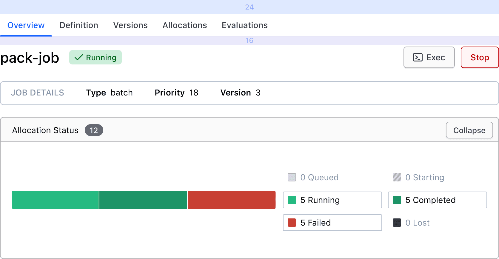
When the content area does not consist of a contained component (ie. text block, form, etc), we recommend:
- 24px above Tabs
- 16px between the Tabs and the content area
- The content area should be flush on the left & right with the Tabs, if only one level of tabs. If nested levels, see "Nested".
Overflow
Tabs will fill 100% of the parent container, unless explicitly set to something else. When there are too many tabs to fit within the TabList, a horizontal scrollbar will help the user navigation hidden tabs.
How to use this component
<i80-tabs>
  <i80-tab>One</i80-tab>
  <i80-tab>Two</i80-tab>
  <i80-tab>Three</i80-tab>

  <i80-tab-panel>Content 1</i80-tab-panel>
  <i80-tab-panel>Content 2</i80-tab-panel>
  <i80-tab-panel>Content 3</i80-tab-panel>
</i80-tabs>
Size
Set size to "large" to display the large Tabs variant. The default size is "medium".
<i80-tabs size="large">
  <i80-tab>One</i80-tab>
  <i80-tab>Two</i80-tab>
  <i80-tab>Three</i80-tab>

  <i80-tab-panel>Content 1</i80-tab-panel>
  <i80-tab-panel>Content 2</i80-tab-panel>
  <i80-tab-panel>Content 3</i80-tab-panel>
</i80-tabs>
Pre-selecting a tab
The first tab is selected by default. To display a different tab on page load, add the selected attribute to one of the <i80-tab> elements. From that moment on, the tab selection is controlled internally by the component.
<i80-tabs>
  <i80-tab>One</i80-tab>
  <i80-tab>Two</i80-tab>
  <i80-tab selected>Three</i80-tab>

  <i80-tab-panel>Content 1</i80-tab-panel>
  <i80-tab-panel>Content 2</i80-tab-panel>
  <i80-tab-panel>Content 3, I am displayed on page load.</i80-tab-panel>
</i80-tabs>
Count and icon
<i80-tabs>
  <i80-tab count="5">One</i80-tab>
  <i80-tab icon="download">Two</i80-tab>
  <i80-tab>Three</i80-tab>

  <i80-tab-panel>Content 1</i80-tab-panel>
  <i80-tab-panel>Content 2</i80-tab-panel>
  <i80-tab-panel>Content 3!</i80-tab-panel>
</i80-tabs>
Nested tabs
We don’t recommend nesting tabs, but in case it’s necessary to implement such a feature, nest an <i80-tabs> inside an <i80-tab-panel> as it is.
🦜 Content for Parrots
🦅 Content for Eagles
🦉 Content for Owls
🐬 Content for Dolphins
🦈 Content for Sharks
🐙 Content for Cephalopods
<i80-tabs>
  <i80-tab>🐤 Birds</i80-tab>
  <i80-tab>🐠 Fishes</i80-tab>
  <i80-tab>🐙 Cephalopods</i80-tab>

  <i80-tab-panel>
    <i80-tabs>
      <i80-tab>🦜 Parrots</i80-tab>
      <i80-tab>🦅 Eagles</i80-tab>
      <i80-tab>🦉 Owls</i80-tab>

      <i80-tab-panel><p>🦜 Content for Parrots</p></i80-tab-panel>
      <i80-tab-panel><p>🦅 Content for Eagles</p></i80-tab-panel>
      <i80-tab-panel><p>🦉 Content for Owls</p></i80-tab-panel>
    </i80-tabs>
  </i80-tab-panel>
  <i80-tab-panel>
    <i80-tabs>
      <i80-tab>🐬 Dolphins</i80-tab>
      <i80-tab>🦈 Sharks</i80-tab>

      <i80-tab-panel><p>🐬 Content for Dolphins</p></i80-tab-panel>
      <i80-tab-panel><p>🦈 Content for Sharks</p></i80-tab-panel>
    </i80-tabs>
  </i80-tab-panel>
  <i80-tab-panel><p>🐙 Content for Cephalopods</p></i80-tab-panel>
</i80-tabs>
Attributes
<i80-tabs> renders this component. Everything it understands:
| Attribute | Values | Default | Notes |
|---|---|---|---|
size |
medium · large | medium |
|
selected |
index | 0 |
The selected tab, from 0. Or put selected on an <i80-tab>. Event: i80-change with detail.index. |
i80-tab-panel |
The panel for the tab in the same position; it can be empty while the tab is being built. | ||
i80-tab |
icon · count · selected | One tab; its text is the label. | |
i80-tab-panel |
The content for the tab in the same position. |
The tag keeps any native element you write inside it, so a server-rendered form, link or button works as it is. See Web Components for loading i80.js and the reference for these examples running.
Anatomy
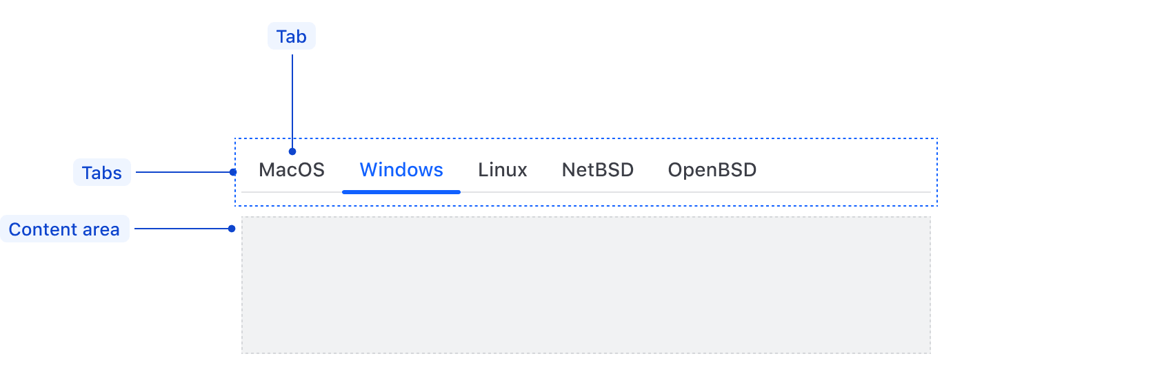
| Element | Usage |
|---|---|
| Tab | Required, two minimum |
| Content area | Required, Tabs should never be used alone |
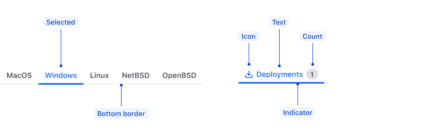
| Element | Usage |
|---|---|
| Selected | Required, one is always selected |
| Bottom border | Required |
| Icon | Optional |
| Text | Required |
| Count | Optional |
| Indicator | Required, displayed on selected Tab |
States

Tabs should be short and concise, and a good indication of what content the user can expect to find within the TabPanel. They should not consist of full sentences.
Conformance rating
Animation
No indicator animation will be present for users that have enabled prefers-reduced-motion.
Keyboard navigation
Focus on a tab
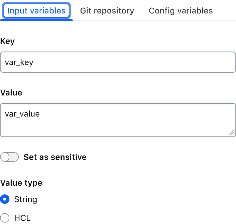
Activate tab to display matching content area
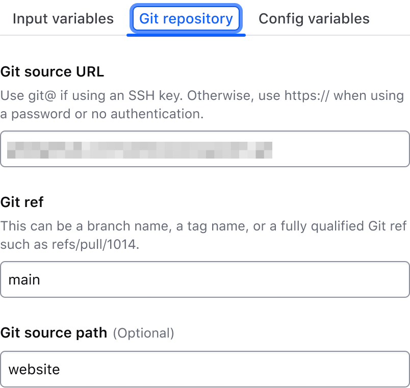
Move between tabs
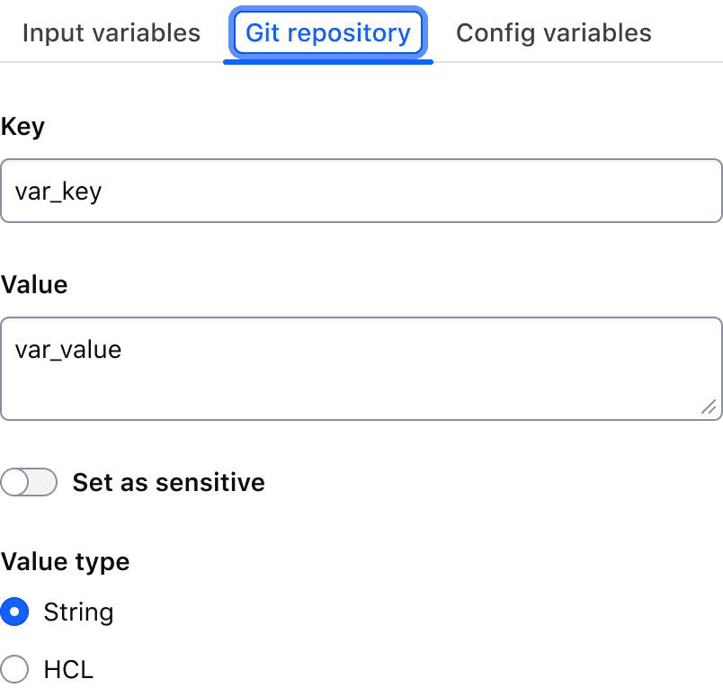
Move to interactive element within the content area
Applicable WCAG Success Criteria
-
1.3.1
Info and Relationships (Level A):
Information, structure, and relationships conveyed through presentation can be programmatically determined or are available in text. -
1.3.2
Meaningful Sequence (Level A):
When the sequence in which content is presented affects its meaning, a correct reading sequence can be programmatically determined. -
1.4.1
Use of Color (Level A):
Color is not used as the only visual means of conveying information, indicating an action, prompting a response, or distinguishing a visual element. -
1.4.10
Reflow (Level AA):
Content can be presented without loss of information or functionality, and without requiring scrolling in two dimensions. -
1.4.11
Non-text Contrast (Level AA):
The visual presentation of the following have a contrast ratio of at least 3:1 against adjacent color(s): user interface components; graphical objects. -
1.4.12
Text Spacing (Level AA):
No loss of content or functionality occurs by setting all of the following and by changing no other style property: line height set to 1.5; spacing following paragraphs set to at least 2x the font size; letter-spacing set at least 0.12x of the font size, word spacing set to at least 0.16 times the font size. -
1.4.13
Content on Hover or Focus (Level AA):
Where receiving and then removing pointer hover or keyboard focus triggers additional content to become visible and then hidden, the following are true: dismissible, hoverable, persistent (see link). -
1.4.3
Minimum Contrast (Level AA):
The visual presentation of text and images of text has a contrast ratio of at least 4.5:1 -
1.4.4
Resize Text (Level AA):
Except for captions and images of text, text can be resized without assistive technology up to 200 percent without loss of content or functionality. -
2.1.1
Keyboard (Level A):
All functionality of the content is operable through a keyboard interface. -
2.1.2
No Keyboard Trap (Level A):
If keyboard focus can be moved to a component of the page using a keyboard interface, then focus can be moved away from that component using only a keyboard interface. -
2.4.6
Headings and Labels (Level AA):
Headings and labels describe topic or purpose. -
2.4.7
Focus Visible (Level AA):
Any keyboard operable user interface has a mode of operation where the keyboard focus indicator is visible. -
3.2.1
On Focus (Level A):
When any user interface component receives focus, it does not initiate a change of context. -
4.1.2
Name, Role, Value (Level A):
For all user interface components, the name and role can be programmatically determined; states, properties, and values that can be set by the user can be programmatically set; and notification of changes to these items is available to user agents, including assistive technologies.
Support
If any accessibility issues have been found within this component, let us know by submitting an issue.
0.1.0
Første i80-version (fork af upstream, se core/UPSTREAM.md).