The App Side Nav provides users with access to contextual navigation within areas of the application and generally includes subpages and nested pages within projects and organizations.
Usage
When to use
- When navigating between subpages and nested pages within the application.
When not to use
- For global navigation across an application, use the App Header instead.
- To move between views within the same context or page, consider Tabs.
Body
The body consists of a group of sections with vertical lists of links, typically to the most important parts of the application. Any generic content or component is also supported by an additional generic container.
List
With title
- A title can help users scan the sections and provide context about the links inside each section.
- Titles should be meaningful and related to the content within the section.

Without title

List items
Without icon

With icon

- Use icons to help users recognize and scan the links they are paired with.
- We recommend only using icons in the main or top level navigation.
- Avoid overwriting color styles in icons.
Use the default icon color in list items.

Don’t override the color of the icon within the list item or incorporate a brand color.

With badge

With count
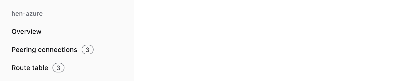
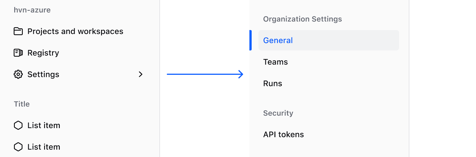
With nested items
Mark a link as having sub-items to show that it opens a nested level of navigation.
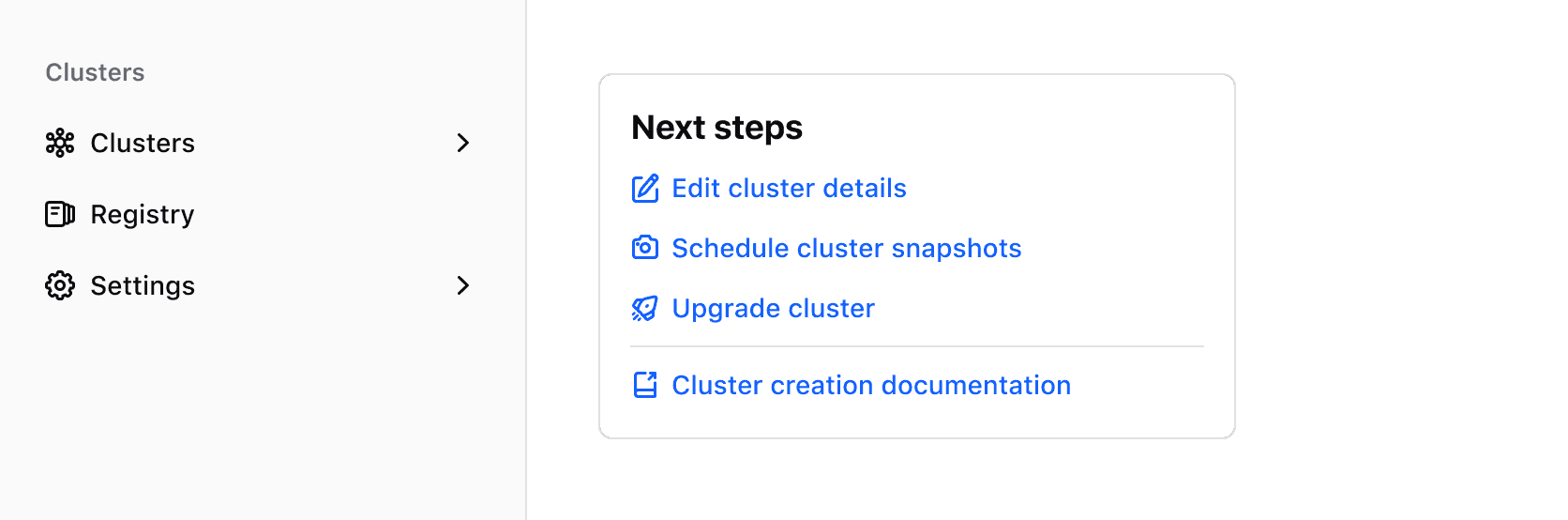
Don’t mark a link as having sub-items when it simply directs to a page containing a list of links within the main content area of the page itself.
External links
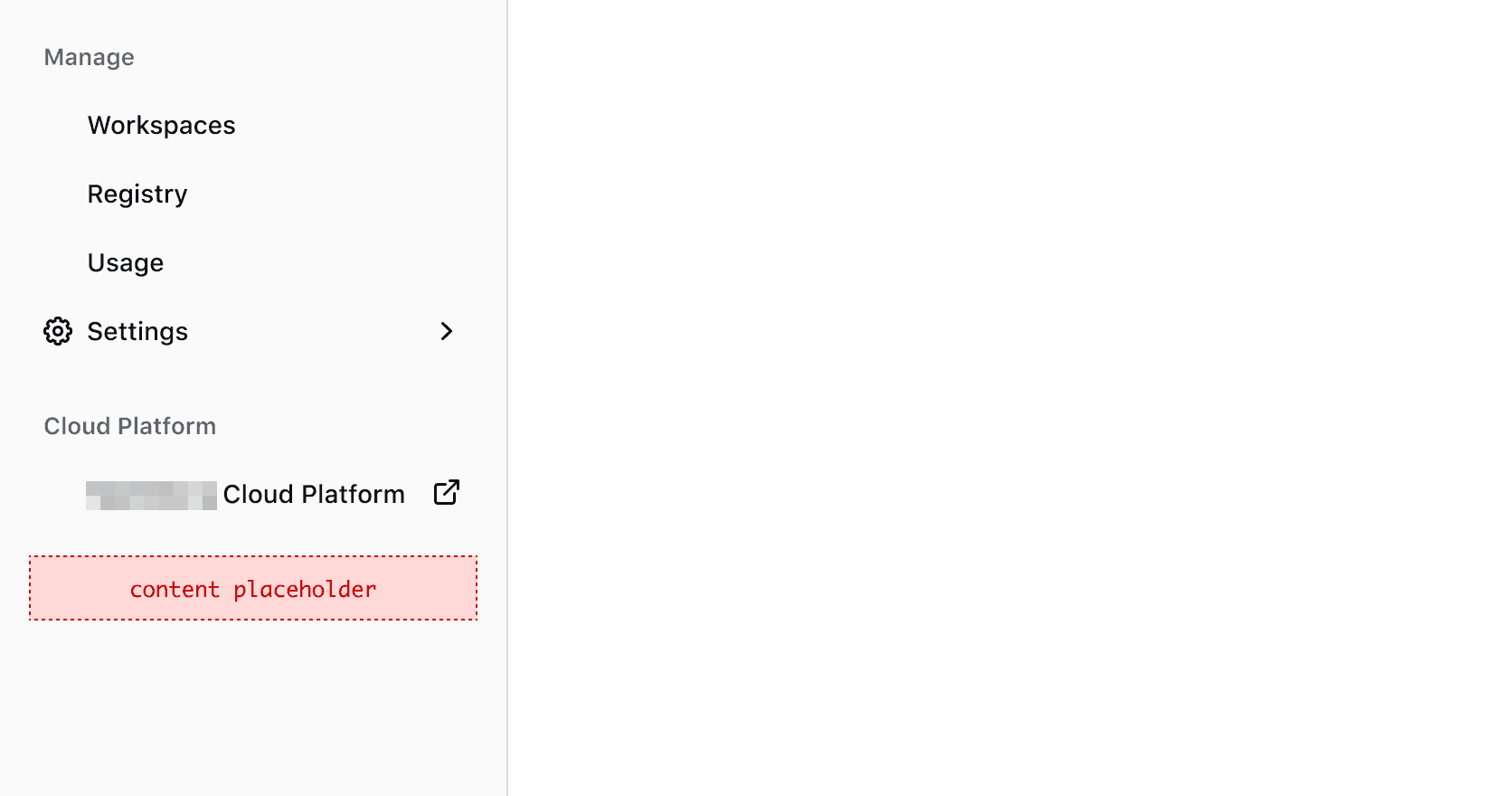
Use external to show that the list item is a hyperlink pointing to a page outside the product or platform.

Generic content
The body container can also hold content above and below the list: text, your own elements or i80 elements.
Positioning, and responsive behavior
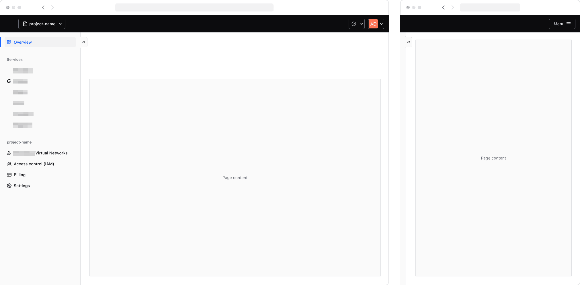
The App Side Nav should always be positioned on the left side of the viewport, occupying 100% of the viewport height to ensure that the navigation is always visible and accessible to the user.
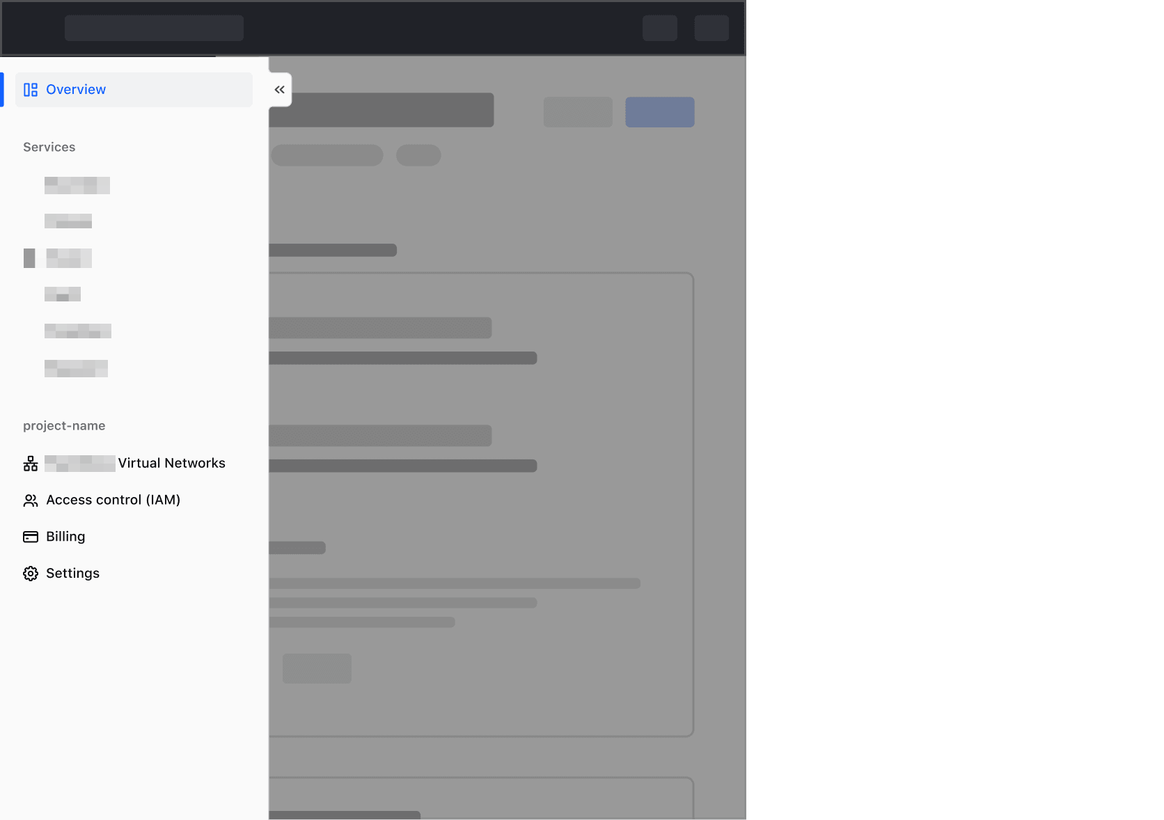
On smaller viewports, the App Side Nav should collapse to maximize the available real estate on tablet and mobile devices. By tapping the menu icon, users can expand and access the full menu when needed.
Collapse functionality
A responsive App Side Nav carries a collapse toggle button, so users can expand and collapse it themselves.

On smaller viewports, the App Side Nav will be rendered in its collapsed state by default and will overlay the main page content in its expanded state.
Collapsed reflow
The collapse functionality of the App Side Nav gives control to the end-user to unlock more horizontal space in the main page. Thus, the main page content should reflow or reposition to occupy this space if the App Side Nav is in its collapsed state. If the main page content has a predetermined maximum width that is reached when the App Side Nav collapses, the content should transition smoothly to the new center of the main page area.
This is handled out of the box by the AppFrame component, but may need to be accounted for in custom implementations of the application/page layout.
This section provides in-depth instructions on how consumers can use the full-featured App Side Nav (<i80-app-side-nav>) to build a “standard” sidebar navigation with responsive behavior, animations/transitions, etc.
Given the complexity and level of customization that an application’s navigation may require, it is not possible to cover all the possible use cases in this documentation. For this reason, if you need to implement a navigation element using this component, contact the Design Systems Team for support.
Full-featured component
The App Side Nav provides a set of advanced features out of the box: layout, content, responsiveness, accessibility.
Layout
The App Side Nav component provides a top-level layout for the sidebar navigation.
Consumers place the navigation content inside the element and add business logic to control the content within it.
<i80-app-side-nav style="height: 320px">
  <i80-nav-link href="#dashboard" icon="dashboard" active>Dashboard</i80-nav-link>
  <i80-nav-title>Services</i80-nav-title>
  <i80-nav-link href="#boundary" icon="shield">Boundary</i80-nav-link>
  <i80-nav-link href="#consul" icon="server">Consul</i80-nav-link>
  <i80-nav-link href="#vault" icon="lock">Vault</i80-nav-link>
</i80-app-side-nav>
It also comes with a set of CSS properties that automatically set the App Side Nav in a fixed position on the left of the application frame, and force it to occupy the full height of the window.
Content
Standard I80 Button and Dropdown components can also be used within the App Side Nav where needed.
The App Side Nav is an agnostic container, in which consumers can in principle add anything they want, in the order they want.
That said, to create consistent experiences for our end-users, it’s very likely that the choice of what to use will fall on the navigation items themselves — <i80-nav-title> and <i80-nav-link>, placed straight inside <i80-app-side-nav>.
The navigation items
The list items are the fundamental building blocks of the navigation. The App Side Nav generates a <nav> element, containing a <ul> list of “items”, and each item you write inside it is rendered as an HTML <li> element. There are a few different variants of items:
<i80-nav-title>- used to provide a title to a specific “section” of the list; it accepts any content, applying specific color and typographic styles to it.<i80-nav-link>- used to render a “link” item that navigates the user to a specific page or resource; it exposes a set of different attributes, to allow the consumers specific customizations.<i80-nav-link back>- a simplified version of the link element, used to take “back” the user to a previous page or navigation state; it shows a leading “left chevron” by default, and accepts a plain text string as its label.
Below is an example (with simplified code for better readability) of how these elements could be used to build different specific navigation items:
<i80-app-side-nav style="height: 420px">
  <i80-nav-link href="#" back>A “back” link</i80-nav-link>
  <i80-nav-title>A section title</i80-nav-title>
  <i80-nav-link href="#">A link with just text</i80-nav-link>
  <i80-nav-link href="#" icon="network">A link with an icon</i80-nav-link>
  <i80-nav-link href="#" icon="users" count="12">With a “count”</i80-nav-link>
  <i80-nav-link href="#" icon="credit-card" badge="Beta">With a “badge”</i80-nav-link>
  <i80-nav-link href="#" icon="guide" external>As an “external” link</i80-nav-link>
</i80-app-side-nav>
For more details about how to use these elements, refer to the “Attributes” section.
Responsiveness
As mentioned above, the full-fledged App Side Nav is “responsive” by default:
- when the viewport is
desktop, the sidebar navigation is static and has a fixed width- the width at which the viewport is considered “desktop” can be overwritten using the
breakpointattribute
- the width at which the viewport is considered “desktop” can be overwritten using the
- when the viewport is
mobile, the sidebar navigation is responsive and the user can minimize or maximize its width via a toggle button (the component will take care automatically of the transitions between these two states)- in this case the App Side Nav occupies only a minimum width in terms of page layout, even when expanded (it partially covers the main content)
- a toggle button is added to the App Side Nav, used to expand/minimize its width
- an overlay is automatically added to the main content area so that the user can’t interact with it while the App Side Nav is opened (if the user clicks on the overlay, the App Side Nav closes and returns to its minimized state; the same happens if the user presses the
esckey)
This “responsive” behavior can be turned off with responsive="false" on <i80-app-side-nav>.
Notice that even if responsiveness is turned off, some JavaScript is executed anyway in the background, and events listeners are attached to some DOM elements (even if these functionality are not used).
Logical and visual states
When the component is “responsive” there are different “states” (and associated logic) for different combinations of these three parameters:
- whether the navigation is responsive
- whether the viewport is desktop
- whether the navigation is minimized
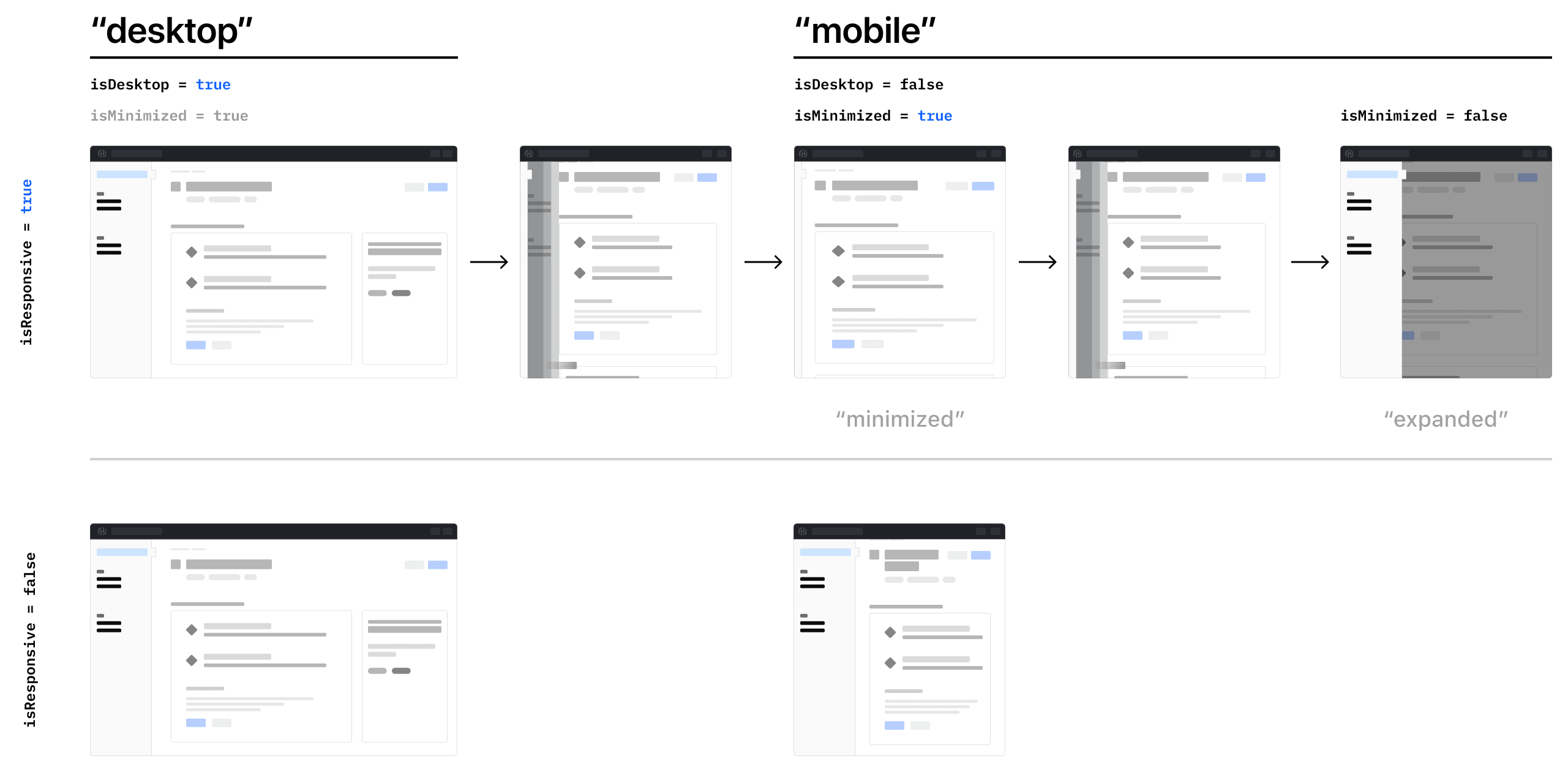
Each one of these states has CSS class names associated, and they’re used by the component code to determine what layout to render for the sidebar navigation.
Content transitions between states
The App Side Nav component automatically:
- fades in/out the content in the navigation
- swaps the toggle button icon between its two states and moves it from one position to another
More specifically, the animation is:
minimized → maximizedtransition: the content appears with a fade-in effect, when the width animation is already completed (the width is maximized)maximized → minimizedtransition: the content disappears at once with no transition, before the width animation starts
Any other content in the App Side Nav needs to be explicitly handled by the consumers (in this way they have full control of the content they add, and they can customize the transition as they want/need).
Advanced customization
Some aspects of the responsiveness/animation/transition of the App Side Nav are parameterized in code via CSS custom properties. It means that in theory they could be customized/overwritten. This though is something that we don’t recommend.
Navigation is a cardinal element of the UI of an application, and its standardization across the different i80 products is an important end goal. Also, the implementation of this component has required considerable efforts and investments, and we should preserve it as much as possible as a unifying element across products.
If you find yourself in the situation of wanting/needing to customize or change the aspect or the behavior of the App Side Nav component, contact the Design Systems Team for support.
Accessibility
Since this component is layout-only, there are no built-in accessibility features: you are responsible for making sure your custom App Side Nav implementation is conformant to the WCAG requirements.
aria attributes
The App Side Nav component already provides some of the required aria attributes. But other attributes are needed when declaring its content. Please refer to the Accessibility section for more details.
Animations
Animations and transition on the component will not take place if the user has prefers-reduced-motion enabled in their browser or operating system.
Attributes
<i80-app-side-nav> renders this component. Everything it understands:
| Attribute | Values | Default | Notes |
|---|---|---|---|
minimized |
boolean | Minimised on a wide screen. Event: i80-toggle with {minimized}. | |
open |
boolean | Open on a narrow screen. Events: i80-open, i80-close. | |
responsive |
boolean | true |
responsive="false" gives a plain sidebar with no toggle. |
breakpoint |
px | 1088 |
Below this width it behaves as a panel. |
label |
text | Application local navigation |
The name screen readers announce. |
i80-nav-link |
href · icon · count · badge · active · external · back | One link; its text is the label. | |
i80-nav-title |
A heading over a group of links. |
The tag keeps any native element you write inside it, so a server-rendered form, link or button works as it is. See Web Components for loading i80.js and the reference for these examples running.
Anatomy
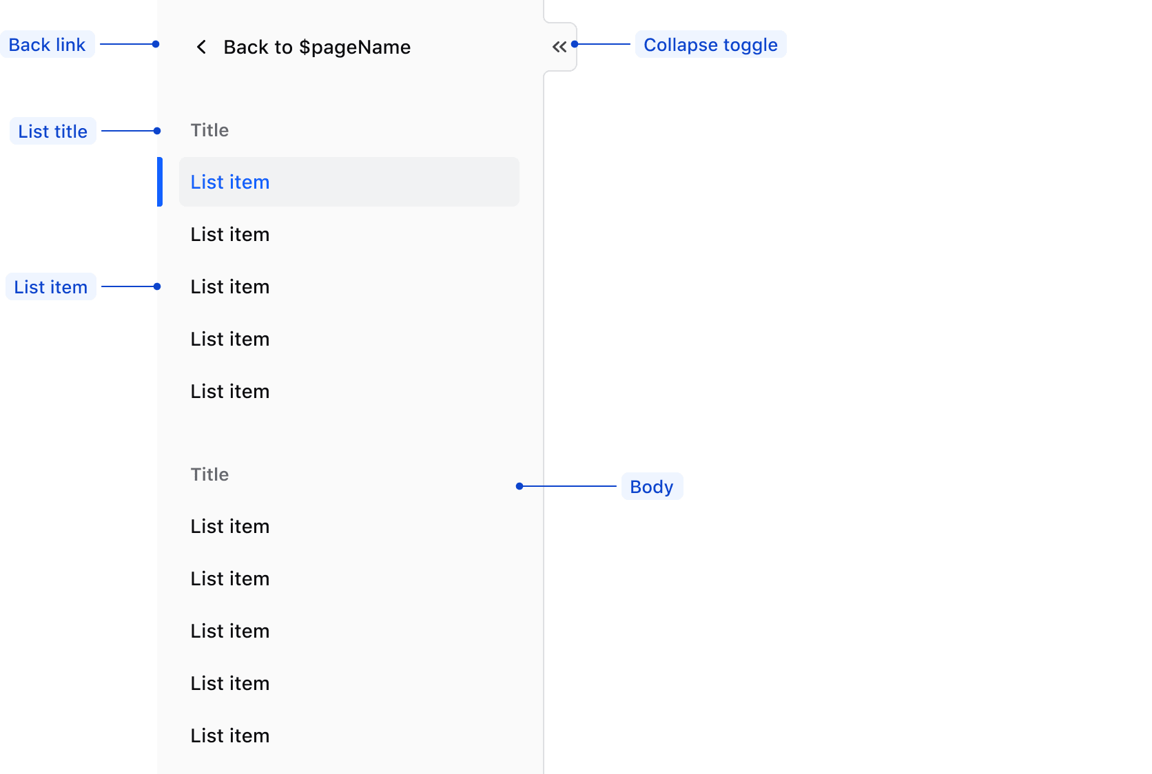
| Element | Usage |
|---|---|
| Collapse Toggle | Optional |
| Back button | Required in sub-pages |
| List title | Optional |
| List item | Required; at least one |
Conformance rating
When used as recommended, there should not be any WCAG conformance issues with this component.
Applicable WCAG Success Criteria
This section is for reference only. This component intends to conform to the following WCAG Success Criteria:
-
1.1.1
Non-text Content (Level A):
All non-text content that is presented to the user has a text alternative that serves the equivalent purpose. -
1.3.1
Info and Relationships (Level A):
Information, structure, and relationships conveyed through presentation can be programmatically determined or are available in text. -
1.3.2
Meaningful Sequence (Level A):
When the sequence in which content is presented affects its meaning, a correct reading sequence can be programmatically determined. -
1.3.3
Sensory Characteristics (Level A):
Instructions provided for understanding and operating content do not rely solely on sensory characteristics of components such as shape, color, size, visual location, orientation, or sound. -
1.3.4
Orientation (Level AA):
Content does not restrict its view and operation to a single display orientation, such as portrait or landscape. -
1.4.1
Use of Color (Level A):
Color is not used as the only visual means of conveying information, indicating an action, prompting a response, or distinguishing a visual element. -
1.4.10
Reflow (Level AA):
Content can be presented without loss of information or functionality, and without requiring scrolling in two dimensions. -
1.4.11
Non-text Contrast (Level AA):
The visual presentation of the following have a contrast ratio of at least 3:1 against adjacent color(s): user interface components; graphical objects. -
1.4.12
Text Spacing (Level AA):
No loss of content or functionality occurs by setting all of the following and by changing no other style property: line height set to 1.5; spacing following paragraphs set to at least 2x the font size; letter-spacing set at least 0.12x of the font size, word spacing set to at least 0.16 times the font size. -
1.4.13
Content on Hover or Focus (Level AA):
Where receiving and then removing pointer hover or keyboard focus triggers additional content to become visible and then hidden, the following are true: dismissible, hoverable, persistent (see link). -
1.4.3
Minimum Contrast (Level AA):
The visual presentation of text and images of text has a contrast ratio of at least 4.5:1 -
1.4.4
Resize Text (Level AA):
Except for captions and images of text, text can be resized without assistive technology up to 200 percent without loss of content or functionality. -
2.1.1
Keyboard (Level A):
All functionality of the content is operable through a keyboard interface. -
2.1.2
No Keyboard Trap (Level A):
If keyboard focus can be moved to a component of the page using a keyboard interface, then focus can be moved away from that component using only a keyboard interface. -
2.1.4
Character Key Shortcuts (Level A):
If a keyboard shortcut is implemented in content using only letter (including upper- and lower-case letters), punctuation, number, or symbol characters, then it should be able to be turned off, remapped, or active only on focus. -
2.4.3
Focus Order (Level A):
If a Web page can be navigated sequentially and the navigation sequences affect meaning or operation, focusable components receive focus in an order that preserves meaning and operability. -
2.4.7
Focus Visible (Level AA):
Any keyboard operable user interface has a mode of operation where the keyboard focus indicator is visible. -
3.2.1
On Focus (Level A):
When any user interface component receives focus, it does not initiate a change of context. -
3.2.3
Consistent Navigation (Level AA):
Navigational mechanisms that are repeated on multiple Web pages within a set of Web pages occur in the same relative order each time they are repeated. -
3.2.4
Consistent Identification (Level AA):
Components that have the same functionality within a set of Web pages are identified consistently. -
4.1.2
Name, Role, Value (Level A):
For all user interface components, the name and role can be programmatically determined; states, properties, and values that can be set by the user can be programmatically set; and notification of changes to these items is available to user agents, including assistive technologies.
Support
If any accessibility issues have been found within this component, let us know by submitting an issue.
0.1.0
Første i80-version (fork af upstream, se core/UPSTREAM.md).