A Breadcrumb is a type of secondary navigation that reveals the user’s location in an application.
Usage
When to use
- To display the hierarchy and location of the current page.
- While not required for every page, a breadcrumb is highly encouraged for the majority of pages with the exception of high-level overviews and dedicated workflows.
When not to use
- As links outside of the page header.
- Within a body of text, consider Inline Link.
- As a standalone link or within a Button Set, consider Standalone Link.
Item types
Text only
Current page
The last item in a the breadcrumb should always be the current page, and it should not be interactive.
With icon
Truncation
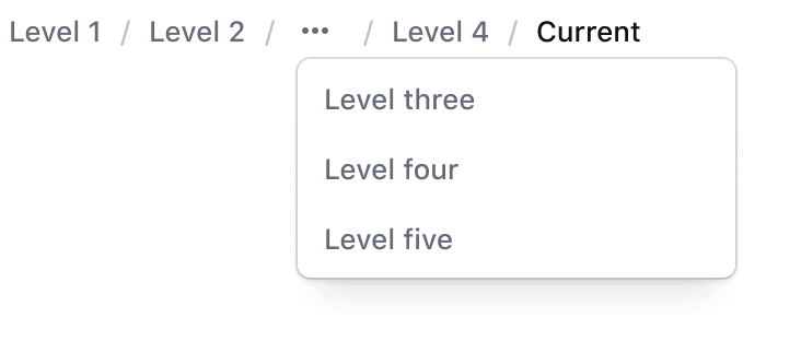
Where a trail is too deep or too wide for the space it has, the items in the middle collapse behind a toggle that shows them in a menu.
Toggle and menu
The truncated menu will include all of the hidden Breadcrumb Items. Clicking on the toggle or using enter or spacebar will open the truncated menu.
Icons
Number of icons
We recommend only adding icons to the first three items to avoid unnecessary visual noise.
Icon placement
Icons shouldn’t be placed randomly within the list. If the preceding item doesn’t include an icon, the next item shouldn’t include an icon either.
Truncation methods
We offer various options for truncation due to depth or lack of space.
With dropdown
Truncate middle
“Truncate middle” houses any number of Breadcrumb Items under a menu in the middle of the Breadcrumb. The number of items displayed before and after truncation depends on the use case and space available within the application. We recommend this method if needing to truncate the Breadcrumb.
The toggle takes the place of the hidden items, between the ones that stay: Level one / Level two / … / Level four / Current.
Truncate squeeze
“Truncate squeeze” reduces the persistent Breadcrumb Items to the first and last/current items and hides the other items under a menu. We recommend only using this method when space is limited, such as on mobile viewports.
Only the first item and the current page stay: Level one / … / Current.
Width-based
A single item with a long text string can instead be cut off at a fixed width, so that the rest of the trail keeps its room. Please be aware there are serious accessibility concerns with using this method: the name a reader sees is no longer the whole name.
How to use this component
The Breadcrumb is an application-level UI element, so it’s likely to be implemented once per application.
Basic use
A few parameters were omitted for clarity.
<i80-breadcrumb>
  <i80-crumb icon="org">My org</i80-crumb>
  <i80-crumb icon="server">Consul</i80-crumb>
  <i80-crumb>my-cluster</i80-crumb>
  <i80-crumb current>Overview</i80-crumb>
</i80-breadcrumb>
Linking each step
Add the href attribute to each <i80-crumb>. The last step, or one marked with current, is the current page and is not a link.
<i80-breadcrumb>
  <i80-crumb href="#" icon="org">My org</i80-crumb>
  <i80-crumb href="#" icon="collections">Projects</i80-crumb>
  <i80-crumb href="#" icon="file-text">Production</i80-crumb>
  <i80-crumb href="#" icon="server">Consul</i80-crumb>
  <i80-crumb href="#">my-cluster</i80-crumb>
  <i80-crumb current>Overview</i80-crumb>
</i80-breadcrumb>
Truncation
Width-based truncation
Wrapping is off by default, so it is possible to constrain the text to one-line and truncate it if it does not fit the available space.
<i80-breadcrumb>
  <i80-crumb href="#" icon="org">Level one with a very long string</i80-crumb>
  <i80-crumb href="#" icon="folder">Level two with a very long string</i80-crumb>
  <i80-crumb href="#">Level three with a very long string</i80-crumb>
  <i80-crumb href="#">Level four with a very long string</i80-crumb>
  <i80-crumb href="#">Level five with a very long string</i80-crumb>
  <i80-crumb current>Current with a very long string</i80-crumb>
</i80-breadcrumb>
Attributes
<i80-breadcrumb> renders this component. Everything it understands:
| Attribute | Values | Default | Notes |
|---|---|---|---|
aria-label |
text | Breadcrumb |
The name of the navigation landmark. |
items-can-wrap |
boolean | Let the trail wrap onto several lines. | |
i80-crumb |
href · icon · current · external | One step; its text is the label. |
The tag keeps any native element you write inside it, so a server-rendered form, link or button works as it is. See Web Components for loading i80.js and the reference for these examples running.
Anatomy
Breadcrumb item

| Element | Usage |
|---|---|
| Text | Required, unless using a truncated item |
| Leading icon | Optional |
| Focus ring | Focus state only |
Breadcrumb container

| Element | Usage |
|---|---|
| Item | At least one is required |
| Separator | Required between Breadcrumb Items |
| Current page | Required |
States
Default

Hover

Active

Focus

Spacing
The gap between the breadcrumb and dropdown menu when opened is 4px.

Conformance rating
The Breadcrumb is real links in an ordered list, and the last crumb (or one marked current) is text with aria-current="page" instead of a link — so it is conformant as long as no crumb is cut off.
Known issues
The crumbs sit on one line by default, and a crumb that doesn’t fit is cut off with an ellipsis. The full text is then unavailable to a keyboard-only user, which is a failure of Reflow – 1.4.10 once the browser zoom reaches 400%.

Add the items-can-wrap attribute and the crumbs wrap onto a second line instead of being cut off. Keep the crumb text short enough that they rarely have to.
Applicable WCAG Success Criteria
This section is for reference only. This component intends to conform to the following WCAG Success Criteria:
-
1.3.1
Info and Relationships (Level A):
Information, structure, and relationships conveyed through presentation can be programmatically determined or are available in text. -
1.3.2
Meaningful Sequence (Level A):
When the sequence in which content is presented affects its meaning, a correct reading sequence can be programmatically determined. -
1.4.10
Reflow (Level AA):
Content can be presented without loss of information or functionality, and without requiring scrolling in two dimensions. -
1.4.12
Text Spacing (Level AA):
No loss of content or functionality occurs by setting all of the following and by changing no other style property: line height set to 1.5; spacing following paragraphs set to at least 2x the font size; letter-spacing set at least 0.12x of the font size, word spacing set to at least 0.16 times the font size. -
1.4.3
Minimum Contrast (Level AA):
The visual presentation of text and images of text has a contrast ratio of at least 4.5:1 -
1.4.4
Resize Text (Level AA):
Except for captions and images of text, text can be resized without assistive technology up to 200 percent without loss of content or functionality. -
2.1.1
Keyboard (Level A):
All functionality of the content is operable through a keyboard interface. -
2.1.2
No Keyboard Trap (Level A):
If keyboard focus can be moved to a component of the page using a keyboard interface, then focus can be moved away from that component using only a keyboard interface. -
2.4.3
Focus Order (Level A):
If a Web page can be navigated sequentially and the navigation sequences affect meaning or operation, focusable components receive focus in an order that preserves meaning and operability. -
2.4.5
Multiple Ways (Level AA):
More than one way is available to locate a Web page within a set of Web pages except where the Web Page is the result of, or a step in, a process. -
2.4.6
Headings and Labels (Level AA):
Headings and labels describe topic or purpose. -
2.4.7
Focus Visible (Level AA):
Any keyboard operable user interface has a mode of operation where the keyboard focus indicator is visible. -
3.2.3
Consistent Navigation (Level AA):
Navigational mechanisms that are repeated on multiple Web pages within a set of Web pages occur in the same relative order each time they are repeated.
Support
If any accessibility issues have been found within this component, let us know by submitting an issue.
0.1.0
Første i80-version (fork af upstream, se core/UPSTREAM.md).