How to hide content behind a toggle
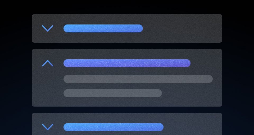
Most of the time you do not have to build this. Accordion is a set of sections that open and close, Reveal is a single small toggle, and both handle the button, the labelling and the keyboard for you:
<i80-reveal text="Show the request" text-when-open="Hide the request">
  <i80-copy-snippet>curl https://api.i80.dk/v1/plans</i80-copy-snippet>
</i80-reveal>

<i80-accordion>
  <i80-accordion-item heading="What counts as a plan?">A plan holds tasks, dates and an owner.</i80-accordion-item>
  <i80-accordion-item heading="Who can see one?">Everyone on the team. Guests only see plans they are invited to.</i80-accordion-item>
</i80-accordion>
When neither fits, there are two ways to do it by hand.
The details element
<details> and <summary> are a toggle and a panel that the browser already knows how to open, close, label and announce. No script, no ARIA:
<details>
  <summary>What counts as a plan?</summary>
  <p>A plan holds tasks, dates and an owner.</p>
</details>
Reach for it when the content is text and the styling is up to you. open on the element shows the panel from the start, and a toggle event fires whenever it changes.
A button that owns a panel
When you need the toggle to be a button of your own — a heading with a chevron, a row in a table — write the button and the panel yourself and wire them together:
<button type="button" aria-expanded="false" aria-controls="request-panel">
  Show the request
</button>

<div id="request-panel" hidden>
  <i80-copy-snippet>curl https://api.i80.dk/v1/plans</i80-copy-snippet>
</div>
Three things have to be true, and they are the three that are usually missed:
- The toggle is a
<button>, soEnter,Spaceand focus all work without any key handling of your own. aria-expandedis on the button and changes with the panel, so a screen reader says "collapsed" or "expanded" rather than nothing.aria-controlspoints at the panel'sid, and the panel ishiddenrather than moved off-screen, so nothing inside a closed panel can be tabbed into.
This is exactly what Reveal does: a button with aria-expanded and aria-controls, and a panel with hidden.
Where the panel sits
Neither of these positions the panel against the toggle; the panel is simply the next thing on the page. If you need it to float over the content and be anchored to the toggle, that is a popover.
Attributes
The two elements that do this for you:
| Element | Attributes |
|---|---|
<i80-reveal> |
text, text-when-open, open, described-by. Property open, method toggle(), event i80-toggle with detail.open. |
<i80-accordion-item> |
heading, open, title-tag, contains-interactive, plus size and type on the item or the accordion. Method toggle(), event i80-toggle with detail.open. |
And what you use when you build it yourself:
| Feature | Notes |
|---|---|
<details> / <summary> |
The whole pattern with no script. open shows the panel from the start; a toggle event fires on every change. |
aria-expanded |
On the toggle button, "true" or "false". Keep it in step with the panel. |
aria-controls |
On the toggle button, the panel's id. |
hidden |
On the panel. It takes the content out of the tab order as well as out of sight. |
See Web Components for loading i80.js.
0.1.0
Første i80-version (fork af upstream, se core/UPSTREAM.md).