Icon Tiles visually identify product-related entities and supporting resources, which can help some users quickly scan and recognize key concepts.
Usage
When to use
- To represent an object or as part of a page title.
When not to use
- When an interactive or clickable element is needed. Use a Button instead.
Color
Use Neutral if the object or page is not a specific product feature but something universal. For example, for a “Dashboard” or “User” page.

Use a brand color for objects or pages that belong to a specific product or area, so they are easy to recognize. For example:
- For a page showing a “Plan” in zPlan
- In a card or table row that represents a “Plan”

Size
Medium is the default size, but we recommend using the size that best fits the supporting text or UI. For example, don’t use large Icon Tiles in tables.

Secondary icon
A secondary icon can be added to provide additional context. For example, in features where an object or element is being added, an Icon Tile with a "plus" secondary icon reinforces the action.

Using with content
Use Icon Tiles as a decorative element or accessory next to a text label for the object or page they are being used to represent. Icon Tiles should not be used without accompanying content.
Using with interactive elements
Avoid placing Icon Tiles immediately next to secondary icon-only Button variants. Even though they visually look different, their proximity can confuse users because they share similar characteristics. Distinguishability discourages the use of elements that look alike but behave differently when in close visual proximity.
How to use this component
<i80-icon-tile> needs an icon: any name from the Icon library. That renders a medium neutral tile.
<i80-icon-tile icon="user"></i80-icon-tile>
<i80-icon-tile icon="lock" color="yellow"></i80-icon-tile>
The tile is decorative and is hidden from assistive technology, so place it beside text that names what it stands for.
Color
Ten colours are available. Use them to tell kinds of things apart — a colour per resource type, say — and use the same colour for the same thing everywhere.
<i80-icon-tile icon="user" color="teal"></i80-icon-tile>Size
Three sizes, small, medium and large. The icon inside follows the tile.
<i80-icon-tile icon="shield" color="coral" size="small"></i80-icon-tile>
<i80-icon-tile icon="package" color="sky" size="large"></i80-icon-tile>
Attributes
<i80-icon-tile> renders this component. Everything it understands:
| Attribute | Values | Default | Notes |
|---|---|---|---|
icon |
icon name | ||
size |
small · medium · large | medium |
|
color |
neutral · brand · coral · pink · green · sky · purple · blue · yellow · teal | neutral |
The tag keeps any native element you write inside it, so a server-rendered form, link or button works as it is. See Web Components for loading i80.js and the reference for these examples running.
Anatomy
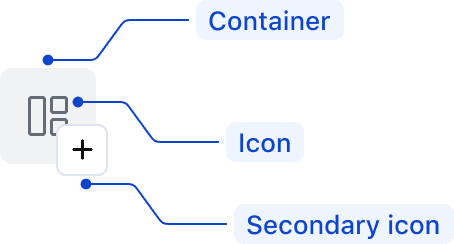
| Element | Usage |
|---|---|
| Container | Required |
| Icon | Required |
| Secondary icon | Optional |
Conformance rating
When used as recommended, there should not be any accessibility issues with this component.
Accounting for screen readers
Because Icon Tiles are purely decorative, <i80-icon-tile> sets aria-hidden="true" on itself: a screen reader skips it. The name of whatever the tile sits beside has to come from the text next to it.

Applicable WCAG Success Criteria
This section is for reference only. This component intends to conform to the following WCAG Success Criteria:
-
1.4.11
Non-text Contrast (Level AA):
The visual presentation of the following have a contrast ratio of at least 3:1 against adjacent color(s): user interface components; graphical objects.
Support
If any accessibility issues have been found within this component, let us know by submitting an issue.
0.1.0
Første i80-version (fork af upstream, se core/UPSTREAM.md).