The accordion is used to show and hide multiple sections of content in a stacked manner. Each section is represented by a toggle.
Usage
When to use
- To show content as needed while keeping the UI organized and visually manageable.
- To hide long pieces of content with a similar structure.
When not to use
- To hide basic non-critical information to users. Instead, consider using a Reveal.
- To allow users switch between different content within the same context. Instead, consider using Tabs.
Accordion vs Reveal
While similar in functionality and interaction, the Accordion and Reveal are meant to be used in different scenarios and use cases.
When to use the Accordion
You have multiple sections of content that can be expanded or collapsed.
Each section of content has its own toggle content, giving users the ability to access specific sections.
Users need to navigate through different sections of content and selectively expand or collapse sections
There is a sequential or hierarchical relationship between the different sections.
When to use the Reveal
You have a single piece of content that can be expanded to collapsed to reveal additional details or information.
The content within the toggle is plain text.
The content within the reveal is relatively short and simple.
There is no need for multiple independent sections or hierarchical relationship between different sections.
Usage examples
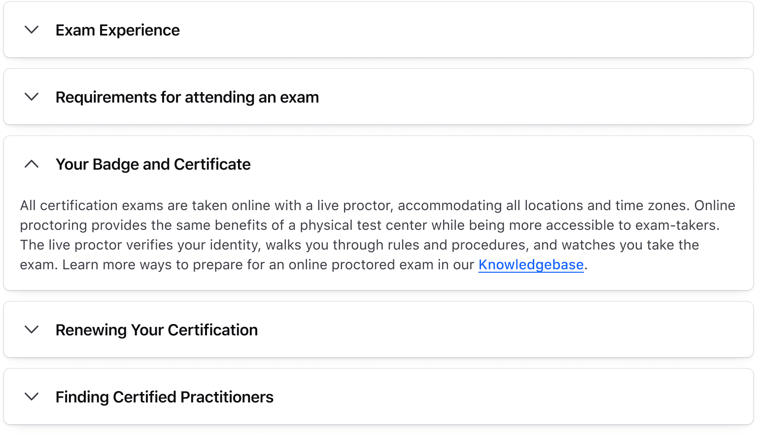
Use the Accordion when you need to display content in different sections that have a sequential or hierarchical relationship between them.
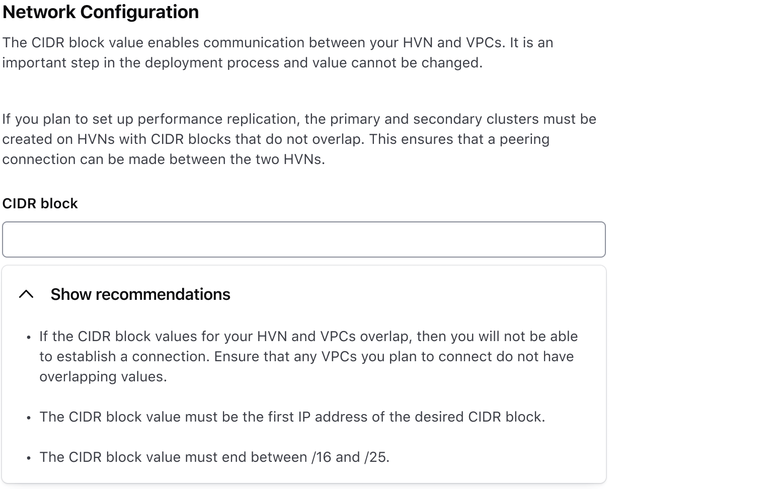
Don’t use the Accordion when you need to display a single piece of content that can expand and collapse. Use the Reveal instead.
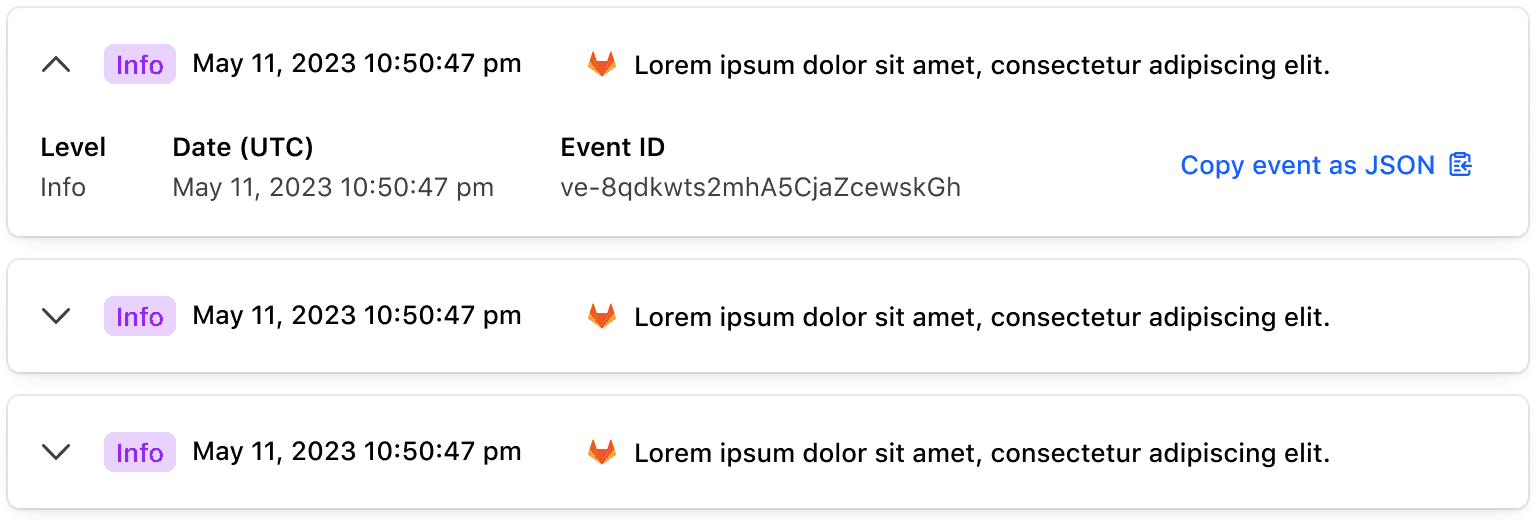
Use the Accordion when the toggle or the content is relatively complex.
Sizes
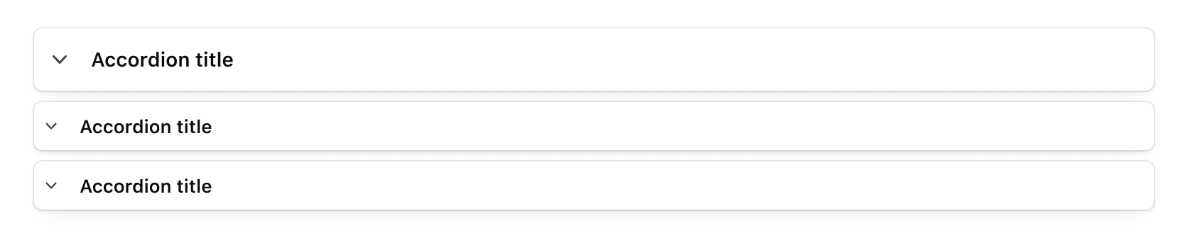
The Accordion comes in three sizes: small, medium, and large. We recommend medium for most use cases, but use whichever size best fits your UI’s needs.
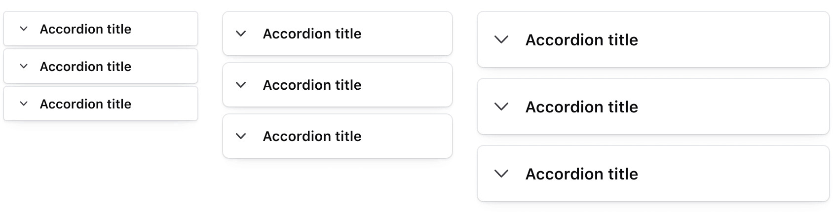
The size is set at the Accordion (group) level; don’t mix different sizes of Accordion items.
Types
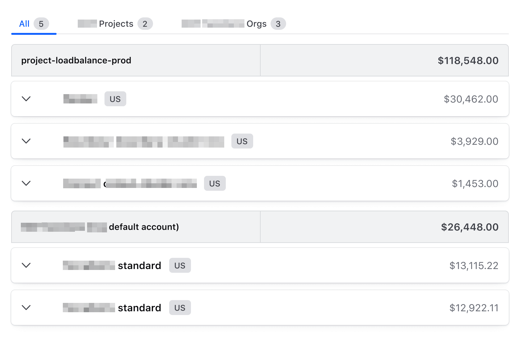
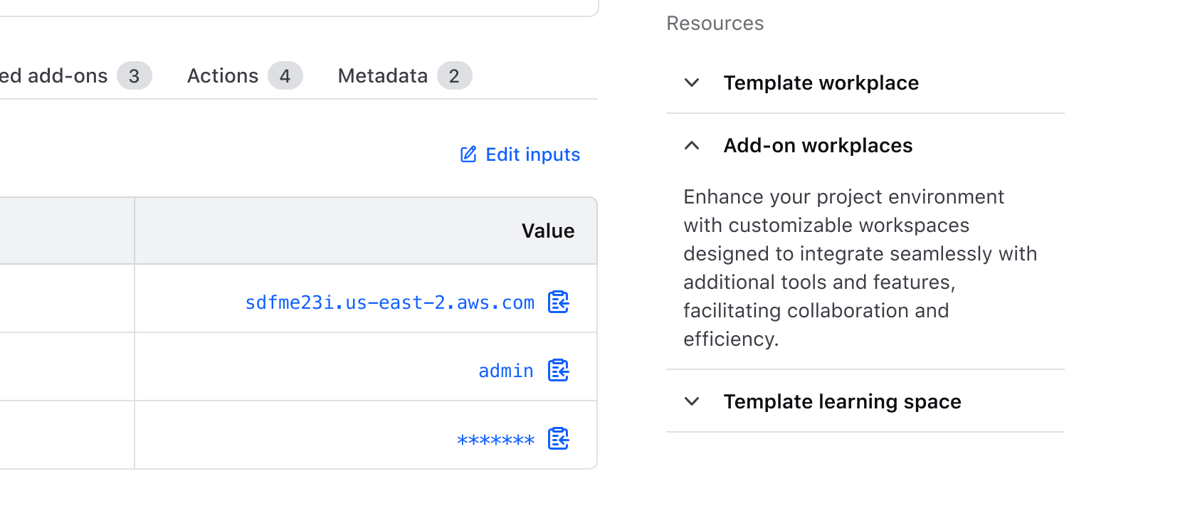
The Accordion offers two container types: card and flush to fit different use cases.
Card
The card variant is the default and recommended type. It creates a visual separation between accordion sections and other UI elements, organizes blocks of content, and distinguishes between sections within tabs.
Flush
Use the flush variant where space is limited such as within a Card, Flyout, or sidebar.
Toggle
Toggle type
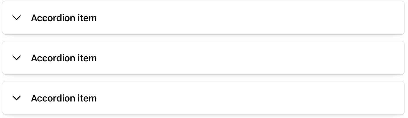
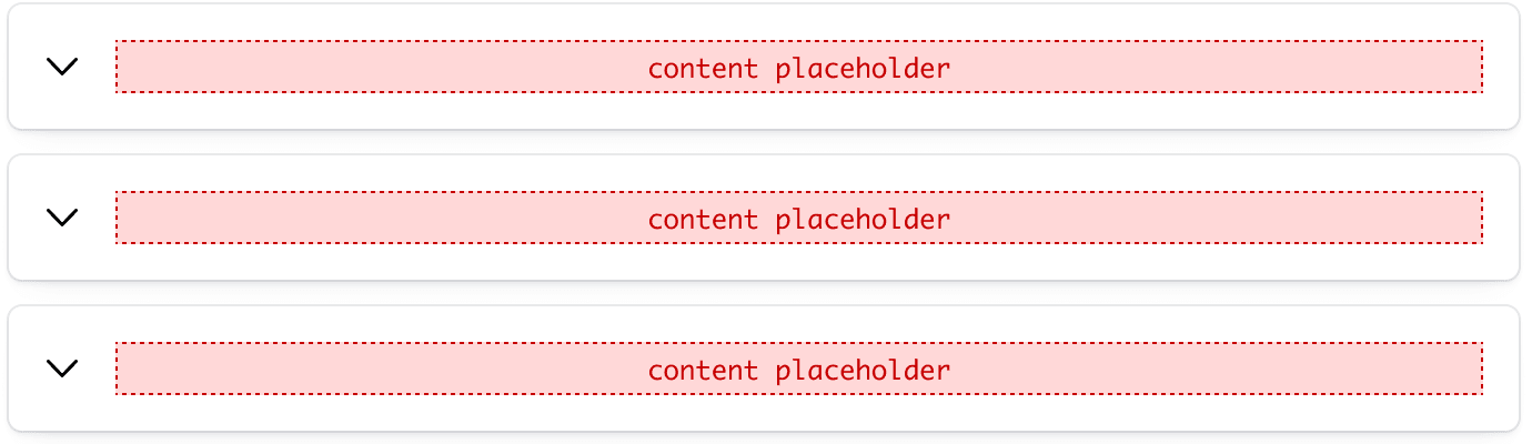
The toggle accepts many different types of content, from text-based content to nested I80 components or generic content.
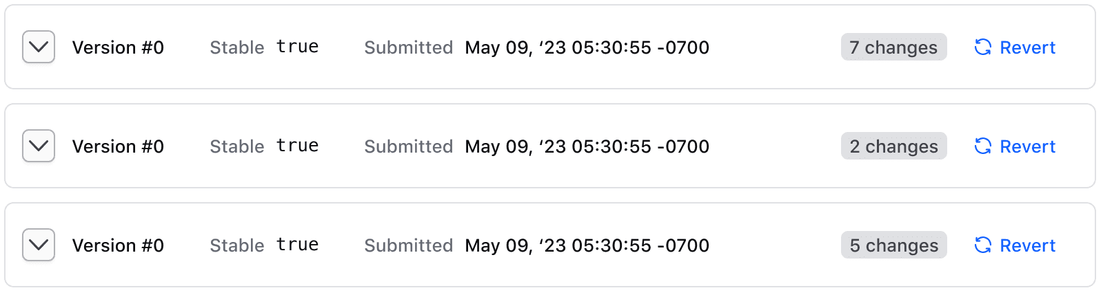
Interactive
Use this variant only when you need to put interactive elements such as a button or a link within the toggle area. Avoid placing complex elements that may compromise the usability and accessibility of the component.
Set contains-interactive when nesting interactive content in the toggle, so that only the chevron toggles the item. This lets users using assistive technology access and interact with the nested element.
When using this, apply it to all items. Avoid mixing with default toggles.
Static
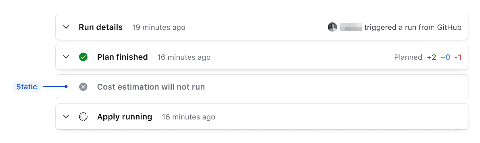
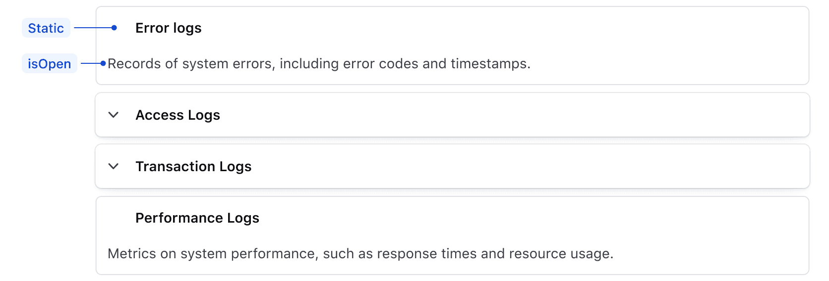
A static item has no toggle at all: it stays in the state it was given, open or closed. This is useful when you want to show important information in the Accordion that should always stay open or closed, making it stand out as different from the other items.
This example shows a static item used to prevent interaction with a skipped step in a triggered Terraform run.
Content type
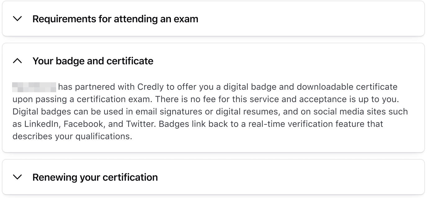
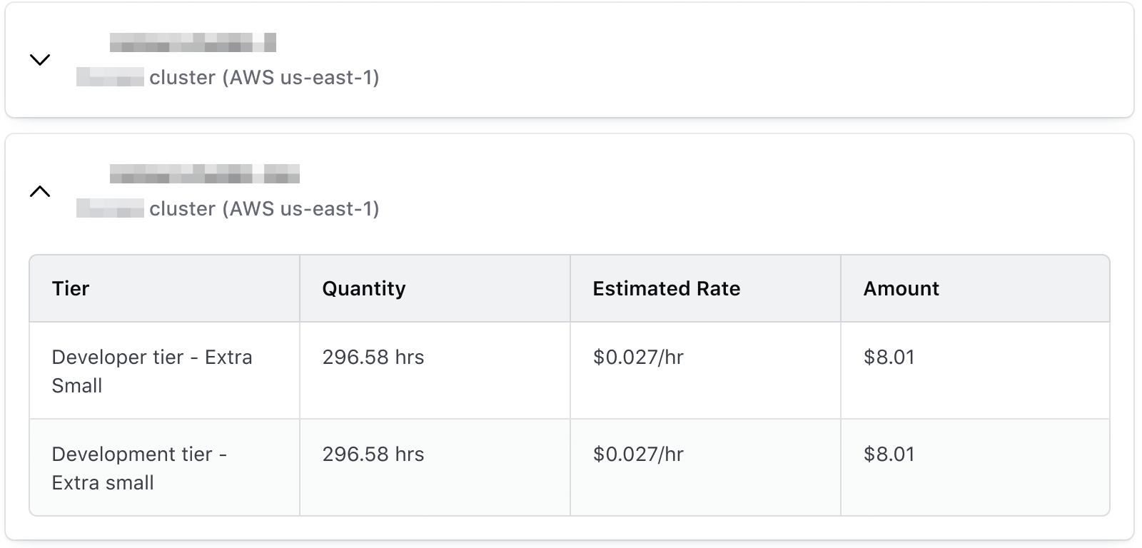
Content type supports any content: text, your own elements or i80 elements, written inside the item.
Nesting Accordions
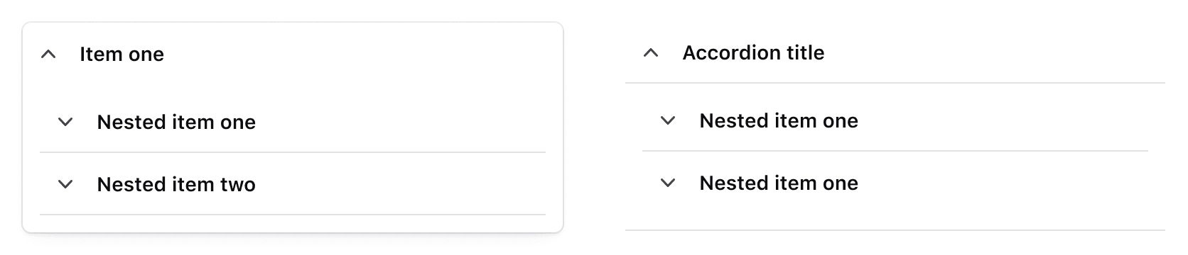
Nesting Accordions can help organize complex content, but should be used in moderation, and is only recommended for the flush variant.
Use nested Accordions for up to two layers of related content. You can nest flush Accordions within each other or inside card type Accordions.
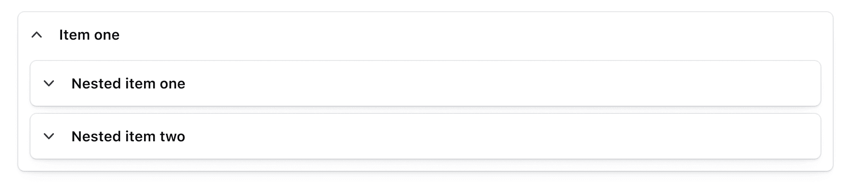
Avoid nesting card Accordions within each other to prevent excessive visual noise.
Composition with other components
Expand and collapse all accordions
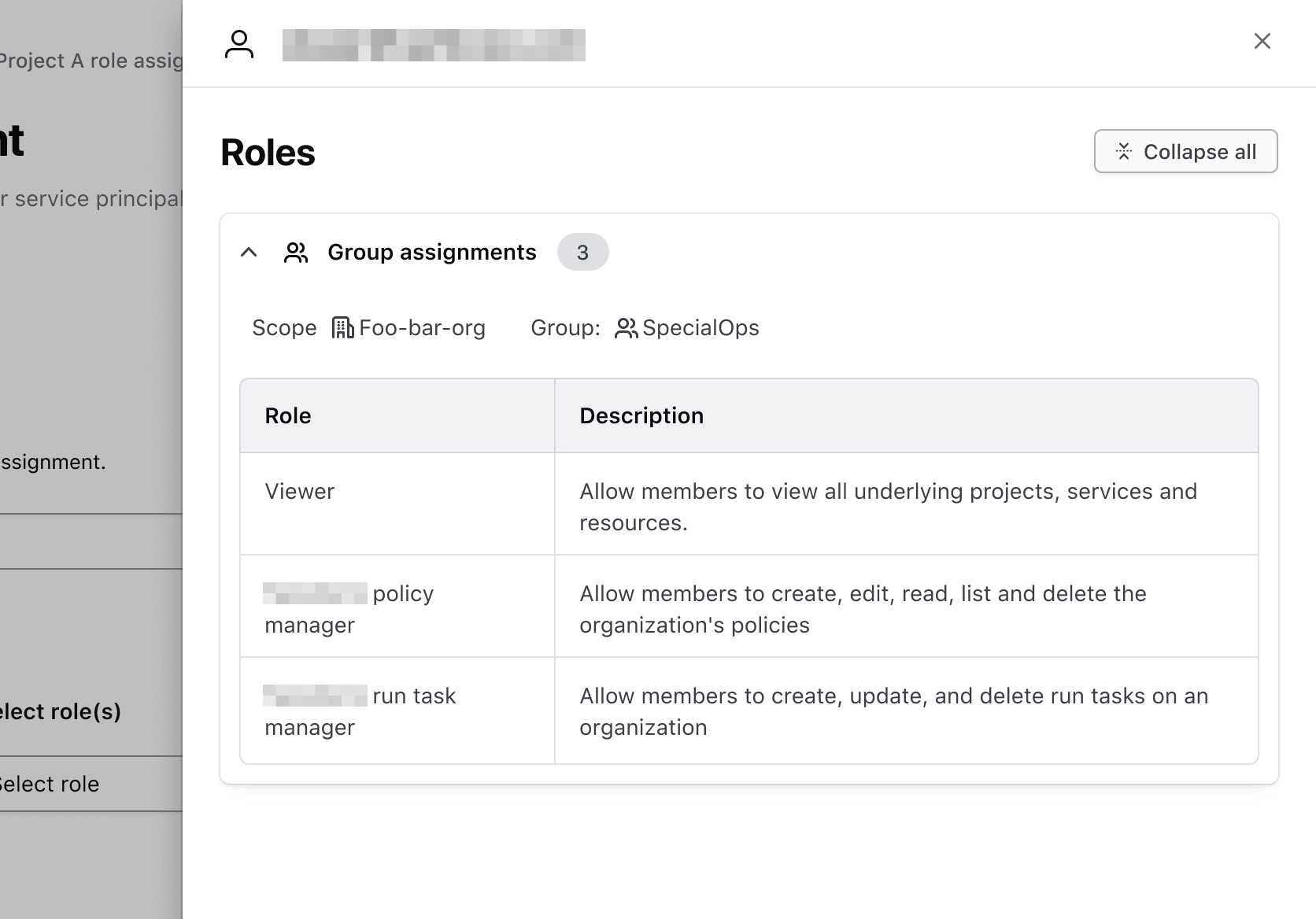
By composing the Accordion with other I80 components, you can provide users with a way to expand and collapse all AccordionItems at once. Expanding all AccordionItems allows users to view and compare content easily, while collapsing provides a summary and reduces cognitive load.
We recommend using a secondary Button above the Accordion, aligned to the right. A tertiary Button can be used if less prominence is needed. Use the small variant of the Button for any size variant of the Accordion.
To ensure consistency across all products, use “Expand all” / “Collapse all” as the Button label and the unfold-open and unfold-close icons in the leading position.

Note that if an AccordionItem is static, the expand/collapse all feature will not affect its behavior.
Avoid using this feature if only one AccordionItem is visible.
How to use this component
The <i80-accordion> element is used to wrap and group one or more <i80-accordion-item> children. Each item consists of a “toggle” and a “content” part, containing plain text or HTML content: the toggle is the heading attribute or a child with slot="toggle", and the rest of the item is the content.
Size
A different size of Accordion can be set with the size attribute.
<i80-accordion size="large">
  <i80-accordion-item heading="Item one">Additional content for item one</i80-accordion-item>
  <i80-accordion-item heading="Item two">Additional content for item two</i80-accordion-item>
</i80-accordion>
Type
Use the type attribute to render a flush Accordion.
<i80-accordion type="flush">
  <i80-accordion-item heading="Item one">Additional content for item one</i80-accordion-item>
  <i80-accordion-item heading="Item two">Additional content for item two</i80-accordion-item>
</i80-accordion>
Complex HTML content
With an Alert component in the toggle — an element with slot="toggle" — and an HTML table in the content.
Queued: 9 days ago > Finished: 9 days ago
| Name | Type | Value |
|---|---|---|
| Cell one A | Cell two A | Cell three A |
| Cell one B | Cell two B | Cell three B |
<i80-accordion>
<i80-accordion-item open>
<i80-alert slot="toggle" type="compact" color="success" heading="Title">Plan finished <small>22 days ago</small></i80-alert>
<p class="i80-typography-body-200">
<strong>Queued:</strong> 9 days ago > <strong>Finished:</strong> 9 days ago
</p>
<i80-table caption="Example table">
<table>
<thead>
<tr><th>Name</th><th>Type</th><th>Value</th></tr>
</thead>
<tbody>
<tr><td>Cell one A</td><td>Cell two A</td><td>Cell three A</td></tr>
<tr><td>Cell one B</td><td>Cell two B</td><td>Cell three B</td></tr>
</tbody>
</table>
</i80-table>
</i80-accordion-item>
</i80-accordion>With a link in the toggle and a form in the content.
<i80-accordion>
  <i80-accordion-item contains-interactive open>
    <div slot="toggle" class="i80-typography-body-300">
      Text inside a nested div with <a href="https://i80.dk">a link</a>.
    </div>
    <i80-text-input label="Email" type="email" name="email"></i80-text-input>
    <i80-button>Submit</i80-button>
  </i80-accordion-item>
</i80-accordion>
With an Accordion in the content.
<i80-accordion type="flush">
  <i80-accordion-item heading="Item one" open>
    <i80-accordion type="flush">
      <i80-accordion-item heading="Nested item one">Nested content one</i80-accordion-item>
      <i80-accordion-item heading="Nested item two">Nested content two</i80-accordion-item>
    </i80-accordion>
  </i80-accordion-item>
</i80-accordion>
Accessible name
The aria-label value is applied to the HTML button which controls visibility of the content. The text does not display in the UI. You can set a custom value useful for translated text for example. If not provided, the accessible name is taken from the toggle content via aria-labelledby.
<i80-accordion>
  <i80-accordion-item heading="Elemento uno" aria-label="Mostrar u ocultar">
    Contenido adicional para el elemento uno
  </i80-accordion-item>
</i80-accordion>
Heading level
The title-tag attribute changes the HTML element that wraps the title of each <i80-accordion-item>. When organizing the content on a webpage, the heading levels should reflect the structure of the page. For example, if an Accordion is within a subsection of the page below a heading level 2, the value should be "h3".
Examination period
<h2 class="i80-text i80-typography-display-300 i80-font-weight-semibold">Examination period</h2>
<i80-accordion>
  <i80-accordion-item title-tag="h3" heading="Exam experience">
    All certification exams are taken online with a live proctor, accommodating all locations and time zones. Online
    proctoring provides the same benefits of a physical test center while being more accessible to exam-takers. The
    live proctor verifies your identity, walks you through rules and procedures, and watches you take the exam. Learn
    more ways to prepare for an online proctored exam in our Knowledgebase.
  </i80-accordion-item>
  <i80-accordion-item title-tag="h3" heading="Requirements for attending an exam">
    Before you register for an exam, review the Exam-taker Handbook to learn the requirements and policies for taking
    exams. It is your responsibility to know and abide by our program rules to successfully enter your exam
    appointment, failure to do so may result in forfeiture of appointment fees.
  </i80-accordion-item>
  <i80-accordion-item title-tag="h3" heading="Your badge and certificate">
    i80 has partnered with Credly to offer you a digital badge and downloadable certificate upon passing a
    certification exam. There is no fee for this service and acceptance is up to you. Digital badges can be used in
    email signatures or digital resumes, and on social media sites such as LinkedIn, Facebook, and Twitter. Badges
    link back to a real-time verification feature that describes your qualifications.
  </i80-accordion-item>
</i80-accordion>
Open on page load
Add the open attribute to an <i80-accordion-item> to display its associated content on page load instead of initially hiding it.
<i80-accordion>
  <i80-accordion-item heading="Item one" open>
    Additional content for item one which is displayed on page load
  </i80-accordion-item>
  <i80-accordion-item heading="Item two">
    Additional content for item two which is hidden on page load
  </i80-accordion-item>
</i80-accordion>
Interactive content in the toggle
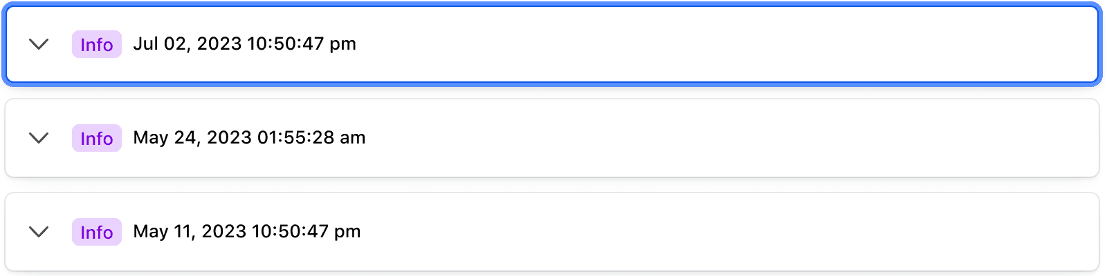
By default, an item has no contains-interactive attribute, meaning that the entire item toggle can be clicked to hide and show the associated content. Add contains-interactive to an <i80-accordion-item> and only the chevron button of the item is clickable vs. the entire block. This allows you to add other interactive content inside the toggle if desired.
<i80-accordion>
  <i80-accordion-item contains-interactive>
    <div slot="toggle" style="display: flex; align-items: center; gap: 16px; justify-content: space-between">
      <i80-alert type="compact" color="success" heading="Title">Plan finished <small>22 days ago</small></i80-alert>
      <i80-button color="secondary" size="small">Details</i80-button>
    </div>
    Additional content for item one
  </i80-accordion-item>
  <i80-accordion-item contains-interactive>
    <div slot="toggle" style="display: flex; align-items: center; gap: 16px; justify-content: space-between">
      <span>Peering connection log results</span>
      <i80-link-standalone href="https://i80.dk" icon="external-link" icon-position="trailing">Details</i80-link-standalone>
    </div>
    Additional content for item two
  </i80-accordion-item>
</i80-accordion>
Attributes
<i80-accordion> renders this component. Everything it understands:
| Attribute | Values | Default | Notes |
|---|---|---|---|
size |
small · medium · large | medium |
On the accordion or an item. |
type |
card · flush | card |
On the accordion or an item. |
heading |
text | On i80-accordion-item. Or put an element with slot="toggle" inside. | |
open |
boolean | On i80-accordion-item. Method: toggle(). Event: i80-toggle with detail.open. | |
title-tag |
div · h1 … h6 | div |
The heading level of the item's title. |
contains-interactive |
boolean | Set when the title contains links or buttons, so only the chevron toggles. |
The tag keeps any native element you write inside it, so a server-rendered form, link or button works as it is. See Web Components for loading i80.js and the reference for these examples running.
Anatomy
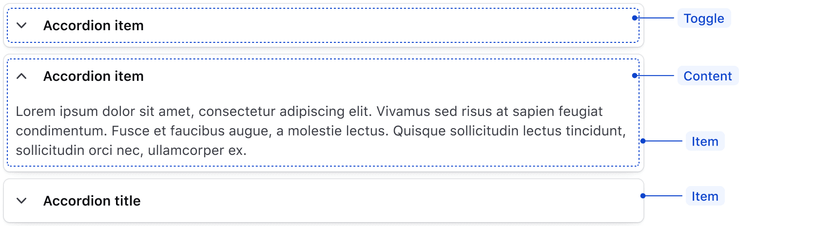
| Element | Usage |
|---|---|
| Item | Required, at least one |
| Toggle | Required |
| Content | Required |
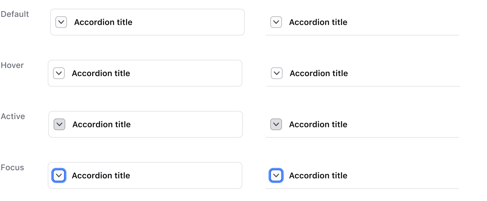
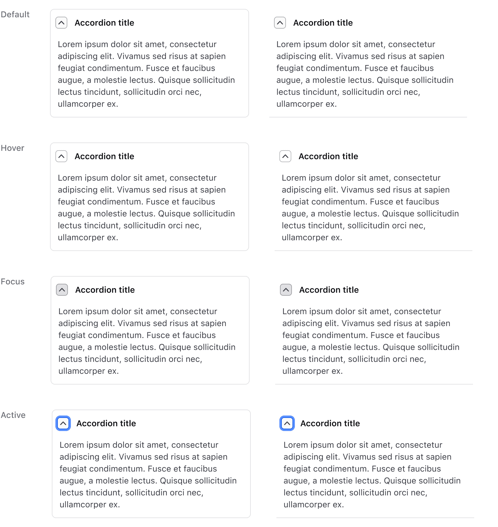
States
Default
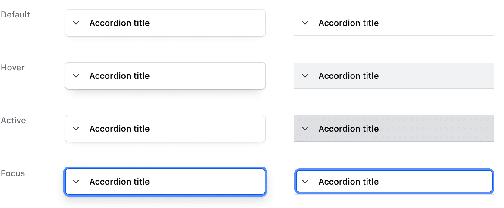
Is open
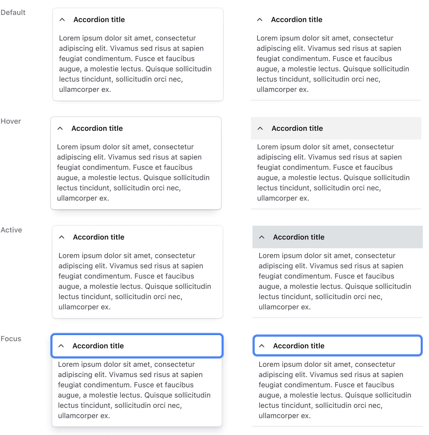
Contains interactive
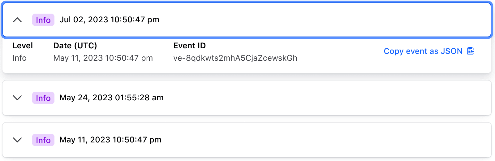
Is open
Conformance rating
When used as recommended, there should not be any WCAG conformance issues with this component.
Keyboard navigation
Focus on a toggle.
Expand container to display hidden content.
Move to the first interactive element within the content area.
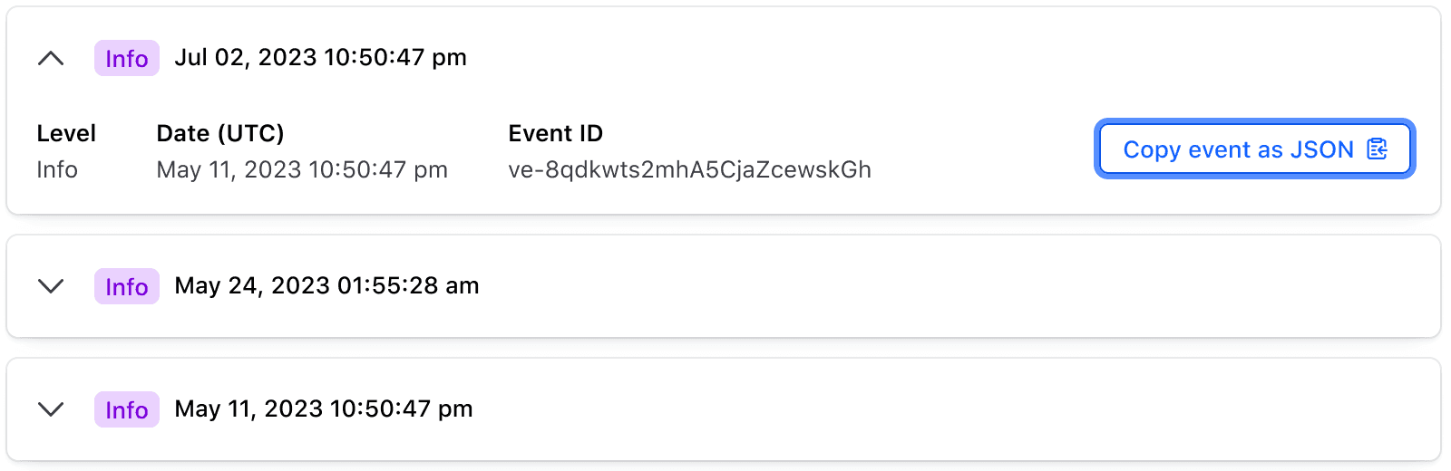
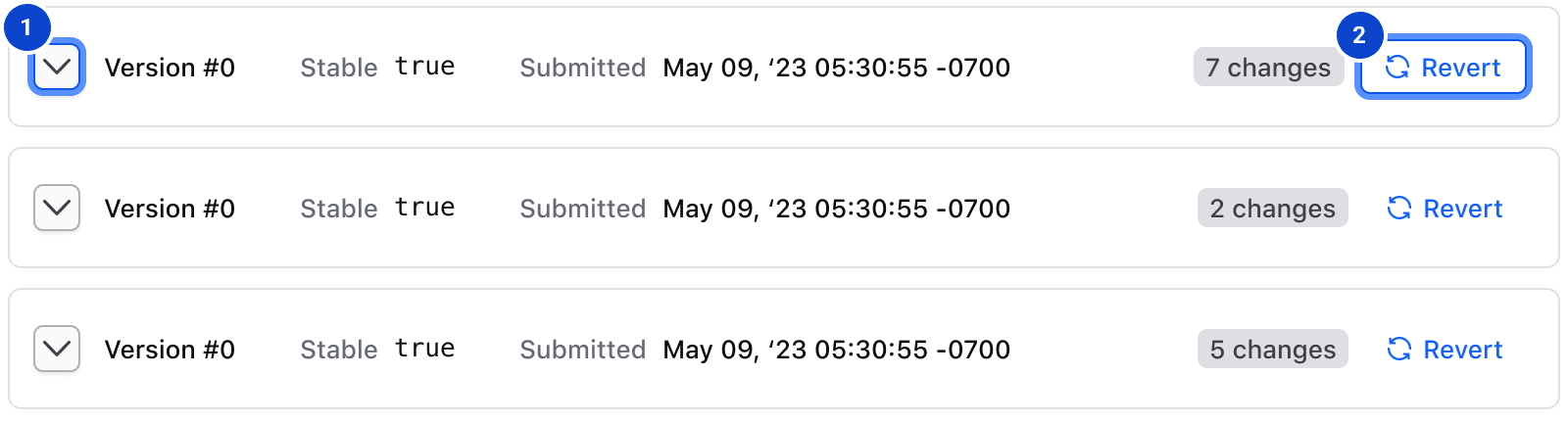
With contains-interactive on an <i80-accordion-item>, only the chevron is the toggle button, so focus moves to it first and then on to the interactive elements you put in the toggle area.
Applicable WCAG Success Criteria
This section is for reference only. This component intends to conform to the following WCAG Success Criteria:
-
1.1.1
Non-text Content (Level A):
All non-text content that is presented to the user has a text alternative that serves the equivalent purpose. -
1.3.1
Info and Relationships (Level A):
Information, structure, and relationships conveyed through presentation can be programmatically determined or are available in text. -
1.3.2
Meaningful Sequence (Level A):
When the sequence in which content is presented affects its meaning, a correct reading sequence can be programmatically determined. -
1.4.1
Use of Color (Level A):
Color is not used as the only visual means of conveying information, indicating an action, prompting a response, or distinguishing a visual element. -
1.4.10
Reflow (Level AA):
Content can be presented without loss of information or functionality, and without requiring scrolling in two dimensions. -
1.4.11
Non-text Contrast (Level AA):
The visual presentation of the following have a contrast ratio of at least 3:1 against adjacent color(s): user interface components; graphical objects. -
1.4.12
Text Spacing (Level AA):
No loss of content or functionality occurs by setting all of the following and by changing no other style property: line height set to 1.5; spacing following paragraphs set to at least 2x the font size; letter-spacing set at least 0.12x of the font size, word spacing set to at least 0.16 times the font size. -
1.4.13
Content on Hover or Focus (Level AA):
Where receiving and then removing pointer hover or keyboard focus triggers additional content to become visible and then hidden, the following are true: dismissible, hoverable, persistent (see link). -
1.4.3
Minimum Contrast (Level AA):
The visual presentation of text and images of text has a contrast ratio of at least 4.5:1 -
1.4.4
Resize Text (Level AA):
Except for captions and images of text, text can be resized without assistive technology up to 200 percent without loss of content or functionality. -
2.1.1
Keyboard (Level A):
All functionality of the content is operable through a keyboard interface. -
2.1.2
No Keyboard Trap (Level A):
If keyboard focus can be moved to a component of the page using a keyboard interface, then focus can be moved away from that component using only a keyboard interface. -
2.4.3
Focus Order (Level A):
If a Web page can be navigated sequentially and the navigation sequences affect meaning or operation, focusable components receive focus in an order that preserves meaning and operability. -
2.4.6
Headings and Labels (Level AA):
Headings and labels describe topic or purpose. -
2.4.7
Focus Visible (Level AA):
Any keyboard operable user interface has a mode of operation where the keyboard focus indicator is visible. -
2.5.3
Label in Name (Level A):
For user interface components with labels that include text or images of text, the name contains the text that is presented visually. -
3.2.1
On Focus (Level A):
When any user interface component receives focus, it does not initiate a change of context. -
3.2.4
Consistent Identification (Level AA):
Components that have the same functionality within a set of Web pages are identified consistently. -
4.1.2
Name, Role, Value (Level A):
For all user interface components, the name and role can be programmatically determined; states, properties, and values that can be set by the user can be programmatically set; and notification of changes to these items is available to user agents, including assistive technologies.
Support
If any accessibility issues have been found within this component, let us know by submitting an issue.
0.1.0
Første i80-version (fork af upstream, se core/UPSTREAM.md).
Related
-

Reveal
A toggle that reveals additional content to the user when triggered.
-

Flyout
Displays additional details and information about an item or object, overlaid on the main page content.
-

Modal
A pop-up window used to request information, confirm a decision, or provide additional context.
-

Tabs
Allows users to move among different views within the same context.