A Segmented Group combines two or more elements (Segments) into a single component to manage complex data, search, and fine-grained filtering within an object or dataset.
Usage
A Segmented Group is an agnostic container that wraps two or more Segments, making the relevant use cases broad.
When to use
- When filtering complex data, searching within a set of filters, and in creating complex filter patterns.
- When collecting information in a way that benefits from a "connected" visual representation, e.g., a key/value pair.
- When an action performs a generative function rather than a submit function, e.g., generating API credentials.
- As a complex data input within a form.
When not to use
- To submit a form or set of inputs. A Segmented Group can be used within a form to collect complex data, but an action within the group should not submit that data via a form method. Use the guidelines in Form patterns instead.
- To connect multiple fields that each require their own label.
- When adding a prefix or suffix to an input field. This is not currently supported by i80 form components, instead consider using a simple text element preceding or following the form element.
Segment components
A Segmented Group can consist of multiple primitive Segments that vary in their properties and intended input value. We recommend sticking to the defined Segmented Button, Segmented Dropdown and Segmented Input primitives to ensure consistent styling and grouping. If a custom solution is required, anything else you put in the group is passed through untouched.
Segmented Button
A Segmented Button can perform a function or interaction within a Segmented Group, e.g., generating an object, string, or value in a field it is connected to. It is an extension of the i80 Button.
Segmented Dropdown
A Segmented Dropdown can be used to filter or narrow the available parameters when searching within a dataset or group of objects. It is an extension of the i80 Dropdown.
Segmented Input
A Segmented Input is an extension of i80 form components and their variants, including:
Different Segmented Input types can be combined within a Segmented Group to collect complex data and support filtering patterns. Use the type that makes the most sense for the intended value or data.
Custom elements
If a custom component within a Segmented Group is necessary, ensure that the visual language and styling match the pre-defined Segment primitives, or contact the Design Systems Team for support.
The base pairing
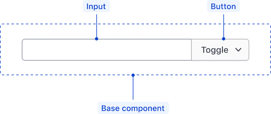
The simplest Segmented Group is one input and one button — either a plain button or a dropdown. Reach for it for the less complex use cases.
Examples
Since a Segmented Group is intended to be agnostic in relation to the inputs and actions it contains, the number of potential use cases and examples are broad. These examples should serve as inspiration for the different scenarios, contexts, and combinations of elements supported by the Segmented Group guidelines.
Within a filter pattern
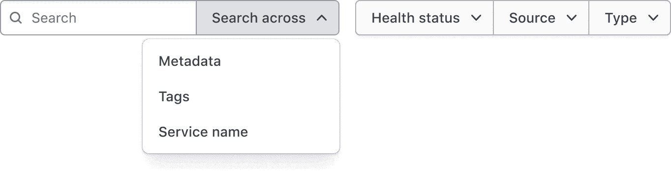
A Segmented Group can be used in a filter pattern as a means to reduce or limit the items within a dataset. Depending on the complexity of the pattern, multiple Segmented Groups may be used to filter complex datasets.
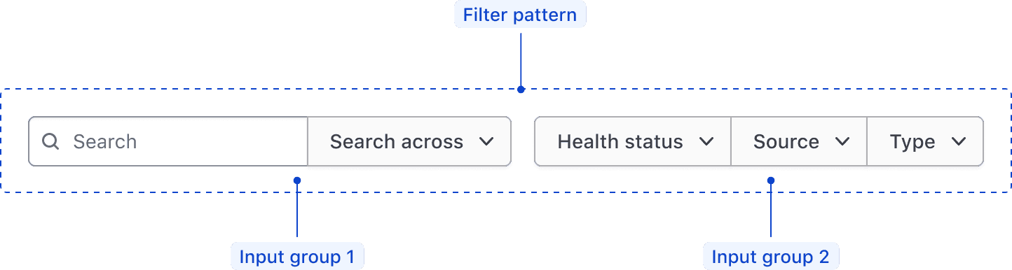
This example showcases a larger filter pattern that consists of two Segmented Groups; the first supporting the limitation of the parameters included in a search query, the second grouping similar filter parameters relationally.
Within a form
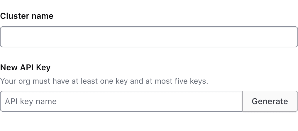
While less common, a Segmented Group can be used within a form to collect relational data or perform generative functions like generating API keys.
Use a Segmented Group to perform a generative function within a form.
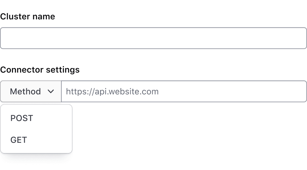
Use a Segmented Group to determine the method of a request or connection.
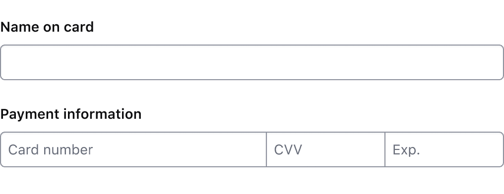
Don’t use a Segmented Group when fields are related, but aren't stored in the same object or value upon submission. This example features a payment form with a Segmented Group and label, but uses a placeholder instead of a label to communicate what information the field collects.
Error validation
For error validation recommendations, refer to the Form patterns documentation.
How to use this component
The segments are the controls you write inside the group: a native <input>, <select>, <button> or <a>, or an <i80-dropdown>. The group adds the i80 classes and rounds only the outer corners, so a server-rendered form looks right before any JavaScript runs.
Within a filter pattern
<i80-segmented-group>
  <input type="search" placeholder="Search" aria-label="Search">
  <i80-dropdown text="Across" color="secondary">
    <i80-dropdown-item>Metadata</i80-dropdown-item>
    <i80-dropdown-item>Tags</i80-dropdown-item>
    <i80-dropdown-item>Service name</i80-dropdown-item>
  </i80-dropdown>
</i80-segmented-group>
For complex filters we recommend grouping related filter criteria into a Segmented Group.
<i80-segmented-group>
  <i80-dropdown text="Health status" color="secondary">
    <i80-dropdown-item>Passing</i80-dropdown-item>
    <i80-dropdown-item>Warning</i80-dropdown-item>
    <i80-dropdown-item>Failing</i80-dropdown-item>
  </i80-dropdown>
  <i80-dropdown text="Source" color="secondary">
    <i80-dropdown-item>Consul</i80-dropdown-item>
    <i80-dropdown-item>Kubernetes</i80-dropdown-item>
  </i80-dropdown>
  <i80-dropdown text="Type" color="secondary">
    <i80-dropdown-item>Service</i80-dropdown-item>
    <i80-dropdown-item>Debug service</i80-dropdown-item>
  </i80-dropdown>
</i80-segmented-group>
Within a form
Give the group a label and it becomes a form field: the label is tied to the first control in the row, and helper-text, error, required and optional work as they do on any other field.
<i80-segmented-group label="New API Key" helper-text="Your org must have at least one key and at most five keys">
  <input type="text" name="api-key" size="32">
  <button type="submit" name="generate">Generate</button>
</i80-segmented-group>
Layout
The group is as wide as its contents. full-width makes it fill its container instead, and max-width limits how wide it may grow.
Your own segments
Anything that is not a control the group knows is passed through unstyled, so you can put your own element in the row. The predefined segments adjust their own corners depending on where they sit in the group; a segment of your own has to match that itself.
<i80-segmented-group>
  <input type="text" size="32" aria-label="input leading generic segment">
  <div style="display: flex; align-items: center; justify-content: center; height: 36px; padding: 0 12px; background: #eee">
    generic segment
  </div>
</i80-segmented-group>
Attributes
<i80-segmented-group> renders this component. Everything it understands:
| Attribute | Values | Default | Notes |
|---|---|---|---|
full-width |
boolean | Fills the width of its container instead of its content. | |
max-width |
CSS length | How wide the row may grow. | |
label |
text | Renders the group as a form field, labelling the first control in the row. | |
helper-text |
text | Linked with aria-describedby. | |
error |
text | Shows the error and marks the control invalid. | |
required / optional |
boolean | Adds the Required badge or (Optional) to the label. | |
invalid |
boolean | Marks the control invalid without a message. |
The tag keeps any native element you write inside it, so a server-rendered form, link or button works as it is. See Web Components for loading i80.js and the reference for these examples running.
Anatomy
Base component
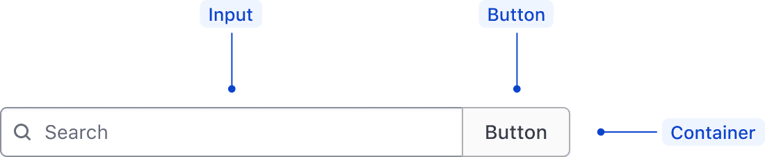
| Element | Usage |
|---|---|
| Segmented Input | Required; one of the types the Text Input accepts. |
| Segmented Button | Required; either a button or a dropdown, taking the styling of the i80 Button and Dropdown. |
| Container | Wraps the segments in one row. |
Segment anatomy
The Segments contained within a Segmented Group are extensions of i80 form components and have the same anatomy as the main components they extend. For more information on the specifications of each Segment, refer to their respective documentation:
States
The Segmented Group doesn’t have its own state intrinsically; instead, the nested Segments should maintain their own interactive state corresponding with the main component specs.
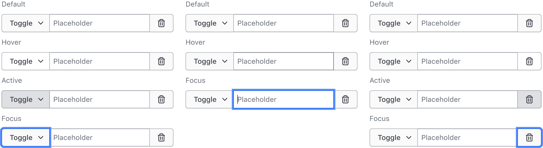
The content within a Segmented Group is dependent on the context:
- If used in a form, the Segmented Group is a form field in its own right and requires a single label.
- If used within a filtering pattern, no label is required.
Conformance rating
The segments are the native <input>, <select>, <button> and <a> you write inside the group, and each of them needs an accessible name of its own. You have two ways to give them one: put a label on <i80-segmented-group>, which renders the group inside a form field and ties the label to the first control in the row, or set an aria-label on each control (or associate it with your own <label>).
An <i80-dropdown> segment names itself through its text attribute.
Applicable WCAG Success Criteria
This section is for reference only. This component intends to conform to the following WCAG Success Criteria:
-
1.3.1
Info and Relationships (Level A):
Information, structure, and relationships conveyed through presentation can be programmatically determined or are available in text. -
1.3.2
Meaningful Sequence (Level A):
When the sequence in which content is presented affects its meaning, a correct reading sequence can be programmatically determined. -
1.3.4
Orientation (Level AA):
Content does not restrict its view and operation to a single display orientation, such as portrait or landscape. -
1.3.5
Identify Input Purpose (Level AA):
The purpose of each input field collecting information about the user can be programmatically determined when the input field serves a purpose identified in the Input Purposes for User Interface Components section; and the content is implemented using technologies with support for identifying the expected meaning for form input data. -
1.4.1
Use of Color (Level A):
Color is not used as the only visual means of conveying information, indicating an action, prompting a response, or distinguishing a visual element. -
1.4.10
Reflow (Level AA):
Content can be presented without loss of information or functionality, and without requiring scrolling in two dimensions. -
1.4.11
Non-text Contrast (Level AA):
The visual presentation of the following have a contrast ratio of at least 3:1 against adjacent color(s): user interface components; graphical objects. -
1.4.12
Text Spacing (Level AA):
No loss of content or functionality occurs by setting all of the following and by changing no other style property: line height set to 1.5; spacing following paragraphs set to at least 2x the font size; letter-spacing set at least 0.12x of the font size, word spacing set to at least 0.16 times the font size. -
1.4.3
Minimum Contrast (Level AA):
The visual presentation of text and images of text has a contrast ratio of at least 4.5:1 -
1.4.4
Resize Text (Level AA):
Except for captions and images of text, text can be resized without assistive technology up to 200 percent without loss of content or functionality. -
2.4.6
Headings and Labels (Level AA):
Headings and labels describe topic or purpose. -
2.4.7
Focus Visible (Level AA):
Any keyboard operable user interface has a mode of operation where the keyboard focus indicator is visible. -
3.2.1
On Focus (Level A):
When any user interface component receives focus, it does not initiate a change of context. -
3.2.2
On Input (Level A):
Changing the setting of any user interface component does not automatically cause a change of context unless the user has been advised of the behavior before using the component. -
3.2.4
Consistent Identification (Level AA):
Components that have the same functionality within a set of Web pages are identified consistently. -
3.3.1
Error Identification (Level A):
If an input error is automatically detected, the item that is in error is identified and the error is described to the user in text. -
3.3.2
Labels or Instructions (Level A):
Labels or instructions are provided when content requires user input. -
4.1.2
Name, Role, Value (Level A):
For all user interface components, the name and role can be programmatically determined; states, properties, and values that can be set by the user can be programmatically set; and notification of changes to these items is available to user agents, including assistive technologies.
Support
If any accessibility issues have been found within this component, let us know by submitting an issue.
0.1.0
Første i80-version (fork af upstream, se core/UPSTREAM.md).