The Code Block is used to display, format, and highlight the syntax of code snippets.
Usage
When to use
- When displaying code examples and longer snippets of code that benefit from syntax highlighting.
When not to use
- As a full-blown code editor.
- As an embedded terminal or terminal emulator.
When to use a Code Block vs. a Copy Snippet
There is some overlap in the copying functionality of the Copy Snippet and the Code Block. Which to use generally comes down to the complexity of the code/value displayed within the component, and whether the user benefits from seeing the larger context of the code example.
Use a Code Block:
- If viewing or displaying code is the primary purpose, and copying the code is secondary.
- If the example consists of a command, e.g., a
curlandbashscript. These are oftentimes on a single line, but consist of multiple commands and functions.
Use a Copy Snippet:
- If copying the code is the primary purpose, and viewing the code is secondary.
- If allowing the user to copy an API key or other single value or string.
- If seeing the value in a larger context of where it's expected to be pasted into isn’t necessary.
Standalone
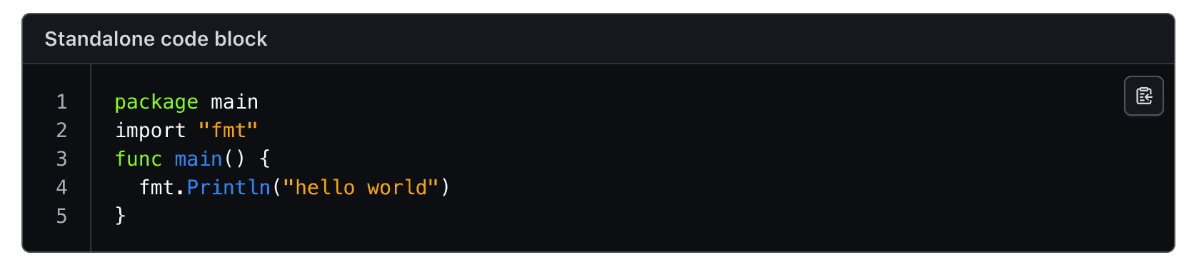
A standalone Code Block carries its own rounded corners, so it can sit anywhere: in a form, in a multi-step process, or simply in the normal layout flow.
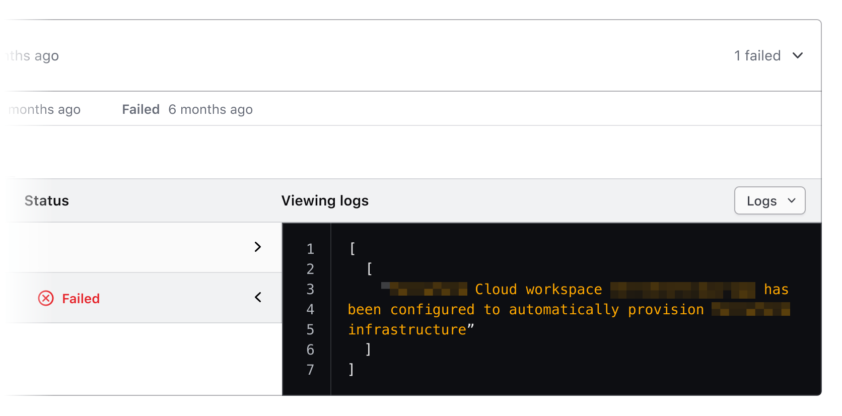
Sometimes it may be necessary to use the Code Block in a more dense layout or nested inside something else. A Code Block that is not standalone drops those corners, so it fits flush alongside other elements, in a split view, or as part of a larger layout.
Header
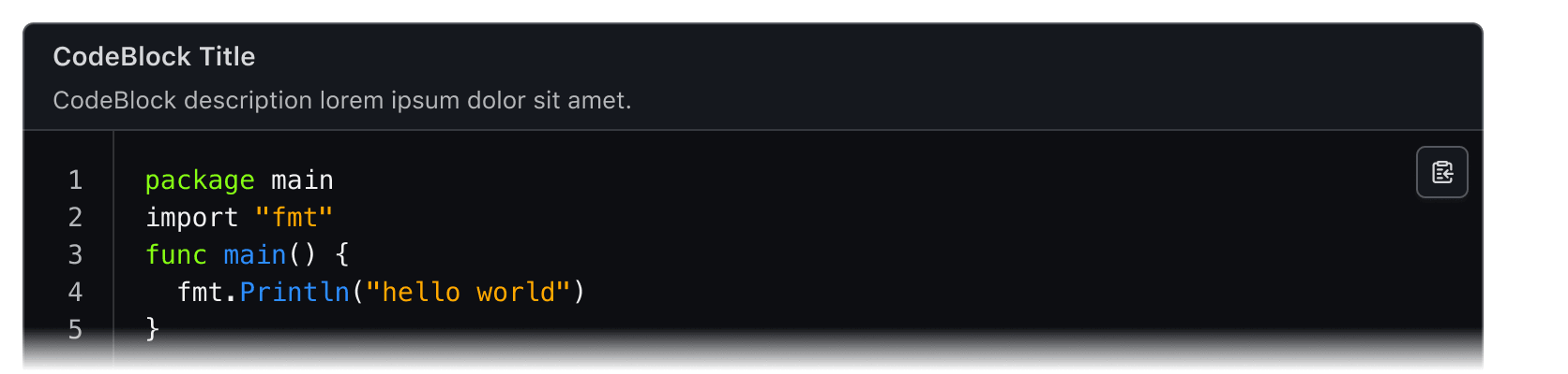
Use a title and/or description in the header to provide additional information, instructions, or to label a Code Block. Both are optional, but including them can help to provide additional context about a specific block of code.
When not to use a header
There can be an overlap between content that you may choose to include in the header as a title or description, and content that is part of the normal layout flow in a headline or paragraph. If it is necessary to elevate this content in the hierarchy of the page, we recommend including it in the normal layout flow, rather than as a title or description within the Code Block.
CopyButton
Use a CopyButton within the Code Block to make copying the snippet a single action. More details can be found in the CopyButton guidelines.

Line selection
If a user needs to copy only a portion of the Code Block, the relevant portion can be selected with a cursor and copied via the keyboard or mouse.

Line numbers
Height toggle button
For longer code content, it can be helpful to cap the height of the Code Block, to limit how much code is shown by default within the UI layout. If the content exceeds this height, a “Show more code” button will be displayed at the bottom of the Code Block, allowing users to expand it. Activating this button again will collapse the content back to its original height.
The button is placed inside a footer element that only appears when the content overflows, keeping the layout clean when the toggle isn’t needed.
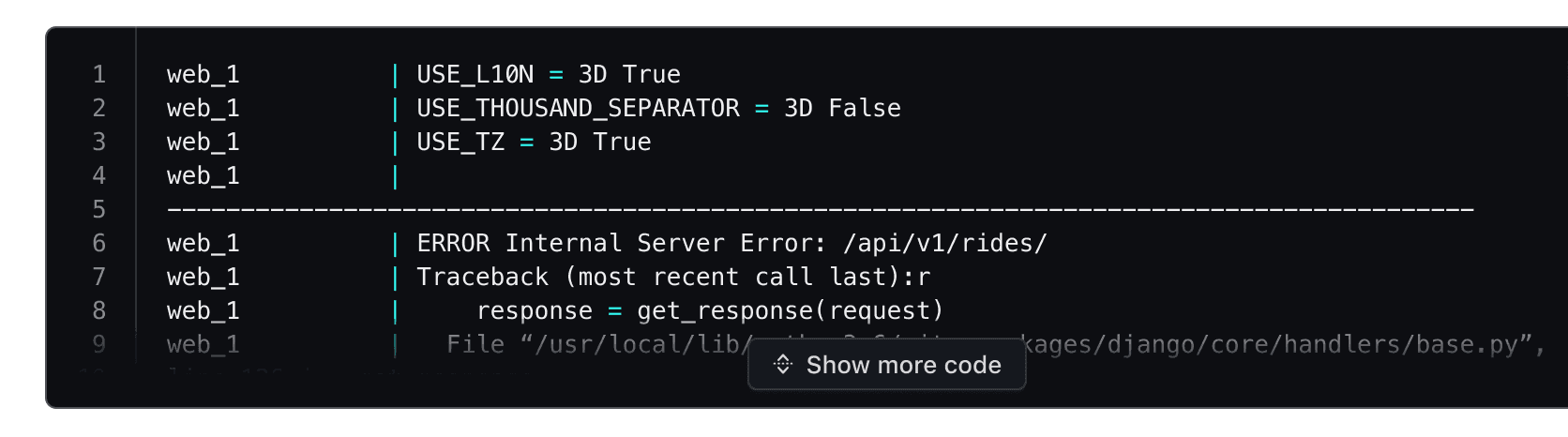
Interacting with this button removes the height limit, expanding the Code Block to display the full code snippet.
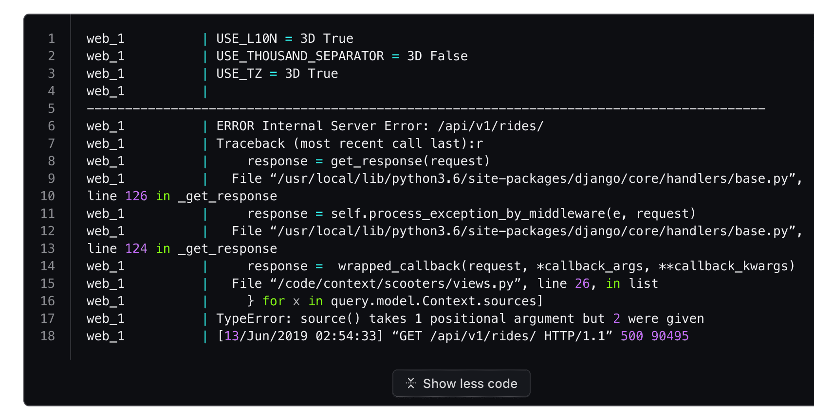
Interacting with it again collapses the Code Block back to its capped height.
Line highlighting
Use line highlighting to target and call attention to specific lines or multiple lines within a block of code.

Language
Language determines how syntax highlighting is applied and formatted within the block.
Syntax highlighting is not part of the component: the code is shown as you write it. Add highlighting with a library of your choice if a page needs it.
Applying syntax highlighting
Due to the number of languages supported by the component, the color styles use a generic naming schema (e.g., cyan, red, purple) to remain as agnostic as possible when being applied to different languages.
For more details around syntax visit the specifications.
How to use this component
<i80-code-block> shows a chunk of code. The code is the text you write inside the tag: the
indentation the surrounding HTML gave it is removed, so the example can sit where it belongs
in your page. For a single line, value works too.
Name the block so it can be reached with a screen reader: give it a title, a label, or a
labelled-by pointing at a heading you already have. A named block becomes a labelled group,
which is what a scrollable box of code is.
<i80-code-block label="basic usage">aws ec2 --region us-west-1 accept-vpc-peering-connection</i80-code-block>Title and description
Optionally, you can pass a title and/or a description. They sit in a header above the code,
and the code is named and described by them without you wiring up any ids.
<i80-code-block language="bash" title="CodeBlock title" description="CodeBlock description">aws ec2 --region us-west-1 accept-vpc-peering-connection</i80-code-block>Title tag
title-tag changes the element the title is rendered as. Heading levels should reflect the
structure of the page: if a code block is in a subsection below a heading level 2, use "h3".
Learn to write functions
Functions are a critical part of learning to code. They are reusable chunks of code that can perform tasks like convert an object to an array.
<div class="doc-code-block-demo-heading">
  <h2 class="i80-text i80-typography-display-300 i80-font-weight-semibold">Learn to write functions</h2>
  <p class="i80-text i80-typography-body-200 i80-font-weight-regular">
    Functions are a critical part of learning to code. They are reusable chunks of code
    that can perform tasks like convert an object to an array.
  </p>
</div>
<i80-code-block language="go" title="Example function" title-tag="h3">
  package main
  import fmt
  func main() {
    fmt.Println(helloWorld)
  }
</i80-code-block>
Language
language accepts bash, go, hcl, json, log, ruby, shell-session and yaml. It
records which language the block is in and sets the matching class; it does not colour the code.
<i80-code-block label="language" language="go">
  package main
  import fmt
  func main() {
    fmt.Println(helloWorld)
  }
</i80-code-block>
Copy button
Add copy-button for a button that copies the code to the clipboard. Give it a meaningful and
unique name with copy-button-text when there is more than one on the page, and use
copied-message for what is announced once the copy succeeds. The button fires i80-copy with
detail.text and detail.success, so the page can react to it.
<i80-code-block label="copy button" copy-button copy-button-text="Copy bash snippet">aws ec2 --region us-west-1 accept-vpc-peering-connection</i80-code-block>Line numbers
Line numbers are shown by default. Set line-numbers="false" to hide them, and
line-number-start to begin at something other than 1.
<i80-code-block label="line numbers" language="go" line-numbers="false">
  package main
  import fmt
  func main() {
    fmt.Println(helloWorld)
  }
</i80-code-block>Line wrapping
By default a long line overflows the box and you scroll sideways to read it. line-wrapping
wraps it instead.
<i80-code-block label="line wrapping" language="ruby" line-wrapping>codeLang='Lorem ipsum dolor sit amet, consectetur adipiscing elit, sed do eiusmod tempor incididunt ut labore et dolore magna aliqua. Ut enim ad minim veniam';</i80-code-block>Limit height
The code is as tall as it needs to be. max-height caps it to save space: the code scrolls, and
a button appears to expand the block to its full height and collapse it again. The block reports
its state with the expanded property and the i80-toggle event, and toggle() does it from
JavaScript.
<i80-code-block language="ruby" max-height="130px" title="CodeBlock title" description="CodeBlock description">
  def convert_object_to_array(obj)
    arr = obj.keys
             .map { |key| [key, obj[key]] }
             .flatten
             .sort
    return arr
  end

  def assert_objects_equal(actual, expected, test_name)
    actual_str = convert_object_to_array(actual).to_s
    expected_str = convert_object_to_array(expected).to_s
    if actual_str == expected_str
      puts 'passed'
    else
      puts 'FAILED'
    end
  end
</i80-code-block>
Attributes
<i80-code-block> renders this component. Everything it understands:
| Attribute | Values | Default | Notes |
|---|---|---|---|
value |
text | The code, for a single line. Otherwise it is the text inside the tag. | |
title |
text | A title above the code. | |
title-tag |
p · h1 … h6 | p |
The title's element. Pick the heading level the page structure asks for. |
description |
text | A line under the title. | |
language |
bash · go · hcl · json · log · ruby · shell-session · yaml | Adds the language-<name> class a highlighter keys off. It does not highlight anything by itself. | |
line-numbers |
boolean | true |
line-numbers="false" hides the gutter. The numbers count lines of code, so with line-wrapping they stop matching the rows on screen. |
line-number-start |
number | 1 |
The number the first line gets. |
line-wrapping |
boolean | Wraps long lines instead of scrolling sideways. | |
standalone |
boolean | true |
standalone="false" drops the rounded corners, for a block flush inside another box. |
max-height |
CSS length | Caps the height: the code scrolls, and a button expands it. Property: expanded. Method: toggle(). Event: i80-toggle with detail.expanded. | |
copy-button |
boolean | Adds the <i80-copy-button> that copies the code. | |
copy-button-text |
text | Copy |
Its accessible name — say what is being copied when there is more than one on the page. |
copied-message |
text | Copied to clipboard |
What the copy button announces. |
label |
text | The code's accessible name, when there is no title to name it. | |
labelled-by |
id | the title |
Names the code from other text on the page. |
described-by |
id | the description |
Points the code's aria-describedby at other text on the page. |
The tag keeps any native element you write inside it, so a server-rendered form, link or button works as it is. See Web Components for loading i80.js and the reference for these examples running.
Anatomy
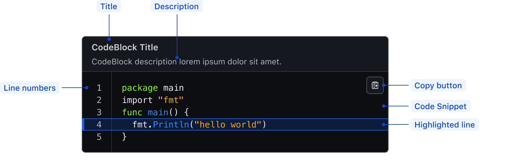
| Element | Usage |
|---|---|
| Title | Optional |
| Description | Optional |
| Line numbers | Optional |
| Copy button | Optional |
| Code snippet | Required |
| Highlighted line | Optional |
Syntax highlighting
To aid in understanding how the highlighting theme is applied via Prism's tokens, we've provided a high-level, non-exhaustive list of token names and how they might be applied depending on the syntax.
| Color | Usage |
|---|---|
| Cyan | Property, url, or operator |
| Blue | Function, builtins |
| Orange | Strings, characters |
| Purple | Booleans, numbers |
| Green | Keywords, class names, saving the world |
| Red | Important items |
| White | Default color within the code block, also used for punctuation (<, { }, =, etc) |
| Gray | Used for comments across languages |
Working directly with an engineering partner can reveal exactly how a snippet will render in the component and should be the first course of action when creating custom snippets. Understanding Prism's token hierarchy can also be helpful when creating examples.
If you have questions or need assistance creating custom examples, contact the Design Systems Team for support.
States
Focus with header content
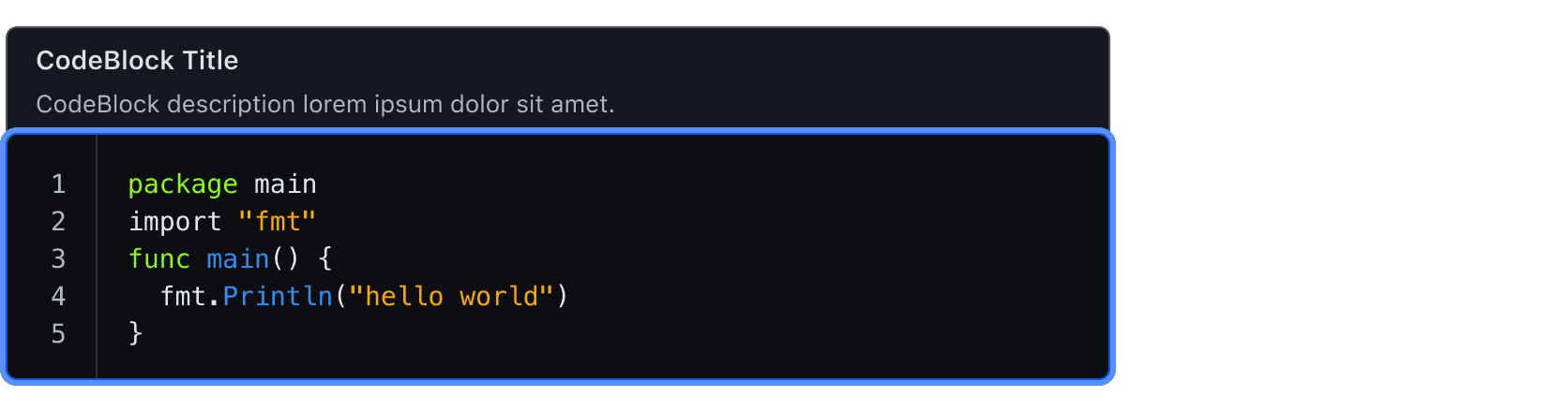
Focus without header content

Conformance rating
When used as recommended, there should not be any WCAG conformance issues with this component.
Applicable WCAG Success Criteria
This section is for reference only. This component intends to conform to the following WCAG Success Criteria:
-
1.3.1
Info and Relationships (Level A):
Information, structure, and relationships conveyed through presentation can be programmatically determined or are available in text. -
1.3.2
Meaningful Sequence (Level A):
When the sequence in which content is presented affects its meaning, a correct reading sequence can be programmatically determined. -
1.4.1
Use of Color (Level A):
Color is not used as the only visual means of conveying information, indicating an action, prompting a response, or distinguishing a visual element. -
1.4.10
Reflow (Level AA):
Content can be presented without loss of information or functionality, and without requiring scrolling in two dimensions. -
1.4.11
Non-text Contrast (Level AA):
The visual presentation of the following have a contrast ratio of at least 3:1 against adjacent color(s): user interface components; graphical objects. -
1.4.12
Text Spacing (Level AA):
No loss of content or functionality occurs by setting all of the following and by changing no other style property: line height set to 1.5; spacing following paragraphs set to at least 2x the font size; letter-spacing set at least 0.12x of the font size, word spacing set to at least 0.16 times the font size. -
1.4.3
Minimum Contrast (Level AA):
The visual presentation of text and images of text has a contrast ratio of at least 4.5:1 -
1.4.4
Resize Text (Level AA):
Except for captions and images of text, text can be resized without assistive technology up to 200 percent without loss of content or functionality. -
2.1.1
Keyboard (Level A):
All functionality of the content is operable through a keyboard interface. -
2.1.2
No Keyboard Trap (Level A):
If keyboard focus can be moved to a component of the page using a keyboard interface, then focus can be moved away from that component using only a keyboard interface. -
2.4.3
Focus Order (Level A):
If a Web page can be navigated sequentially and the navigation sequences affect meaning or operation, focusable components receive focus in an order that preserves meaning and operability. -
2.4.7
Focus Visible (Level AA):
Any keyboard operable user interface has a mode of operation where the keyboard focus indicator is visible. -
4.1.2
Name, Role, Value (Level A):
For all user interface components, the name and role can be programmatically determined; states, properties, and values that can be set by the user can be programmatically set; and notification of changes to these items is available to user agents, including assistive technologies.
Support
If any accessibility issues have been found within this component, let us know by submitting an issue.
0.1.0
Første i80-version (fork af upstream, se core/UPSTREAM.md).