Usage
When to use
- To copy plain text, large code snippets, and input values.
- When needing separation between the text-to-copy and the copy interaction.
When not to use
- To copy short code snippets, such as URLs, tokens, IDs, use a Copy Snippet.
Sizes
The Copy Button comes in small and medium sizes. Use the size that best fits the hierarchy of the UI.
Placement
Place the Copy Button as close to the content being copied as possible. Avoid too much visual separation between the content and the button to ensure users understand what will be copied to the clipboard.
Placing the Copy Button far away from the content being copied may make it challenging for users to recognize what they are copying to their clipboard.
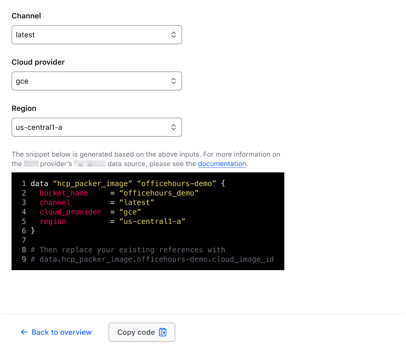
Placing a Copy Button close to the content explicitly communicates what is being copied.
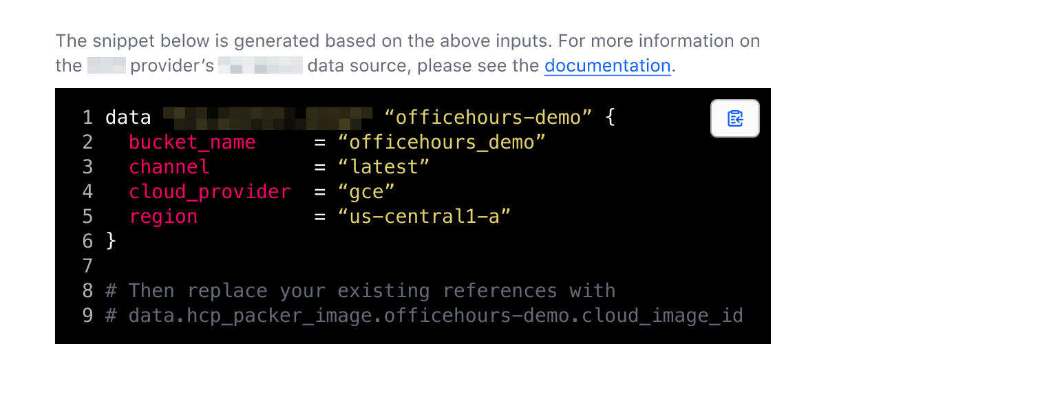
Composition with other components
Since the CopyButton can target almost any associated DOM element, it can be composed with other i80 components to create and support more complex scenarios and use cases.
With form inputs
When combining the CopyButton with form inputs:
- Put the whole thing in a fieldset.
- Wrap the input control (generally a Text Input, Masked Input, or Textarea) and the Copy Button in a container with an 8px gap between each element. This is not something the components do for you; it is a layout you write.
- Use the
icon-onlyCopy Button, as this layout already gives enough visual association.

This ensures that other form primitives (helper text, error, etc) will span the combined width of the input control and the CopyButton.
Single line inputs
A simple example composition of a CopyButton and TextInput or MaskedInput.

A more complex composition with helper and error text.
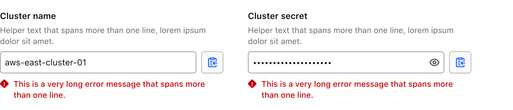
Multi-line inputs
In the case of a multi-line input (e.g., a Textarea or multi-line MaskedInput), align the CopyButton to the top of the control.

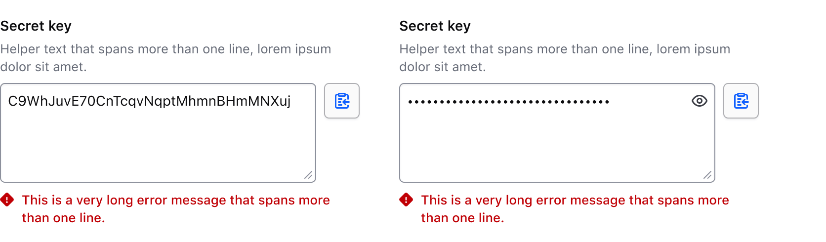
How to use this component
Write the button's text inside <i80-copy-button> and point target-to-copy at the element holding the value to copy. That is an input's value, or otherwise the text the element shows:
The button will copy the text in this paragraph element.
<p id="clipboardTarget" class="doc-copy-button-copy-text">
  The button will copy the text in this paragraph element.
</p>
<i80-copy-button target-to-copy="#clipboardTarget">Copy</i80-copy-button>
Icon-only
Add icon-only to show just the icon. The text is still needed: it becomes the button's aria-label.
The button will copy the text in this paragraph element.
<p id="clipboardTarget2" class="doc-copy-button-copy-text">
  The button will copy the text in this paragraph element.
</p>
<i80-copy-button icon-only target-to-copy="#clipboardTarget2">Copy</i80-copy-button>
Sizes
There are two sizes available, small and medium (medium is the default):
The button will copy the text in this paragraph element.
<p id="clipboardTarget3" class="doc-copy-button-copy-text">
  The button will copy the text in this paragraph element.
</p>
<i80-copy-button size="small" target-to-copy="#clipboardTarget3">Copy</i80-copy-button>
Full-width
This indicates that the button should take up the full-width of the parent container. Add the full-width attribute; it’s off by default.
The button will copy the text in this paragraph element.
<p id="clipboardTarget4" class="doc-copy-button-copy-text">
  The button will copy the text in this paragraph element.
</p>
<i80-copy-button full-width target-to-copy="#clipboardTarget4">Copy</i80-copy-button>
Text to copy
You can also give the string to be copied directly, with text-to-copy, instead of pointing at a target element:
<i80-copy-button text-to-copy="someSecretThingGoesHere">Copy your secret key</i80-copy-button>Composition with form inputs
These representative examples showcase the compositional recommendations in the guidelines.
With single line inputs
<div style="display: flex; align-items: flex-end; gap: 8px">
  <i80-text-input label="Cluster name" helper-text="This is some example helper text.">
    <input type="text" id="cluster-name-example-text-input" value="aws-east-cluster-01">
  </i80-text-input>
  <i80-copy-button icon-only target-to-copy="#cluster-name-example-text-input">Copy</i80-copy-button>
</div>
With multi-line inputs
<div style="display: flex; align-items: flex-start; gap: 8px">
  <i80-textarea label="Cluster secret" helper-text="This is some example helper text.">
    <textarea id="cluster-secret-example-textarea">C9WhJuvE70CnTcqvNqptMhmnBHmMNXuj</textarea>
  </i80-textarea>
  <i80-copy-button icon-only target-to-copy="#cluster-secret-example-textarea">Copy</i80-copy-button>
</div>
Attributes
<i80-copy-button> renders this component. Everything it understands:
| Attribute | Values | Default | Notes |
|---|---|---|---|
text-to-copy |
text | The value to copy. | |
target-to-copy |
CSS selector | Copy what that element holds instead: an input's value, otherwise its visible text (sr-only text is left out). | |
size |
small · medium | medium |
|
icon-only |
boolean | Shows only the icon; the text becomes the aria-label. | |
full-width |
boolean | Fills the parent's width. | |
disabled |
boolean | ||
copied-message |
text | Copied to clipboard |
What the live region says after a copy. |
error-message |
text | Failed to copy to clipboard |
And when it failed. |
The tag keeps any native element you write inside it, so a server-rendered form, link or button works as it is. See Web Components for loading i80.js and the reference for these examples running.
Anatomy

| Element | Usage |
|---|---|
| Icon | Required |
| Text | Optional, but aria label will still be attached. |
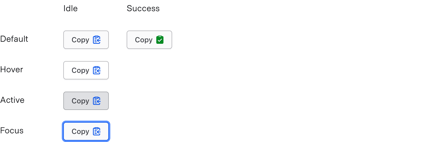
States
Conformance rating
When used as recommended, there should not be any WCAG conformance issues with this component.
Applicable WCAG Success Criteria
This section is for reference only. This component intends to conform to the following WCAG Success Criteria:
-
1.1.1
Non-text Content (Level A):
All non-text content that is presented to the user has a text alternative that serves the equivalent purpose. -
1.3.1
Info and Relationships (Level A):
Information, structure, and relationships conveyed through presentation can be programmatically determined or are available in text. -
1.3.2
Meaningful Sequence (Level A):
When the sequence in which content is presented affects its meaning, a correct reading sequence can be programmatically determined. -
1.3.3
Sensory Characteristics (Level A):
Instructions provided for understanding and operating content do not rely solely on sensory characteristics of components such as shape, color, size, visual location, orientation, or sound. -
1.4.1
Use of Color (Level A):
Color is not used as the only visual means of conveying information, indicating an action, prompting a response, or distinguishing a visual element. -
1.4.10
Reflow (Level AA):
Content can be presented without loss of information or functionality, and without requiring scrolling in two dimensions. -
1.4.11
Non-text Contrast (Level AA):
The visual presentation of the following have a contrast ratio of at least 3:1 against adjacent color(s): user interface components; graphical objects. -
1.4.12
Text Spacing (Level AA):
No loss of content or functionality occurs by setting all of the following and by changing no other style property: line height set to 1.5; spacing following paragraphs set to at least 2x the font size; letter-spacing set at least 0.12x of the font size, word spacing set to at least 0.16 times the font size. -
1.4.3
Minimum Contrast (Level AA):
The visual presentation of text and images of text has a contrast ratio of at least 4.5:1 -
1.4.4
Resize Text (Level AA):
Except for captions and images of text, text can be resized without assistive technology up to 200 percent without loss of content or functionality. -
2.1.1
Keyboard (Level A):
All functionality of the content is operable through a keyboard interface. -
2.1.2
No Keyboard Trap (Level A):
If keyboard focus can be moved to a component of the page using a keyboard interface, then focus can be moved away from that component using only a keyboard interface. -
2.4.7
Focus Visible (Level AA):
Any keyboard operable user interface has a mode of operation where the keyboard focus indicator is visible. -
4.1.2
Name, Role, Value (Level A):
For all user interface components, the name and role can be programmatically determined; states, properties, and values that can be set by the user can be programmatically set; and notification of changes to these items is available to user agents, including assistive technologies.
Support
If any accessibility issues have been found within this component, let us know by submitting an issue.
0.1.0
Første i80-version (fork af upstream, se core/UPSTREAM.md).