The Application State is used to communicate status, errors, and zero/empty states.
Usage
When to use
- When an application encounters an issue or error during its operation.
- When emphasis is needed on the creation of a new object within a null state.
When not to use
- When the absence of content is expected and does not require an explanation to the user.
- When there is a clear and intuitive way to add or populate content.
Alignment
The Application State supports two alignment options: left (default) and center. The alignment affects text alignment, action placement/alignment in the footer, and media placement; however, it does not change the default page alignment.
Left alignment

Center alignment

Media
The media slot is used to add illustrations to increase the visual impact of the Application State.
This provides additional visual prominence while also elevating the brand experience. If the illustration has a circular container, we recommend setting the alignment to center.

Header
Icon
When set, the icon is displayed side by side with the title.

This is commonly used when displaying an error state for application failures. The icon must always be accompanied by a title.
Title
The title should be short and provide a clear and concise message.
Error code
If enabled and available, an error code will be shown, providing additional information associated with the title.
Body
Focus on relevant information and avoid unnecessary details. If there is an error, include suggestions or guidance for how the user can resolve the issue, if possible. If no objects are found (zero/empty state), provide a brief explanation on how creating this new object will benefit the user.
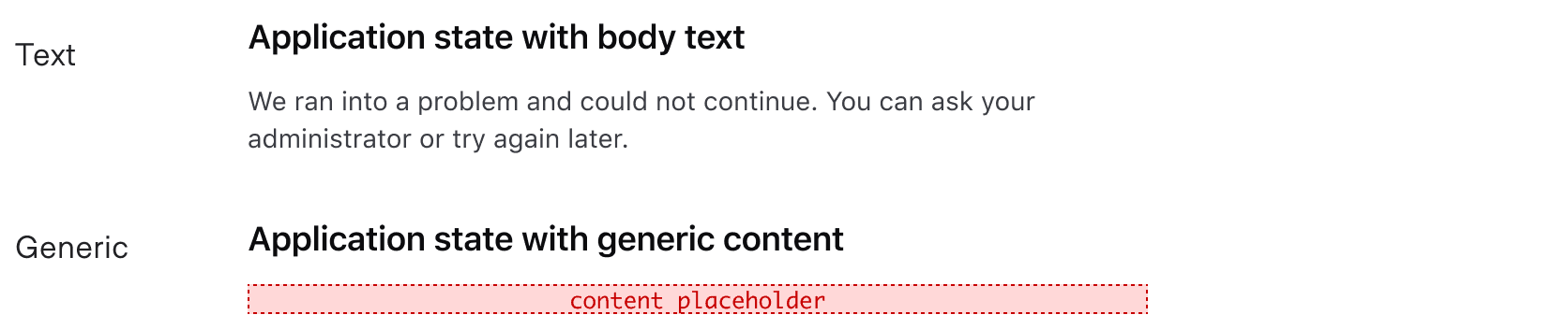
The body allows for two types of content: text and generic.
Footer
The Application State supports up to three actions, including Dropdown, Standalone Link, and Button components. Use footer actions to help users resolve errors or access issues with actionable steps.

Using buttons or links
Buttons, along with links, are the most common actions used in the footer. Buttons are more often used in empty state contexts because they provide high visibility for the primary action on the page. Links are more common in error state contexts as a means to provide a solution to the error they encountered.
Read more about when to use Buttons and Links.
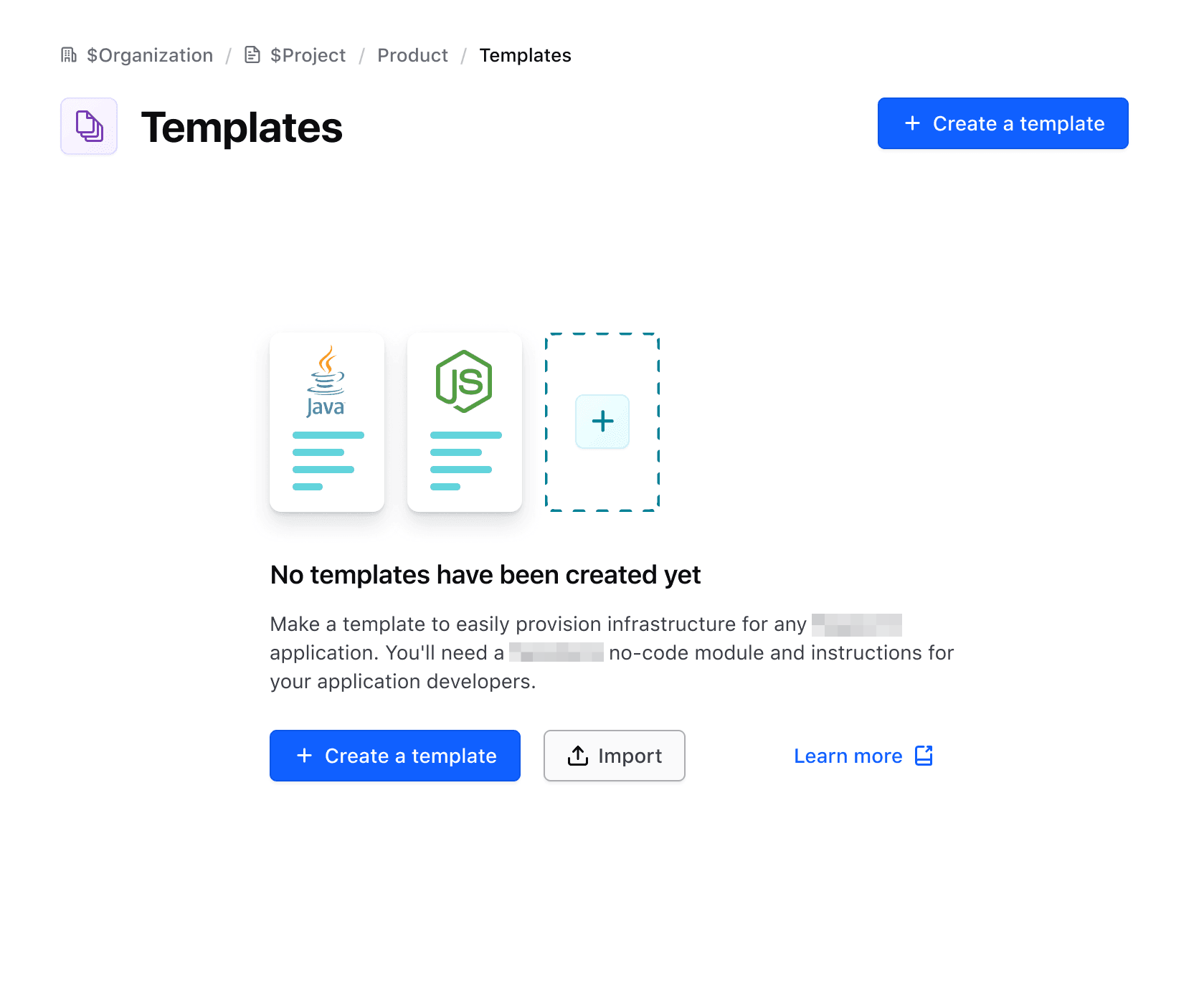
When there is an empty state that occupies the majority of the page, do not display two similar actions in different areas of the UI. In this example, there is a primary button in the Page Header and in the Application State.
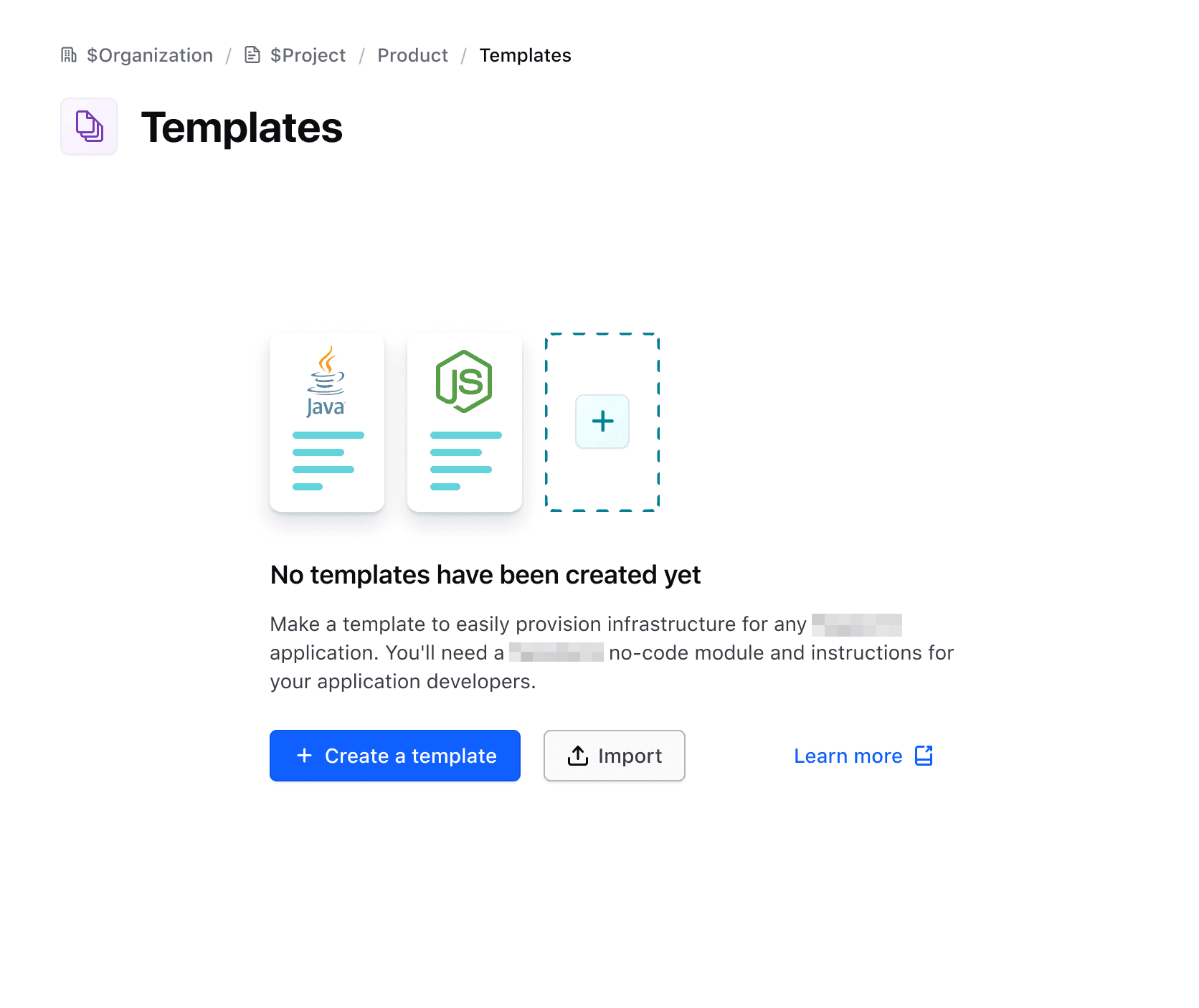
Instead, use the Application State as the only means of drawing attention to the primary action.
Using dropdowns
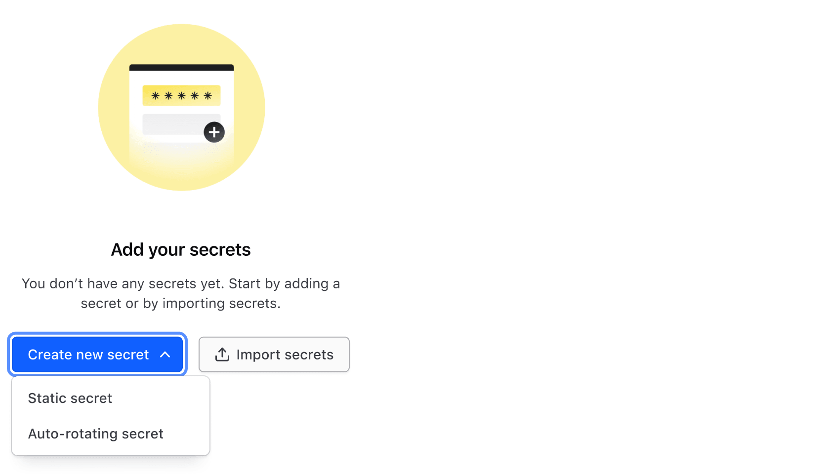
Dropdowns can be used as actions in the footer in rare cases. Limit dropdowns to one per Application State.
Width constraints
The Application State’s content has a max width of 480 pixels. This is done for better readability, ensuring that the max character count is close to 70 characters per line.
Examples
Here are some common use cases for the Application State, however, it is not limited to just these two examples.
Error state
Error states are used when the application encounters an issue or error during its operation. It shows the associated error code, icon, messages, and actions to help users find a solution.

Empty state
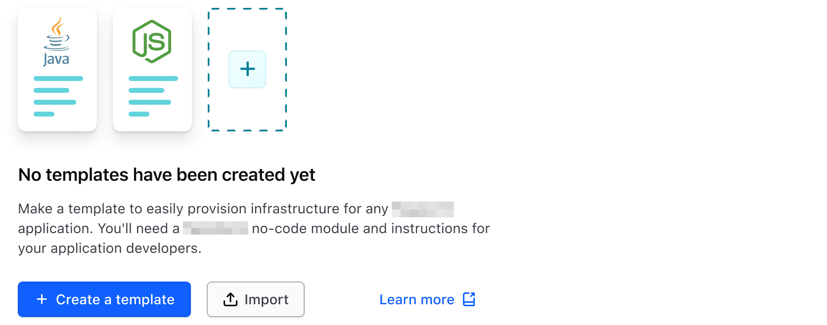
An empty state occurs when a user has yet to create an object. Illustrations are placed using the media slot to further elevate the experience and express the purpose of the object.
How to use this component
This component intends to replace a few different simple error and empty/zero state components that exist across product UIs, while providing flexibility to adapt to additional application states. While we’re referring to these as "error state" and "empty state" this is just to help consumers relate to the components that have been replaced. Really, this component can be used to reflect any kind of application state message that is needed.
As an empty state
The item you were looking for was not found.
<i80-application-state title="Empty state title text">
  <p>The item you were looking for was not found.</p>
</i80-application-state>
Empty state with header icon
The item you were looking for was not found.
<i80-application-state title="Empty state title text" icon="alert-circle">
  <p>The item you were looking for was not found.</p>
</i80-application-state>
Empty state with a footer link
The item you were looking for was not found.
<i80-application-state title="Empty state title text">
  <p>The item you were looking for was not found.</p>
  <i80-link-standalone slot="footer" href="/components/alert" icon="help" icon-position="trailing">Need Help</i80-link-standalone>
</i80-application-state>
Empty state with a block of custom content
<i80-application-state title="Empty state title text">
  <div style="display: flex; align-items: center; justify-content: center; height: 100px; background: #eee">
    block yield
  </div>
  <i80-link-standalone slot="footer" href="/" icon="arrow-left">Go back</i80-link-standalone>
</i80-application-state>
Empty state with body text
Some sentence that conveys a good message to the user
<i80-application-state title="Empty state title text">
  <p>Some sentence that conveys a good message to the user</p>
  <i80-link-standalone slot="footer" href="/" icon="arrow-left">Go back</i80-link-standalone>
</i80-application-state>
Empty state with media
Some sentence that conveys a good message to the user
<i80-application-state title="Empty state title text">
  <svg slot="media" width="72" height="72" viewBox="0 0 72 72" role="img" aria-label="An illustration of an empty folder">
    <path d="M4 20a6 6 0 0 1 6-6h16l7 8h29a6 6 0 0 1 6 6v30a6 6 0 0 1-6 6H10a6 6 0 0 1-6-6V20Z" fill="#dedfe3"></path>
  </svg>
  <p>Some sentence that conveys a good message to the user</p>
  <i80-link-standalone slot="footer" href="/" icon="arrow-left">Go back</i80-link-standalone>
</i80-application-state>
As an error state
To indicate that the message is an error state, add the error-code attribute to <i80-application-state>.
Sorry, an unexpected error has occurred. Please try again later or contact support for assistance.
<i80-application-state title="An error has occurred" error-code="404">
  <p>Sorry, an unexpected error has occurred. Please try again later or contact support for assistance.</p>
  <i80-link-standalone slot="footer" href="/" icon="arrow-left">Go back</i80-link-standalone>
  <i80-link-standalone slot="footer" href="/components/alert" icon="help" icon-position="trailing">Need Help</i80-link-standalone>
</i80-application-state>
Error state with header icon
Sorry, an unexpected error has occurred. Please try again later or contact support for assistance.
<i80-application-state title="An error has occurred" error-code="404" icon="help">
  <p>Sorry, an unexpected error has occurred. Please try again later or contact support for assistance.</p>
  <i80-link-standalone slot="footer" href="/" icon="arrow-left">Go back</i80-link-standalone>
  <i80-link-standalone slot="footer" href="/components/alert" icon="help" icon-position="trailing">Need Help</i80-link-standalone>
</i80-application-state>
Error state with a block of custom content
<i80-application-state title="An error has occurred" error-code="404">
  <div style="display: flex; align-items: center; justify-content: center; height: 100px; background: #eee">
    block yield
  </div>
  <i80-link-standalone slot="footer" href="/" icon="arrow-left">Go back</i80-link-standalone>
  <i80-link-standalone slot="footer" href="/components/alert" icon="help" icon-position="trailing">Need Help</i80-link-standalone>
</i80-application-state>
Error state with center alignment
Sorry, an unexpected error has occurred. Please try again later or contact support for assistance.
<i80-application-state title="An error has occurred" error-code="404" align="center">
  <p>Sorry, an unexpected error has occurred. Please try again later or contact support for assistance.</p>
  <i80-link-standalone slot="footer" href="/" icon="arrow-left">Go back</i80-link-standalone>
  <i80-link-standalone slot="footer" href="/components/alert" icon="help" icon-position="trailing">Need Help</i80-link-standalone>
</i80-application-state>
Error state with media
Sorry, an unexpected error has occurred. Please try again later or contact support for assistance.
<i80-application-state title="An error has occurred" error-code="404">
  <svg slot="media" width="72" height="72" viewBox="0 0 72 72" role="img" aria-label="An illustration of a broken page">
    <path d="M14 8h28l16 16v40a6 6 0 0 1-6 6H20a6 6 0 0 1-6-6V14a6 6 0 0 1 6-6Z" fill="#dedfe3"></path>
  </svg>
  <p>Sorry, an unexpected error has occurred. Please try again later or contact support for assistance.</p>
  <i80-link-standalone slot="footer" href="/" icon="arrow-left">Go back</i80-link-standalone>
  <i80-link-standalone slot="footer" href="/components/alert" icon="help" icon-position="trailing">Need Help</i80-link-standalone>
</i80-application-state>
Alignment
Center align content
Application State content, such as text, is left-aligned by default but you can optionally center it with the align attribute.
Some sentence that conveys a good message to the user
<i80-application-state title="Empty state title text" align="center">
  <p>Some sentence that conveys a good message to the user</p>
  <i80-link-standalone slot="footer" href="/" icon="arrow-left">Go back</i80-link-standalone>
</i80-application-state>
Heading level
The title-tag attribute changes the HTML element that wraps the title content. When organizing the content on a webpage, the heading levels should reflect the structure of the page. For example, if an Application State is used as an empty state below the main heading of a page, the value should be "h2".
Templates
Make a template to easily provision infrastructure for any Waypoint application. You’ll need a Terraform co-node module and instructions for your application developers.
<h1 class="i80-text i80-typography-display-500 i80-font-weight-bold">Templates</h1>
<i80-application-state title="No templates have been created yet" title-tag="h2">
  <p>
    Make a template to easily provision infrastructure for any Waypoint application. You’ll need a Terraform co-node
    module and instructions for your application developers.
  </p>
  <i80-button slot="footer" icon="plus">Create a template</i80-button>
  <i80-button slot="footer" icon="upload" color="secondary">Import</i80-button>
  <i80-link-standalone slot="footer" href="/components/application-state" icon="docs-link" icon-position="trailing">Learn more</i80-link-standalone>
</i80-application-state>
Attributes
<i80-application-state> renders this component. Everything it understands:
| Attribute | Values | Default | Notes |
|---|---|---|---|
title |
text | The headline. | |
title-tag |
div · h1 … h6 | div |
The heading level. |
icon |
icon name | 24px icon above the title. | |
error-code |
text | Shows "ERROR 404" above the title. | |
align |
left · center | left |
|
auto-centered |
boolean | Centres the block in the space it has. |
The tag keeps any native element you write inside it, so a server-rendered form, link or button works as it is. See Web Components for loading i80.js and the reference for these examples running.
Anatomy
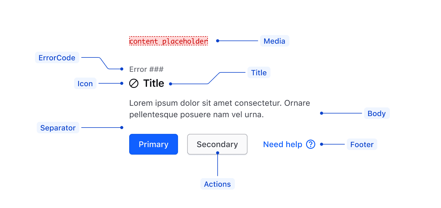
| Element | Usage |
|---|---|
| Media | Optional. |
| Title | Required. |
| Icon | Optional, but recommended with errorCode. |
| errorCode | Optional, but recommended when in errorState. |
| Body | Required. |
| Footer | Optional. |
| Actions | Required, if no footer; optional. |
Conformance rating
When used as directed, there should not be any conformance issues with this component. You are responsible for the conformance of anything you write inside it — the body text, the actions in slot="footer" and the illustration in slot="media".
Applicable WCAG Success Criteria
This section is for reference only. This component intends to conform to the following WCAG Success Criteria:
-
1.1.1
Non-text Content (Level A):
All non-text content that is presented to the user has a text alternative that serves the equivalent purpose. -
1.3.1
Info and Relationships (Level A):
Information, structure, and relationships conveyed through presentation can be programmatically determined or are available in text. -
1.3.2
Meaningful Sequence (Level A):
When the sequence in which content is presented affects its meaning, a correct reading sequence can be programmatically determined. -
1.4.1
Use of Color (Level A):
Color is not used as the only visual means of conveying information, indicating an action, prompting a response, or distinguishing a visual element. -
1.4.10
Reflow (Level AA):
Content can be presented without loss of information or functionality, and without requiring scrolling in two dimensions. -
1.4.11
Non-text Contrast (Level AA):
The visual presentation of the following have a contrast ratio of at least 3:1 against adjacent color(s): user interface components; graphical objects. -
1.4.12
Text Spacing (Level AA):
No loss of content or functionality occurs by setting all of the following and by changing no other style property: line height set to 1.5; spacing following paragraphs set to at least 2x the font size; letter-spacing set at least 0.12x of the font size, word spacing set to at least 0.16 times the font size. -
1.4.3
Minimum Contrast (Level AA):
The visual presentation of text and images of text has a contrast ratio of at least 4.5:1 -
1.4.4
Resize Text (Level AA):
Except for captions and images of text, text can be resized without assistive technology up to 200 percent without loss of content or functionality. -
2.1.1
Keyboard (Level A):
All functionality of the content is operable through a keyboard interface. -
2.1.2
No Keyboard Trap (Level A):
If keyboard focus can be moved to a component of the page using a keyboard interface, then focus can be moved away from that component using only a keyboard interface. -
2.4.4
Link Purpose In Context (Level A):
The purpose of each link can be determined from the link text alone or from the link text together with its programmatically determined link context, except where the purpose of the link would be ambiguous to users in general. -
2.4.6
Headings and Labels (Level AA):
Headings and labels describe topic or purpose. -
2.4.7
Focus Visible (Level AA):
Any keyboard operable user interface has a mode of operation where the keyboard focus indicator is visible. -
3.2.1
On Focus (Level A):
When any user interface component receives focus, it does not initiate a change of context. -
3.3.3
Error Suggestion (Level AA):
If an input error is automatically detected and suggestions for correction are known, then the suggestions are provided to the user, unless it would jeopardize the security or purpose of the content. -
4.1.2
Name, Role, Value (Level A):
For all user interface components, the name and role can be programmatically determined; states, properties, and values that can be set by the user can be programmatically set; and notification of changes to these items is available to user agents, including assistive technologies. -
4.1.3
Status Messages (Level AA):
In content implemented using markup languages, status messages can be programmatically determined through role or properties such that they can be presented to the user by assistive technologies without receiving focus.
Support
If any accessibility issues have been found within this component, let us know by submitting an issue.
0.1.0
Første i80-version (fork af upstream, se core/UPSTREAM.md).