What is a “dialog”
A dialog is both a semantic HTML element and a UX pattern in which a “conversation” occurs between the user and the system.
Dialog types
There are two types of dialogs:
Modal: A modal dialog is an interruptive experience that demands the user’s attention and renders the rest of the page inert. It is often coupled with an overlay to obscure the page underneath and requires user action to proceed. The Modal component is an example of this.
Non-modal: A non-modal dialog minimizes interruption by allowing the user to continue interacting with the rest of the page. It does not always require user action and is often dismissed on its own. The Toast component is an example of this.
Conversation types
Conversations between the user and the system can be:
One-way: A conversation in which the system communicates directly to the user. One-way conversations are commonly initiated when the system’s state changes, e.g., by notifying the user of a successful background process. Non-modal dialogs are best used for one-way conversations.
Two-way: A conversation between the system and the user. It is commonly initiated by a user action, e.g., interacting with a button, and often requires user engagement. Modal dialogs are best for two-way conversations.
What a “dialog” isn’t
Form errors and alerts
When a form is submitted with errors, it’s common to show an alert before the form. This kind of experience is not considered a dialog because, although the system communicates the error to the user (conversational), alerts do not overlay the UI or interrupt the user’s workflow.
Tooltip or Rich Tooltip
While the Tooltip and Rich Tooltip overlay the UI and block content underneath, they display static informational content and are not seen as a conversation between the system and user.
Creating custom dialogs
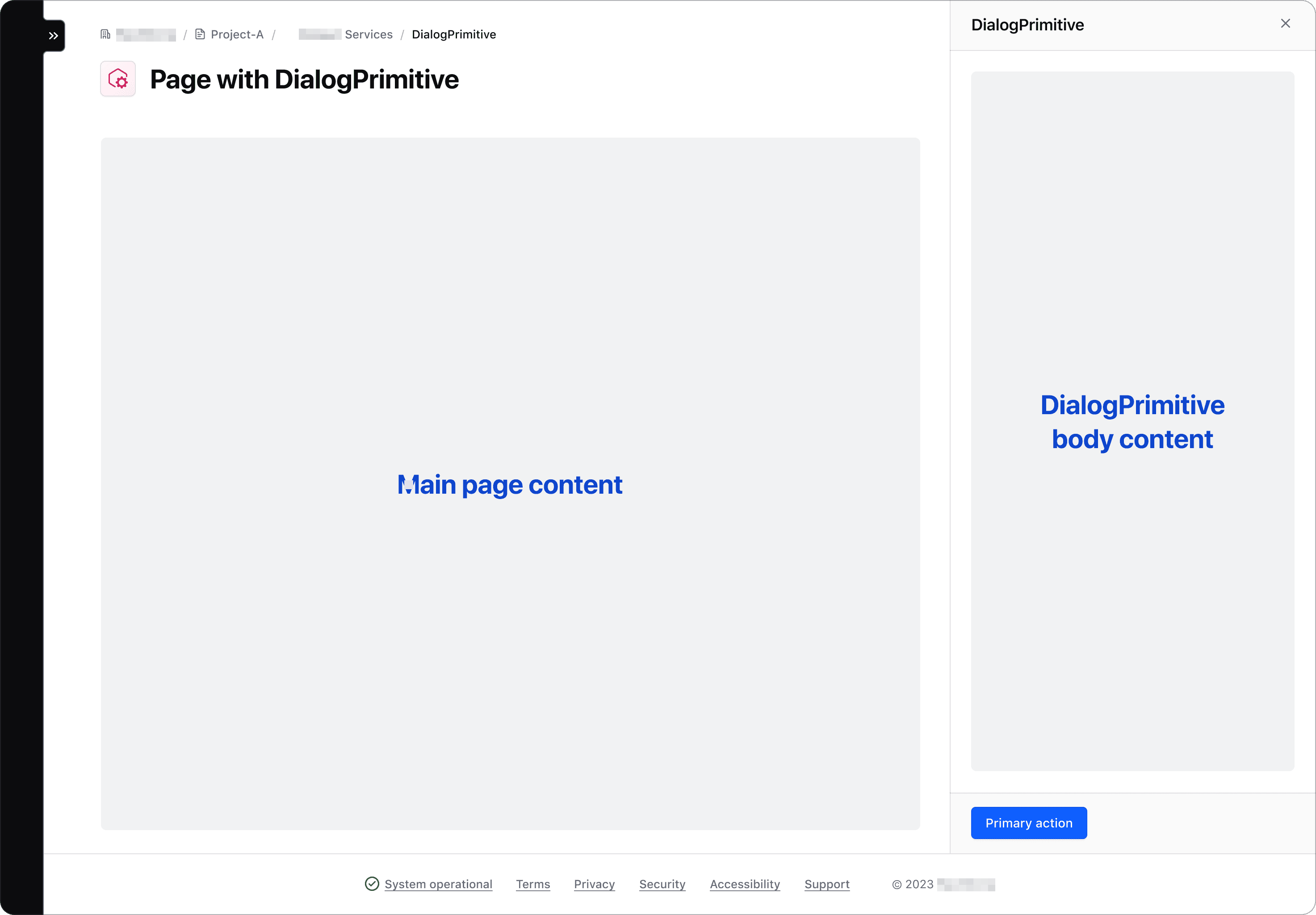
A common example of a non-modal dialog is a SplitWindow, Panel, or Drawer. This type of component allows the user to interact with both the main page content and the content within the dialog.
If you discover other use cases, contact the Design Systems Team for assistance.
How to use a dialog
A dialog is a real HTML element: <dialog>. You almost never have to write one, because Modal and Flyout are that element with our header, body and footer already inside it:
A modal is a <dialog> the browser opened with showModal(): focus stays
inside it, Esc closes it, and the page behind it cannot be clicked or tabbed into.
<i80-button color="primary" opens="dialog-example">Open the dialog</i80-button>
<i80-modal id="dialog-example" heading="Title" tagline="Tagline" icon="info">
<p class="i80-typography-body-300 i80-foreground-primary">
A modal is a <code><dialog></code> the browser opened with <code>showModal()</code>: focus stays
inside it, Esc closes it, and the page behind it cannot be clicked or tabbed into.
</p>
<div class="i80-button-set" slot="footer">
<i80-button color="primary" close>Primary</i80-button>
<i80-button color="secondary" close>Secondary</i80-button>
</div>
</i80-modal>Reach for a <dialog> of your own only when the layout you need is not a modal or a flyout — a split window, a panel or a drawer that sits inside the page instead of floating above it.
What the browser does for you
Open a dialog with showModal() and the browser, not our code:
- moves focus into the dialog and keeps it there while it is open,
- makes everything behind it inert, so a click or a Tab cannot reach it,
- puts it in the top layer, above every
z-indexon the page, - closes it on
Esc, first firing acancelevent you can stop, - paints the backdrop, which you style with
::backdrop.
show() opens the same element without any of the last four: no focus trap, no inert page, no Esc. That is what a non-modal dialog wants.
A <button> inside a <form method="dialog"> closes the dialog and reports its value in returnValue, with no JavaScript at all.
A dialog with a layout of your own
Write the <dialog> yourself and use our classes for the parts. open on the element, with no showModal(), is a non-modal dialog: the reader can keep using the page around it.
Page title
<div class="doc-dialog-primitive-grid-layout">
  <div class="doc-dialog-primitive-flex-layout">
    <h1 class="i80-text i80-typography-display-500 i80-font-weight-bold">Page title</h1>
    <div style="min-height: 10rem; background: #eee"></div>
  </div>

  <dialog open class="i80-dialog-primitive__wrapper doc-dialog-primitive-with-border" aria-labelledby="split-window-title">
    <div class="i80-dialog-primitive__wrapper-header">
      <div class="i80-dialog-primitive__header">
        <i80-icon name="info" size="24" class="i80-dialog-primitive__icon"></i80-icon>
        <h2 class="i80-dialog-primitive__title" id="split-window-title">
          <div class="i80-text i80-typography-body-100 i80-dialog-primitive__tagline">Tagline</div>
          <div class="i80-text i80-typography-display-300 i80-font-weight-semibold">Split window</div>
        </h2>
        <button type="button" class="i80-dismiss-button i80-dialog-primitive__dismiss" aria-label="Close the split window">
          <i80-icon name="x"></i80-icon>
        </button>
      </div>
    </div>

    <div class="i80-dialog-primitive__wrapper-body">
      <div class="i80-dialog-primitive__body">
        <div style="min-height: 8rem; background: #eee"></div>
      </div>
    </div>

    <div class="i80-dialog-primitive__wrapper-footer">
      <div class="i80-dialog-primitive__footer">
        <div class="i80-button-set">
          <i80-button color="primary">Primary</i80-button>
          <i80-button color="secondary">Secondary</i80-button>
        </div>
      </div>
    </div>
  </dialog>
</div>
Heading level
The title of a dialog is a heading, and the level has to fit the page it sits in. When a dialog is used as a split window next to a page title, its title is an <h2>.
The parts of a dialog
A dialog is a <dialog> element with four areas inside it. Modal and Flyout build all of them from their own attributes; in a dialog you write yourself, these are the classes to use.
| Class | What it is |
|---|---|
i80-dialog-primitive__wrapper |
On the <dialog> itself. Lays the areas out in a column and paints the surface. |
i80-dialog-primitive__wrapper-header |
The header band. It hides itself when it is empty. |
i80-dialog-primitive__header |
The row inside the header: icon, title, dismiss button. |
i80-dialog-primitive__icon |
An optional 24px icon before the title. |
i80-dialog-primitive__title |
The heading. Pick the level yourself: <h1> … <h6>. |
i80-dialog-primitive__tagline |
Small text above the title, inside the heading. |
i80-dialog-primitive__dismiss |
The close button. Combine with i80-dismiss-button and give it an aria-label. |
i80-dialog-primitive__description |
Optional text under the header row. |
i80-dialog-primitive__wrapper-body |
The scrolling area. |
i80-dialog-primitive__body |
The padding around the main content. |
i80-dialog-primitive__wrapper-footer |
The footer band. It hides itself when it is empty. |
i80-dialog-primitive__footer |
The padding around the actions. A tertiary button inside i80-button-set is pushed to the end. |
i80-dialog-primitive__overlay |
The backdrop, if you want one behind a dialog you open with show(). A dialog opened with showModal() gets ::backdrop from the browser instead. |
What the element itself gives you
These are the <dialog> element's own API, not ours — see MDN.
| Member | Notes |
|---|---|
showModal() |
Opens it in the top layer, traps focus, makes the page behind inert, closes on Esc. |
show() |
Opens it in place, with none of the above. For a dialog inside the page. |
close(returnValue) |
Closes it and sets returnValue. |
open |
Attribute and property. Setting the attribute in HTML opens a non-modal dialog. |
cancel event |
Fired on Esc before closing; cancel it to keep the dialog open. |
close event |
Fired after it closes, however it closed. |
<form method="dialog"> |
A submit button inside closes the dialog and reports its value — no JavaScript. |
::backdrop |
The pseudo-element behind a dialog opened with showModal(). |
See Web Components for loading i80.js.
Anatomy
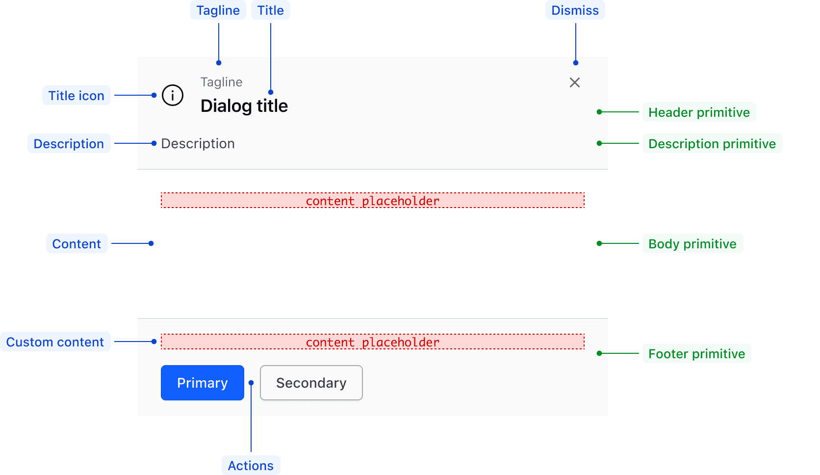
| Element | Usage |
|---|---|
| Header | |
| Title | Required |
| Title icon | Optional |
| Tagline | Optional |
| Dismiss button | Required |
| Description | |
| Description | Optional |
| Body | |
| Content | Required |
| Footer | |
| Actions | Optional; maximum of three (primary, secondary, and tertiary) |
| Custom content | Optional |
Conformance rating
A dialog you write yourself is a set of containers, and containers cannot be conformant on their own. Modal and Flyout are conformant as they come; if you build a dialog from the <dialog> element and these classes, the accessible name, the heading level and the accessible name of the dismiss button are yours to get right.
Applicable WCAG Success Criteria
This section is for reference only. This component intends to conform to the following WCAG Success Criteria:
-
1.1.1
Non-text Content (Level A):
All non-text content that is presented to the user has a text alternative that serves the equivalent purpose. -
1.3.1
Info and Relationships (Level A):
Information, structure, and relationships conveyed through presentation can be programmatically determined or are available in text. -
1.3.2
Meaningful Sequence (Level A):
When the sequence in which content is presented affects its meaning, a correct reading sequence can be programmatically determined. -
1.3.3
Sensory Characteristics (Level A):
Instructions provided for understanding and operating content do not rely solely on sensory characteristics of components such as shape, color, size, visual location, orientation, or sound. -
1.3.5
Identify Input Purpose (Level AA):
The purpose of each input field collecting information about the user can be programmatically determined when the input field serves a purpose identified in the Input Purposes for User Interface Components section; and the content is implemented using technologies with support for identifying the expected meaning for form input data. -
1.4.1
Use of Color (Level A):
Color is not used as the only visual means of conveying information, indicating an action, prompting a response, or distinguishing a visual element. -
1.4.10
Reflow (Level AA):
Content can be presented without loss of information or functionality, and without requiring scrolling in two dimensions. -
1.4.11
Non-text Contrast (Level AA):
The visual presentation of the following have a contrast ratio of at least 3:1 against adjacent color(s): user interface components; graphical objects. -
1.4.12
Text Spacing (Level AA):
No loss of content or functionality occurs by setting all of the following and by changing no other style property: line height set to 1.5; spacing following paragraphs set to at least 2x the font size; letter-spacing set at least 0.12x of the font size, word spacing set to at least 0.16 times the font size. -
1.4.13
Content on Hover or Focus (Level AA):
Where receiving and then removing pointer hover or keyboard focus triggers additional content to become visible and then hidden, the following are true: dismissible, hoverable, persistent (see link). -
1.4.3
Minimum Contrast (Level AA):
The visual presentation of text and images of text has a contrast ratio of at least 4.5:1 -
1.4.4
Resize Text (Level AA):
Except for captions and images of text, text can be resized without assistive technology up to 200 percent without loss of content or functionality. -
2.1.1
Keyboard (Level A):
All functionality of the content is operable through a keyboard interface. -
2.1.2
No Keyboard Trap (Level A):
If keyboard focus can be moved to a component of the page using a keyboard interface, then focus can be moved away from that component using only a keyboard interface. -
2.4.2
Page Titled (Level A):
Web pages have titles that describe topic or purpose. -
2.4.3
Focus Order (Level A):
If a Web page can be navigated sequentially and the navigation sequences affect meaning or operation, focusable components receive focus in an order that preserves meaning and operability. -
2.4.6
Headings and Labels (Level AA):
Headings and labels describe topic or purpose. -
2.4.7
Focus Visible (Level AA):
Any keyboard operable user interface has a mode of operation where the keyboard focus indicator is visible. -
3.2.1
On Focus (Level A):
When any user interface component receives focus, it does not initiate a change of context. -
3.2.2
On Input (Level A):
Changing the setting of any user interface component does not automatically cause a change of context unless the user has been advised of the behavior before using the component. -
3.3.1
Error Identification (Level A):
If an input error is automatically detected, the item that is in error is identified and the error is described to the user in text. -
3.3.2
Labels or Instructions (Level A):
Labels or instructions are provided when content requires user input. -
3.3.3
Error Suggestion (Level AA):
If an input error is automatically detected and suggestions for correction are known, then the suggestions are provided to the user, unless it would jeopardize the security or purpose of the content. -
3.3.4
Error Prevention (Legal, Financial, Data) (Level AA):
For Web pages that cause legal commitments or financial transactions for the user to occur, that modify or delete user-controllable data in data storage systems, or that submit user test responses, at least one of the following is true: submissions are reversible, data is checked and user is provided an opportunity to correct them, a mechanism is available for reviewing, confirming and correcting the information before finalizing the submission. -
4.1.2
Name, Role, Value (Level A):
For all user interface components, the name and role can be programmatically determined; states, properties, and values that can be set by the user can be programmatically set; and notification of changes to these items is available to user agents, including assistive technologies. -
4.1.3
Status Messages (Level AA):
In content implemented using markup languages, status messages can be programmatically determined through role or properties such that they can be presented to the user by assistive technologies without receiving focus.
Support
If any accessibility issues have been found within this component, let us know by submitting an issue.
0.1.0
Første i80-version (fork af upstream, se core/UPSTREAM.md).