Alerts display brief and important messages that capture the user’s attention but don’t interrupt their workflow.
Usage
When to use
- To display a concise, important message that requires the user’s attention.
When not to use
- To communicate successful feedback on a user’s action, consider Toast.
- As a dialog to confirm an action, consider Modal.
- To flag new features (e.g., "In Preview", "Beta", "New", etc), consider Badge.
Types of alerts
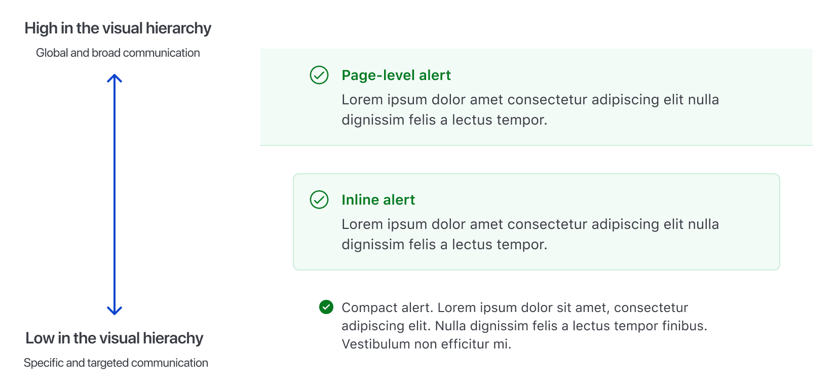
There are three types of alerts: page, inline, and compact.
Page
Use page-level alerts on the top of the page, between the navigation and the breadcrumb to inform users of an event that may require the user’s attention or action.
Inline
Use inline alerts when the message is contextual or specific to the section it’s placed in.
Compact
Use compact alerts when a less prominent alert is needed.
Ordering Alerts by type
Alert types have an implied hierarchy and should be ordered starting from page and descending in hierarchy to compact.
Color
Informational alerts
Informational alerts are non-urgent, non-disruptive alerts that don’t require immediate attention and will not notify users with assistive technology.
Neutral alerts
Use neutral alerts to show general information regarding the current context or relevant actions.
Highlight alerts
Use highlight alerts to show more prominent general information or promotional content.
Status alerts
Status alerts, such as success, warning, and critical, will immediately notify users with assistive technology.
Success alerts
Use success alerts to indicate a successful action. Use it sparingly. To communicate success after a user action is performed, use Toast.
Warning alerts
Use warning alerts to help users avoid an issue. Provide guidance and actions, if possible.
Critical alerts
Use critical alerts to indicate critical errors, such as validation errors, that require user attention or action.
Use the Alert for more intrusive message communication about errors or critical disruptions at an application, page, or section level where users need to take immediate action.
Use the Alert to communicate validation errors. For more details, refer to the form validation patterns.
Don't use alerts to provide non-intrusive feedback to users about the failure of an ongoing task or request. For example, a failure while deleting a cluster. Use the Toast instead.
Don't use alerts to communicate error messages that are not caused by the user. For example, an unsuccessful Vault cluster creation due to a failure while validating the deployment. Use the Toast instead.
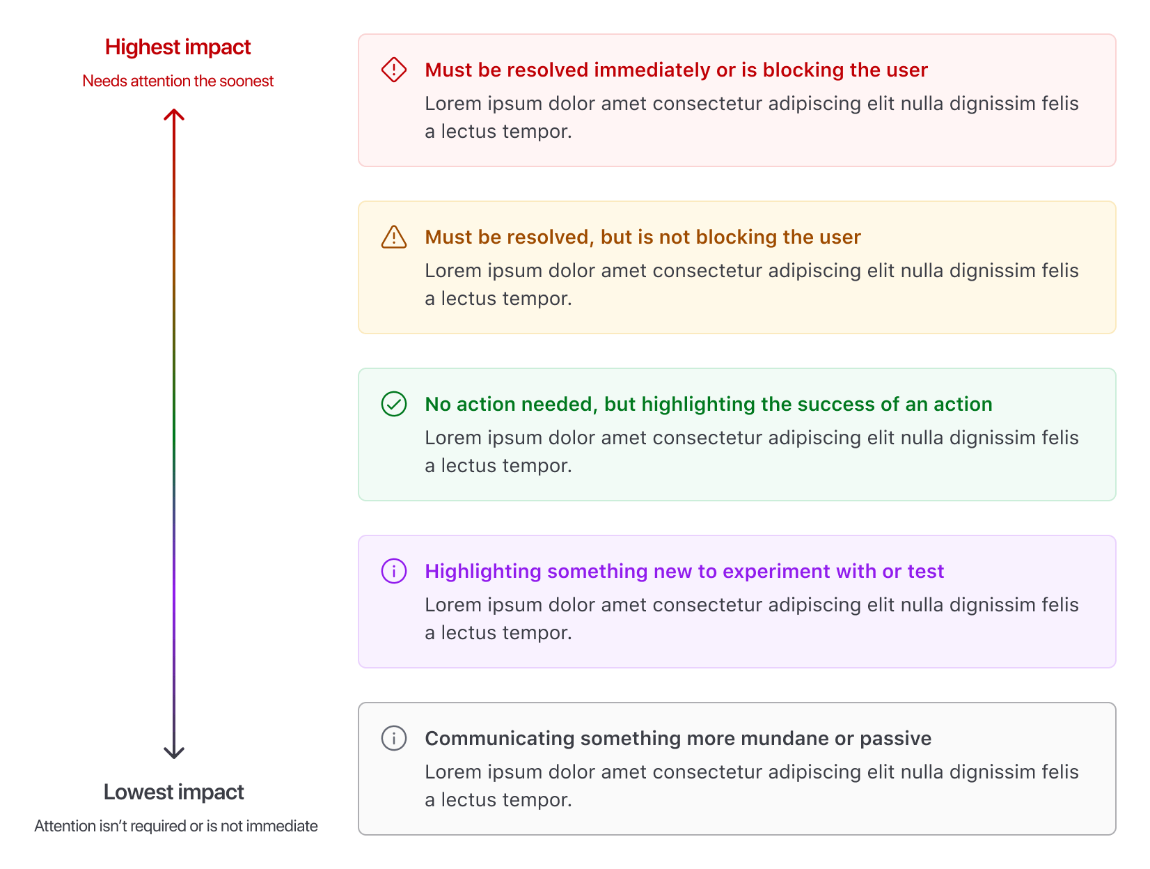
Ordering Alerts by color
Order multiple Alerts by their importance and impact on the user, starting from critical, to communicate an Alert that must be resolved immediately, and descending in order of perceived impact to neutral.
Placing Alerts
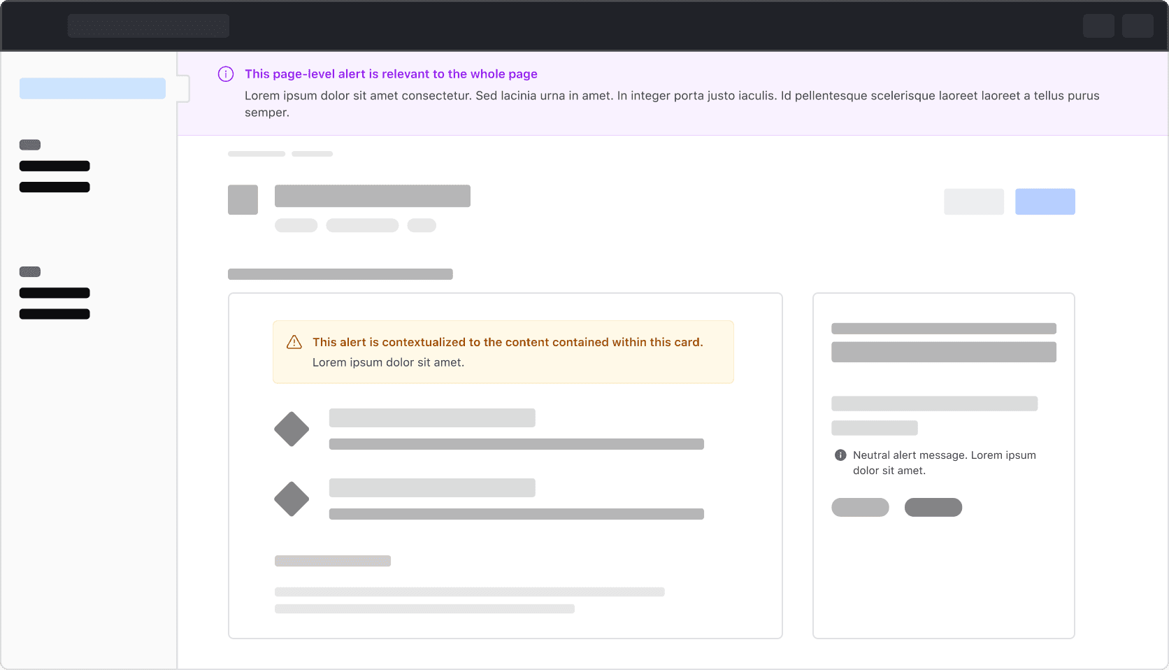
Inline and compact Alerts can have more meaning if they are placed within the element that is responsible for the Alert. This can help when it’s necessary to have more than one Alert on the page and is relevant for pages that aggregate content like dashboards, or where a specific message is necessary.
Placement by type
Where an Alert is placed is dependent on the type.
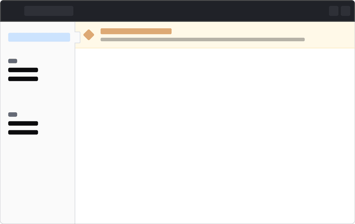
Page
Page alerts are placed between the global header navigation and the breadcrumb, next to the left navigation.
Inline
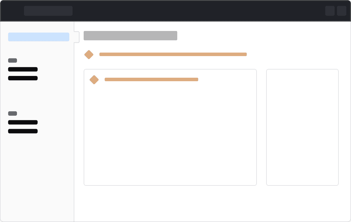
Inline alerts can be added to a section or component or inline with content.
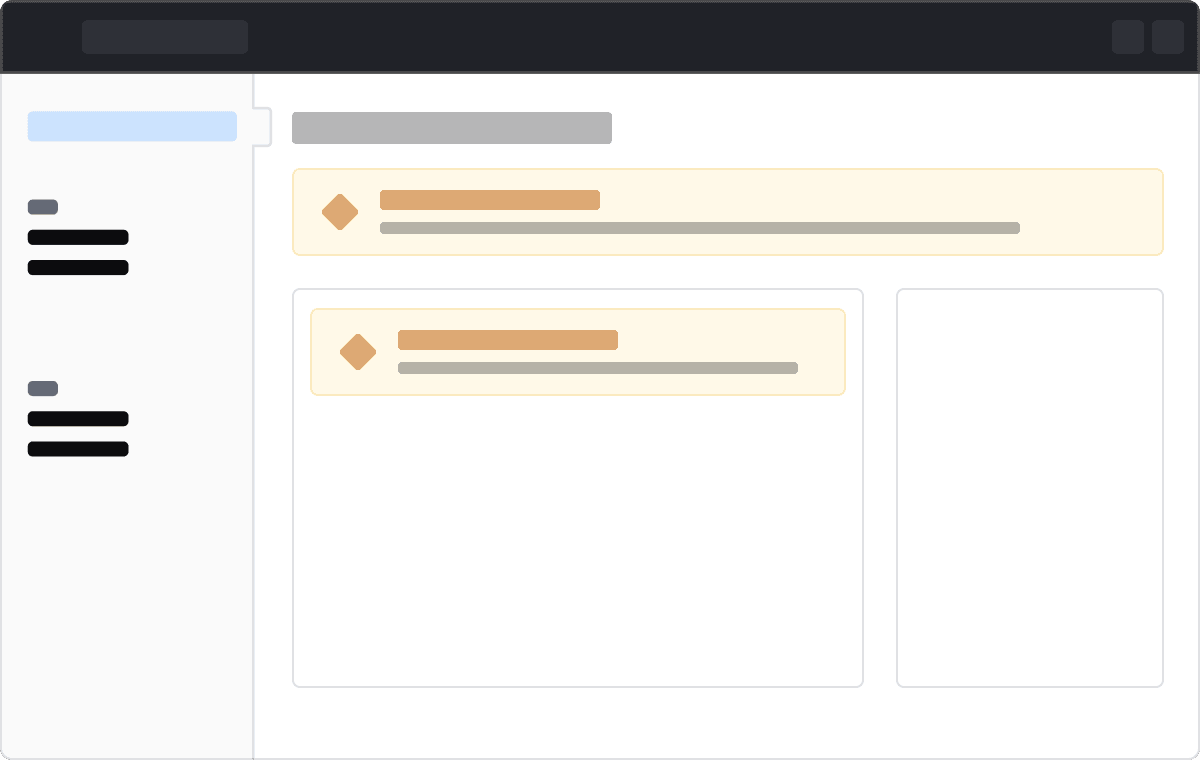
Compact
Compact alerts can be added to a section or component or inline with content.
Mixing Alert types
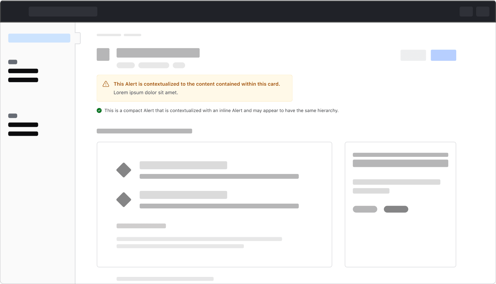
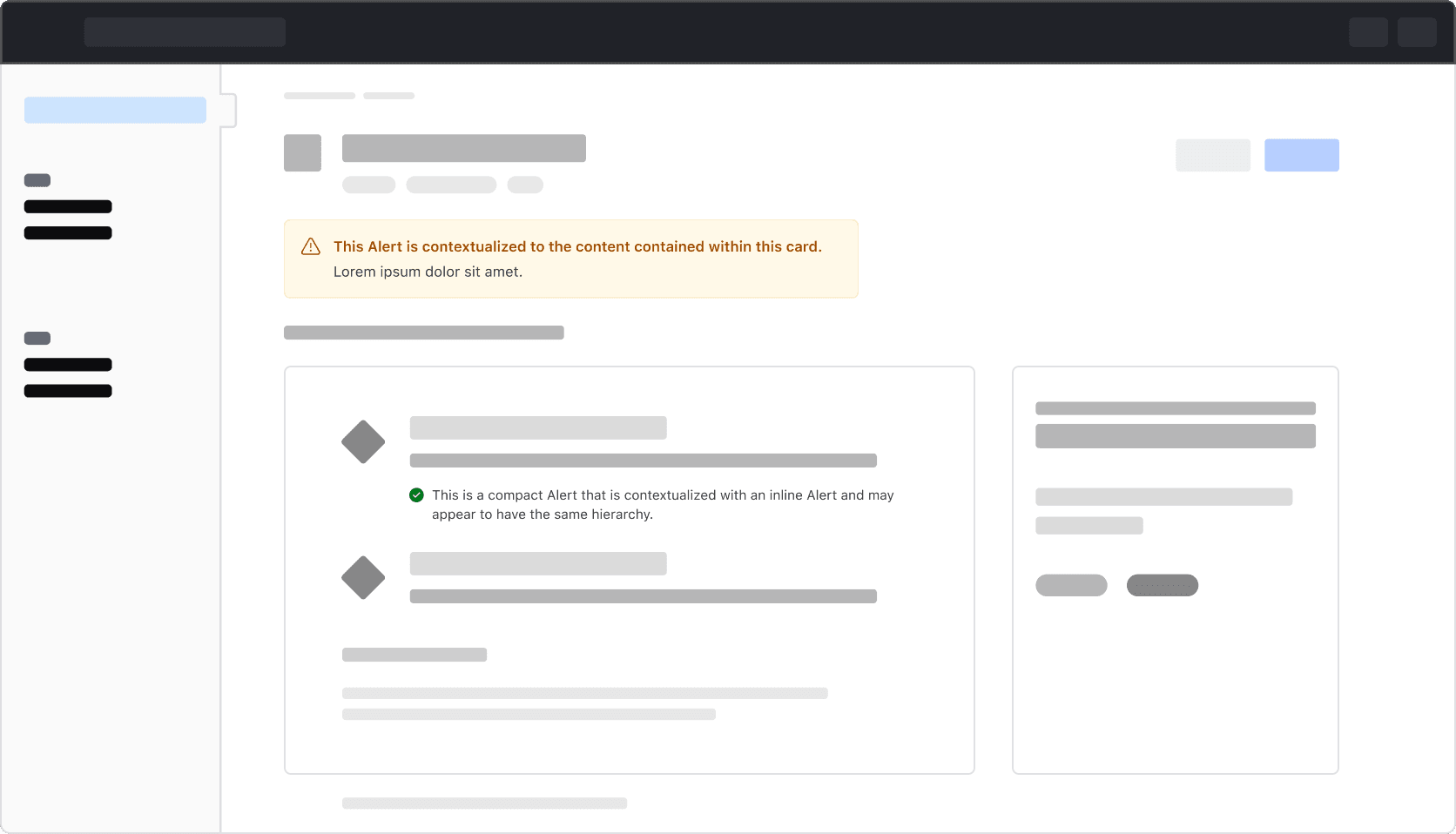
We recommend against mixing different types of Alerts in the same context, as this can unintentionally convey that different Alert types have the same hierarchical impact.
Don’t mix different Alert types in the same context.
Instead, be more specific with how the Alerts are placed depending on what the message applies to.
Icons
All alerts have icons by default that are intentionally tied to the alert type.
Icons within the neutral and highlight alerts can be replaced with other icons. Change them only when the new icon provides the user with extra value; otherwise, use the default icon provided.
Dismissal
Persistent
All alerts are persistent by default, while compact alerts are always persistent.
Dismissible
Page and inline alerts can be dismissible.
We recommend setting neutral and highlight alerts to be dismissible, as they are not critical for users to complete their journey.
We recommend keeping critical alerts non-dismissible as they are essential to the user’s journey and can get dismissed by mistake.
Multiple alerts
In general, displaying multiple alerts on the same page is discouraged as it can negatively impact the page hierarchy and unnecessarily shift emphasis away from the main content on the page.
However, depending on the logic within the application and the type of content being expressed to the user, displaying more than one Alert on a page may be necessary.
Alerts of the same color
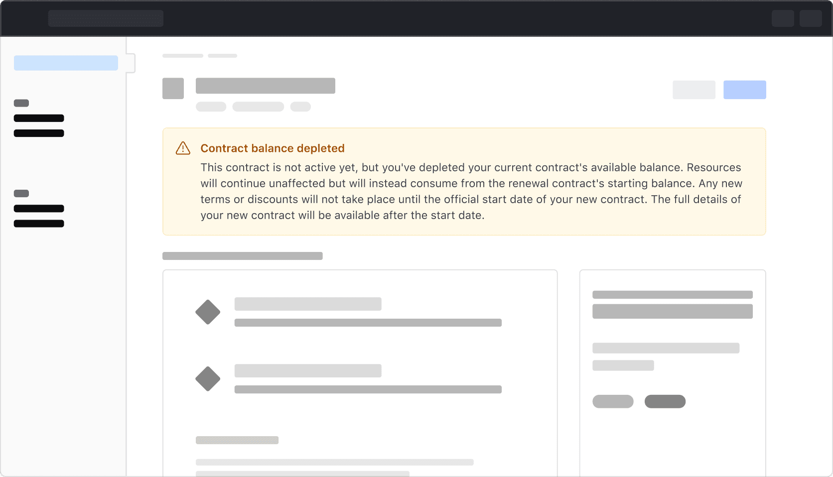
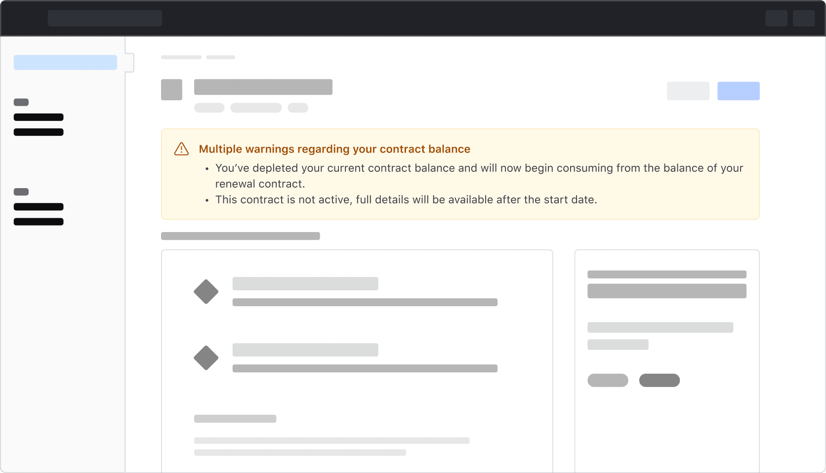
While it might not always be possible depending on the type of content and intended action, try to refrain from displaying more than one of the same color Alert on the same page. This adds unnecessary visual weight to the page and may result in the user being confused about which Alert is more important or which might require attention first.
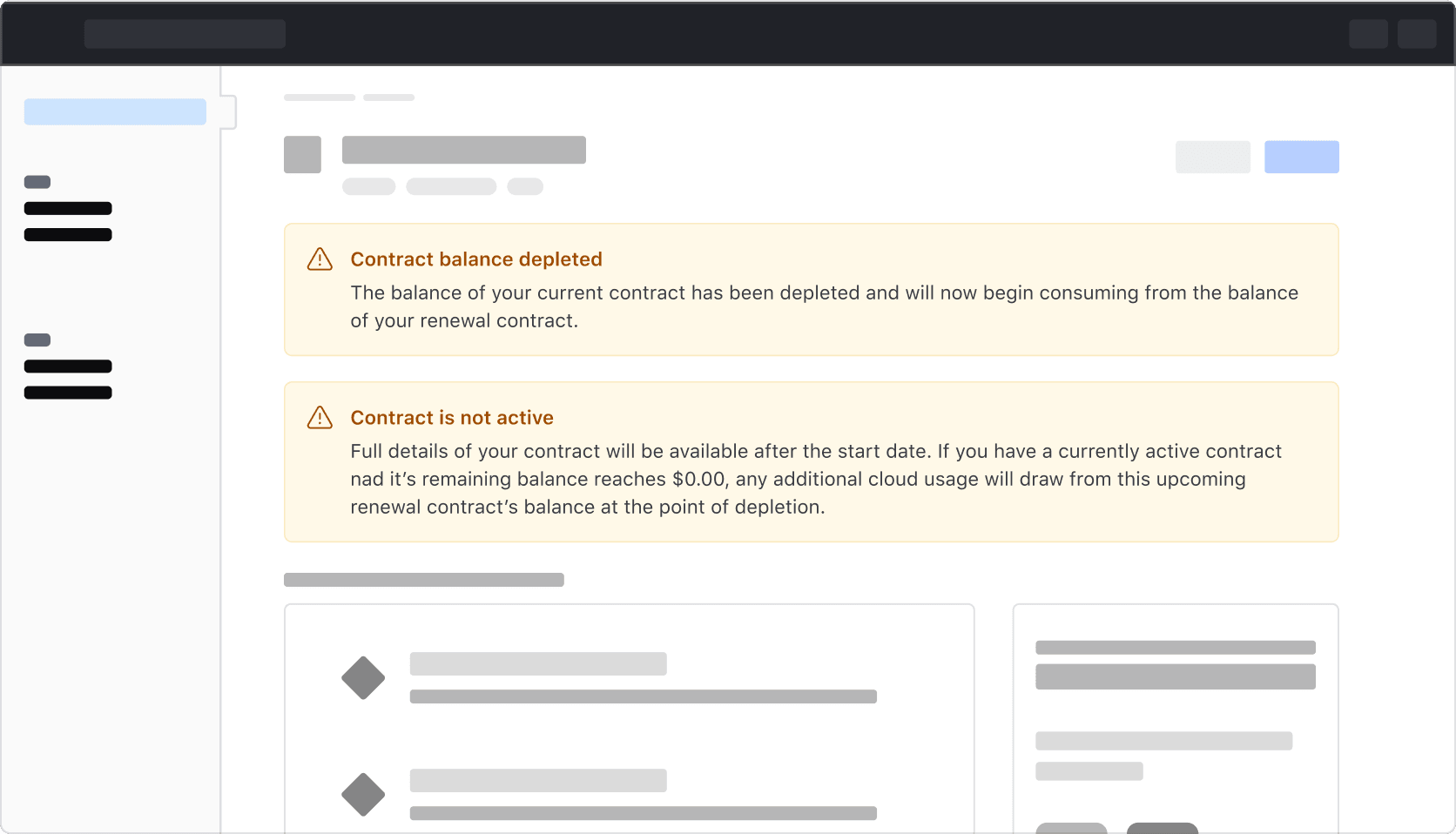
To avoid this, try combining relevant or overlapping content into a single Alert with a more concise narrative, or by translating the related messages into a list.
Alerts of the same type
While not recommended for page type Alerts, it may be necessary to have more than one inline or compact Alert on a page. If this is the case, ensure that the Alerts are ordered by impact and placed in areas where they provide the most relevance.
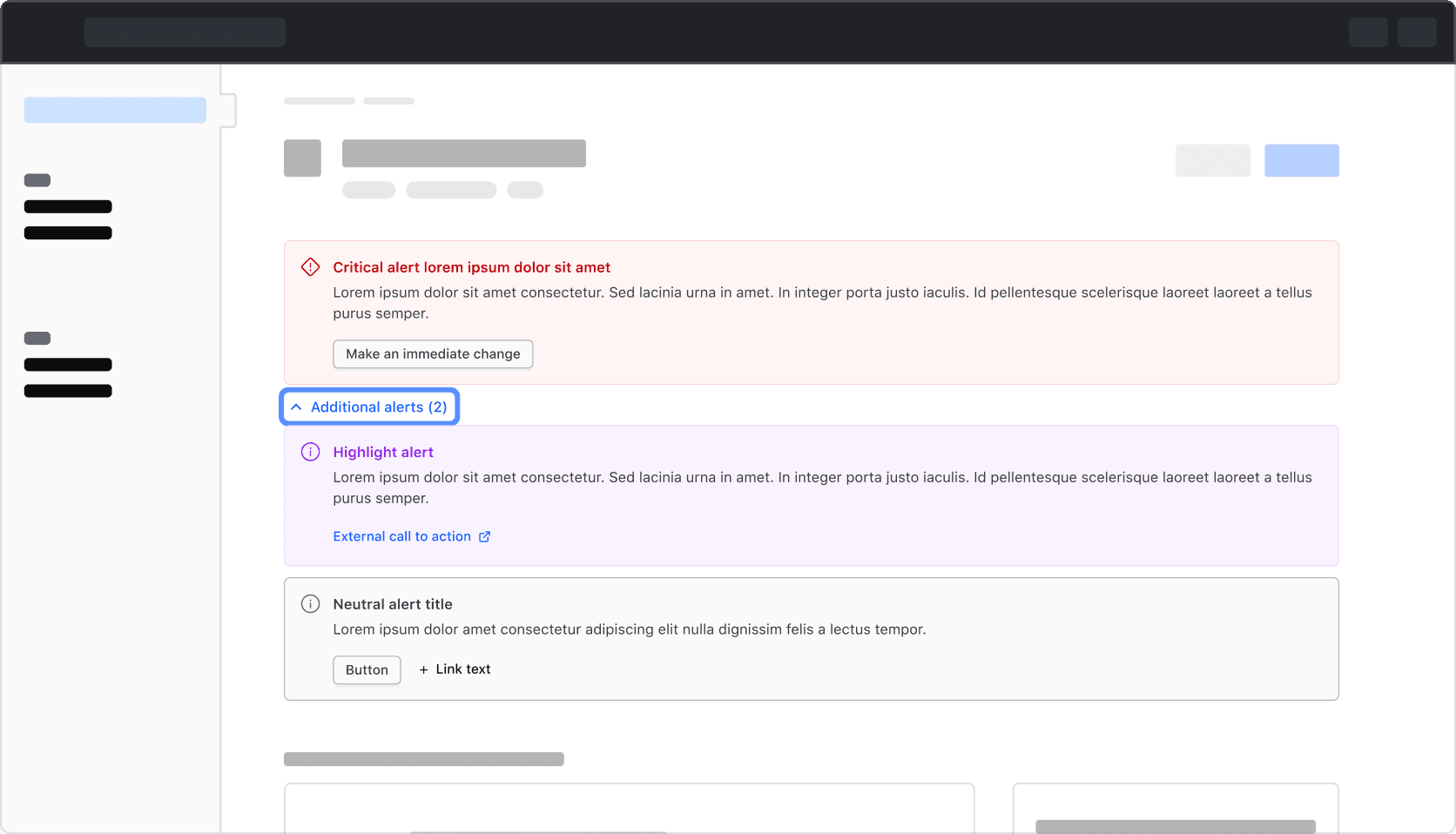
Alerts within a Reveal
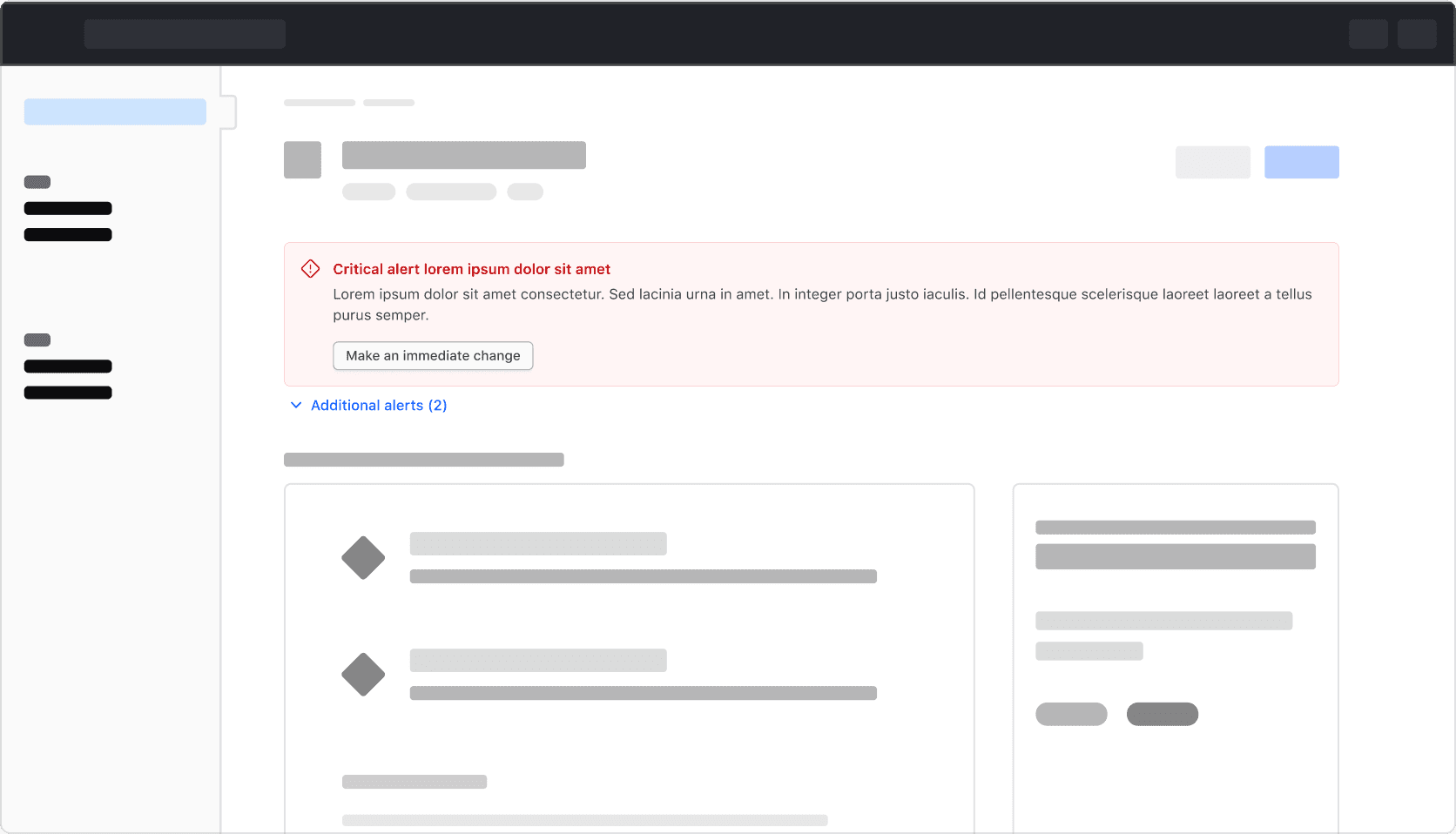
As a last resort, when multiple Alerts of the same type are necessary, display the Alerts that require immediate attention or have the most impact to the user within the page while obfuscating additional Alerts within a Reveal. We recommend against hiding critical and warning Alerts in this manner as they generally must be addressed quickly to avoid a negative outcome.
This pattern is somewhat experimental, if you find a use case for it we recommend performing a usability test and collecting user feedback as a means to validate the pattern. The I80 team would love to discuss your findings through our normal support channels.
How to use this component
The most basic invocation requires the type attribute, along with a title and/or a description: the title is the heading attribute and the description is the content you write inside the tag. By default, a neutral Alert is generated.
<i80-alert type="inline" heading="Title here">Description here</i80-alert>Type
A different type of Alert can be invoked using the type attribute.
<i80-alert type="page" heading="Title here">Description here</i80-alert>
<i80-alert type="compact" heading="Title here">Description here</i80-alert>
Title and description
Optionally, you can pass only the title or only the description.
<i80-alert type="inline" heading="Title here"></i80-alert>
<i80-alert type="inline">Description here</i80-alert>
Color
The available color values are neutral (the default), highlight, success, warning, and critical. Setting a color value will also determine the default icon used in the Alert, although it is customizable.
The color value will also determine some accessibility features of the component, so this should be taken into consideration when choosing which Alert color value to use.
If the alert is being used in an informational or promotional way, neutral or highlight colors should be chosen.
The other color values map to accessibility-related roles, and will ensure that essential information is presented to the user with assistive technology in a timely manner.
<i80-alert type="inline" color="success" heading="Title here">Description here</i80-alert>Icons
A different icon can be used in the Alert using the icon attribute. This accepts any icon name.
<i80-alert type="inline" color="success" icon="bulb" heading="Title here">Description here</i80-alert>If you need to hide the icon, set icon="false". This is only an option on page and inline Alerts as compact Alerts require an icon.
<i80-alert type="inline" color="success" icon="false" heading="Title here">Description here</i80-alert>Dismissal
To enable dismissibility, add the dismissible attribute. This will add a dismiss button to the Alert. When that button is clicked, the element fires a cancelable i80-dismiss event and then removes the Alert; cancel the event if the removal needs to be handled elsewhere.
<i80-alert type="inline" color="warning" heading="Title here" dismissible>Description here</i80-alert>Actions
Actions are the buttons and links you write inside the tag: an <i80-button> or an <i80-link-standalone> becomes an action.
<i80-alert type="inline" heading="Title here">
  Description here
  <i80-button color="secondary">Your action</i80-button>
  <i80-link-standalone color="secondary" icon="arrow-right" icon-position="trailing" href="#">Another action</i80-link-standalone>
</i80-alert>
Structured content
When needed, the description can contain rich HTML or structured content.
code, pre, and
<i80-alert type="inline" color="success" heading="Title here">
  The description can contain HTML tags, like <strong>strong text</strong>,
  <em>emphasized text</em>, <code>code</code>, <pre>pre</pre>, and
  <i80-link-inline color="secondary" href="#">inline links</i80-link-inline>.
</i80-alert>
You can write more than one block-level element inside the tag to have multiple description lines.
<i80-alert type="inline" color="success" heading="Title here">
  <div>First line of description.</div>
  <div>Second line of description.</div>
</i80-alert>
Attributes
<i80-alert> renders this component. Everything it understands:
| Attribute | Values | Default | Notes |
|---|---|---|---|
type |
page · inline · compact | inline |
|
color |
neutral · highlight · success · warning · critical | neutral |
|
heading |
text | The title. | |
icon |
icon name · false | by color |
|
dismissible |
boolean | Adds a close button; fires a cancelable i80-dismiss event, then removes the alert. |
The tag keeps any native element you write inside it, so a server-rendered form, link or button works as it is. See Web Components for loading i80.js and the reference for these examples running.
Anatomy
Page and inline alerts
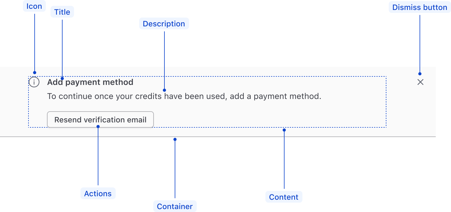
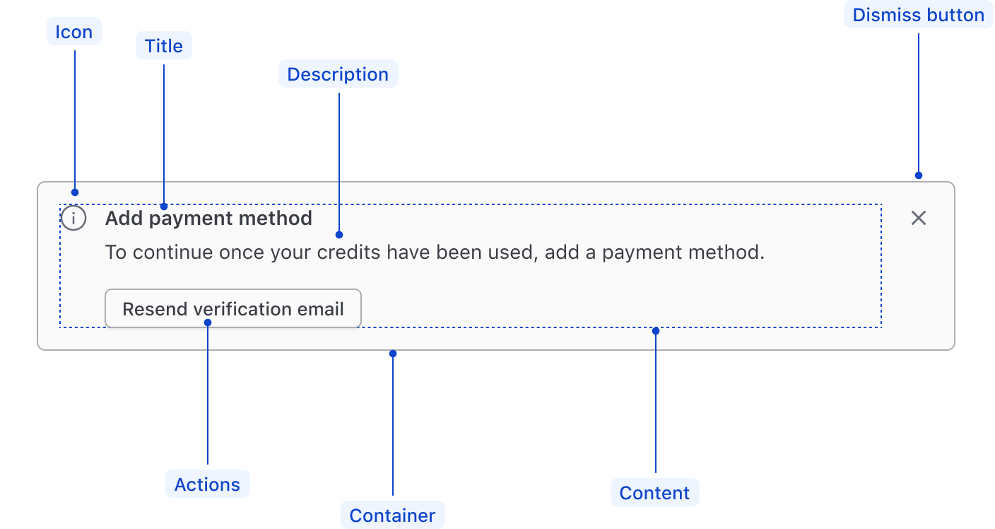
| Element | Usage |
|---|---|
| Icon | Optional, but recommended |
| Title | Required, if no description; optional, otherwise |
| Description | Required, if no title; optional, otherwise |
| Actions | Optional |
| Dismiss button | Optional |
| Content | Required |
| Container | Required |
Compact alerts

| Element | Usage |
|---|---|
| Icon | Required |
| Description | Required |
General recommendations
- Keep the title short, as this will be the most prominent element when users scan the Alert.
- Avoid ending the title with a period.
- Alert descriptions should be short but clear enough to explain what’s happening. We recommend keeping messages under 90 characters.
- For warning and critical alerts, guide the users on how to prevent or fix the issue.
Actions
Use small buttons to avoid competing with other actions on the page. Use more than two actions sparingly.
We recommend using the secondary button variant for primary actions and the tertiary button variant for secondary actions.
For content guidelines on actions, refer to Button and Link documentation.
Usage of critical buttons
Avoid using critical buttons in alerts. We handle the prominence and importance via the styling of the alert container itself. If you need to confirm that the user intended to interact with the action, consider displaying a confirmation modal.
Links
Within page and inline Alerts
When linking to internal and external resources in the Alert, default to using a secondary Standalone Link in the actions area.
Within the Alert description, use the secondary Inline Link as the default link color. A common use case for this is when linking to multiple resources.
Wrap links to multiple related items on the same page in a list, e.g., when highlighting multiple form validation errors.
Email address First name Billing address
Within compact Alerts
As compact Alerts don’t support a title or actions, use secondary Inline Links in the description of the component. This matches the intended hierarchy of the component relative to other Alert types and supports linking to multiple resources.
If there is only one link within the compact alert, it’s acceptable to use the primary color, but this will result in increased prominence and elevated hierarchy.
Don’t mix and match different link colors in the same compact Alert.
Don’t use a Standalone Link in the description of a compact Alert. The description area is intended for inline content, while the Standalone Link is a block-level element.

Composition
Page and inline alerts can be configured in a variety of ways. For example:
With icon and title
With icon, title, and description
Title and description only
The title or description should contain the alert type, e.g., “Warning,” if no icon is present.
With actions
With generic content
Conformance rating
When used as recommended, there should not be any WCAG conformance issues with this component.
Best practices
Notification
A success, warning or critical Alert is a live region: <i80-alert> gives it role="alert" and aria-live="polite", so it is announced as soon as it appears. Put an alert of those colors on the page only when the message is worth interrupting for.
When such an alert contains a button or a link, the role becomes alertdialog instead, so assistive technology announces that there is something to act on inside it.
A neutral or highlight Alert is not a live region and is not announced — it is ordinary page content that happens to be in a box. That is deliberate: use those two for a standing note, and a semantic color for something that has just happened.
Dismissing the alert
Since alerts are not required to receive focus, it should not be required that the user close the alert. The dismissible attribute adds a Dismiss button for people who want the space back; nothing should depend on their pressing it.
Applicable WCAG Success Criteria
This section is for reference only. This component intends to conform to the following WCAG Success Criteria:
-
1.3.1
Info and Relationships (Level A):
Information, structure, and relationships conveyed through presentation can be programmatically determined or are available in text. -
1.3.2
Meaningful Sequence (Level A):
When the sequence in which content is presented affects its meaning, a correct reading sequence can be programmatically determined. -
1.4.1
Use of Color (Level A):
Color is not used as the only visual means of conveying information, indicating an action, prompting a response, or distinguishing a visual element. -
1.4.10
Reflow (Level AA):
Content can be presented without loss of information or functionality, and without requiring scrolling in two dimensions. -
1.4.11
Non-text Contrast (Level AA):
The visual presentation of the following have a contrast ratio of at least 3:1 against adjacent color(s): user interface components; graphical objects. -
1.4.12
Text Spacing (Level AA):
No loss of content or functionality occurs by setting all of the following and by changing no other style property: line height set to 1.5; spacing following paragraphs set to at least 2x the font size; letter-spacing set at least 0.12x of the font size, word spacing set to at least 0.16 times the font size. -
1.4.3
Minimum Contrast (Level AA):
The visual presentation of text and images of text has a contrast ratio of at least 4.5:1 -
2.1.1
Keyboard (Level A):
All functionality of the content is operable through a keyboard interface. -
2.1.2
No Keyboard Trap (Level A):
If keyboard focus can be moved to a component of the page using a keyboard interface, then focus can be moved away from that component using only a keyboard interface. -
2.2.1
Timing Adjustable (Level A):
If there are time limitations set by the content, one of the following should be true: turn off, adjust, extend, real-time exception, essential exception, 20 hour exception. -
2.5.3
Label in Name (Level A):
For user interface components with labels that include text or images of text, the name contains the text that is presented visually. -
4.1.2
Name, Role, Value (Level A):
For all user interface components, the name and role can be programmatically determined; states, properties, and values that can be set by the user can be programmatically set; and notification of changes to these items is available to user agents, including assistive technologies. -
4.1.3
Status Messages (Level AA):
In content implemented using markup languages, status messages can be programmatically determined through role or properties such that they can be presented to the user by assistive technologies without receiving focus.
Support
If any accessibility issues have been found within this component, let us know by submitting an issue.
0.1.0
Første i80-version (fork af upstream, se core/UPSTREAM.md).