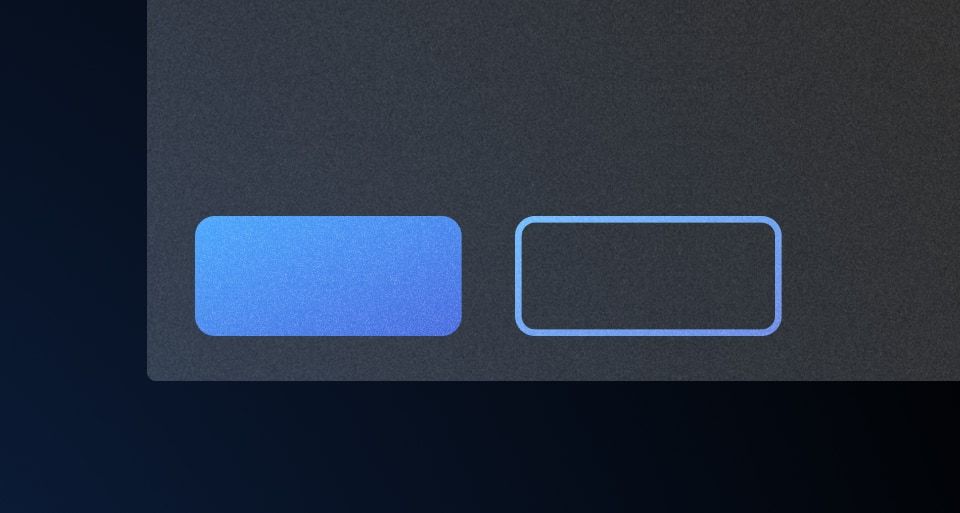
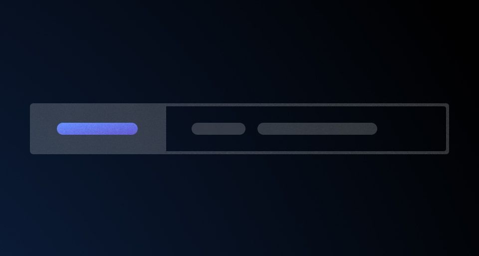
Use a Button Set to ensure a consistent layout when using multiple Buttons in a single row.
Usage
More detailed examples and guidance around button alignment, grouping, and organization can be found in the button organization pattern documentation.
How to use this component
Write two or more buttons inside <i80-button-set>. (With only one button there will be no noticeable visual difference.) A tertiary button is pushed to the end of the row, away from the others.
<i80-button-set>
  <i80-button type="submit">Submit</i80-button>
  <i80-button color="secondary" href="https://i80.dk">Cancel</i80-button>
</i80-button-set>
Other button-like elements, such as the Dropdown, can also be used as children.
<i80-button-set>
  <i80-dropdown text="Select an option" color="secondary">
    <i80-dropdown-title>Title Text</i80-dropdown-title>
    <i80-dropdown-item href="#add">Add</i80-dropdown-item>
    <i80-dropdown-item href="#add-more">Add More</i80-dropdown-item>
    <i80-dropdown-item href="#add-another">Add Another Thing Too</i80-dropdown-item>
    <i80-dropdown-separator></i80-dropdown-separator>
    <i80-dropdown-item href="#delete" icon="trash" color="critical">Delete</i80-dropdown-item>
  </i80-dropdown>
  <i80-button type="submit">Submit</i80-button>
</i80-button-set>
Equal width buttons
If you want buttons with equal widths, add full-width to each button. Since the button set is full-width (100%) by default, you will likely want to constrain its overall width by adding a max-width to the set itself (via an inline style or CSS class).
<i80-button-set style="max-width: 15rem">
  <i80-button full-width>Save</i80-button>
  <i80-button color="secondary" href="https://i80.dk" full-width>Cancel</i80-button>
</i80-button-set>
Attributes
<i80-button-set> renders this component. Everything it understands:
| Attribute | Values | Default | Notes |
|---|
The tag keeps any native element you write inside it, so a server-rendered form, link or button works as it is. See Web Components for loading i80.js and the reference for these examples running.
0.1.0
Første i80-version (fork af upstream, se core/UPSTREAM.md).