Usage
When to use
Use a card container to help build more consistently styled cards.
Types
Static cards
Static cards may contain interactive elements but must not be actionable or interactive on their own. They should not have any shadows applied to them, so that they can be differentiated from an interactive card.

Interactive cards
Interactive cards are actionable, e.g., they can be hovered over, clicked, or focused on.
If you're using an interactive element (like an <a> or <button>) as the main content wrapper inside a Card, avoid placing other interactive elements inside it. This kind of nesting creates accessibility issues—particularly for screen reader users—because nested interactive elements can't be reliably accessed or operated.
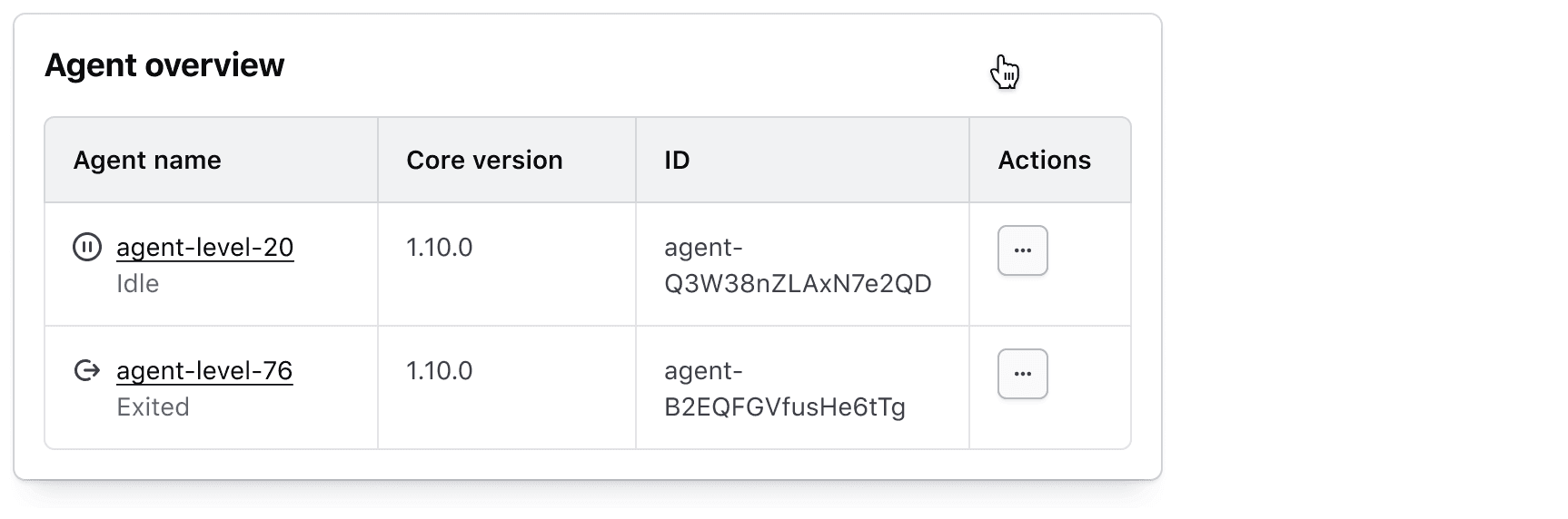
When the card is interactive, only static elements should be contained within it.

Levels
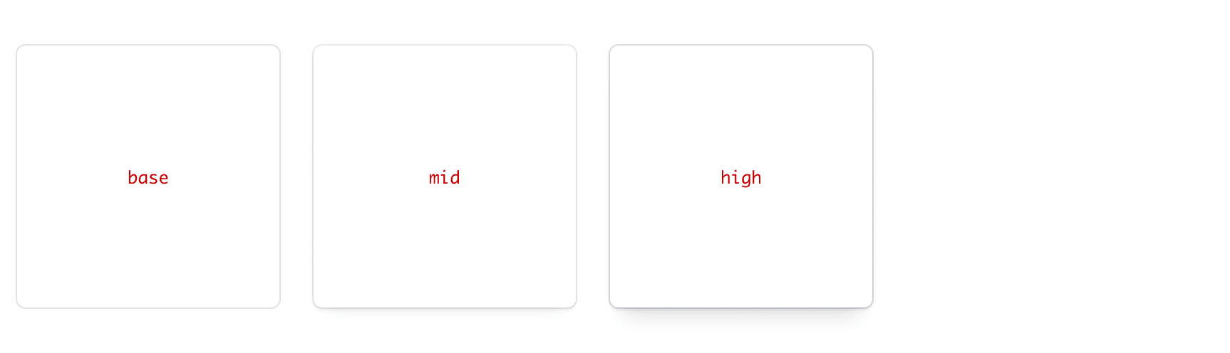
Base
Use for static cards.
Mid
Use for the rested (default) and active (pressed) states of interactive cards.
High
Use for the raised (hover) state of interactive cards.
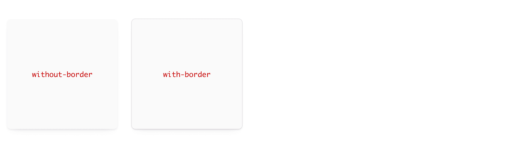
Border
Card containers come with or without borders.
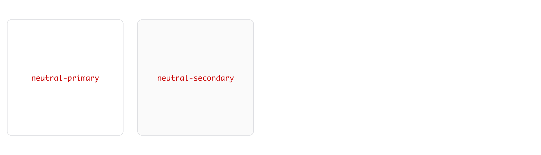
Background
There are two backgrounds available: neutral-primary and neutral-secondary.
Recommended spacing
We recommend the following spacing options for cards:
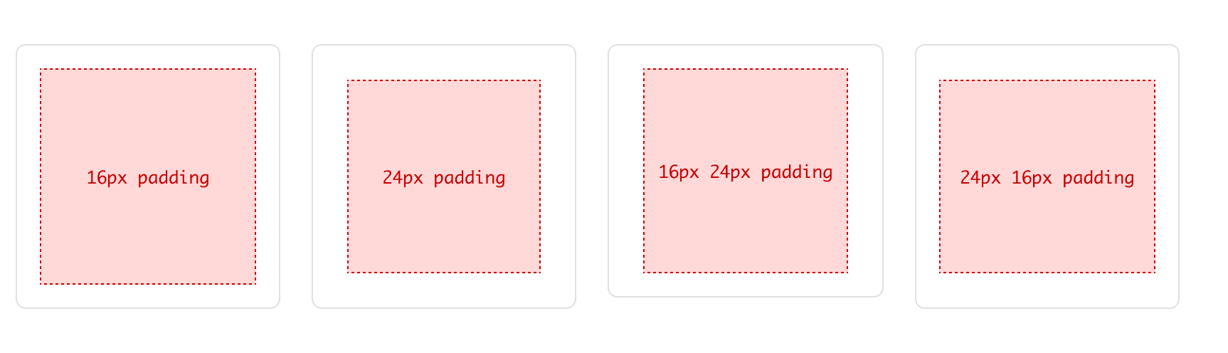
- 16px all around
- 24px all around
- 16px top/bottom; 24px left/right
- 24px top/bottom; 16px left/right
How to use this component
<i80-card level="mid" border>
  <div style="padding: 24px">[Your content here]</div>
</i80-card>
To style the Cards, you can add an external element that wraps the Card, with a custom class that controls the width of the wrapper itself and an internal element that wraps the content and applies padding around it (resulting in visual internal padding for the Card) and aligns the text to the center.
Alternatively, you could use the Card Containers in a CSS flex or grid container.
Using a Card in a list
The Card renders a div. For a card in a list, write the li yourself around it: <li><i80-card border>…</i80-card></li>.
Note: If you choose to use the Card as a list item, you must wrap it either in a ul or ol tag for the markup to be valid. Also note that you are responsible for the related styling for the list and list items.
Card item 1 Card item 2 Card item 3
<ul class="doc-card-list-demo">
  <li class="doc-card-list-demo__item"><i80-card border>Card item 1</i80-card></li>
  <li class="doc-card-list-demo__item"><i80-card border>Card item 2</i80-card></li>
  <li class="doc-card-list-demo__item"><i80-card border>Card item 3</i80-card></li>
</ul>
Interactive states
The level, level-hover, and level-active attributes can be used to declare the specific elevation of the Card for each interactive state. Following the guidelines, this example transitions between mid → high → mid elevation for the corresponding interactive states; default → hover → active.
<i80-card level="mid" level-hover="high" level-active="mid" border>
  <a href="#" style="display: block; padding: 24px">[Your static content here]</a>
</i80-card>
Using SCSS, the .doc-card-interactive-demo class would look something like this:
.doc-card-interactive-demo {
  .i80-card__container {
    a {
      display: block;
      padding: 16px;
      border-radius: inherit;

      &:focus {
        outline: none;
        box-shadow: var(--i80-focus-ring-action-box-shadow);
      }
    }
  }
}
This example implements a basic interactive card which uses a link to wrap the entirety of the static content area. For further assistance on implementing interactive cards, contact the Design System Team.
Attributes
<i80-card> renders this component. Everything it understands:
| Attribute | Values | Default | Notes |
|---|---|---|---|
level / level-hover / level-active |
base · mid · high | base |
|
border |
boolean | Border instead of shadow. | |
background |
neutral-primary · neutral-secondary | neutral-primary |
|
overflow |
visible · hidden | visible |
The tag keeps any native element you write inside it, so a server-rendered form, link or button works as it is. See Web Components for loading i80.js and the reference for these examples running.
Conformance rating
A Card is a container, so its conformance is mostly the conformance of what you put in it. Three things are worth knowing.
<i80-card> lets content overflow by default. If you set overflow="hidden", anything that doesn’t fit is clipped without a scrollbar, and you have to make sure no text is lost that a keyboard-only user would need.
A card is always a <div>. For a card in a list, write the <li> yourself around the <i80-card>, inside a <ul> or <ol>, so the list markup stays valid and a screen reader announces how many items there are.
If you make the whole card interactive and it also contains links or buttons, you get nested interactive elements, which is a conformance failure. To implement accessible interactive cards, a helpful resource is the “Inclusive Components” blog on Cards.
Support
If any accessibility issues have been found within this component, let us know by submitting an issue.
0.1.0
Første i80-version (fork af upstream, se core/UPSTREAM.md).