Badges are concise, non-interactive labels that represent metadata.
Usage
When to use
- To indicate status, such as “Running”, “Applied”, “Errored”, etc.
- As feature flags, such as “In Preview”, “Beta”, “New”, etc.
- For categorizations, such as Product Lines and Account Levels.
- For keyboard shortcut hints, such as
Esc.
When not to use
- To display version numbers or collection counts in Tabs, consider Badge Count.
- For a list of metadata elements (like selected filters), consider Tag.
- For dismissable elements, consider Tag.
- For longer status messages, consider Alert.
- For linked content, consider Standalone Links.
Color
There are six colors: neutral, neutral-dark-mode, highlight, critical, success, and warning.
Use color logically.
- Neutral to call attention to general metadata, such as “New”, “Beta”, “In Preview”, etc.
- Neutral (dark mode) for general metadata on dark backgrounds, such as sidebars and headers.
- Highlight for general metadata that needs a more obvious callout or prominence on the page.
- Success to indicate a successful or passive action, such as “Running”.
- Warning to indicate a warning.
- Critical to indicate critical feedback or something needing immediate action.
Alternative color usage
Badges can also indicate different account levels:
Type
There are three types of Badges: filled, inverted, and outlined.
Filled
Use filled Badges when displaying many on a single page or for subtle callouts.
For example:
- for successful or passive actions
Inverted
Use inverted Badges to draw extra attention to something. However, avoid using too many inverted Badges on one page, as it could overwhelm the user and reduce the importance of nearby elements.
For example:
- for errors or other critical feedback that needs addressing
Outlined
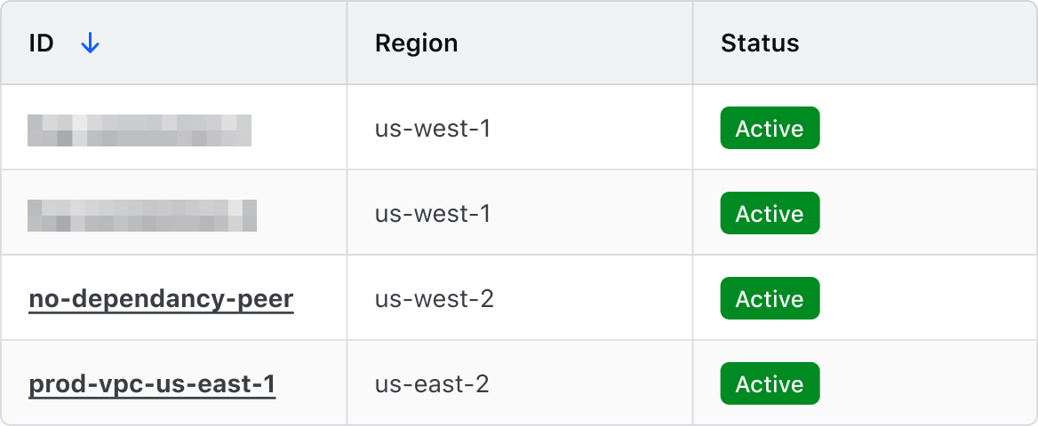
Use outlined Badges as an alternative to filled Badges, but when extra attention is not required.
Size
There are three sizes: small, medium, and large. Content within the Badges may truncate as screen sizes reduce.
Medium is preferred, but use a badge size that best fits the UI.
For example:
- use large Badges when inline with a heading
- use small or medium Badges in tables, depending on the data density
Icon
Badges come in a few icon and text combinations; text only, icon only, and icon + text (where the icon is in the leading position). Use icons intentionally and only when they provide the user with extra value.
Using Badges for status
Badges are commonly used to communicate status of items and objects. To avoid relying solely on color as a means to communicate status, we recommend:
- Including an icon that aligns with the intended severity or importance of the status. Some common examples of this are
checkfor success,alertfor warning, andxfor critical. - Using explicit, straightforward language when communicating status, e.g., for items that are in a positive state, use "Successful" or "Active".
How to use this component
The most basic invocation requires text — write it inside the tag — resulting in a medium neutral Badge.
<i80-badge>Default badge</i80-badge>Color
The color attribute can be used to change the color.
<i80-badge color="highlight">Highlight badge</i80-badge>
<i80-badge color="success">Success badge</i80-badge>
<i80-badge color="warning">Warning badge</i80-badge>
<i80-badge color="critical">Critical badge</i80-badge>
Type
Use the type attribute to invoke different Badge types. The options are filled, inverted, outlined.
<i80-badge type="inverted">Inverted badge</i80-badge>
<i80-badge type="outlined">Outlined badge</i80-badge>
Size
A different size of Badge can be invoked using the size attribute.
<i80-badge size="small">Small badge</i80-badge>
<i80-badge size="large">Large badge</i80-badge>
Icon
Use the icon attribute to pass in any icon name. Icons always display in the leading (left) position.
<i80-badge icon="layers">Terraform</i80-badge>Icon-only Badge
To display an icon without text, add the icon-only attribute. The text is still necessary to conform with accessibility standards but won’t be displayed visually.
<i80-badge icon="layers" icon-only>Terraform</i80-badge>Attributes
<i80-badge> renders this component. Everything it understands:
| Attribute | Values | Default | Notes |
|---|---|---|---|
color (badge) |
neutral · neutral-dark-mode · highlight · success · warning · critical | neutral |
|
type (badge) |
filled · inverted · outlined | filled |
|
size (badge) |
small · medium · large | medium |
|
icon, icon-only (badge) |
|||
href, color, dismissible (tag) |
color only with href: primary · secondary. dismissible fires i80-dismiss. |
The tag keeps any native element you write inside it, so a server-rendered form, link or button works as it is. See Web Components for loading i80.js and the reference for these examples running.
Anatomy
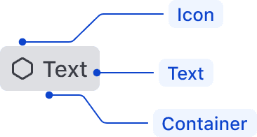
| Element | Usage |
|---|---|
| Icon | Required for status badges (Success, Warning, Critical); optional, otherwise |
| Text | Required |
| Container | Required |
Labels
- Labels should be short and to the point (~25 characters). They should not consist of full sentences but should provide enough context to be useful, especially in the case of status badges.
- Use language consistently within products. For example, if using “In Progress” for one badge, use that same language throughout the rest of the application.
Conformance rating
When used as recommended, there should not be any accessibility issues with this component.
Annotations in design
When using icon-only Badges, include annotations of the non-visual experience in your handoff notes. For example:

Support
If any accessibility issues have been found within this component, let us know by submitting an issue.
0.1.0
Første i80-version (fork af upstream, se core/UPSTREAM.md).