Tooltips are used to provide additional information or context for a UI element, clarify the purpose or function of a UI element, or indicate the meaning of an icon or symbol.
Usage
When to use
When displaying additional context or information that is not critical to the user’s task or decision-making process.
When not to use
- When the content is too lengthy or complex.
- When the information provided is critical to the user’s task or decision-making process, consider moving the content to the page or an alert.
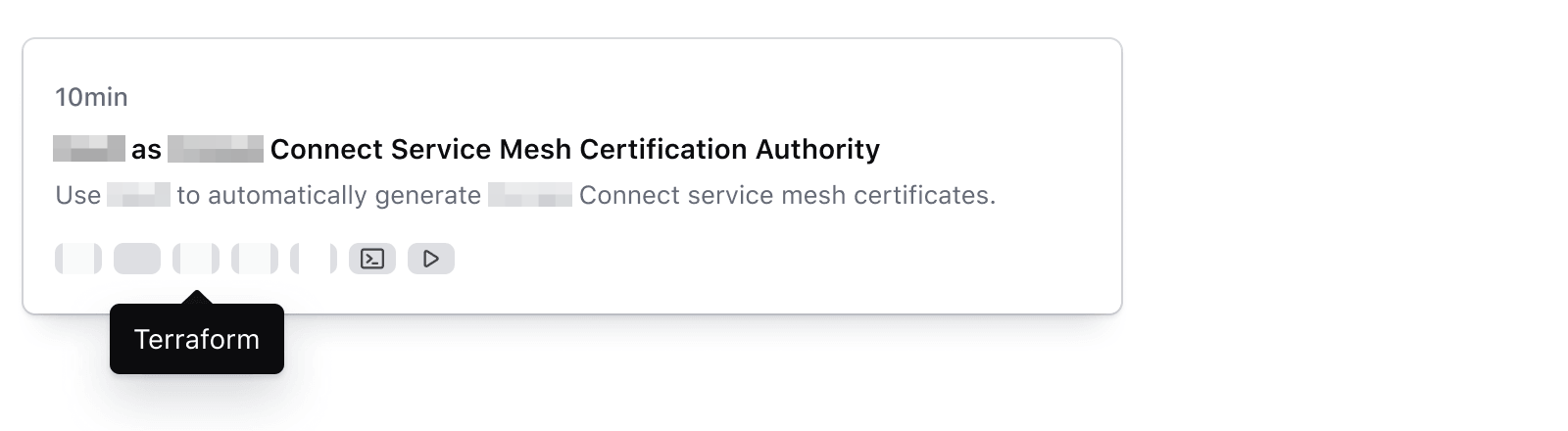
Use tooltips to provide additional context or supplementary non-critical information.
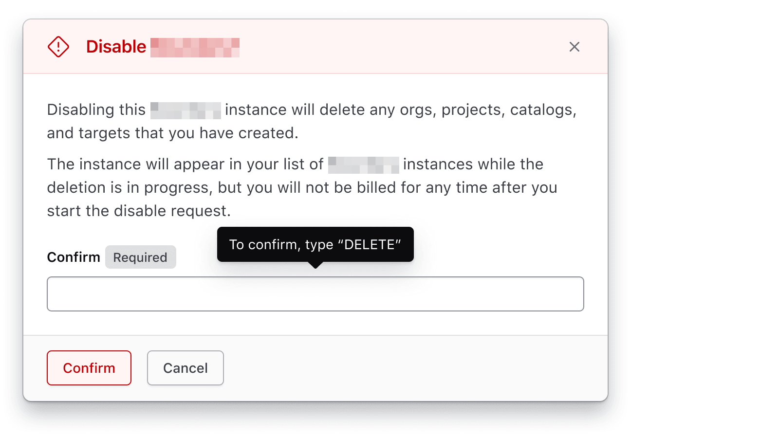
Avoid using tooltips to place crucial information related to the user’s task.
Placement
Tooltips can be placed in various positions relative to the UI element they are associated with. Choose the placement based on the context and available space around the tooltip trigger.
The most common options are: top, bottom, left, right.

The tooltip supports additional placement options: top-start, top-end, bottom-start, bottom-end, left-start, left-end, right-start, right-end.
How to use this component
The tooltip is one element, <i80-tooltip>: put the text in its text attribute and wrap the element the tooltip belongs to. To be accessible, the element which triggers a tooltip needs to be an interactive element which can receive focus. This means that:
- if the tooltip needs to be applied to a non-interactive element, it has to be wrapped in a
buttonelement.<i80-tooltip>does this for you. - if the tooltip needs to be applied to an element which is already interactive, that element is used as the trigger as it is.
The <i80-tooltip> element positions itself with Floating UI.
Around plain text
Inline with text
Header text More information
<h4>Header text <i80-tooltip text="Hello!">More information</i80-tooltip></h4>Placement
The tooltip appears at the “top” centered above the opener button content by default. If the tooltip is near any of the edges of the screen, its position will automatically adjust to prevent the tooltip content from being cut off so it remains readable.
Use the placement attribute if you would like to use a different starting position for the tooltip vs. the default.
<i80-tooltip text="Hello!" placement="right">Some tests failed</i80-tooltip>Around an interactive element
Put the interactive element inside <i80-tooltip> and it becomes the trigger, as the examples below show.
On a link
<i80-tooltip text="Hello!">
  <i80-link-standalone href="#" icon="collections">Read tutorial</i80-link-standalone>
</i80-tooltip>
On a button
<i80-tooltip text="Hello!" placement="right">
  <i80-button href="https://i80.dk" icon="external-link">Visit website</i80-button>
</i80-tooltip>
Attributes
<i80-tooltip> renders this component. Everything it understands:
| Attribute | Values | Default | Notes |
|---|---|---|---|
text |
text | The tooltip. | |
placement |
top · bottom · left · right (-start · -end) | top |
Flips when there is no room. |
The tag keeps any native element you write inside it, so a server-rendered form, link or button works as it is. See Web Components for loading i80.js and the reference for these examples running.
Anatomy
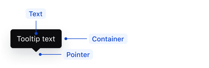
| Element | Usage |
|---|---|
| Pointer | Required |
| Text | Required |
| Container | Required |
Spacing
The default and recommended distance between the trigger and the tooltip’s pointer is 4px.

Adjust the offset when the tooltip needs to be positioned in a way that it doesn’t obstruct the view of the UI element or information it is associated with.
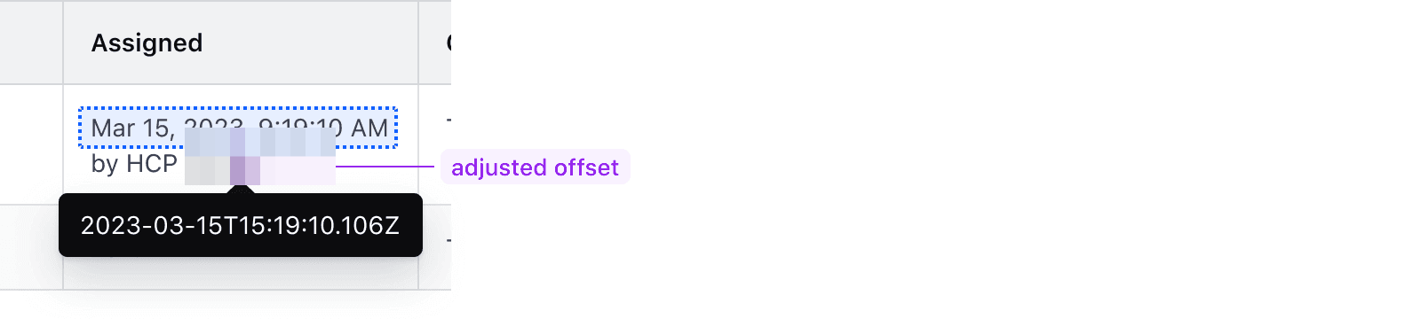
Don’t add extra offset if the tooltip would block important information, appear disjointed from the element it is meant to provide information for, or cause confusion for the user.

The tooltip should only contain text. Basic text formatting, such as bold and italic, is supported.
If more complex content is necessary to convey the information, consider other display components or moving the content to the page.

Text overflow
The text should wrap when it exceeds a maximum width of 280px. There is no character limit, but we recommend keeping it short and concise (~80 characters).

Conformance rating
When used on an interactive element, there should be no conformance issues with this component.
The issue with tooltips, in general, is that of persistence and perceivability. When used on inline text, how does the user know that the text has some sort of tooltip attached to it? If the user cannot perceive that the text has any kind of interactivity, then the tooltip would, in this case, not be conformant.
Consumers should proceed with caution in this case, and consider designs that make it clear to the user what options are available to them.
Minimum target size
Write a button or a link inside <i80-tooltip> and that element is the trigger. Write plain text inside it and the element makes a button out of the text, because a tooltip has to be reachable by keyboard — and then whatever is inside needs to be at least 24px by 24px, or positioned so that there is sufficient spacing around the button.
For example:
- Use the 24px icon variant
- Add 4px padding around a 16px icon variant
- Ensure the element you add a Tooltip to is at least 24px by 24px
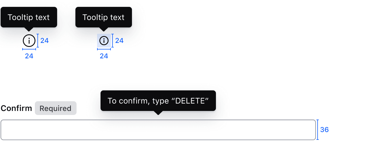
Learn more about WCAG SC 2.5.8: Target size (Minimum) (Level AA)
Focus
- When the trigger receives focus via keyboard, the tooltip shows. The element puts the tooltip’s
idin the trigger’saria-describedby, so a screen reader reads the hint after the trigger’s name. - When the user presses the ESC key, the tooltip dismisses and gets removed from the screen.

Applicable WCAG Success Criteria
This section is for reference only. This component intends to conform to the following WCAG Success Criteria:
-
1.1.1
Non-text Content (Level A):
All non-text content that is presented to the user has a text alternative that serves the equivalent purpose. -
1.3.1
Info and Relationships (Level A):
Information, structure, and relationships conveyed through presentation can be programmatically determined or are available in text. -
1.3.2
Meaningful Sequence (Level A):
When the sequence in which content is presented affects its meaning, a correct reading sequence can be programmatically determined. -
1.4.1
Use of Color (Level A):
Color is not used as the only visual means of conveying information, indicating an action, prompting a response, or distinguishing a visual element. -
1.4.10
Reflow (Level AA):
Content can be presented without loss of information or functionality, and without requiring scrolling in two dimensions. -
1.4.11
Non-text Contrast (Level AA):
The visual presentation of the following have a contrast ratio of at least 3:1 against adjacent color(s): user interface components; graphical objects. -
1.4.12
Text Spacing (Level AA):
No loss of content or functionality occurs by setting all of the following and by changing no other style property: line height set to 1.5; spacing following paragraphs set to at least 2x the font size; letter-spacing set at least 0.12x of the font size, word spacing set to at least 0.16 times the font size. -
1.4.13
Content on Hover or Focus (Level AA):
Where receiving and then removing pointer hover or keyboard focus triggers additional content to become visible and then hidden, the following are true: dismissible, hoverable, persistent (see link). -
1.4.3
Minimum Contrast (Level AA):
The visual presentation of text and images of text has a contrast ratio of at least 4.5:1 -
1.4.4
Resize Text (Level AA):
Except for captions and images of text, text can be resized without assistive technology up to 200 percent without loss of content or functionality. -
2.1.1
Keyboard (Level A):
All functionality of the content is operable through a keyboard interface. -
2.1.2
No Keyboard Trap (Level A):
If keyboard focus can be moved to a component of the page using a keyboard interface, then focus can be moved away from that component using only a keyboard interface. -
2.4.7
Focus Visible (Level AA):
Any keyboard operable user interface has a mode of operation where the keyboard focus indicator is visible. -
2.5.8
Target Size Minimum (Level AA):
The size of the target for pointer inputs is at least 24 by 24 CSS pixels, with a few exceptions. -
4.1.2
Name, Role, Value (Level A):
For all user interface components, the name and role can be programmatically determined; states, properties, and values that can be set by the user can be programmatically set; and notification of changes to these items is available to user agents, including assistive technologies.
Support
If any accessibility issues have been found within this component, let us know by submitting an issue.
0.1.0
Første i80-version (fork af upstream, se core/UPSTREAM.md).