The App Header provides consistent controls for navigating between global areas of the application (organizations and projects) and accessing application utilities like support, documentation, and user settings. It should be paired with the App Side Nav component within the App Frame (in code).
Usage
When to use
- Provide consistent global navigation across an application.
- Offer quick access to important utilities such as user settings, help, and search.
- Establish a clear visual hierarchy and brand presence at the top of the application.
When not to use
- To navigate within subpages of an organization or project, use the App Side Nav instead.
Navigation hierarchy
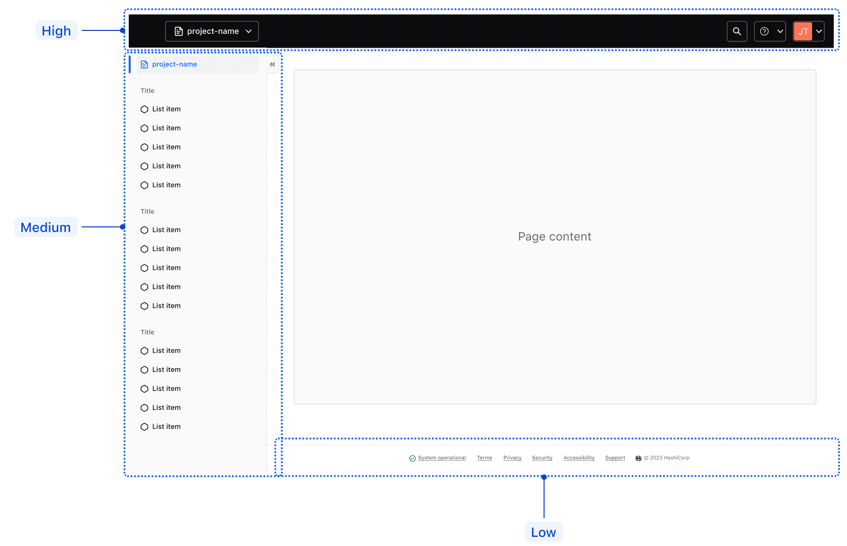
The App Header provides consistent navigation between global application areas, such as organizations and projects, while facilitating easy access to utilities like support and user settings.
In the hierarchy of navigational elements, the App Header sits at the top and is followed by:
- The App Side Nav, which focuses on contextual pages and subpages within a project or organization.
- The App Footer, which focuses on non-essential metadata and general links.
Global navigation
Home link
The home link gives users quick, consistent access to the application's home page or dashboard.
Use the product’s logo icon, e.g. the zPlan logo in zPlan.

Text
The home link supports an optional text property to more explicitly title an application. We recommend using this property sparingly as it's often unnecessary to title a i80 application in such an explicit manner.

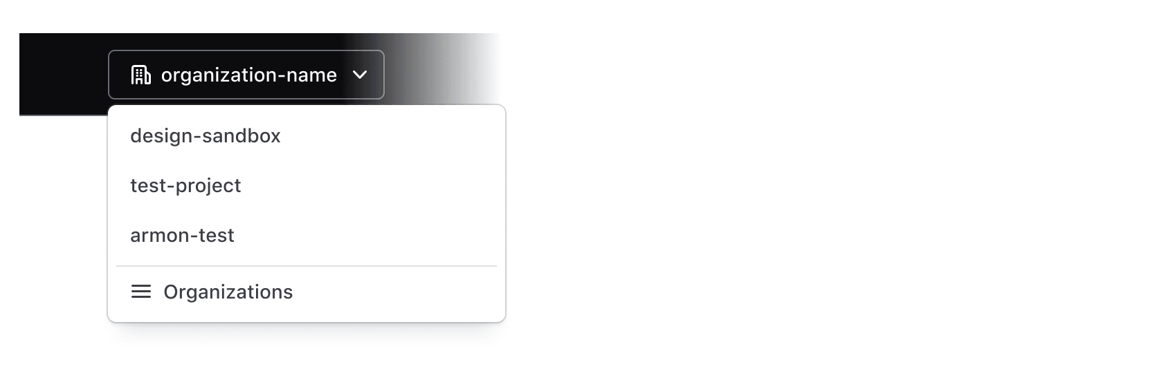
Context switcher
The context switcher allows users to switch between different global contexts within the product or application, such as navigating between different organizations or projects.
Utility navigation
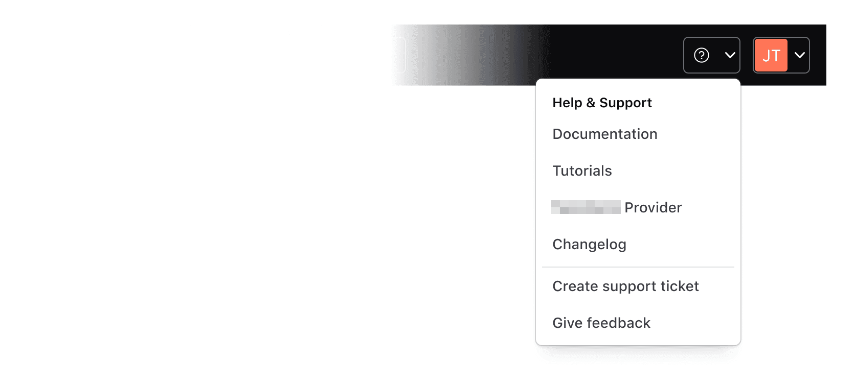
Help dropdown
Use the help dropdown to provide users with access to support and helpful resources that can be easily accessible from anywhere within the application, e.g., links to the help center, documentation, or tutorials.
Avoid placing non-help-related links within the help dropdown menu.
User dropdown
The user dropdown gives users quick and easy access to their settings and preferences. The menu should contain links or actions related to the user's profile, settings, and/or preferences.
Avoid placing links to unrelated pages within the user dropdown menu.

Search
Search within the App Header is triggered by a standard I80 Button themed to match the App Header’s styles. The application teams are responsible for building search capabilities themselves, if and when needed.

Sizes
The App Header supports basic responsive behavior out of the box with a single breakpoint at 1088px. The two sizes are:
Large: applicable for most desktop-sized viewports with a minimum width of 1088px.Small: applicable for most mobile and some tablet-sized viewports with a maximum width of 1088px.


Menu
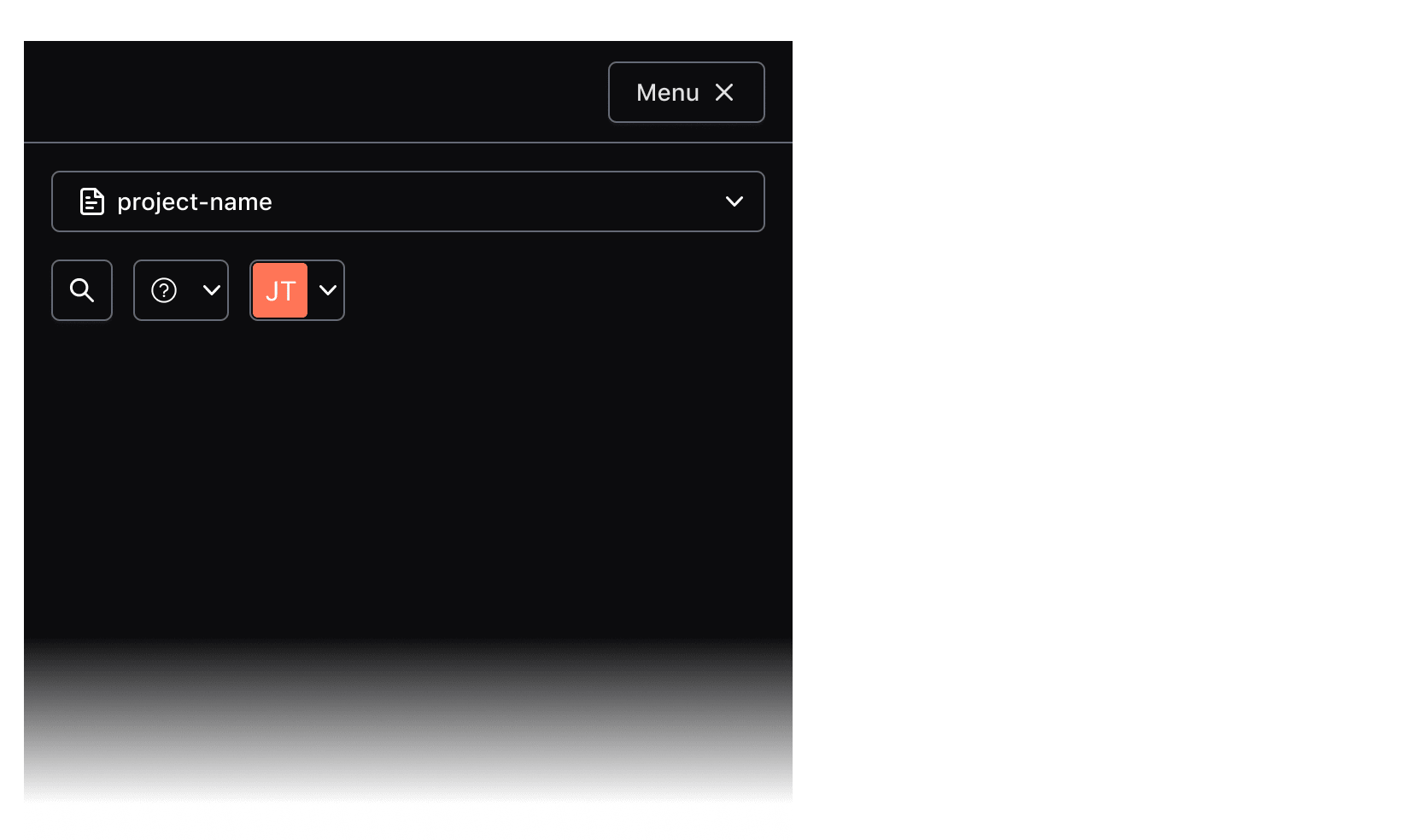
The controls in the App Header (context switcher, help and user dropdowns, and so on) collapse automatically into a vertical menu that the Menu button opens and closes.
Responsive characteristics
By default (and if used within the App Frame), the App Header will occupy 100% of the viewport width. As the viewport width condenses, the components' controls will collapse into a menu that can be toggled open/closed with the menu button (shown conditionally based on the viewport width).
At smaller viewports, the menu containing the App Header controls will occupy 100% of the viewport height and prevent scrolling content on the main page.
Usage in the App Frame
The App Header is intended to sit in the App Frame, which reserves a place for it.
If you intend to use the App Header without the App Frame, contact the I80 team for assistance and guidance on implementation.
How to use this component
The App Header (<i80-app-header>) provides persistent global navigation controls and utility links such as help and user menus. It is meant to be paired with the App Side Nav (<i80-app-side-nav>) which should be used to provide local or page-level navigation.
Layout
The App Header has a built-in logo, plus two “slots” (slot attributes on its children) where consumers can place the navigation content and also add business logic to control the content.
The logo is set with the home-href, home-text and home-icon attributes.
The two slots are intended for consumer-provided controls. A child with slot="global" should typically contain a “context switcher” (sometimes called an “org switcher” or “project switcher”). A child with slot="utility" is used to provide utilities including “Help” and “User” menus and, optionally, “Search”.
<i80-app-header home-href="#" home-text="i80 home menu" home-icon="hexagon">
  <i80-dropdown slot="global" text="Choose an organization" icon="org" color="secondary" size="small">
    <i80-dropdown-item icon="check">organizationName</i80-dropdown-item>
  </i80-dropdown>
  <i80-dropdown slot="utility" text="Help" icon="help" color="secondary" size="small" position="bottom-left">
    <i80-dropdown-item href="#documentation">Documentation</i80-dropdown-item>
    <i80-dropdown-item href="#support">Create support ticket</i80-dropdown-item>
  </i80-dropdown>
  <i80-dropdown slot="utility" text="email@domain.com" icon="user" color="secondary" size="small" position="bottom-left">
    <i80-dropdown-item href="#account">Account settings</i80-dropdown-item>
  </i80-dropdown>
</i80-app-header>
Content
The home link
The home link is part of <i80-app-header> itself. It provides consistent branding and navigates the user to the “home” or main dashboard page.
It requires a value for the home-icon and home-text attributes, and home-href sets where it goes.
Refer to the Attributes section for details.
<i80-app-header home-href="#" home-text="i80 home menu" home-icon="hexagon">
  <i80-dropdown slot="global" text="Choose an organization" icon="org" color="secondary" size="small">
    <i80-dropdown-item icon="check">organizationName</i80-dropdown-item>
  </i80-dropdown>
  <i80-dropdown slot="utility" text="email@domain.com" icon="user" color="secondary" size="small" position="bottom-left">
    <i80-dropdown-item href="#account">Account settings</i80-dropdown-item>
  </i80-dropdown>
</i80-app-header>
home-text displays text inline with the logo and can be used to more deliberately title an application or provide other differentiating text. Add home-icon-only to show the icon alone and use the text as its accessible name.
<i80-app-header home-href="#" home-text="Admin Console" home-icon="layers">
  <i80-dropdown slot="utility" text="Help" icon="help" color="secondary" size="small" position="bottom-left">
    <i80-dropdown-item href="#documentation">Documentation</i80-dropdown-item>
  </i80-dropdown>
  <i80-dropdown slot="utility" text="email@domain.com" icon="user" color="secondary" size="small" position="bottom-left">
    <i80-dropdown-item href="#account">Account settings</i80-dropdown-item>
  </i80-dropdown>
</i80-app-header>
Global actions
Consumers should provide their own “context switcher” (e.g., “org switcher” or “project switcher”) control, as a child with slot="global". I80 does not currently provide this component.
<i80-app-header home-href="#" home-text="i80 home menu" home-icon="hexagon">
  <i80-dropdown slot="global" text="Choose an organization" icon="org" color="secondary" size="small">
    <i80-dropdown-title>Organizations</i80-dropdown-title>
    <i80-dropdown-item icon="check">organizationName</i80-dropdown-item>
  </i80-dropdown>
  <i80-dropdown slot="utility" text="Help" icon="help" color="secondary" size="small" position="bottom-left">
    <i80-dropdown-item href="#documentation">Documentation</i80-dropdown-item>
  </i80-dropdown>
  <i80-dropdown slot="utility" text="email@domain.com" icon="user" color="secondary" size="small" position="bottom-left">
    <i80-dropdown-item href="#account">Account settings</i80-dropdown-item>
  </i80-dropdown>
</i80-app-header>
Utility actions
Consumers should provide their own utility action controls, as children with slot="utility". Recommended controls are a user menu and help menu. Other controls such as a search button can optionally be included.
<i80-app-header home-href="#" home-text="i80 home menu" home-icon="hexagon">
<i80-dropdown slot="global" text="Choose an organization" icon="org" color="secondary" size="small">
<i80-dropdown-item icon="check">organizationName</i80-dropdown-item>
</i80-dropdown>
<i80-dropdown slot="utility" text="Help" icon="help" color="secondary" size="small" position="bottom-left">
<i80-dropdown-title>Help & Support</i80-dropdown-title>
<i80-dropdown-item href="#documentation">Documentation</i80-dropdown-item>
<i80-dropdown-item href="#tutorials">Tutorials</i80-dropdown-item>
<i80-dropdown-item href="#provider">Terraform Provider</i80-dropdown-item>
<i80-dropdown-item href="#changelog">Changelog</i80-dropdown-item>
<i80-dropdown-separator></i80-dropdown-separator>
<i80-dropdown-item href="#support">Create support ticket</i80-dropdown-item>
<i80-dropdown-item href="#feedback">Give feedback</i80-dropdown-item>
</i80-dropdown>
<i80-dropdown slot="utility" text="email@domain.com" icon="user" color="secondary" size="small" position="bottom-left">
<i80-dropdown-title>Signed in as email@domain.com</i80-dropdown-title>
<i80-dropdown-item href="#account">Account settings</i80-dropdown-item>
</i80-dropdown>
</i80-app-header>Attributes
<i80-app-header> renders this component. Everything it understands:
| Attribute | Values | Default | Notes |
|---|---|---|---|
home-href, home-text, home-icon |
The link back to the front page. | ||
home-icon-only |
boolean | Shows the icon alone; the text becomes its accessible name. | |
breakpoint |
px | 768 |
Below this width the menu button appears. |
open |
boolean | Opens the collapsed menu. Method: toggle(). |
The tag keeps any native element you write inside it, so a server-rendered form, link or button works as it is. See Web Components for loading i80.js and the reference for these examples running.
Anatomy
Large viewports
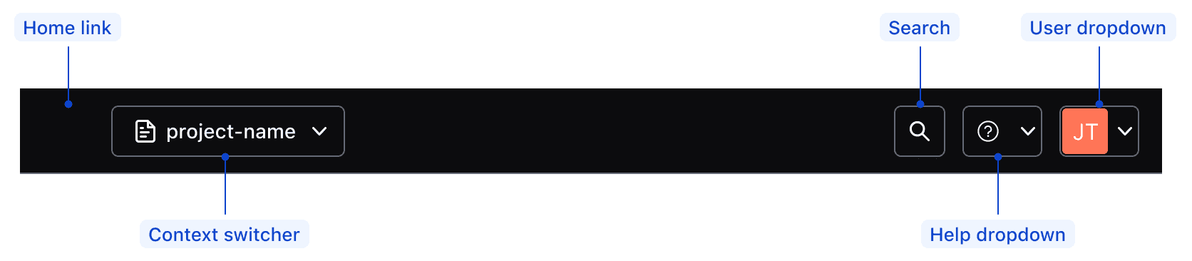
| Element | Usage |
|---|---|
| Global | |
| Home link | Required; supports multiple product logos |
| Context switcher | Optional |
| Utilities | |
| Help dropdown | Optional, but highly recommend (WCAG guidelines) |
| User dropdown | Required |
| Search | Optional |
Small viewports
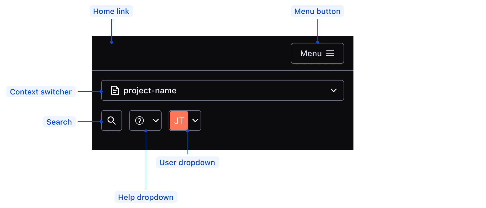
| Element | Usage |
|---|---|
| Home link | Required; supports multiple product logos |
| Menu button | Required |
| Context switcher | Optional |
| Menu | |
| Help dropdown | Optional, but highly recommend (WCAG guidelines) |
| User dropdown | Required |
| Search | Optional |
Conformance rating
When used as recommended, there should not be any WCAG conformance issues with this component.
Focus
When the App Header receives focus via keyboard, the home link should focus as the first interactive element in the DOM (document object model). Then, focus will follow through with the rest of the elements according to their order in the DOM.
Since the App Header is a complex component that holds several nested components and can contain multiple types of content, nested elements must adhere to their individual accessibility criteria.

Applicable WCAG Success Criteria
This section is for reference only. This component intends to conform to the following WCAG Success Criteria:
-
1.1.1
Non-text Content (Level A):
All non-text content that is presented to the user has a text alternative that serves the equivalent purpose. -
1.3.1
Info and Relationships (Level A):
Information, structure, and relationships conveyed through presentation can be programmatically determined or are available in text. -
1.3.2
Meaningful Sequence (Level A):
When the sequence in which content is presented affects its meaning, a correct reading sequence can be programmatically determined. -
1.3.3
Sensory Characteristics (Level A):
Instructions provided for understanding and operating content do not rely solely on sensory characteristics of components such as shape, color, size, visual location, orientation, or sound. -
1.3.4
Orientation (Level AA):
Content does not restrict its view and operation to a single display orientation, such as portrait or landscape. -
1.4.1
Use of Color (Level A):
Color is not used as the only visual means of conveying information, indicating an action, prompting a response, or distinguishing a visual element. -
1.4.10
Reflow (Level AA):
Content can be presented without loss of information or functionality, and without requiring scrolling in two dimensions. -
1.4.11
Non-text Contrast (Level AA):
The visual presentation of the following have a contrast ratio of at least 3:1 against adjacent color(s): user interface components; graphical objects. -
1.4.12
Text Spacing (Level AA):
No loss of content or functionality occurs by setting all of the following and by changing no other style property: line height set to 1.5; spacing following paragraphs set to at least 2x the font size; letter-spacing set at least 0.12x of the font size, word spacing set to at least 0.16 times the font size. -
1.4.13
Content on Hover or Focus (Level AA):
Where receiving and then removing pointer hover or keyboard focus triggers additional content to become visible and then hidden, the following are true: dismissible, hoverable, persistent (see link). -
1.4.3
Minimum Contrast (Level AA):
The visual presentation of text and images of text has a contrast ratio of at least 4.5:1 -
1.4.4
Resize Text (Level AA):
Except for captions and images of text, text can be resized without assistive technology up to 200 percent without loss of content or functionality. -
2.1.1
Keyboard (Level A):
All functionality of the content is operable through a keyboard interface. -
2.1.2
No Keyboard Trap (Level A):
If keyboard focus can be moved to a component of the page using a keyboard interface, then focus can be moved away from that component using only a keyboard interface. -
2.1.4
Character Key Shortcuts (Level A):
If a keyboard shortcut is implemented in content using only letter (including upper- and lower-case letters), punctuation, number, or symbol characters, then it should be able to be turned off, remapped, or active only on focus. -
2.4.3
Focus Order (Level A):
If a Web page can be navigated sequentially and the navigation sequences affect meaning or operation, focusable components receive focus in an order that preserves meaning and operability. -
2.4.7
Focus Visible (Level AA):
Any keyboard operable user interface has a mode of operation where the keyboard focus indicator is visible. -
3.2.1
On Focus (Level A):
When any user interface component receives focus, it does not initiate a change of context. -
3.2.3
Consistent Navigation (Level AA):
Navigational mechanisms that are repeated on multiple Web pages within a set of Web pages occur in the same relative order each time they are repeated. -
3.2.4
Consistent Identification (Level AA):
Components that have the same functionality within a set of Web pages are identified consistently. -
4.1.2
Name, Role, Value (Level A):
For all user interface components, the name and role can be programmatically determined; states, properties, and values that can be set by the user can be programmatically set; and notification of changes to these items is available to user agents, including assistive technologies.
Support
If any accessibility issues have been found within this component, let us know by submitting an issue.
0.1.0
Første i80-version (fork af upstream, se core/UPSTREAM.md).