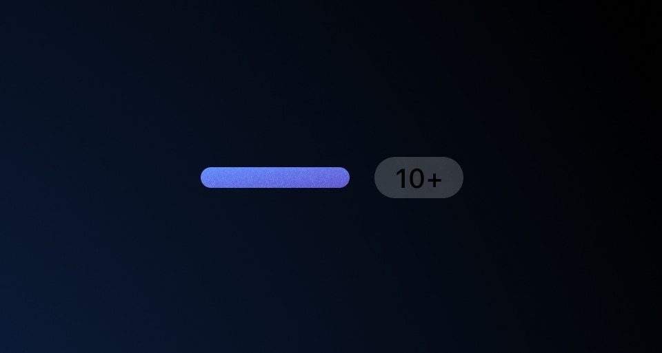
Use Badge Count as a label to display numeric values, such as version numbers and collection counts in tabs.
Usage
When to use
To display version numbers (e.g., “v1.2.0”), collection counts in tabs, or similar numeric information.
When not to use
To display non-numeric information, consider Badge.
Type
There are three types of BadgeCounts: filled, inverted, and outlined.
Color
There are two color options for each type: neutral and neutral-dark-mode.
Size
There are three sizes: small, medium, and large.
How to use this component
Write the number inside <i80-badge-count>, or give it as the text attribute. That renders a medium neutral filled badge count.
<i80-badge-count>3</i80-badge-count>The badge count is not interactive and says nothing on its own, so keep it next to a label that tells the reader what the number counts.
Type
Three types: filled, inverted and outlined. Which one to use depends on what is behind it — an inverted count reads on a coloured surface, an outlined one on a busy one.
<i80-badge-count type="inverted">3</i80-badge-count>
<i80-badge-count type="outlined">3</i80-badge-count>
Size
Two sizes, small and medium. Match the size to the text it sits next to.
<i80-badge-count size="small">3</i80-badge-count>
<i80-badge-count size="medium">3</i80-badge-count>
Color
On a dark surface, neutral-dark-mode keeps the contrast the other way around.
<i80-badge-count color="neutral-dark-mode">3</i80-badge-count>Attributes
<i80-badge-count> renders this component. Everything it understands:
| Attribute | Values | Default | Notes |
|---|---|---|---|
text |
text | Or write the number inside the tag. | |
size |
small · medium | medium |
|
type |
filled · inverted · outlined | filled |
|
color |
neutral · neutral-dark-mode | neutral |
The tag keeps any native element you write inside it, so a server-rendered form, link or button works as it is. See Web Components for loading i80.js and the reference for these examples running.
Conformance rating
When used as recommended, there should not be any accessibility issues with this component.
Support
If any accessibility issues have been found within this component, let us know by submitting an issue.
0.1.0
Første i80-version (fork af upstream, se core/UPSTREAM.md).