The App Footer is a universal component designed to provide essential links and content at the bottom of the application.
Usage
When to use
- On every screen of an application where universal links or content are required.
Order of content
The order of links and content is yours to choose, but we recommend the following structure for a consistent visual appearance across applications:
- StatusLink
- LegalLinks
- Additional links
- Plain text items (or metadata, such as version numbers)
- Copyright

Status link
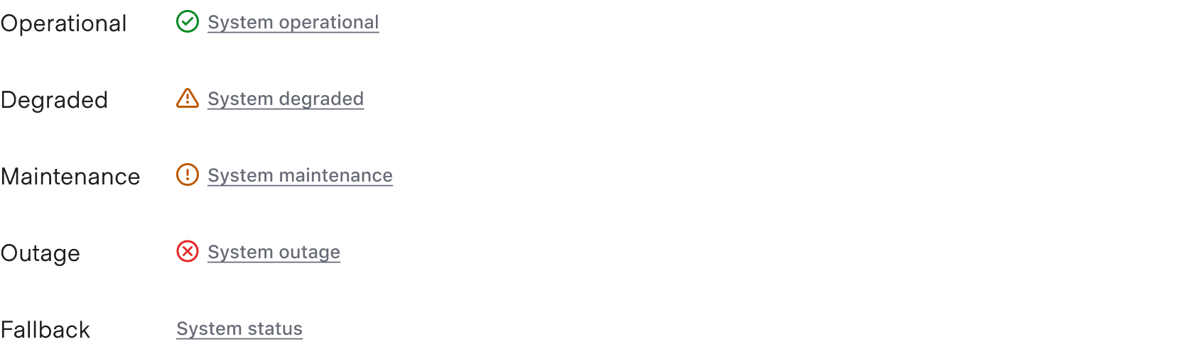
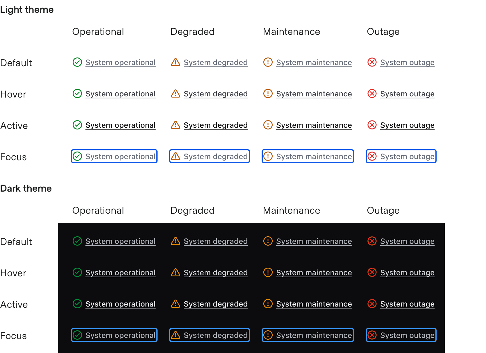
The StatusLink is used to communicate the application status via a third-party service or tool (such as statuspage.io). If needed, the status can be customized to suit the specific product needs.
Legal links
A set of standard legal links are provided by default. These are recommended for customer-facing products, but can be turned on/off within the component as needed.

Additional links
Additional links can be added as necessary. Common examples may include linking to a changelog, the source repository, etc.

Plain text items
Plain text content can be added after the links. This is often used for displaying the version number or other metadata related to the product.

Extra content blocks
Extra content blocks are available before the list of links and before the copyright.

The extra content block can be used to add quick interactions that change the whole application, e.g., a theme switcher.

Avoid adding information that's critical to the user's journey in the App Footer.

Themes
The App Footer supports both Light and Dark theme options. The dark theme can be used when there is a need for a footer on a dark background, e.g., a loading screen, but it should be used sparingly.

Responsiveness
The component is responsive.
Large
The Large size accounts for most larger viewport sizes and, depending on the number of links and additional content, will display elements in a single row or wrap as the viewport size is reduced.
Please note, this screenshot is reduced in size to fit within the content container of the website.

Small

How to use this component
The App Footer (<i80-app-footer>) is used to display a brief list of useful links and information relevant to an entire application.
Recommended content
The App Footer contains only a copyright by default. Write the legal links you need as plain <a> elements inside <i80-app-footer>.
<i80-app-footer>
  <a href="https://i80.dk">Support</a>
  <a href="https://i80.dk">Terms</a>
  <a href="https://i80.dk">Privacy</a>
  <a href="https://i80.dk">Security</a>
  <a href="https://i80.dk">Accessibility</a>
</i80-app-footer>
Links
You can add custom links in addition to or instead of the recommended legal links: any <a> element you write inside <i80-app-footer> becomes a footer link.
<i80-app-footer>
  <a href="https://i80.dk">Changelog</a>
</i80-app-footer>
Non-link content
Meta text or other non-link content can be included as well: write it as an element (a <span>, for example) inside <i80-app-footer>.
<i80-app-footer>
  <span class="i80-text i80-typography-body-100 i80-font-weight-regular">v.2.0</span>
  <span class="i80-text i80-typography-body-100 i80-font-weight-regular">Vault</span>
  <span class="i80-text i80-typography-body-100 i80-font-weight-regular">API: 1.0</span>
</i80-app-footer>
Theme
Both a light and a dark theme are included; choose one with the theme attribute.
<div style="padding: 8px; background: var(--i80-color-palette-neutral-700)">
  <i80-app-footer theme="dark">
    <a href="https://i80.dk">Support</a>
    <a href="https://i80.dk">Terms</a>
    <a href="https://i80.dk">Privacy</a>
    <a href="https://i80.dk">Security</a>
    <a href="https://i80.dk">Accessibility</a>
  </i80-app-footer>
</div>
Attributes
<i80-app-footer> renders this component. Everything it understands:
| Attribute | Values | Default | Notes |
|---|---|---|---|
theme |
light · dark | light |
|
year |
number | this year |
Used in the default copyright line. |
copyright |
text | © <year> i80 |
Replaces the whole line. |
aria-label |
text | Footer |
The name of the list. |
The tag keeps any native element you write inside it, so a server-rendered form, link or button works as it is. See Web Components for loading i80.js and the reference for these examples running.
Anatomy
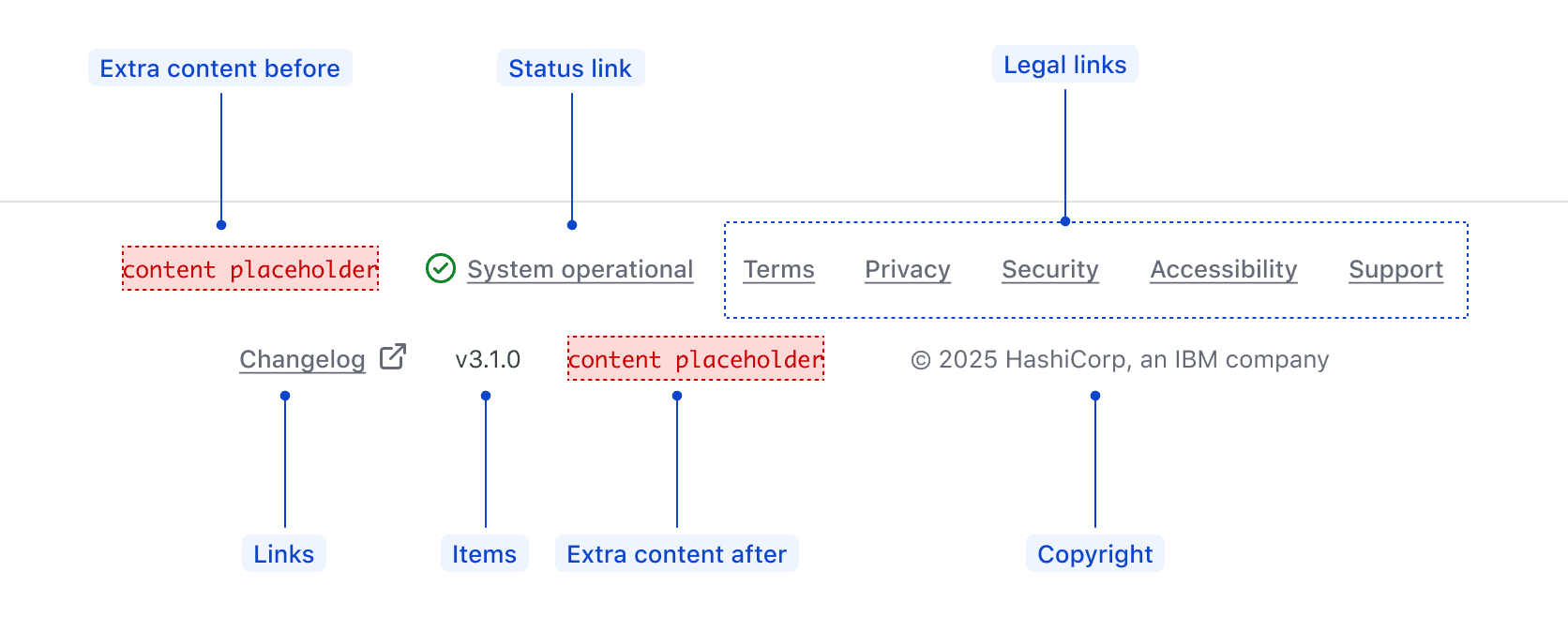
| Element | Usage |
|---|---|
| Extra content before | Optional |
| Status link | Optional |
| Legal links | Optional, but recommended for consumer-facing apps |
| Links | Optional |
| Items | Optional |
| Extra content after | Optional |
| Copyright | Required |
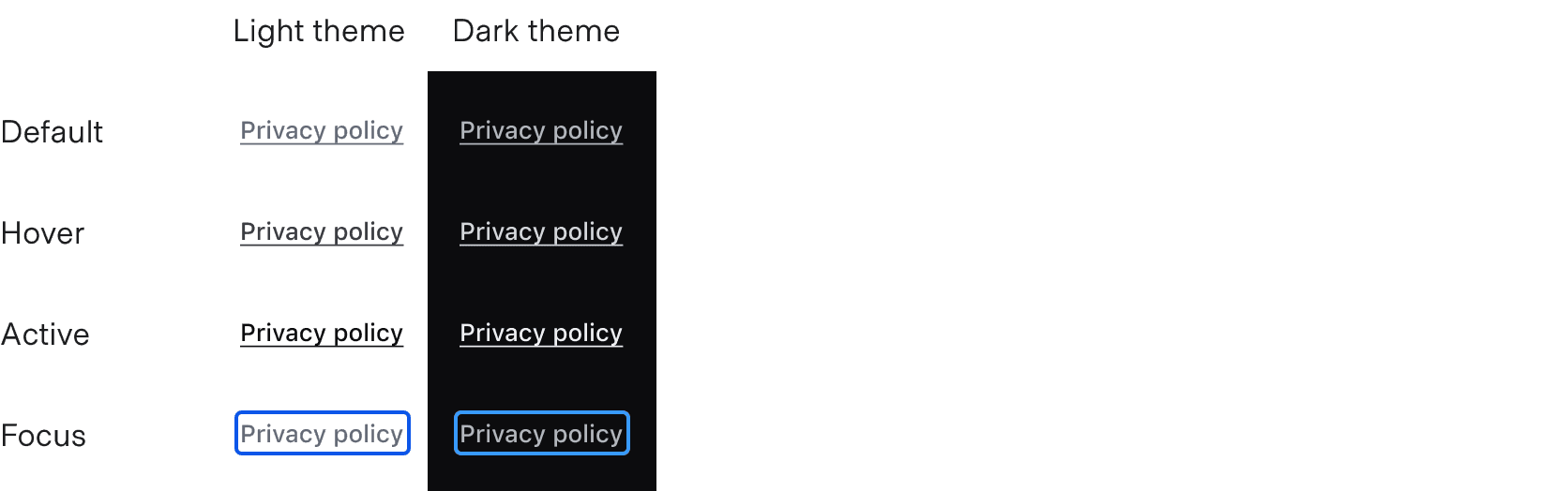
States
Links
Status link
Conformance rating
When used as recommended, there should not be any WCAG conformance issues with this component.
Applicable WCAG Success Criteria
This section is for reference only. This component intends to conform to the following WCAG Success Criteria:
-
1.1.1
Non-text Content (Level A):
All non-text content that is presented to the user has a text alternative that serves the equivalent purpose. -
1.3.1
Info and Relationships (Level A):
Information, structure, and relationships conveyed through presentation can be programmatically determined or are available in text. -
1.3.2
Meaningful Sequence (Level A):
When the sequence in which content is presented affects its meaning, a correct reading sequence can be programmatically determined. -
1.4.1
Use of Color (Level A):
Color is not used as the only visual means of conveying information, indicating an action, prompting a response, or distinguishing a visual element. -
1.4.10
Reflow (Level AA):
Content can be presented without loss of information or functionality, and without requiring scrolling in two dimensions. -
1.4.3
Minimum Contrast (Level AA):
The visual presentation of text and images of text has a contrast ratio of at least 4.5:1 -
1.4.4
Resize Text (Level AA):
Except for captions and images of text, text can be resized without assistive technology up to 200 percent without loss of content or functionality. -
2.1.1
Keyboard (Level A):
All functionality of the content is operable through a keyboard interface. -
2.1.2
No Keyboard Trap (Level A):
If keyboard focus can be moved to a component of the page using a keyboard interface, then focus can be moved away from that component using only a keyboard interface. -
2.4.3
Focus Order (Level A):
If a Web page can be navigated sequentially and the navigation sequences affect meaning or operation, focusable components receive focus in an order that preserves meaning and operability. -
2.4.7
Focus Visible (Level AA):
Any keyboard operable user interface has a mode of operation where the keyboard focus indicator is visible. -
3.2.3
Consistent Navigation (Level AA):
Navigational mechanisms that are repeated on multiple Web pages within a set of Web pages occur in the same relative order each time they are repeated. -
4.1.2
Name, Role, Value (Level A):
For all user interface components, the name and role can be programmatically determined; states, properties, and values that can be set by the user can be programmatically set; and notification of changes to these items is available to user agents, including assistive technologies.
Support
If any accessibility issues have been found within this component, let us know by submitting an issue.
0.1.0
Første i80-version (fork af upstream, se core/UPSTREAM.md).