Form layout components are structural components that provide the scaffolding for building standardized forms across products. These components establish spacing and layout standards to give users a consistent experience.
Usage
When to use
- To structure and organize form elements and inputs into a consistent layout
- When creating a form of any size in our products, including forms nested within Flyout or Modal components
When not to use
- To organize non-form content
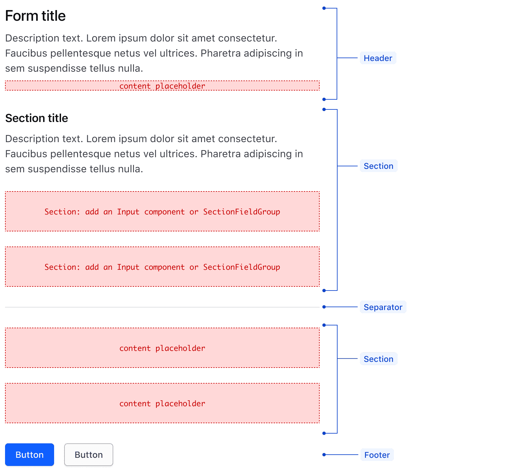
Form
The Form component serves as the container for all Form layout components and form content. It establishes the spacing between the Form Header, Sections, Separators, and Form Footer.
Form Header
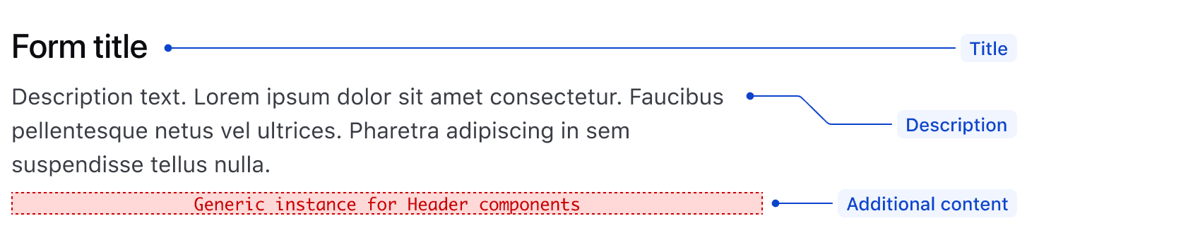
The Form component has an optional header with styled text for a Title and Description. It also includes a space for custom content to use as needed.
Form-level error alert
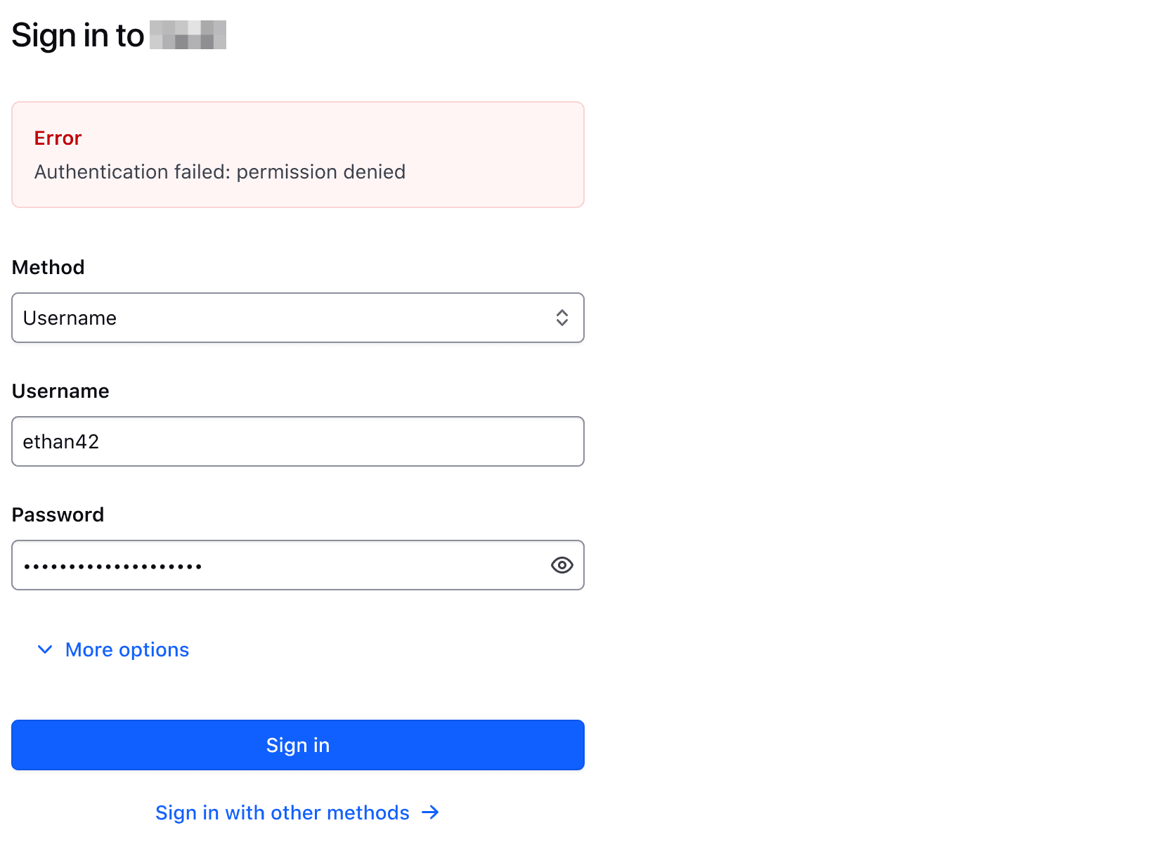
Conventionally, input level validation is sufficient for error messaging within a form but overarching form-level messaging may be needed if validations happen on submission. Form-level error alerts should be applied in the case of form-level submission failures, timeouts during data submission, or when errors apply to multiple sections within the larger form.
The form-level error message will appear below the Header as its own Section and uses the Alert component.
Form Section
Inputs within a form are organized in Sections. Multiple Sections may be used to group content for a more scannable and organized experience. Inputs that belong under the same heading or are related to the same topic should be within a Section.
Section Header
Similar to the Form Header, the Section Header contains styled and spaced text elements, and a space for custom content to be used as needed.

Section Multi Field Group
The Section Multi Field Group organizes closely related form inputs in a single row, setting 16px between them, as opposed to 24px when stacked. This reinforces their relationship.
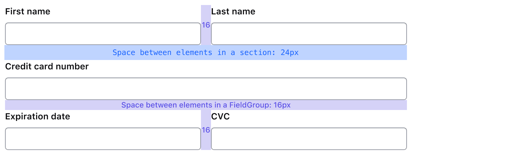
When the viewport width falls below the “md” breakpoint, inputs contained in a Section Multi Field Group automatically stack.
Organize inputs together when they are closely related and beneficial to read together. No more than three inputs should be put within a single row.
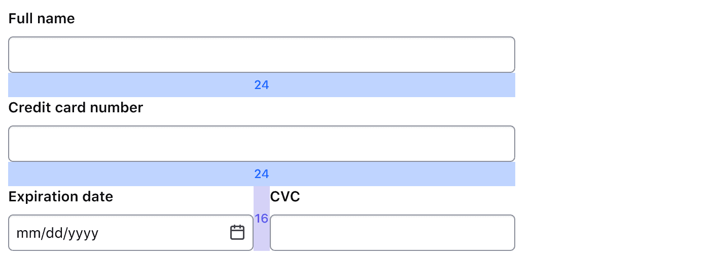
Place inputs in rows to save space or create columns within the form.

Form Separator
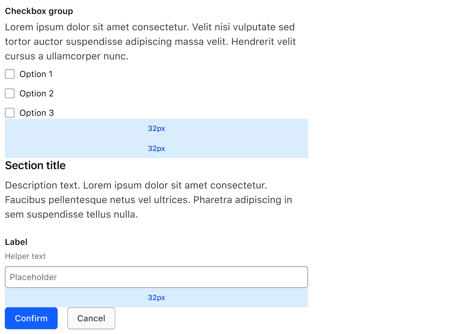
A Separator can be placed between Sections when a clearer visual distinction between Sections is needed.
Use a Separator to add space between Sections or before a new Section Header.
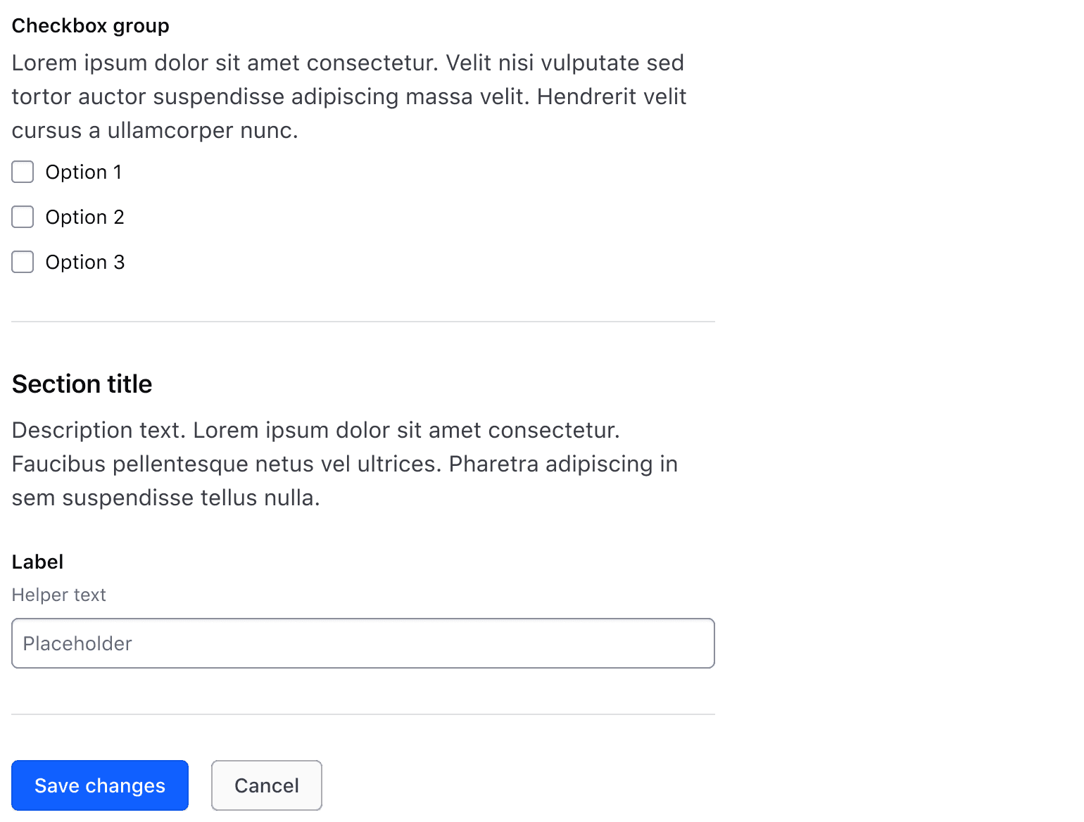
Don’t use a Separator between the last Section and Form Footer / Button Set.
Form Footer
The Form Footer typically houses Buttons to allow users to submit form information. When there's more than one Button or action, we recommend using the Button Set component for consistent spacing and layout.
Width and resizing behavior
Max-width
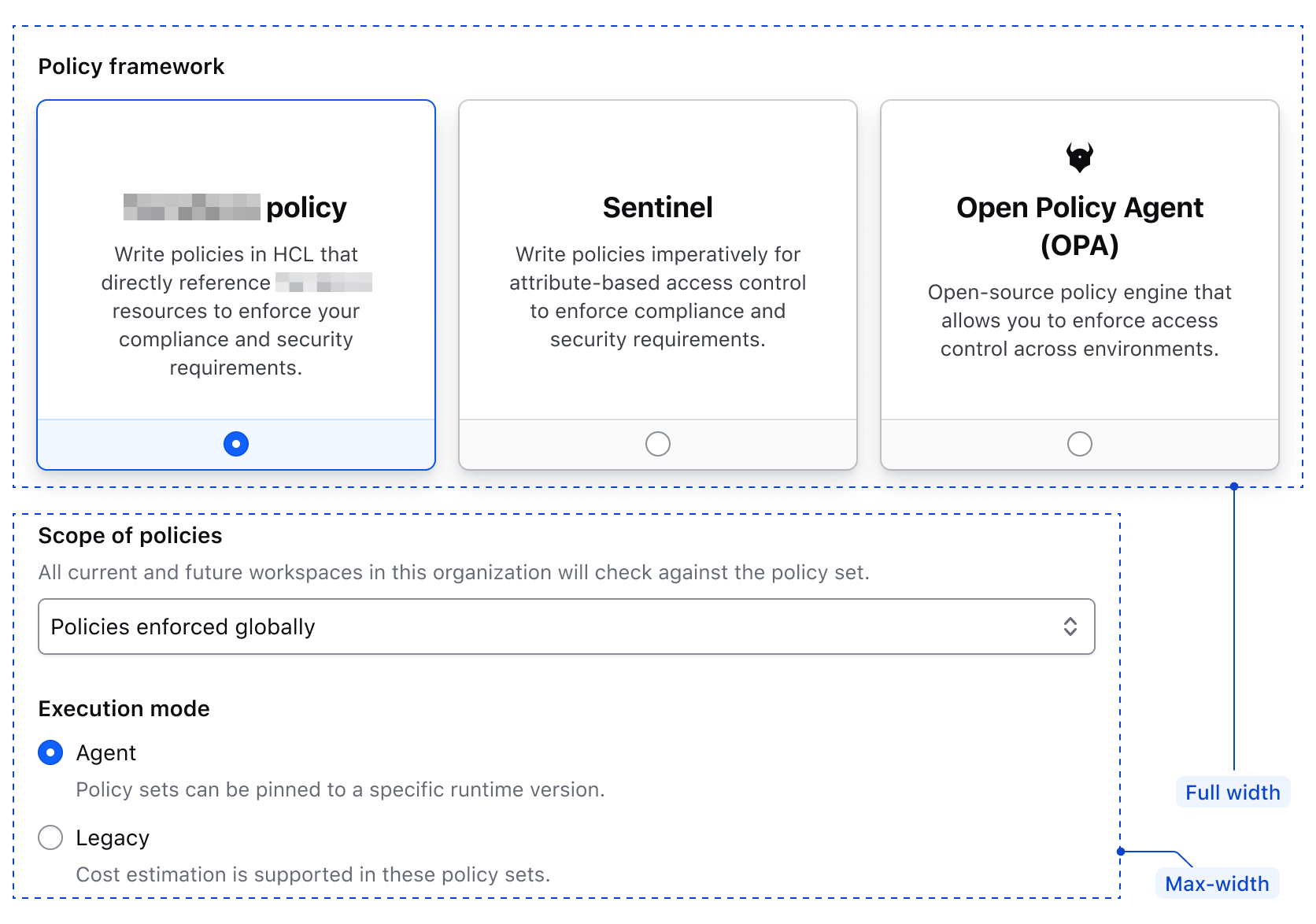
Sections have a default max-width of 672px, establishing a consistent line length throughout applications. It's possible to customize this max-width value if needed.
Full-width
Individual Sections can be set to full-width, if needed. Any component requiring increased width for usability, e.g., a Radio Card Group, should be moved into a separate Section to allow for full width layout, even if they would otherwise be grouped with other associated fields.
How to use this component
The form layout is a grid, and a grid is CSS. There is no <i80-*> tag on this page: every part of it is a plain HTML element with a class from components.css, so a server-rendered template writes the structure directly.
| | |
| - | - |
| i80-form | the form itself: stacks its children and sets the max-width they share |
| i80-form__header | the title and description at the top |
| i80-form__section | a group of related fields, spaced and width-limited |
| i80-form__section-header | a title and description for one section |
| i80-form__section-multi-field-group | fields on one line, stacking on a narrow screen |
| i80-form__section-multi-field-group-item | one item in such a row, with a width of its own |
| i80-form__separator | a line between sections |
| i80-form__footer | the form's actions |
| i80-form-content--is-full-width | on a header, section, separator or footer: drop the max-width |
Load components.css and the classes work; i80.js is only needed for the fields inside the form. See Web Components for both.
The form
class="i80-form" on the <form> element establishes the spacing between everything in it and the max-width its sections share.
<form class="i80-form" action="/plans" method="post">
  Add form content here.
</form>
When the markup is not really a form — a read-only summary laid out the same way — put the class on a <div> instead.
<div class="i80-form">
  This “form” is actually just a div.
</div>
The header, its title and description
A <div class="i80-form__header"> holds a title and a description for the whole form. Both are ordinary elements carrying the typography classes plus the contextual class:
<form class="i80-form" action="/plans" method="post">
  <div class="i80-form__header">
    <h2 class="i80-text i80-typography-display-400 i80-font-weight-semibold i80-foreground-strong i80-form__header-title">My form title</h2>
    <p class="i80-text i80-typography-body-300 i80-font-weight-regular i80-foreground-primary i80-form__header-description">A brief description of my form content.</p>
  </div>
</form>
The heading level and size of the title
The tag is the heading level; the i80-typography-display-* class is the size. They are independent: a title can be an <h3> at display-300 if that is what the page needs. The default the design uses for a form title is display-400 semibold in the strong foreground colour.
<form class="i80-form" action="/plans" method="post">
  <div class="i80-form__header">
    <h3 class="i80-text i80-typography-display-300 i80-font-weight-semibold i80-foreground-strong i80-form__header-title">My form title</h3>
    <p class="i80-text i80-typography-body-300 i80-font-weight-regular i80-foreground-primary i80-form__header-description">A brief description of my form content.</p>
  </div>
</form>
Sections
A <div class="i80-form__section"> groups related fields, spacing them and limiting their width. A section can hold other content too — an Alert, for instance — and gives it the same max-width.
<form class="i80-form" action="/plans" method="post">
  <div class="i80-form__section">
    <i80-alert type="inline" color="critical" heading="Form submission error">
      Correct the formatting of the following field:
      <i80-link-inline href="#" color="secondary">Expiration date</i80-link-inline>
    </i80-alert>
  </div>

  <div class="i80-form__section">
    <i80-text-input label="Field 1" name="field-1-name"></i80-text-input>

    <i80-radio-group legend="Field 2" name="field-2-name" layout="horizontal">
      <i80-radio label="Option 1" value="1"></i80-radio>
      <i80-radio label="Option 2" value="2"></i80-radio>
      <i80-radio label="Option 3" value="3"></i80-radio>
    </i80-radio-group>

    <i80-select label="Field 3" name="field-3-name">
      <option value="Kubernetes">Kubernetes</option>
      <option value="Other" selected>Selected</option>
    </i80-select>

    <i80-textarea label="Field 4" name="field-4-name"></i80-textarea>
  </div>
</form>
Add i80-form-content--is-full-width to let one section fill the width it is given:
<form class="i80-form" action="/connections" method="post">
  <div class="i80-form__section i80-form-content--is-full-width">
    <i80-radio-card-group legend="Create connection" name="radio-card-basic-example" alignment="center">
      <i80-radio-card label="Quick peering with Quick Links" icon="aws-color" badge="2-5 min" value="quick" checked
        description="Quick peering with quick links will provide the fastest way to connect to your providers’ network."></i80-radio-card>
      <i80-radio-card label="Manual peering using AWS CLI" icon="aws-color" badge="5-10 min" value="cli"
        description="Provide you AWS CLI template to apply connection settings."></i80-radio-card>
      <i80-radio-card label="Manual peering using HCP and AWS web console" icon="cloud" badge="30-60 min" value="console"
        description="Manually follow UI instructions to complete configuring a connection at provider side."></i80-radio-card>
    </i80-radio-card-group>
  </div>
</form>
A section's own header, title and description
Each section can carry its own <div class="i80-form__section-header"> with a title and a description, built the same way as the form's:
<form class="i80-form" action="/plans" method="post">
  <div class="i80-form__section">
    <div class="i80-form__section-header">
      <h3 class="i80-text i80-typography-display-300 i80-font-weight-semibold i80-foreground-strong i80-form__header-title">Section header title</h3>
      <p class="i80-text i80-typography-body-300 i80-font-weight-regular i80-foreground-primary i80-form__header-description">Section header description</p>
    </div>
    <i80-text-input label="Field 1" name="field-1-name"></i80-text-input>
  </div>
</form>
The heading level and size of a section title
A section title is one step smaller than a form title: display-300 semibold. Change the tag for the heading level and the typography class for the size:
<form class="i80-form" action="/plans" method="post">
  <div class="i80-form__section">
    <div class="i80-form__section-header">
      <h4 class="i80-text i80-typography-display-200 i80-font-weight-semibold i80-foreground-strong i80-form__header-title">Section header title</h4>
      <p class="i80-text i80-typography-body-300 i80-font-weight-regular i80-foreground-primary i80-form__header-description">Section header description</p>
    </div>
    <i80-text-input label="Field 1" name="field-1-name"></i80-text-input>
  </div>
</form>
Fields on one line
Wrap fields in a <div class="i80-form__section-multi-field-group"> to lay them out in a row:
<form class="i80-form" action="/people" method="post">
  <div class="i80-form__section">
    <div class="i80-form__section-multi-field-group">
      <i80-text-input label="First name" name="first-name"></i80-text-input>
      <i80-text-input label="Last name" name="last-name"></i80-text-input>
    </div>
  </div>
</form>
To give one of them a width of its own, wrap it in a <div class="i80-form__section-multi-field-group-item"> and set --i80-form-section-multi-field-group-item-width. Fields that are not wrapped share the width that is left.
<form class="i80-form" action="/addresses" method="post">
  <div class="i80-form__section">
    <div class="i80-form__section-multi-field-group">
      <i80-text-input label="City" name="city"></i80-text-input>

      <div class="i80-form__section-multi-field-group-item" style="--i80-form-section-multi-field-group-item-width: auto">
        <i80-select label="State" name="state">
          <option value="state-1">Ohio</option>
          <option value="state-2">Massachusetts</option>
          <option value="state-3">Washington</option>
          <option value="state-4">Florida</option>
          <option value="state-5">North Carolina</option>
        </i80-select>
      </div>

      <div class="i80-form__section-multi-field-group-item" style="--i80-form-section-multi-field-group-item-width: 8em">
        <i80-text-input label="Zip" name="zip"></i80-text-input>
      </div>
    </div>
  </div>
</form>
On a narrow screen
Below 768px (the “md” breakpoint) a row of fields stacks by itself; nothing needs to be written for it.
<form class="i80-form doc-form-layout-mobile-view" action="/addresses" method="post">
  <div class="i80-form__section">
    <div class="i80-form__section-multi-field-group">
      <i80-text-input label="City" name="city"></i80-text-input>

      <div class="i80-form__section-multi-field-group-item" style="--i80-form-section-multi-field-group-item-width: auto">
        <i80-select label="State" name="state">
          <option value="state-1">Ohio</option>
          <option value="state-2">Massachusetts</option>
          <option value="state-3">Washington</option>
        </i80-select>
      </div>

      <div class="i80-form__section-multi-field-group-item" style="--i80-form-section-multi-field-group-item-width: 6em">
        <i80-text-input label="Zip" name="zip"></i80-text-input>
      </div>
    </div>
  </div>
</form>
A line between sections
For more separation between sections, put an <hr> between them with the separator's classes and the form's contextual class:
<form class="i80-form" action="/plans" method="post">
  <div class="i80-form__section">
    <span class="i80-text i80-typography-body-200 i80-font-weight-regular">First section</span>
  </div>

  <hr class="i80-separator i80-separator--spacing-0 i80-form__separator">

  <div class="i80-form__section">
    <span class="i80-text i80-typography-body-200 i80-font-weight-regular">Second section</span>
  </div>
</form>
The footer
A <div class="i80-form__footer"> at the end holds the form's actions. Put the buttons in a <div class="i80-button-set"> to space them.
<form class="i80-form" action="/plans" method="post">
  <div class="i80-form__footer">
    <div class="i80-button-set">
      <i80-button type="submit">Submit</i80-button>
      <i80-button color="secondary">Cancel</i80-button>
    </div>
  </div>
</form>
Putting it all together
A form with sections at the default max-width and one full-width section:
<form class="i80-form" action="/policies" method="post">
  <div class="i80-form__header">
    <h2 class="i80-text i80-typography-display-400 i80-font-weight-semibold i80-foreground-strong i80-form__header-title">Add policy</h2>
    <p class="i80-text i80-typography-body-300 i80-font-weight-regular i80-foreground-primary i80-form__header-description">Please specify which policy you would like to assign to your cluster. Read more about
      policies in our <i80-link-inline href="#">documentation</i80-link-inline>.</p>
  </div>

  <div class="i80-form__section">
    <i80-text-input label="Secret ID" name="demo-secret-id"
      helper-text="Create a token within your self-managed cluster and attach only the “builtin/global-read-only” policy to it. Once complete, save the token, copy its secret ID from the token list, and insert it below."></i80-text-input>
  </div>

  <div class="i80-form__section i80-form-content--is-full-width">
    <i80-radio-card-group legend="Policy framework" name="demo-radio-card-policies-example" alignment="center">
      <i80-radio-card label="Terraform policy" icon="layers" badge="New" value="terraform" checked
        description="Write policies in HCL that directly reference Terraform resources to enforce your compliance and security requirements."></i80-radio-card>
      <i80-radio-card label="Sentinel" icon="hexagon" value="sentinel"
        description="Write policies imperatively for attribute-based access control to enforce compliance and security requirements."></i80-radio-card>
      <i80-radio-card label="Open Policy Agent (OPA)" icon="wrench" value="opa"
        description="Open-source, general-purpose policy engine that allows you to enforce fine-grained access control and decision-making across cloud-native environments."></i80-radio-card>
    </i80-radio-card-group>
  </div>

  <div class="i80-form__section">
    <i80-text-input label="Policy set name" name="policy-set-name"
      helper-text="Valid characters include ASCII letters, numbers, as well as spaces, periods (.), dashes (-), and underscores (_)."></i80-text-input>
  </div>

  <hr class="i80-separator i80-separator--spacing-0 i80-form__separator">

  <div class="i80-form__section">
    <div class="i80-form__section-header">
      <h3 class="i80-text i80-typography-display-300 i80-font-weight-semibold i80-foreground-strong i80-form__header-title">Policy OPA</h3>
      <p class="i80-text i80-typography-body-300 i80-font-weight-regular i80-foreground-primary i80-form__header-description">Policy OPA is a governance rule that enforces specific access controls and compliance
        requirements within the organization‘s infrastructure.</p>
    </div>

    <i80-text-input label="Query" name="query" placeholder="e.g data.policy.deny"
      helper-text="The rule expression that the policy will evaluate."></i80-text-input>
  </div>

  <div class="i80-form__footer">
    <div class="i80-button-set">
      <i80-button type="submit">Submit</i80-button>
      <i80-button color="secondary">Cancel</i80-button>
    </div>
  </div>
</form>
Setting the max-width yourself
--i80-form-section-max-width on the form sets the max-width every header, section, separator and footer shares, instead of overriding it one section at a time:
<form class="i80-form" style="--i80-form-section-max-width: 100%" action="/plans" method="post">
  <!-- Sections, the header, the footer and the separators all have a 100% max-width -->
  <div class="i80-form__section">
    <i80-text-input label="Field 1" name="field-1-name"></i80-text-input>
  </div>
</form>
An individual section can still opt out of it with i80-form-content--is-full-width:
<form class="i80-form" style="--i80-form-section-max-width: 36rem" action="/plans" method="post">
  <!-- Sections, the header, the footer and the separators all have a 36rem max-width -->
  <div class="i80-form__section">
    <i80-text-input label="Field 1" name="field-1-name"></i80-text-input>
  </div>

  <!-- Except this section, which fills the width it is given -->
  <div class="i80-form__section i80-form-content--is-full-width">
    <i80-text-input label="Field 2" name="field-2-name"></i80-text-input>
  </div>
</form>
Classes
The form layout has no element of its own: it is a set of classes in components.css that you put on ordinary HTML. Load components.css and they work — see Web Components. The fields inside a form are the <i80-*> elements documented on their own pages, or a field you assemble with the Form Primitives.
Form
| Class | On | What it does |
|---|---|---|
i80-form |
<form>, or <div> when the markup is not really a form |
Stacks its children 32px apart and sets the max-width they share. |
| Custom property | Default | What it does |
|---|---|---|
--i80-form-section-max-width |
672px |
The max-width of every header, section, separator and footer in the form. |
Form header
| Class | On | What it does |
|---|---|---|
i80-form__header |
<div> |
The form's title and description, 8px apart, at the shared max-width. |
i80-form__header-title |
a heading, or <div> |
The title. Add the typography classes with it: i80-text i80-typography-display-400 i80-font-weight-semibold i80-foreground-strong is what the design uses. |
i80-form__header-description |
<p> |
The description, with i80-text i80-typography-body-300 i80-font-weight-regular i80-foreground-primary. |
The same two title and description classes are used inside a section header, one size smaller.
Form section
| Class | On | What it does |
|---|---|---|
i80-form__section |
<div> |
A group of related fields, 24px apart, at the shared max-width. Hidden while it is empty. |
i80-form__section-header |
<div> |
A section's own title and description; the title is one step smaller, i80-typography-display-300. |
i80-form__section-multi-field-group |
<div> |
Fields on one line, 16px apart, aligned along their bottom edge; stacks below 768px. |
i80-form__section-multi-field-group-item |
<div> |
One item in that line, with a width of its own. |
| Custom property | Default | What it does |
|---|---|---|
--i80-form-section-multi-field-group-item-width |
auto |
The width of one item in a line of fields. |
Form separator
| Class | On | What it does |
|---|---|---|
i80-form__separator |
<hr> |
A line between sections. Write it with the separator's own classes: i80-separator i80-separator--spacing-0. |
Form footer
| Class | On | What it does |
|---|---|---|
i80-form__footer |
<div> |
The form's actions, at the shared max-width. Put the buttons in a <div class="i80-button-set"> to space them. |
Filling the width
| Class | On | What it does |
|---|---|---|
i80-form-content--is-full-width |
a header, a section, a separator or a footer | Drops the max-width, so that one part fills the space it is given. |
Anatomy
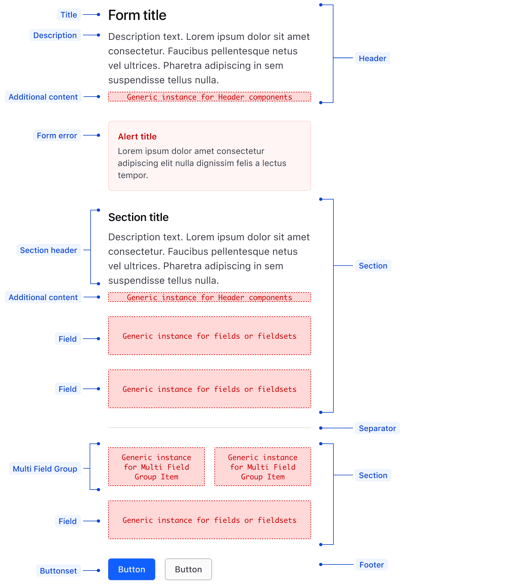
| Element | Usage |
|---|---|
| Title/Section title | Optional |
| Description/Section description | Optional |
| Section | May consist of multiple content types, including text, fields, and multi field groups. |
| Form error | Optional, uses the critical inline Alert |
| Field | Required, supports any Form component |
| Multi Field Group | Optional, supports any Form component |
| Separator | Optional |
| Footer | Most often consists of ButtonSet and actions |
Spacing
Spacing in forms is based on a decreasing scale on an 8px grid. From largest to smallest, the spacing structure is:
- The Form Header, Sections, Separators, and Footer are 32px apart.
- Stacked inputs are 24px apart.
- Side by side inputs within a Section Multi Field Group are 16px apart.
- Text elements within the Form Header and Form Section Headers are 8px apart.
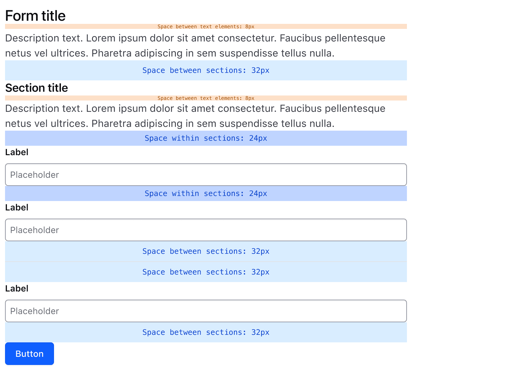
Visit the Form Patterns guidelines for additional details on spacing in forms.
Conformance rating
When used as recommended, there should not be any WCAG conformance issues with this component.
Applicable WCAG Success Criteria
This section is for reference only. This component intends to conform to the following WCAG Success Criteria:
-
1.3.2
Meaningful Sequence (Level A):
When the sequence in which content is presented affects its meaning, a correct reading sequence can be programmatically determined. -
1.4.10
Reflow (Level AA):
Content can be presented without loss of information or functionality, and without requiring scrolling in two dimensions. -
1.4.12
Text Spacing (Level AA):
No loss of content or functionality occurs by setting all of the following and by changing no other style property: line height set to 1.5; spacing following paragraphs set to at least 2x the font size; letter-spacing set at least 0.12x of the font size, word spacing set to at least 0.16 times the font size. -
1.4.4
Resize Text (Level AA):
Except for captions and images of text, text can be resized without assistive technology up to 200 percent without loss of content or functionality. -
2.4.3
Focus Order (Level A):
If a Web page can be navigated sequentially and the navigation sequences affect meaning or operation, focusable components receive focus in an order that preserves meaning and operability. -
2.4.7
Focus Visible (Level AA):
Any keyboard operable user interface has a mode of operation where the keyboard focus indicator is visible. -
2.4.11
Focus Not Obscured (Minimum) (Level AA):
When a user interface component receives keyboard focus, the component is not entirely hidden due to author-created content.
Support
If any accessibility issues have been found within this component, let us know by submitting an issue.
0.1.0
Første i80-version (fork af upstream, se core/UPSTREAM.md).