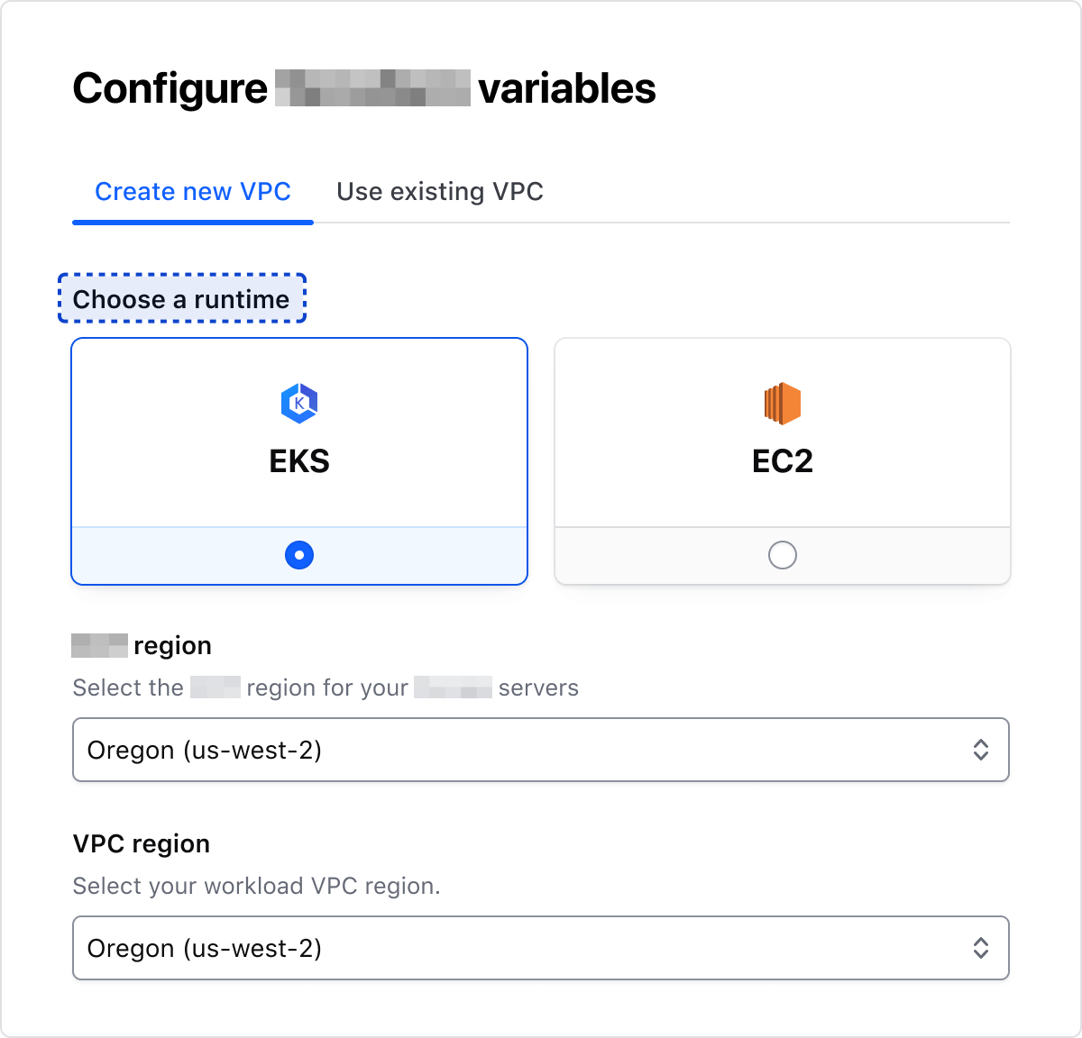
The Radio Card is a form element (radio input) with a bigger target area represented by a card container that allows users to select a single item from a list of related options.
Usage
Use the Radio Card Group in most cases. Use individual Radio Cards only in special cases and sparingly.
When to use
- To allow users to select a single option from a group of two or more Radio Cards.
When not to use
Control position
In most cases, we recommend using the bottom position. Still, we offer Radio Cards in a left position, which is a good option when the content in the cards is minimal.
Bottom
Left
Alignment
Left
Center
Layout
In most cases, use the horizontal layout to maximize the real estate available. Use the vertical layout intentionally when assembled with other components within limited horizontal space, or when needing to create a vertical options list with radio cards.
Horizontal
Vertical
Nested badge
Badges can be used in radio cards to display additional information and context. To ensure proper usage of the badge component, refer to the guidelines.
- Connect workloads in your cloud provider network with HCP
- Offload Consul operations to i80 Experts
- Multi-cloud artifact registry
- Golden images workflow
- Terraform Cloud integration
- 10 free images/month
- 250 free requests/month
Legend
The legend is required to provide context for Radio Card's fieldset.
Error validation
For error validation recommendations, refer to the Form patterns documentation.
How to use this component
<i80-radio-card-group> creates:
- a
<fieldset>container - a
<legend>element - a list of
<i80-radio-card>cards, each of them a<label>around a real<input type="radio">(witharia-describedbyattributes automatically generated).
Because the cards are real radio buttons, the browser takes care of their mutually exclusive nature: when a card is checked, any other card with the same name that was previously checked becomes unchecked, and the arrow keys move between the cards.
The name attribute on the group offers an easy way to provide the same name for all the radio controls with a single declaration.
<i80-radio-card-group legend="Create connection" name="radio-card-basic-example" alignment="center">
  <i80-radio-card label="Quick peering with Quick Links" description="Quick peering with quick links will provide the fastest way to connect to your providers’ network." icon="aws-color" badge="2-5 min" value="quick" checked></i80-radio-card>
  <i80-radio-card label="Manual peering using AWS CLI" description="Provide you AWS CLI template to apply connection settings." icon="aws-color" badge="5-10 min" value="cli"></i80-radio-card>
  <i80-radio-card label="Manual peering using HCP and AWS web console" description="Manually follow UI instructions to complete configuring a connection at provider side." icon="cloud" badge="30-60 min" value="console"></i80-radio-card>
</i80-radio-card-group>
Custom content
Customizable options include:
- Writing your own content inside a card
- Defining a custom width using the
max-widthattribute - Adding multiple Badge elements
- Connect workloads in your cloud provider network with HCP
- Offload Consul operations to i80 Experts
- Multi-cloud artifact registry
- Golden images workflow
- Terraform Cloud integration
<i80-radio-card-group legend="Cluster type" name="radio-card-custom-example">
  <i80-radio-card label="HCP-managed Consul" value="managed" checked>
    <i80-badge>6 clusters left</i80-badge>
    <ul class="doc-radio-card-list-demo">
      <li class="i80-typography-display-100">Connect workloads in your cloud provider network with HCP</li>
      <li class="i80-typography-display-100">Offload Consul operations to i80 Experts</li>
    </ul>
  </i80-radio-card>
  <i80-radio-card label="Self-managed Consul" value="self">
    <i80-badge>5 clusters left</i80-badge>
    <i80-badge icon="kubernetes">Kubernetes only</i80-badge>
    <ul class="doc-radio-card-list-demo">
      <li class="i80-typography-display-100">Multi-cloud artifact registry</li>
      <li class="i80-typography-display-100">Golden images workflow</li>
      <li class="i80-typography-display-100">Terraform Cloud integration</li>
    </ul>
  </i80-radio-card>
</i80-radio-card-group>
Required vs. optional
Use the required and optional attributes on the group to add a visual indication next to the legend text that the field is “required” or “optional”.
<i80-radio-card-group legend="Allow this source connect to the destination" name="radio-card-layout-required" required>
  <i80-radio-card label="Admin" description="Grants full admin capabilities for this project." value="admin"></i80-radio-card>
  <i80-radio-card label="Read" description="Grants full admin capabilities for this project." value="read"></i80-radio-card>
  <i80-radio-card label="Write" description="Grants full admin capabilities for this project." value="write"></i80-radio-card>
</i80-radio-card-group>
<i80-radio-card-group legend="Allow this source connect to the destination" name="radio-card-layout-optional" optional>
  <i80-radio-card label="Admin" description="Grants full admin capabilities for this project." value="admin"></i80-radio-card>
  <i80-radio-card label="Read" description="Grants full admin capabilities for this project." value="read"></i80-radio-card>
  <i80-radio-card label="Write" description="Grants full admin capabilities for this project." value="write"></i80-radio-card>
</i80-radio-card-group>
Layout and control position
To change how the cards are laid out in a group, set layout to vertical. To change the position of the control elements within a card, set control-position to left. Both can be set on a single card or on the group, for every card in it.
<i80-radio-card-group legend="Allow this source connect to the destination" name="radio-card-layout-vertical" layout="vertical" control-position="left">
  <i80-radio-card label="Admin" description="Grants full admin capabilities for this project and all workspaces within. Team members can edit and delete this project, manage the team access level, and create and move workspaces." value="admin" checked></i80-radio-card>
  <i80-radio-card label="Read" description="Grants full admin capabilities for this project and all workspaces within. Team members can manage the team access level, and create and move workspaces." value="read"></i80-radio-card>
  <i80-radio-card label="Write" description="Grants full admin capabilities for this project and all workspaces within. Team members can edit this project, manage the team access level, and create and move workspaces." value="write"></i80-radio-card>
</i80-radio-card-group>
Attributes
<i80-radio-card> renders this component. Everything it understands:
| Attribute | Values | Default | Notes |
|---|---|---|---|
label |
text | The card's heading. | |
description |
text | One line under the label. | |
icon |
icon name | A 24px icon above the label. | |
badge |
text | A badge under the label; write <i80-badge> inside for colours or an icon. | |
value, name, checked, disabled |
Passed to the radio. The group supplies the name. | ||
alignment |
left · center | left |
Also on the group, for every card. |
control-position |
bottom · left | bottom |
Where the radio sits. Also on the group. |
max-width |
CSS length | A fixed width instead of filling the row. | |
i80-radio-card-group |
legend · name · helper-text · error · layout (horizontal · vertical) · required · optional · alignment · control-position | The fieldset around the cards. Anything else written in a card is kept in its content. |
The tag keeps any native element you write inside it, so a server-rendered form, link or button works as it is. See Web Components for loading i80.js and the reference for these examples running.
Anatomy
Item
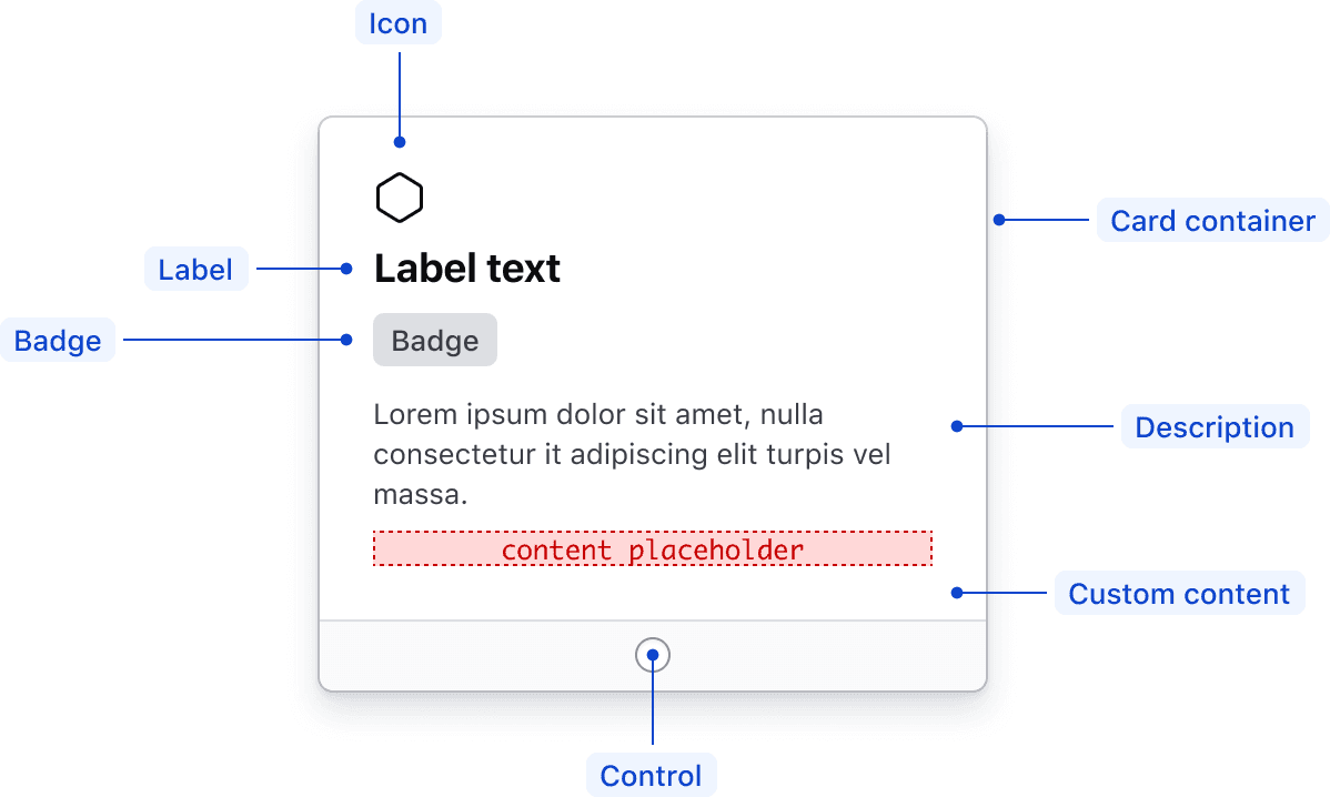
| Element | Usage |
|---|---|
| Icon | Optional |
| Label | Optional, but requires an aria-label when no label is provided |
| Badge | Optional |
| Card container | Required |
| Description | Optional |
| Custom content | Optional |
| Control | Required |
Group
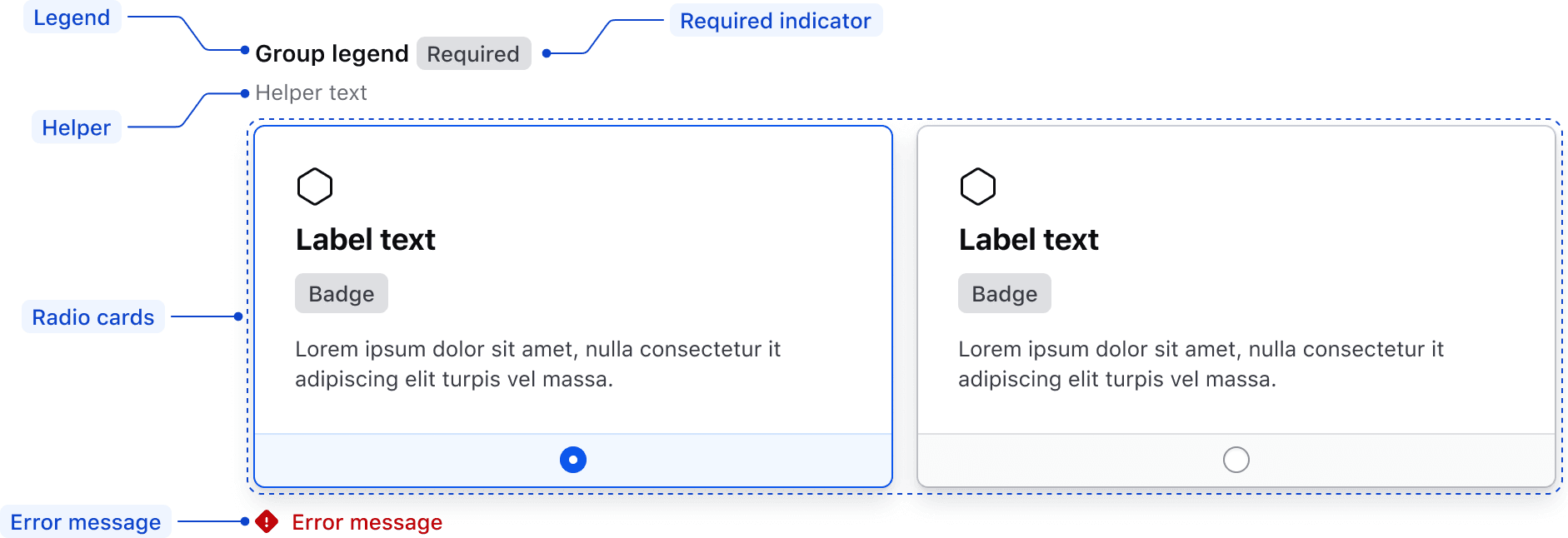
| Element | Usage |
|---|---|
| Legend | Optional |
| Required indicator | Optional |
| Helper text | Optional |
| Radio Card | Required |
| Error message | Triggered by system |
States
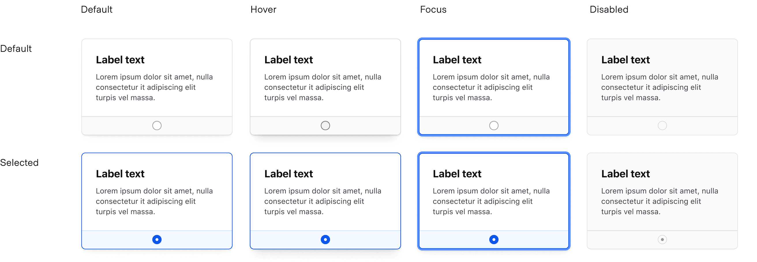
For general content recommendations, refer to the Primitives documentation.
Labels
Labels are part of the radio’s selectable area, making them interactive elements. This means that links inside labels are nested interactive elements and cannot be reached by assistive technology.
Conformance rating
A radio card
<i80-radio-card> is conformant when used as directed. The card is a <label> wrapped around a real <input type="radio">, so the whole card is clickable, the name of the card is the name of the control, and the form submits the chosen value.
A group of radio cards
<i80-radio-card-group> is conformant when used as directed: it renders a <fieldset> with the legend attribute as its <legend>, and gives every card inside it the same name, which is what makes the browser treat them as one radio group.
Keyboard navigation
Move focus to the selected card. If nothing is selected, focus will move to the first Radio Card.
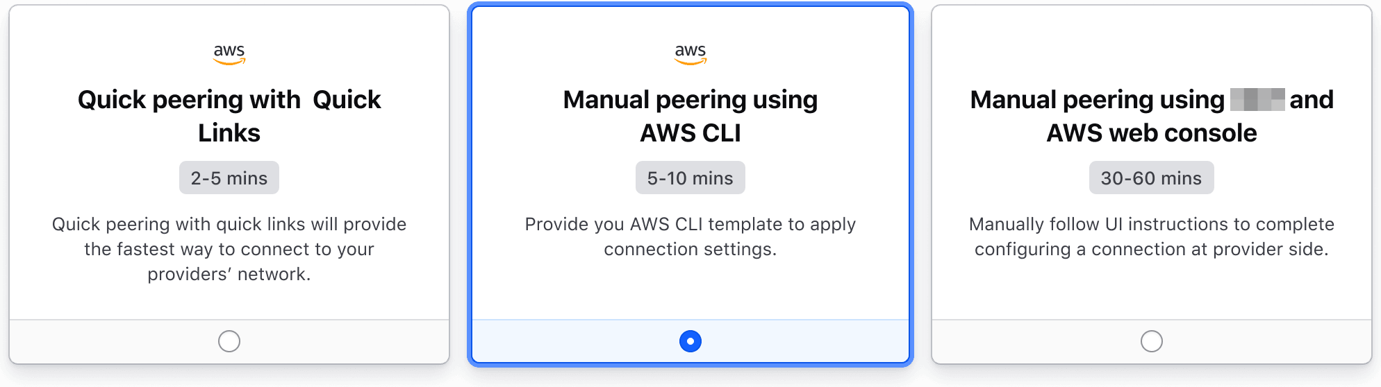
Navigate between Radio Cards. As the card is focused it also becomes selected.
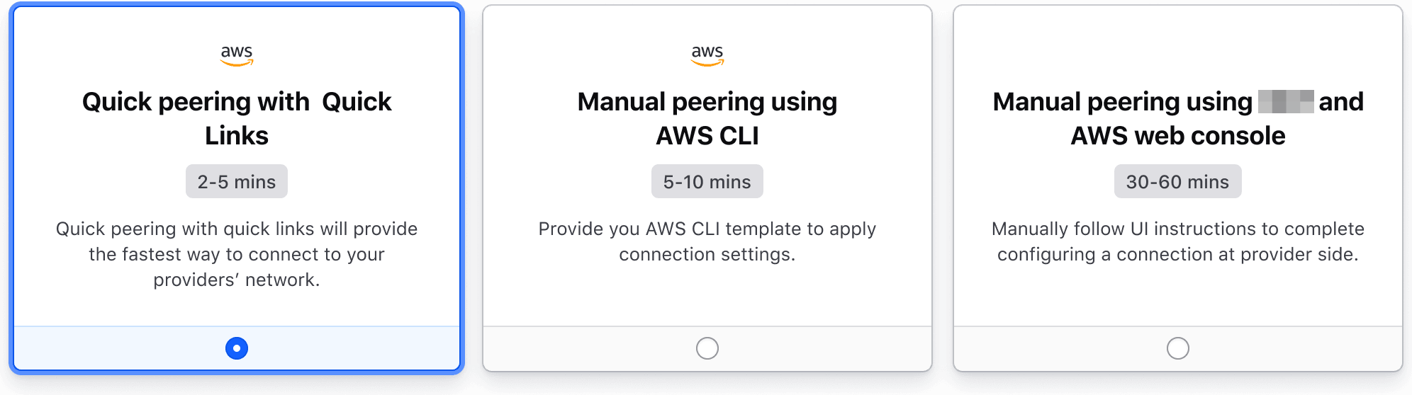
None of this is scripted: because the cards are real radio buttons sharing one name, the browser moves focus with the arrow keys, wraps around at the ends and selects as it goes.
Applicable WCAG Success Criteria
This section is for reference only, some descriptions have been truncated for brevity.
This component intends to conform to the following WCAG Success Criteria:
-
1.3.1
Info and Relationships (Level A):
Information, structure, and relationships conveyed through presentation can be programmatically determined or are available in text. -
1.3.2
Meaningful Sequence (Level A):
When the sequence in which content is presented affects its meaning, a correct reading sequence can be programmatically determined. -
1.3.4
Orientation (Level AA):
Content does not restrict its view and operation to a single display orientation, such as portrait or landscape. -
1.3.5
Identify Input Purpose (Level AA):
The purpose of each input field collecting information about the user can be programmatically determined when the input field serves a purpose identified in the Input Purposes for User Interface Components section; and the content is implemented using technologies with support for identifying the expected meaning for form input data. -
1.4.1
Use of Color (Level A):
Color is not used as the only visual means of conveying information, indicating an action, prompting a response, or distinguishing a visual element. -
1.4.10
Reflow (Level AA):
Content can be presented without loss of information or functionality, and without requiring scrolling in two dimensions. -
1.4.11
Non-text Contrast (Level AA):
The visual presentation of the following have a contrast ratio of at least 3:1 against adjacent color(s): user interface components; graphical objects. -
1.4.12
Text Spacing (Level AA):
No loss of content or functionality occurs by setting all of the following and by changing no other style property: line height set to 1.5; spacing following paragraphs set to at least 2x the font size; letter-spacing set at least 0.12x of the font size, word spacing set to at least 0.16 times the font size. -
1.4.3
Minimum Contrast (Level AA):
The visual presentation of text and images of text has a contrast ratio of at least 4.5:1 -
1.4.4
Resize Text (Level AA):
Except for captions and images of text, text can be resized without assistive technology up to 200 percent without loss of content or functionality. -
2.4.6
Headings and Labels (Level AA):
Headings and labels describe topic or purpose. -
2.4.7
Focus Visible (Level AA):
Any keyboard operable user interface has a mode of operation where the keyboard focus indicator is visible. -
3.2.1
On Focus (Level A):
When any user interface component receives focus, it does not initiate a change of context. -
3.2.2
On Input (Level A):
Changing the setting of any user interface component does not automatically cause a change of context unless the user has been advised of the behavior before using the component. -
3.2.4
Consistent Identification (Level AA):
Components that have the same functionality within a set of Web pages are identified consistently. -
3.3.2
Labels or Instructions (Level A):
Labels or instructions are provided when content requires user input. -
4.1.2
Name, Role, Value (Level A):
For all user interface components, the name and role can be programmatically determined; states, properties, and values that can be set by the user can be programmatically set; and notification of changes to these items is available to user agents, including assistive technologies.
Support
If any accessibility issues have been found within this component, let us know by submitting an issue.
0.1.0
Første i80-version (fork af upstream, se core/UPSTREAM.md).