An input of type "radio" is a form element that allows users to select a single item from a list of related options.
Usage
When to use
- To allow users to select a single option from a group of two or more mutually exclusive options.
When not to use
- When users should check and uncheck an option, consider Checkbox.
- When users need to select more than one option from a list, consider Checkbox.
- When checking or unchecking results in an immediate change, consider Toggle.
Layout
We recommend using vertical Radio groups, especially with short option lists.
Required and optional
Generally, we recommend pre-selecting one of the radio buttons by default. However, there could be cases where the default selection could affect the user’s choice (the power of suggestion), and leaving all radio buttons unselected may provide a better user experience. Use required and optional indicators in those instances.
For complex forms, indicate required fields. This is the most explicit and transparent method and ensures users don’t have to make assumptions. Read more about best practices for marking required fields in forms.
For shorter, simpler forms (e.g., login/signup and feedback requests), indicate optional fields instead.
Error validation
For error validation recommendations, refer to the Form patterns documentation.
How to use this component
There are three ways to use the Radio component, across the <i80-radio> and <i80-radio-group> elements:
- the base control: an
<i80-radio>with your own<input>written inside it - the field: an
<i80-radio>with alabelattribute — the<input>control, with label, helper text, and error messaging (in a wrapping container) - the group: an
<i80-radio-group>around the fields — alegend(optional), a list of fields, and error messaging
The group
The basic invocation creates:
- a
<fieldset>container. - a
<legend>element, from thelegendattribute. - a list of rendered radio fields.
The name attribute on the group offers an easy way to provide the same name for all the Radio controls in a single place.
<i80-radio-group legend="Choose datacenter" name="datacenter-demo1">
  <i80-radio label="NYC1" value="NYC1"></i80-radio>
  <i80-radio label="DC1" value="DC1"></i80-radio>
  <i80-radio label="NYC2" value="NYC2"></i80-radio>
  <i80-radio label="SF1" value="SF1"></i80-radio>
</i80-radio-group>
Layout
To better fit your spacing requirements, choose between two different layout orientations with the layout attribute: vertical or horizontal.
<i80-radio-group legend="Choose datacenter" name="datacenter-demo2" layout="vertical">
  <i80-radio label="NYC1" value="NYC1"></i80-radio>
  <i80-radio label="DC1" value="DC1"></i80-radio>
  <i80-radio label="NYC2" value="NYC2"></i80-radio>
  <i80-radio label="SF1" value="SF1"></i80-radio>
</i80-radio-group>
<i80-radio-group legend="Choose datacenter" name="datacenter-demo3" layout="horizontal">
  <i80-radio label="NYC1" value="NYC1"></i80-radio>
  <i80-radio label="DC1" value="DC1"></i80-radio>
  <i80-radio label="NYC2" value="NYC2"></i80-radio>
  <i80-radio label="SF1" value="SF1"></i80-radio>
</i80-radio-group>
Required vs. optional
Use the required and optional attributes to add a visual indication that the field is “required” or “optional”.
<i80-radio-group legend="Method" helper-text="Choose which HTTP method to use for the communication channel." name="method-demo2" layout="horizontal" required>
  <i80-radio label="POST" value="POST"></i80-radio>
  <i80-radio label="GET" value="GET"></i80-radio>
  <i80-radio label="PUT" value="PUT"></i80-radio>
</i80-radio-group>
<i80-radio-group legend="Method" helper-text="Choose which HTTP method to use for the communication channel." name="method-demo3" layout="horizontal" optional>
  <i80-radio label="POST" value="POST"></i80-radio>
  <i80-radio label="GET" value="GET"></i80-radio>
  <i80-radio label="PUT" value="PUT"></i80-radio>
</i80-radio-group>
Validation
To indicate a field is invalid, provide an error message: the error attribute on the group.
<i80-radio-group legend="Choose datacenter" name="datacenter-demo4" layout="horizontal" error="Error: you need to choose one datacenter.">
  <i80-radio label="NYC1" value="NYC1"></i80-radio>
  <i80-radio label="DC1" value="DC1"></i80-radio>
  <i80-radio label="NYC2" value="NYC2"></i80-radio>
  <i80-radio label="SF1" value="SF1"></i80-radio>
</i80-radio-group>
Field items
A group of Radios is made of one or more radio fields: <i80-radio> elements. All the attributes that can be passed to a single field can be passed to the same items inside the group.
<i80-radio-group legend="Choose datacenter" name="datacenter-demo5" layout="vertical">
  <i80-radio label="NYC1" value="NYC1" helper-text="CoreSite- 32 Avenue of the Americas" checked></i80-radio>
  <i80-radio label="DC1" value="DC1" helper-text="CoreSite- K Street"></i80-radio>
  <i80-radio label="NYC2" value="NYC2" helper-text="H5 Data Center - 325 Hudson Street"></i80-radio>
  <i80-radio label="SF1" value="SF1" helper-text="INAP - 650 Townsend Street"></i80-radio>
</i80-radio-group>
The field and the base control
The field and the base control are intended for rare cases where the group can’t be used and a custom implementation is needed. Most of the details for the field also apply to the base control, but see the Component API for more details.
The basic invocation for a field — an <i80-radio> with a label — creates:
- a
<label>element with aforattribute automatically associated with the inputIDattribute. - a
<input type="radio">control with an automatically generatedIDattribute.
<i80-radio label="SF1" name="data-center-radio" value="SF1"></i80-radio>For the base control, write the <input type="radio"> inside the element with its own aria-label.
<i80-radio>
  <input type="radio" name="data-center-radio2" value="SF1" aria-label="San Francisco datacenter number 1">
</i80-radio>
Attributes
<i80-radio> renders this component. Everything it understands:
| Attribute | Values | Default | Notes |
|---|---|---|---|
label, helper-text, error, invalid, name, value, checked, required, optional, disabled, readonly |
On i80-checkbox, i80-radio and i80-toggle. | ||
legend, helper-text, error, required, optional |
On i80-checkbox-group, i80-radio-group and i80-toggle-group. | ||
layout |
vertical · horizontal | vertical |
On i80-checkbox-group, i80-radio-group and i80-toggle-group. |
name |
text | On i80-radio-group: given to radios without a name. |
The tag keeps any native element you write inside it, so a server-rendered form, link or button works as it is. See Web Components for loading i80.js and the reference for these examples running.
Anatomy
A single radio
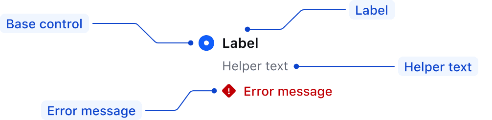
| Element | Usage |
|---|---|
| Base control | Required |
| Label | Required |
| Helper text | Optional |
| Error message | Triggered by system |
A group of radios
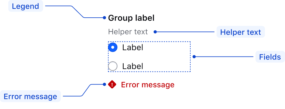
| Element | Usage |
|---|---|
| Legend | Optional |
| Helper text | Optional |
| Fields | At least one is required |
| Error message | Triggered by system |
States
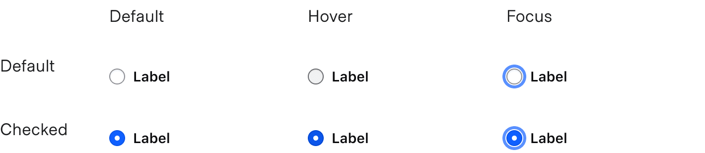
For general content recommendations, refer to the Primitives documentation.
Conformance rating
A group of radios
<i80-radio-group> is conformant when used as directed. It renders a real <fieldset> with the legend attribute as its <legend>, and passes its name to every <i80-radio> inside it, so the browser treats them as one radio group: Tab moves to the chosen radio (or the first one, if none is chosen) and the arrow keys move between them.
A single radio
<i80-radio> with a label is conformant: the label is a real <label for> pointing at the <input type="radio">, so clicking the text chooses it and the control has an accessible name.
A radio without a label
A radio is not conformant until it has an accessible name. If you leave the label attribute off, put an aria-label on the element instead, or write your own <label for="…"> and <input type="radio"> inside the tag.
Applicable WCAG Success Criteria
This section is for reference only, some descriptions have been truncated for brevity.
This component intends to conform to the following WCAG Success Criteria:
-
1.3.1
Info and Relationships (Level A):
Information, structure, and relationships conveyed through presentation can be programmatically determined or are available in text. -
1.3.2
Meaningful Sequence (Level A):
When the sequence in which content is presented affects its meaning, a correct reading sequence can be programmatically determined. -
1.3.4
Orientation (Level AA):
Content does not restrict its view and operation to a single display orientation, such as portrait or landscape. -
1.3.5
Identify Input Purpose (Level AA):
The purpose of each input field collecting information about the user can be programmatically determined when the input field serves a purpose identified in the Input Purposes for User Interface Components section; and the content is implemented using technologies with support for identifying the expected meaning for form input data. -
1.4.1
Use of Color (Level A):
Color is not used as the only visual means of conveying information, indicating an action, prompting a response, or distinguishing a visual element. -
1.4.10
Reflow (Level AA):
Content can be presented without loss of information or functionality, and without requiring scrolling in two dimensions. -
1.4.11
Non-text Contrast (Level AA):
The visual presentation of the following have a contrast ratio of at least 3:1 against adjacent color(s): user interface components; graphical objects. -
1.4.12
Text Spacing (Level AA):
No loss of content or functionality occurs by setting all of the following and by changing no other style property: line height set to 1.5; spacing following paragraphs set to at least 2x the font size; letter-spacing set at least 0.12x of the font size, word spacing set to at least 0.16 times the font size. -
1.4.3
Minimum Contrast (Level AA):
The visual presentation of text and images of text has a contrast ratio of at least 4.5:1 -
1.4.4
Resize Text (Level AA):
Except for captions and images of text, text can be resized without assistive technology up to 200 percent without loss of content or functionality. -
2.4.6
Headings and Labels (Level AA):
Headings and labels describe topic or purpose. -
2.4.7
Focus Visible (Level AA):
Any keyboard operable user interface has a mode of operation where the keyboard focus indicator is visible. -
3.2.1
On Focus (Level A):
When any user interface component receives focus, it does not initiate a change of context. -
3.2.2
On Input (Level A):
Changing the setting of any user interface component does not automatically cause a change of context unless the user has been advised of the behavior before using the component. -
3.2.4
Consistent Identification (Level AA):
Components that have the same functionality within a set of Web pages are identified consistently. -
3.3.2
Labels or Instructions (Level A):
Labels or instructions are provided when content requires user input. -
4.1.2
Name, Role, Value (Level A):
For all user interface components, the name and role can be programmatically determined; states, properties, and values that can be set by the user can be programmatically set; and notification of changes to these items is available to user agents, including assistive technologies.
Support
If any accessibility issues have been found within this component, let us know by submitting an issue.
0.1.0
Første i80-version (fork af upstream, se core/UPSTREAM.md).