Usage
When to use
- In complex flows that are broken up into multiple steps.
- To communicate what has and has not been completed in a multi-step flow.
- For a single page multi-step flow that requires completion.
When not to use
- For simple flows, use the form pattern on a single page.
- For simple forms or when progress doesn't need to be tracked, use structured page content.
- For a progression of tasks that doesn’t require a user to remain on the same page, use the Stepper List.
Interactive vs non-interactive
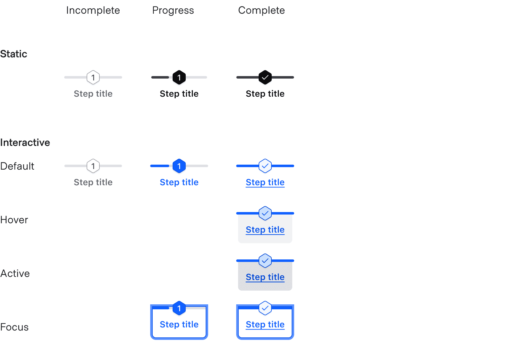
The Stepper Nav supports both interactive (default) and non-interactive variants.
Interactive steps
Users can navigate backwards within the Stepper Nav steps but cannot navigate forwards unless they have completed the current step. This creates consistency for step flow behavior and the order of operations.


Non-interactive steps
The non-interactive variant is for read-only purposes and does not allow backwards navigation.

Spacing
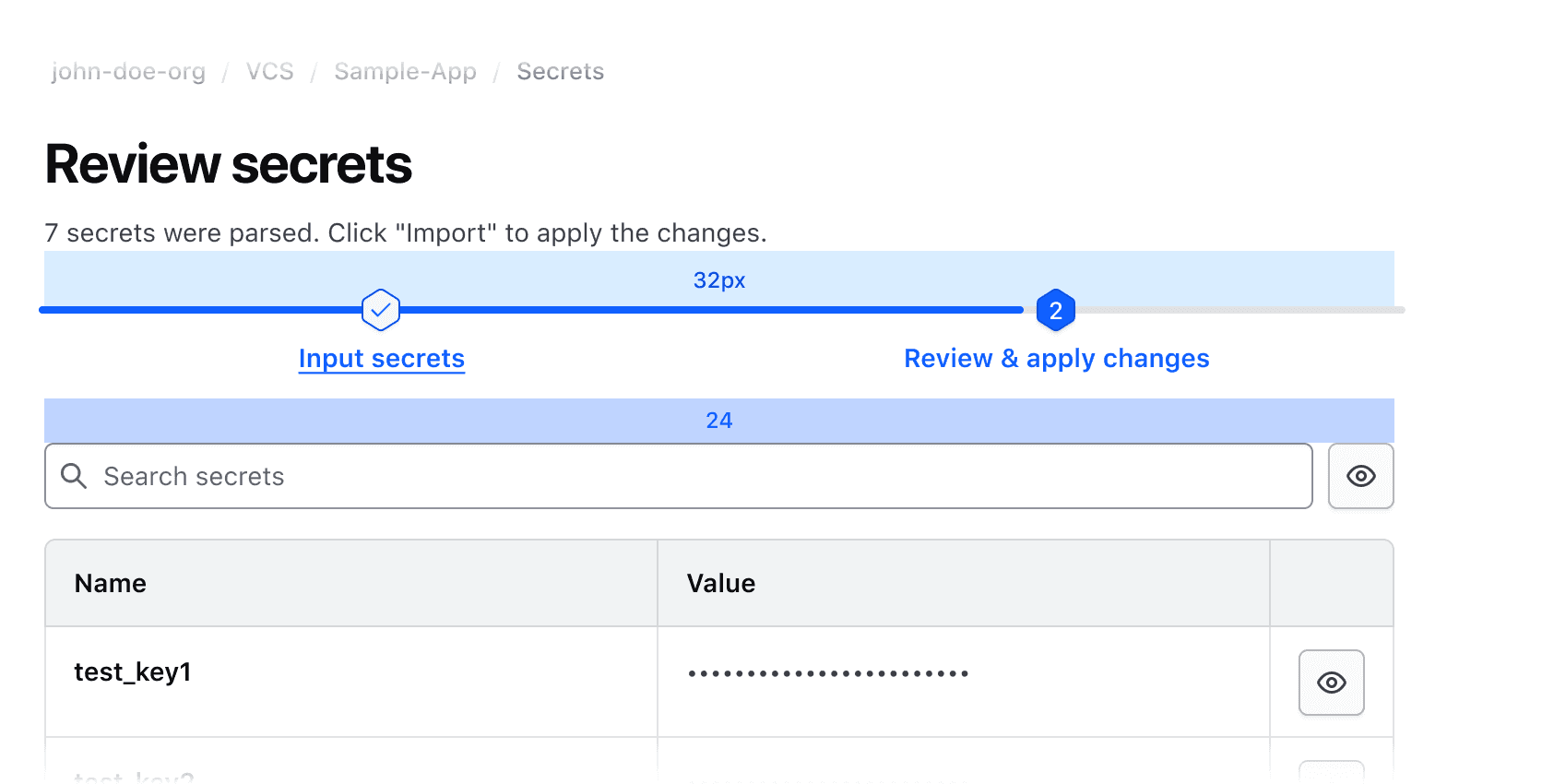
There should be 32px of spacing above the Stepper Nav and 24px below.
Resizing behavior
Each step scales evenly to fit within the total width of the Stepper Nav. This ensures consistent touch target sizes for hover, active, and focus states. The total width of the Stepper Nav should match the page content width.
Responsive layout
At browser widths of 550px and below, the steps will stack vertically and not display a connecting progress bar.

Composition with other components
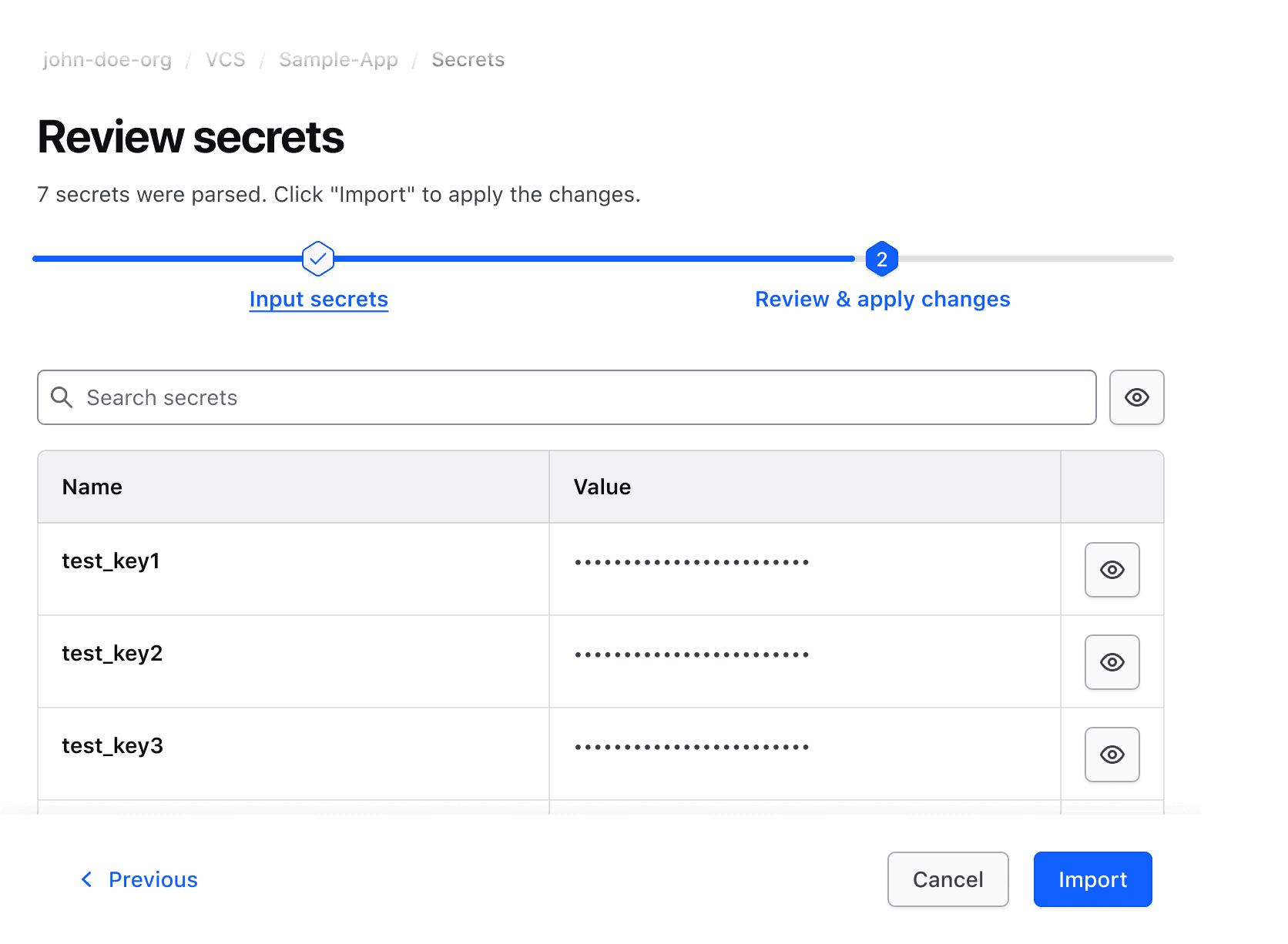
Always pair the Stepper Nav with appropriate navigation Buttons such as "Next" and "Previous". Buttons can be wrapped with a Button Set to ensure consistent spacing between them.
If backwards navigation is allowed, use an interactive Stepper Nav, otherwise use the non-interactive variant.
How to use this component
The Stepper Nav component is used to track the linear progress of a user in a given on-page flow.
Write an <i80-stepper-step> per step and, where the content lives inside the component, an <i80-stepper-panel> per step. Steps and panels are paired by order: the first panel belongs to the first step.
<i80-stepper-nav label="Basic usage">
  <i80-stepper-step title="Step 1"></i80-stepper-step>
  <i80-stepper-step title="Step 2"></i80-stepper-step>
  <i80-stepper-step title="Step 3"></i80-stepper-step>

  <i80-stepper-panel>Content 1</i80-stepper-panel>
  <i80-stepper-panel>Content 2</i80-stepper-panel>
  <i80-stepper-panel>Content 3</i80-stepper-panel>
</i80-stepper-nav>
Step status
current is the step in progress, counting from 0, and everything else follows from it: earlier steps are complete, later steps are incomplete. So a wizard only has to say which step it is on.
<i80-stepper-nav label="Status" current="1">
  <i80-stepper-step title="Step 1"></i80-stepper-step>
  <i80-stepper-step title="Step 2"></i80-stepper-step>
  <i80-stepper-step title="Step 3"></i80-stepper-step>

  <i80-stepper-panel>Content 1</i80-stepper-panel>
  <i80-stepper-panel>Content 2</i80-stepper-panel>
  <i80-stepper-panel>Content 3</i80-stepper-panel>
</i80-stepper-nav>
Where the flow moves without a page load, set the current property or the attribute and the bar follows.
Interactivity
A completed step is a button that goes back to it; incomplete steps are not reachable. The arrow keys move between the steps the reader can reach.
Interactive
When a completed step is clicked, the component fires i80-change with the step's index in detail.index. Listen for it to move a flow whose state lives in your application; where the state lives on the server, use the event to navigate or to ask for the step.
<i80-stepper-nav label="Interactive" current="1">
  <i80-stepper-step title="Step 1"></i80-stepper-step>
  <i80-stepper-step title="Step 2"></i80-stepper-step>
  <i80-stepper-step title="Step 3"></i80-stepper-step>

  <i80-stepper-panel>Content 1</i80-stepper-panel>
  <i80-stepper-panel>Content 2</i80-stepper-panel>
  <i80-stepper-panel>Content 3</i80-stepper-panel>
</i80-stepper-nav>
Not interactive
interactive="false" makes the bar a display of progress that cannot be clicked — which is what you want when the reader is not the one moving the flow along, like an order on its way.
<i80-stepper-nav label="Interactive" current="1" interactive="false">
  <i80-stepper-step title="Step 1"></i80-stepper-step>
  <i80-stepper-step title="Step 2"></i80-stepper-step>
  <i80-stepper-step title="Step 3"></i80-stepper-step>

  <i80-stepper-panel>Content 1</i80-stepper-panel>
  <i80-stepper-panel>Content 2</i80-stepper-panel>
  <i80-stepper-panel>Content 3</i80-stepper-panel>
</i80-stepper-nav>
Without panels
Leave the panels out and the component is a list of steps. Use that when the content of each step lives elsewhere on the page, or on another page.
Steps content
<i80-stepper-nav label="Standalone contextual components" interactive="false">
  <i80-stepper-step title="Step 1"></i80-stepper-step>
  <i80-stepper-step title="Step 2"></i80-stepper-step>
  <i80-stepper-step title="Step 3"></i80-stepper-step>
</i80-stepper-nav>
<p>Steps content</p>
Attributes
<i80-stepper-nav> renders this component. Everything it understands:
| Attribute | Values | Default | Notes |
|---|---|---|---|
label |
text | The step list's accessible name. | |
current |
index | 0 |
The step in progress, counting from 0. Property: current. Event: i80-change with detail.index when a completed step is clicked. |
interactive |
boolean | true |
interactive="false" makes it a progress display: plain steps, no tablist. Read when the steps are taken in. |
title-tag |
div · h1 … h6 | div |
The heading level of the step titles. |
i80-stepper-step |
title · description | One step; its status comes from current. slot="title" and slot="description" take HTML. | |
i80-stepper-panel |
The content of the step in the same position; the others are hidden. |
The tag keeps any native element you write inside it, so a server-rendered form, link or button works as it is. See Web Components for loading i80.js and the reference for these examples running.
Anatomy

| Element | Usage |
|---|---|
| Stepper Indicator | Required |
| Progress bar | Required |
| Title | Required |
| Description | Optional |
States
The Stepper Nav supports a title and an optional description. Content should be limited to only what is necessary, and long form content should live within the body of the Step.
Title
Titles provide an overview to help users understand what tasks need to be completed. Titles are required and should be brief.
Description
Descriptions provide additional context about the step and are optional. We recommend that all steps either have a description or do not.
Use descriptions consistently.

Don't mix and match inclusion of descriptions.

Number of steps
We recommend a maximum of 4 steps. If that isn’t possible, be mindful of how the content within the title and description will wrap on smaller screens.
Conformance rating
When used as recommended, there should not be any WCAG conformance issues with this component.
Keyboard navigation
Focus on the active step.

Move between completed and active steps. The steps after the one in progress are marked aria-disabled and are skipped.
If focus is on the first step, left arrow moves focus to the last completed or active step. If focus is on the last completed or active step, right arrow moves focus to the first completed or active step.

Activate step to display step content.

Move to interactive element within the content area.

Applicable WCAG Success Criteria
-
1.3.1
Info and Relationships (Level A):
Information, structure, and relationships conveyed through presentation can be programmatically determined or are available in text. -
1.3.2
Meaningful Sequence (Level A):
When the sequence in which content is presented affects its meaning, a correct reading sequence can be programmatically determined. -
1.4.1
Use of Color (Level A):
Color is not used as the only visual means of conveying information, indicating an action, prompting a response, or distinguishing a visual element. -
1.4.10
Reflow (Level AA):
Content can be presented without loss of information or functionality, and without requiring scrolling in two dimensions. -
1.4.11
Non-text Contrast (Level AA):
The visual presentation of the following have a contrast ratio of at least 3:1 against adjacent color(s): user interface components; graphical objects. -
1.4.12
Text Spacing (Level AA):
No loss of content or functionality occurs by setting all of the following and by changing no other style property: line height set to 1.5; spacing following paragraphs set to at least 2x the font size; letter-spacing set at least 0.12x of the font size, word spacing set to at least 0.16 times the font size. -
1.4.3
Minimum Contrast (Level AA):
The visual presentation of text and images of text has a contrast ratio of at least 4.5:1 -
1.4.4
Resize Text (Level AA):
Except for captions and images of text, text can be resized without assistive technology up to 200 percent without loss of content or functionality. -
2.1.1
Keyboard (Level A):
All functionality of the content is operable through a keyboard interface. -
2.1.2
No Keyboard Trap (Level A):
If keyboard focus can be moved to a component of the page using a keyboard interface, then focus can be moved away from that component using only a keyboard interface. -
2.2.2
Pause, Stop, Hide (Level A):
If you have moving, blinking, scrolling or auto-updating information, read the guidance because there are a lot of details. -
2.4.6
Headings and Labels (Level AA):
Headings and labels describe topic or purpose. -
2.4.7
Focus Visible (Level AA):
Any keyboard operable user interface has a mode of operation where the keyboard focus indicator is visible. -
3.2.1
On Focus (Level A):
When any user interface component receives focus, it does not initiate a change of context. -
3.3.2
Labels or Instructions (Level A):
Labels or instructions are provided when content requires user input. -
4.1.2
Name, Role, Value (Level A):
For all user interface components, the name and role can be programmatically determined; states, properties, and values that can be set by the user can be programmatically set; and notification of changes to these items is available to user agents, including assistive technologies.
Support
If any accessibility issues have been found within this component, let us know by submitting an issue.
0.1.0
Første i80-version (fork af upstream, se core/UPSTREAM.md).