When advancing through a multi-step flow or feature, a Stepper Indicator helps users maintain context and directionality. In certain circumstances, it could act as a navigational device between steps. It’s generally assembled as part of a larger Stepper pattern.
Usage
When to use
- As a visual decorator to assist in the status and context of a multi-step flow.
- Within a larger stepper or step item pattern paired with a label and description.
When not to use
- In isolation, consider a standard icon.
Steps
Interactive steps
Interactive steps are part of a sequential flow and can be interacted with as a navigational device.

Non-interactive steps
Non-interactive steps are a part of a list of steps that can be completed sequentially, or asynchronously. They cannot be interacted with.

Tasks
Interactive tasks
Interactive tasks are part of a list of tasks that can be completed in any order. They can also be interacted with as a navigational device.

Non-interactive tasks
Non-interactive tasks are part of a list of tasks which can be completed in any order. They are not interactive but serve as a visual list item indicator.

The Stepper Indicator indicates the relational step value, helping users maintain context in a multi-step flow or sequence. It should be used in larger stepper item patterns with an appropriate label, description, and design language indicating directionality.
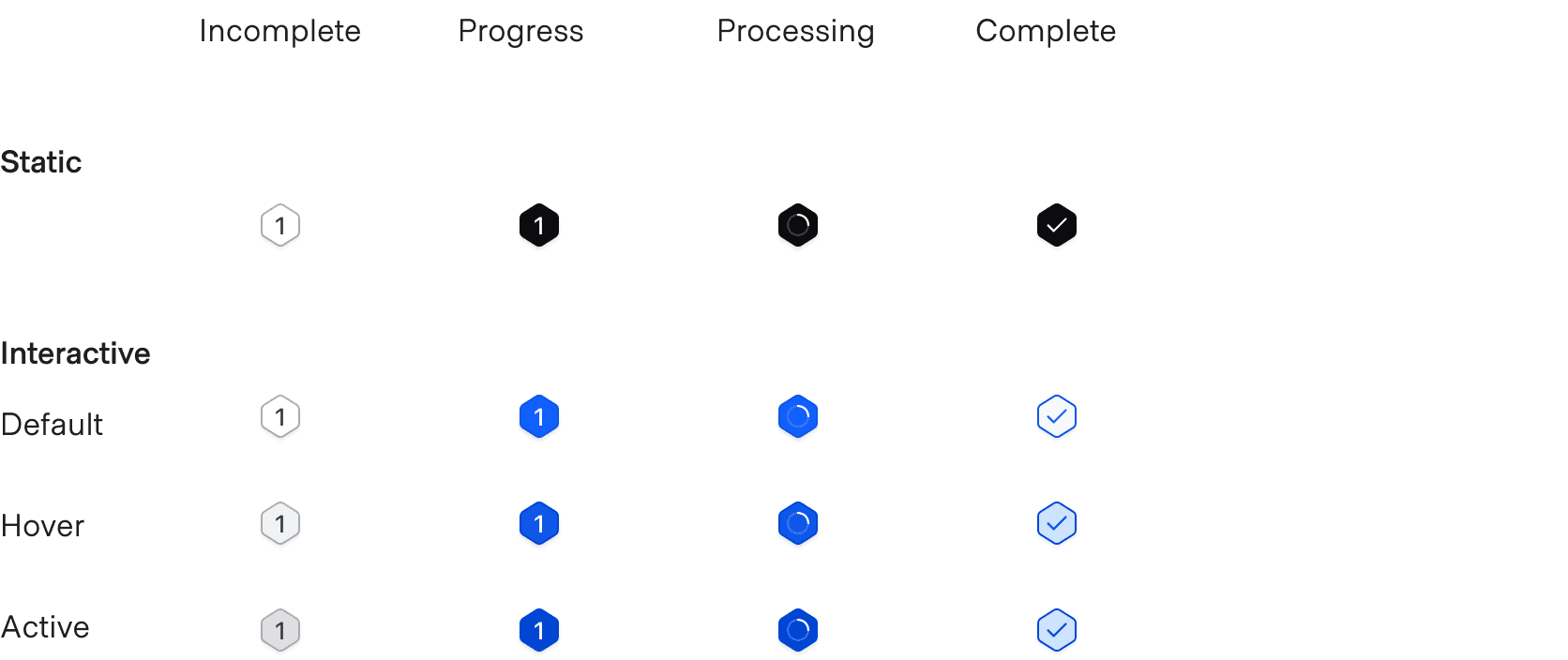
There are two kinds of indicator, set with type: a step indicator, which is a hexagon holding the step number, and a task indicator, which is the status mark on its own. They can be used together or separately, depending on how much hierarchy the flow needs.
The Stepper List and Stepper Nav draw their own indicators. Use this element when you are building the list yourself — a step inside a table row, or a checklist of your own.
The step indicator
Give it a text, which is the number in the hexagon, and a status.
<i80-stepper-indicator text="1" status="incomplete"></i80-stepper-indicator>Adding interactivity
Indicators are generally assembled into a larger stepper item, so the hover, active and focus states belong to that item rather than to the indicator. Where the indicator itself is the thing being clicked, interactive gives it those styles. It does not make the indicator a control: put it inside your own <button> or <a>.
<i80-stepper-indicator text="1" status="incomplete" interactive></i80-stepper-indicator>Indicating status
Four values: incomplete, progress, processing and complete. processing spins, for a step the server is still working on.
<i80-stepper-indicator text="1" status="progress" interactive></i80-stepper-indicator>
<i80-stepper-indicator text="1" status="processing" interactive></i80-stepper-indicator>
<i80-stepper-indicator text="1" status="complete" interactive></i80-stepper-indicator>
The task indicator
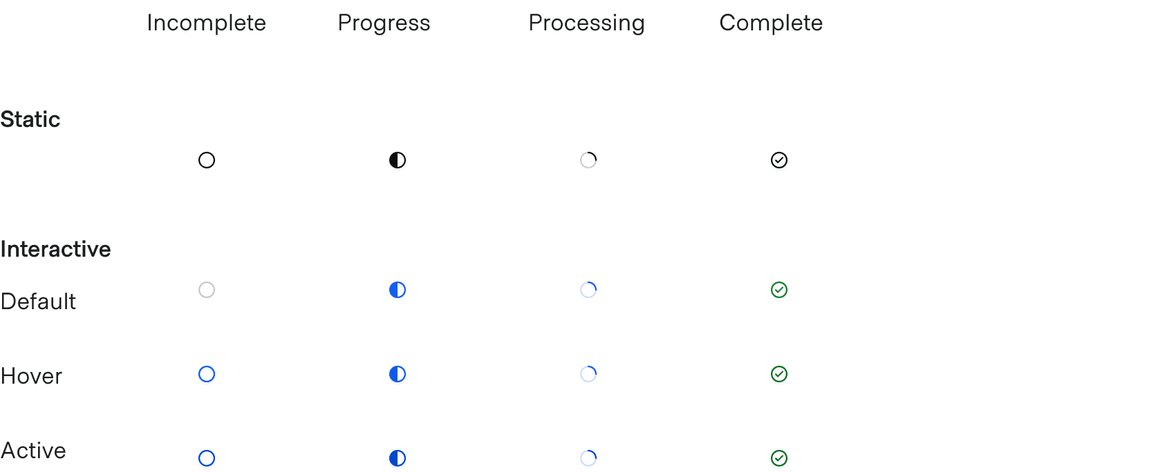
type="task" drops the hexagon and shows the status mark alone, for a list of tasks where a number would say nothing.
<i80-stepper-indicator type="task" status="incomplete"></i80-stepper-indicator>Adding interactivity
As above, interactive adds the hover and active styles for an indicator inside something clickable.
<i80-stepper-indicator type="task" status="incomplete" interactive></i80-stepper-indicator>Indicating status
The same four values.
<i80-stepper-indicator type="task" status="progress" interactive></i80-stepper-indicator>
<i80-stepper-indicator type="task" status="processing" interactive></i80-stepper-indicator>
<i80-stepper-indicator type="task" status="complete" interactive></i80-stepper-indicator>
Attributes
<i80-stepper-indicator> renders this component. Everything it understands:
| Attribute | Values | Default | Notes |
|---|---|---|---|
type |
step · task | step |
The hexagon with a number, or the status icon on its own. |
status |
incomplete · progress · processing · complete | incomplete |
|
text |
text | The step number in the hexagon. | |
interactive |
boolean | Adds the hover and active styles, for an indicator inside something clickable. |
The tag keeps any native element you write inside it, so a server-rendered form, link or button works as it is. See Web Components for loading i80.js and the reference for these examples running.
Anatomy
Step indicator

| Element | Usage |
|---|---|
| Text | Required (indicates the step sequence) |
| Container | Required |
Task indicator

| Element | Usage |
|---|---|
| Icon indicator | Required |
States
Step indicator
Task indicator
General recommendations
The Step Indicator must be numerical (1, 2, 3) in its sequencing.
Conformance rating
<i80-stepper-indicator> is not WCAG-conformant on its own. It draws one step or task marker and nothing else: no list, no headings, no state for assistive technology.
Best practices
For practical accessibility purposes, consider a Stepper (the whole component) a list of items, with each step being a list item.
Applicable WCAG Success Criteria
There is no specific WCAG Success Criteria applicable to the Stepper Indicator on its own. Since we’re only providing the Stepper Indicator and not the entire stepper, product teams are responsible for ensuring WCAG conformance is met in any components they build.
Support
If any accessibility issues have been found within this component, let us know by submitting an issue.
0.1.0
Første i80-version (fork af upstream, se core/UPSTREAM.md).