Usage
When to use
- In onboarding, account creation, or initial setups that are broken up into multiple steps.
- To communicate what has and has not been completed in a multi-step flow.
- For progress that does not require the user to remain on the current page to complete.
When not to use
- When the user needs to remain within the step to complete it, use the Stepper Nav.
- For simple forms or when progress doesn't need to be tracked, use structured page content.
Progressive disclosure
We recommend showing the contents of the in-progress step while hiding the contents of other steps. This narrows the focus to the current step and ensures steps are completed in order. However, context from the previous step is sometimes needed for the user to complete the next step, so use your best judgment.
Show the contents of one step at a time.

Don’t introduce visual noise. Instead, focus the user’s attention on which action should be taken first.
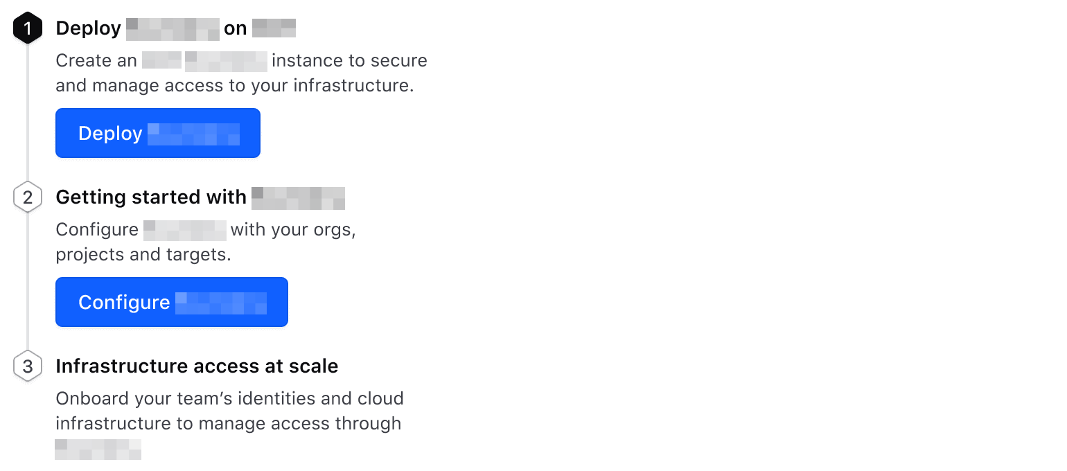
Using processing status
Set the status as processing to provide the user with immediate feedback when data is submitted within a step.

If an error occurs, the error should be displayed within the step and the status should remain in progress.

How to use this component
Write an <i80-stepper-step> per step inside <i80-stepper-list>. The steps are numbered by their place in the list, so adding one in the middle renumbers the rest. The list needs a label, which is its accessible name.
<i80-stepper-list label="Basic usage">
  <i80-stepper-step>One</i80-stepper-step>
  <i80-stepper-step>Two</i80-stepper-step>
  <i80-stepper-step>Three</i80-stepper-step>
</i80-stepper-list>
Indicating status
Each step takes a status: incomplete (the default), progress, processing or complete.
<i80-stepper-list label="Indicating status">
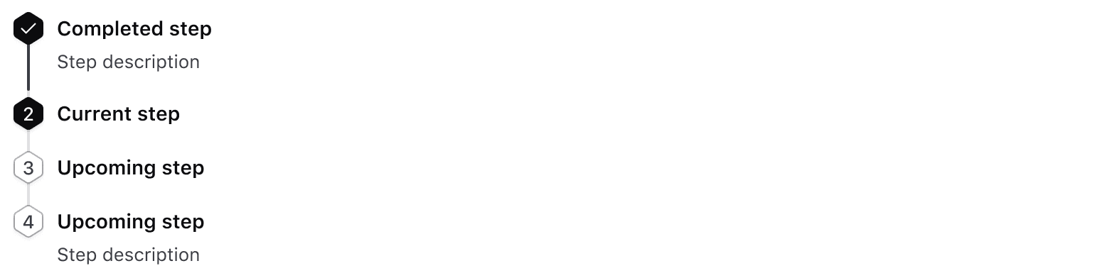
  <i80-stepper-step status="complete">Completed step</i80-stepper-step>
  <i80-stepper-step status="progress">Current step</i80-stepper-step>
  <i80-stepper-step>Upcoming step</i80-stepper-step>
</i80-stepper-list>
A processing status is used to indicate an ongoing process in the background, such as the user's data being submitted.
<i80-stepper-list label="Processing status">
  <i80-stepper-step status="complete">Completed step</i80-stepper-step>
  <i80-stepper-step status="processing">Current step</i80-stepper-step>
  <i80-stepper-step>Upcoming step</i80-stepper-step>
</i80-stepper-list>
Title, description and content
Every step needs a title: give it as the title attribute, or as the step's own text. A description adds a line under it, and anything else you write inside the step — a button, a link, a form — becomes the step's content.
<i80-stepper-list label="Additional information">
  <i80-stepper-step status="complete" title="Completed step" description="Step description"></i80-stepper-step>
  <i80-stepper-step status="progress" title="Current step" description="Step description">
    <i80-button>Do step action</i80-button>
  </i80-stepper-step>
  <i80-stepper-step title="Upcoming step" description="Step description"></i80-stepper-step>
</i80-stepper-list>
The title-tag attribute on the list sets the heading level of those titles, so a list inside a section can fit the document outline.
Attributes
<i80-stepper-list> renders this component. Everything it understands:
| Attribute | Values | Default | Notes |
|---|---|---|---|
label |
text | The list's accessible name. | |
title-tag |
div · h1 … h6 | div |
The heading level of the step titles. |
i80-stepper-step |
status (incomplete · progress · processing · complete) · title · description | One step. The title and description can also be children with slot="title" and slot="description"; anything else inside becomes the step's content. |
The tag keeps any native element you write inside it, so a server-rendered form, link or button works as it is. See Web Components for loading i80.js and the reference for these examples running.
Anatomy

| Element | Usage |
|---|---|
| Stepper Indicator | Required |
| Title | Required |
| Description | Optional |
| Body | Optional; accepts any custom component instance (local or from i80) |
| Progress bar | Required |
States
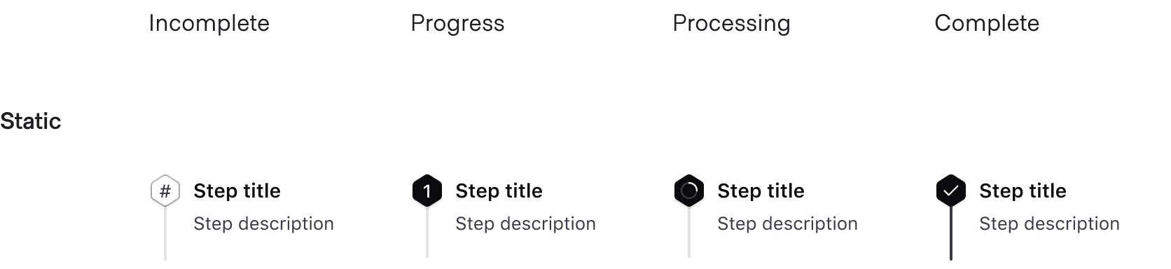
The Stepper List includes a title, an optional description, and a generic slot for content.
Title
Titles provide an overview to help users understand what tasks need to be completed and their purpose within the flow. Titles are required and should be brief.
Description
Descriptions are optional. They can be used to provide additional brief context. If used, we recommend providing a description for all steps.
Ensure inclusion of descriptions is consistent.

Don't mix and match inclusion of descriptions.
Conformance rating
When used as recommended, there should not be any WCAG conformance issues with this component.
Best Practices
Using processing status
Use status="processing" on an <i80-stepper-step> only for a step that is waiting on a loading or background process, or where the user cannot go on until something finishes. It draws a spinner, so using it outside those cases is not conformant.
Applicable WCAG Success Criteria
-
1.3.1
Info and Relationships (Level A):
Information, structure, and relationships conveyed through presentation can be programmatically determined or are available in text. -
1.3.2
Meaningful Sequence (Level A):
When the sequence in which content is presented affects its meaning, a correct reading sequence can be programmatically determined. -
1.4.1
Use of Color (Level A):
Color is not used as the only visual means of conveying information, indicating an action, prompting a response, or distinguishing a visual element. -
1.4.10
Reflow (Level AA):
Content can be presented without loss of information or functionality, and without requiring scrolling in two dimensions. -
1.4.11
Non-text Contrast (Level AA):
The visual presentation of the following have a contrast ratio of at least 3:1 against adjacent color(s): user interface components; graphical objects. -
1.4.12
Text Spacing (Level AA):
No loss of content or functionality occurs by setting all of the following and by changing no other style property: line height set to 1.5; spacing following paragraphs set to at least 2x the font size; letter-spacing set at least 0.12x of the font size, word spacing set to at least 0.16 times the font size. -
1.4.3
Minimum Contrast (Level AA):
The visual presentation of text and images of text has a contrast ratio of at least 4.5:1 -
1.4.4
Resize Text (Level AA):
Except for captions and images of text, text can be resized without assistive technology up to 200 percent without loss of content or functionality. -
2.2.2
Pause, Stop, Hide (Level A):
If you have moving, blinking, scrolling or auto-updating information, read the guidance because there are a lot of details. -
2.4.6
Headings and Labels (Level AA):
Headings and labels describe topic or purpose.
Support
If any accessibility issues have been found within this component, let us know by submitting an issue.
0.1.0
Første i80-version (fork af upstream, se core/UPSTREAM.md).