The Advanced Table is designed for complex datasets, featuring sticky headers, keyboard navigation, and expandable rows. The Table and Advanced Table features aren't interchangeable.
Usage
When to use
- For large data sets with many properties that benefit from being viewed in a scrollable container.
- When expandable rows are needed for hierarchical data.
- When users would benefit from more efficient keyboard navigation, e.g., when there are many rows or columns.
- When users would benefit from customizing the view of the data set (column width, order, etc).
When not to use
- If your dataset requires only basic interactions, such as simple sorting or pagination, and does not require features like nested rows, advanced keyboard navigation, or sticky headers, the standard Table is a more suitable choice.
- When data visualizations better convey the data.
- As a layout mechanism for structuring content that isn’t tabular data.
- To replicate spreadsheet-like functionality with extensive in-cell editing or calculations.
Columns
Sorting
- While multiple columns may offer sorting, only one column can be sorted at a time.
- In addition to standard sorting methods (like alphabetical or chronological), domain-specific sorting, such as by status severity, can also be useful.
- Sorting is not relevant for all content and should be applied thoughtfully.

Tooltips
Labels should be concise and straightforward. If more context is necessary, a Tooltip can be used in conjunction with the label, but should be used sparingly and as a last resort.
Some examples where it may be useful to include additional context in a tooltip include:
- When the label contains a product or i80-specific term.
- When the label refers to a setting that can be changed elsewhere in the application.

Width
As a best practice, column width should be adjusted to fit the longest data type within the cell.
Placement
Column placement determines the visual styling based on where the column is within the table structure.
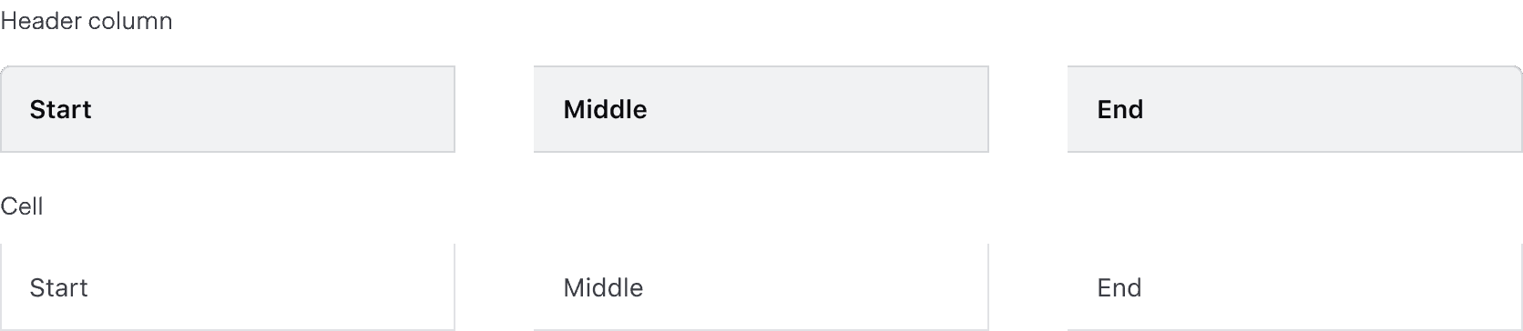
Alignment
The content's alignment can impact readability and scannability. The proper alignment method depends on the content type and its relative position in the table.
Use consistent alignment between the header label and the cell content in a column.

Avoid misaligned header labels and content.

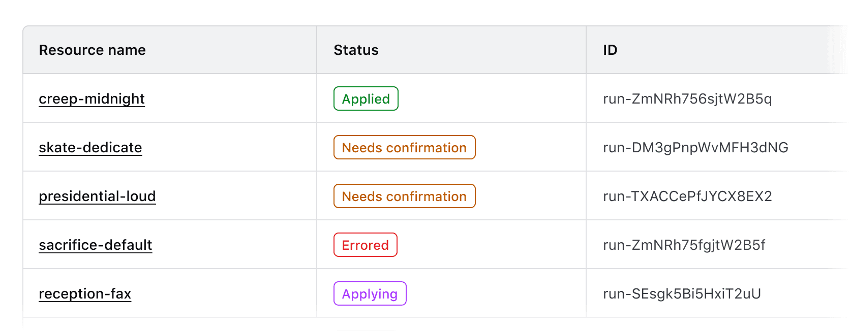
Left alignment
By default, align content to the left. This lends itself to the default left-to-right reading order of most content types.
Use left alignment for:
- Strings (unique identifiers or IDs, names and naming conventions, etc).
- Numerical values that do not contain decimals or floating point numbers.
- Numerical values that contain periods or other delimiter characters (IP addresses).
- Nested components that display a string, e.g., a Badge.
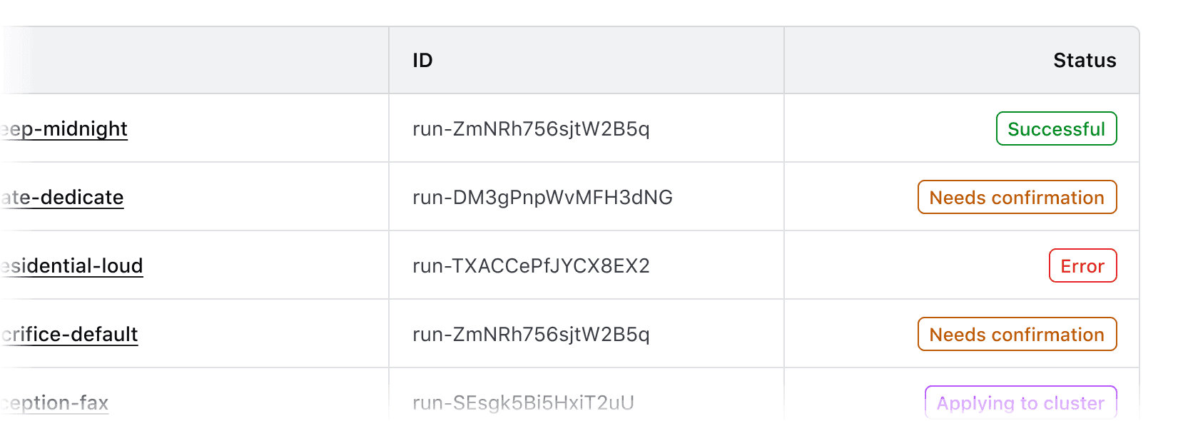
Right alignment
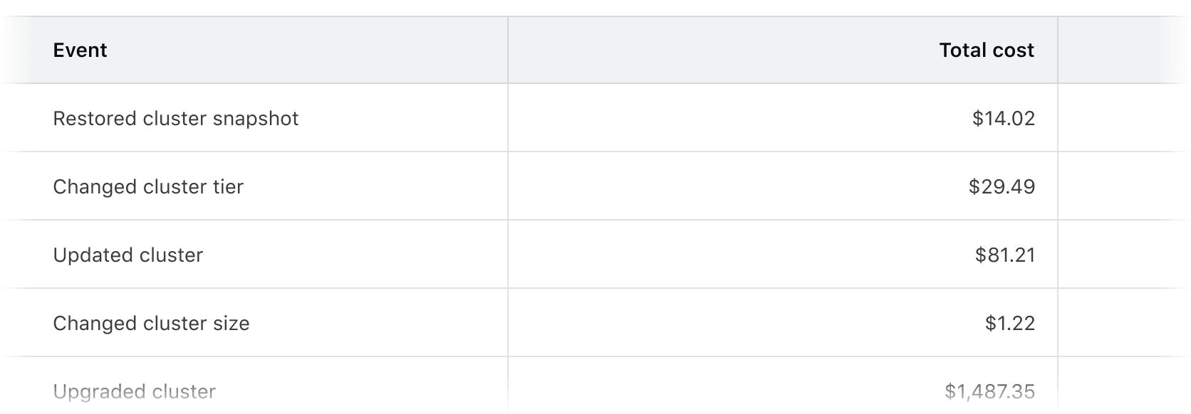
Right alignment can be used when expressing numerical values with decimals as this aligns the decimal places vertically.
Common examples of right alignment include:
- Financial information, currency amounts, or other numbers with decimal values.
- In a column with a "more options" function.
- As a means to visually "bookend" the row with content that is of a similar length, e.g., timestamps, TTL (time-to-live) values, dates.
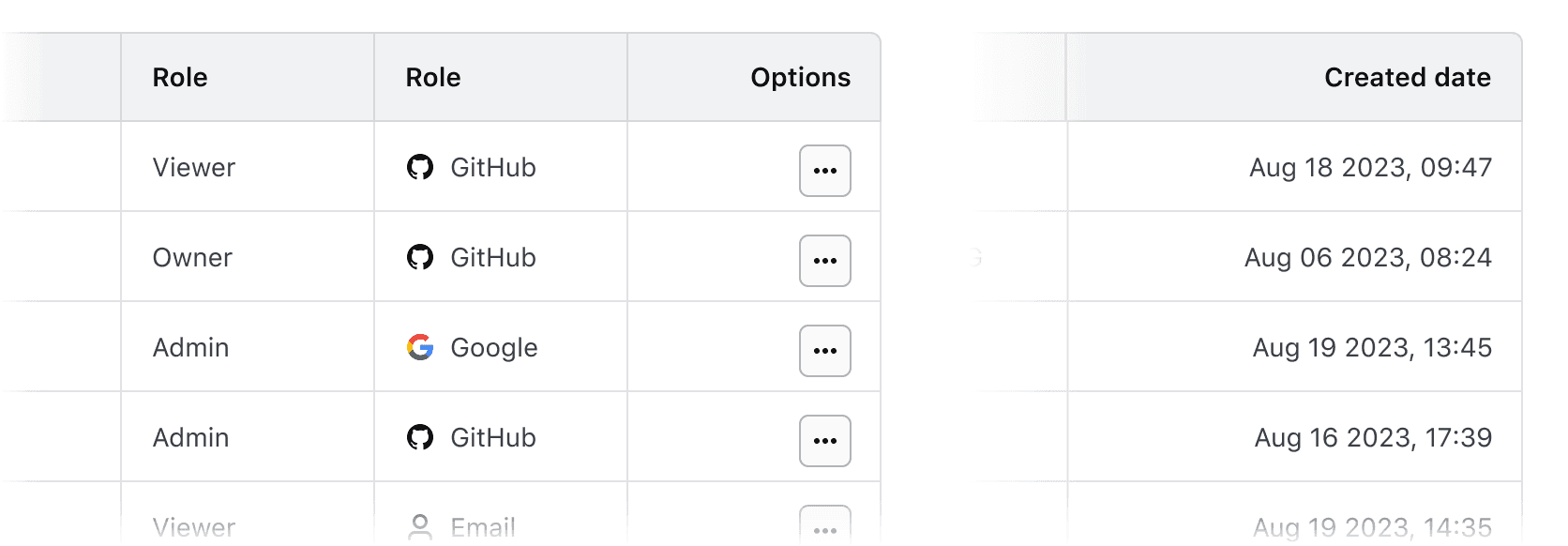
Don’t align content of varied lengths to the right. This can make it difficult to read by forcing an unnatural reading pattern.
Other alignment methods
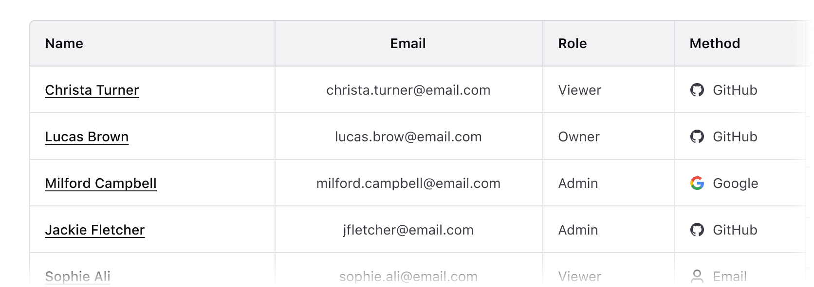
We don’t recommend centered or justified content alignment. These can be difficult to read, especially when the content varies in length.
Don’t center header labels or cell content within a table.
Reordering columns
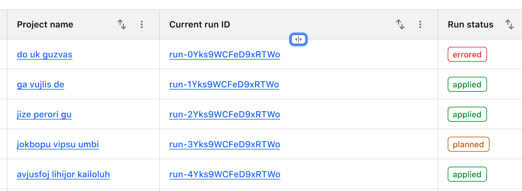
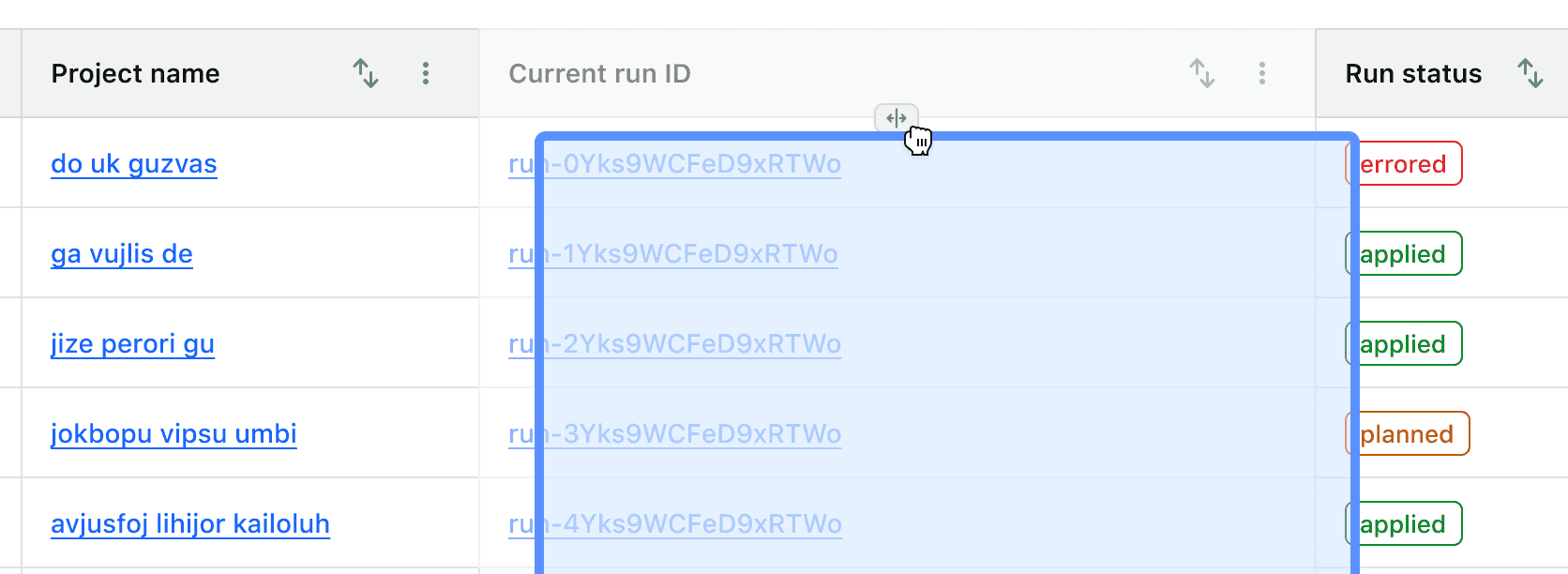
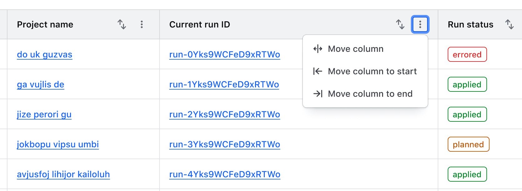
Where reorderable columns are enabled, users can reorder columns either by dragging the column reorder handle with a mouse, or by moving focus to the handle and using the left and right arrow keys.
Actions related to moving columns are displayed in a context menu in the table header. These are not customizable and include:
- Move column: moves focus to the reordering handle
- Move column to start/end: moves the column to the first or last position in the table unless the column is already in this position.
Resizing columns
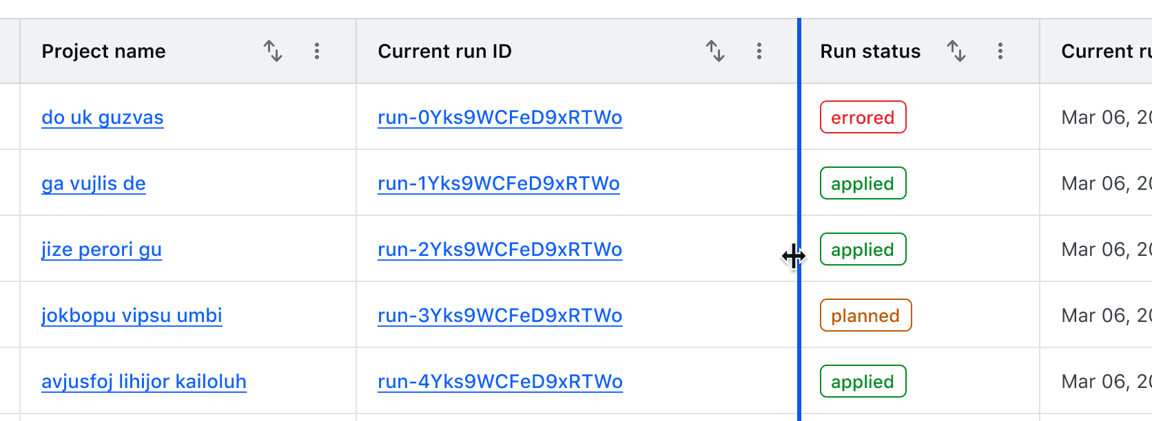
Columns can be resized by dragging the "resize border" with a mouse or by moving focus to it and using the left and right arrow keys.
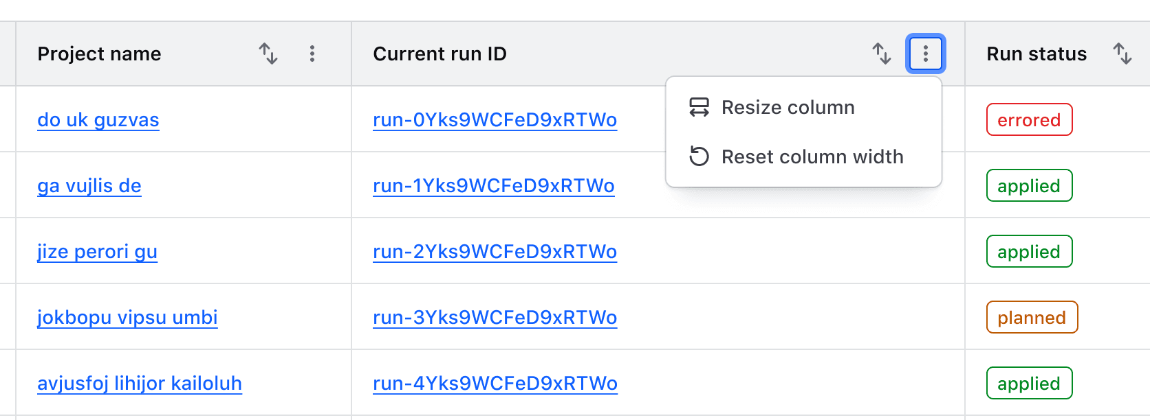
When resizable columns are enabled, actions related to each function are rendered in a context menu in the table header. These functions are not customizable.
Minimum and maximum width
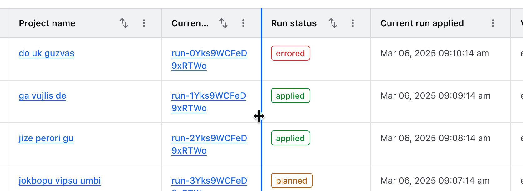
To prevent a column from being resized beyond a reasonable amount, every column keeps a minimum width, and a column can be given a minimum and a maximum of its own.
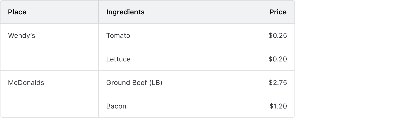
Column and row span
- Supports combining multiple columns or rows into a single cell.
- Apply column and row spans carefully to maintain alignment, accessibility, and smooth table interactions.
- Multi-span cells should use the same alignment for readability.
Rows
Headers
- Labels in headers should be concise and straightforward.
- The label should clearly indicate what type of content is contained within the cell (string, number, status, etc).
- Labels should always use sentence-case.
Expandable rows
Expandable rows let users show or hide more content without navigating away from the table. The expanded content should align with the header labels, even if the parent row includes minimal data.
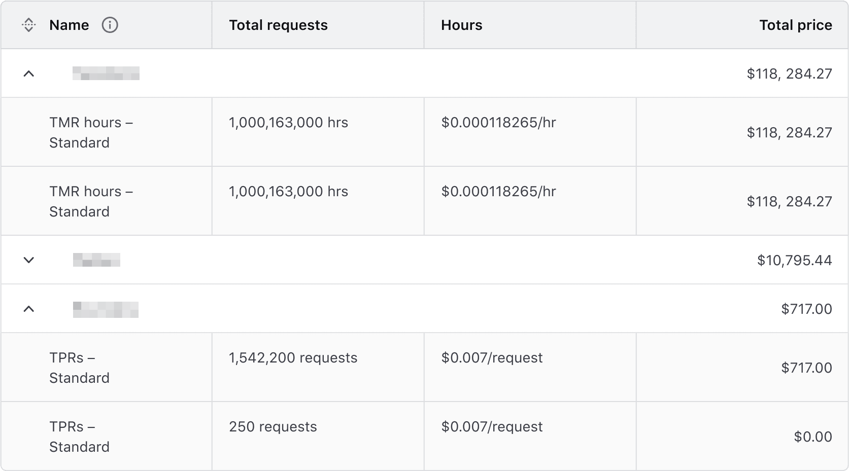
Avoid using expandable rows when data is not structured in parent-child relationships.
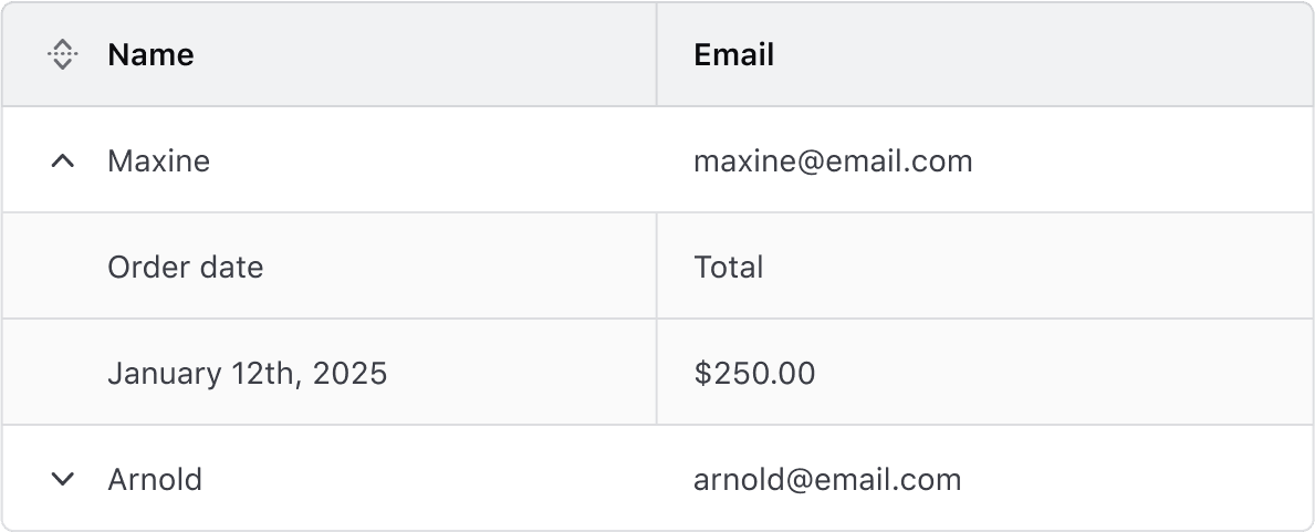
Avoid using different density settings for parent and child rows.
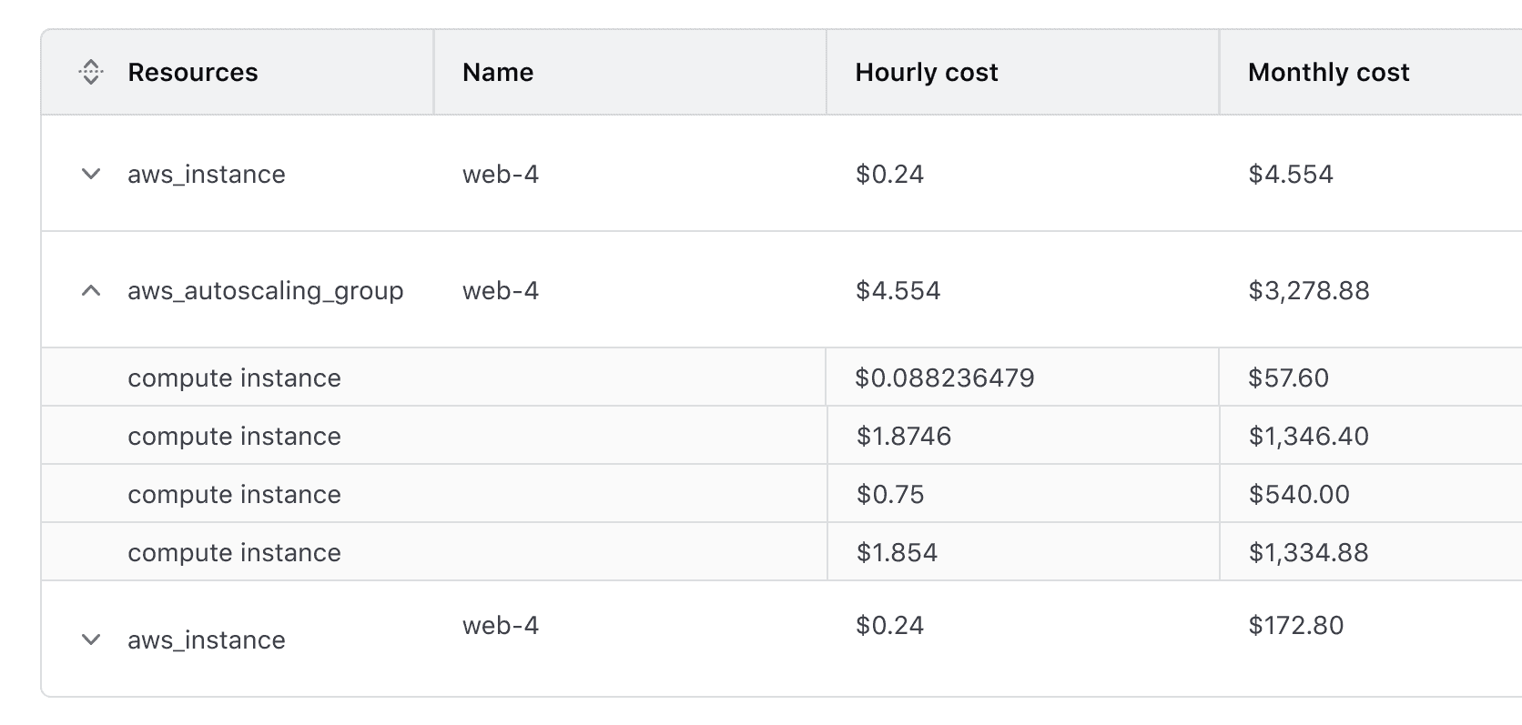
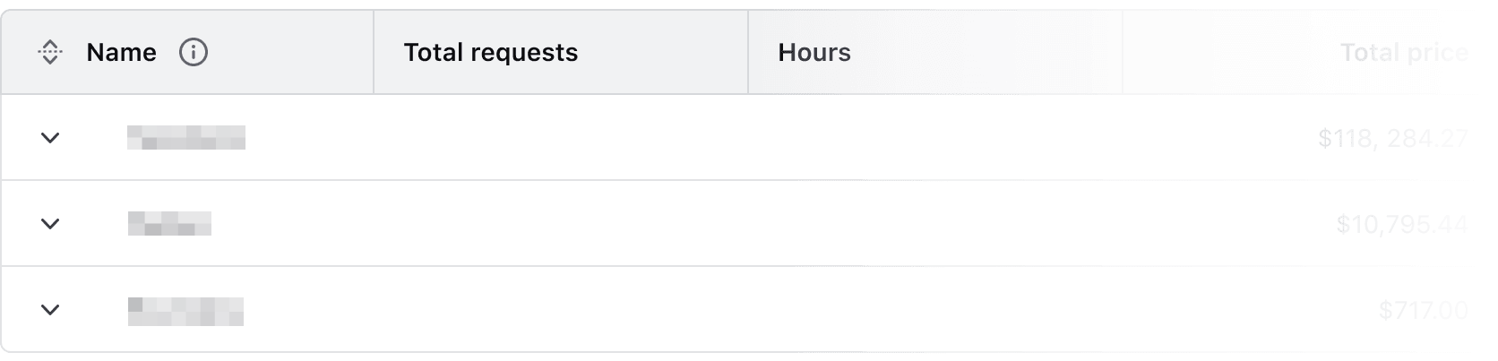
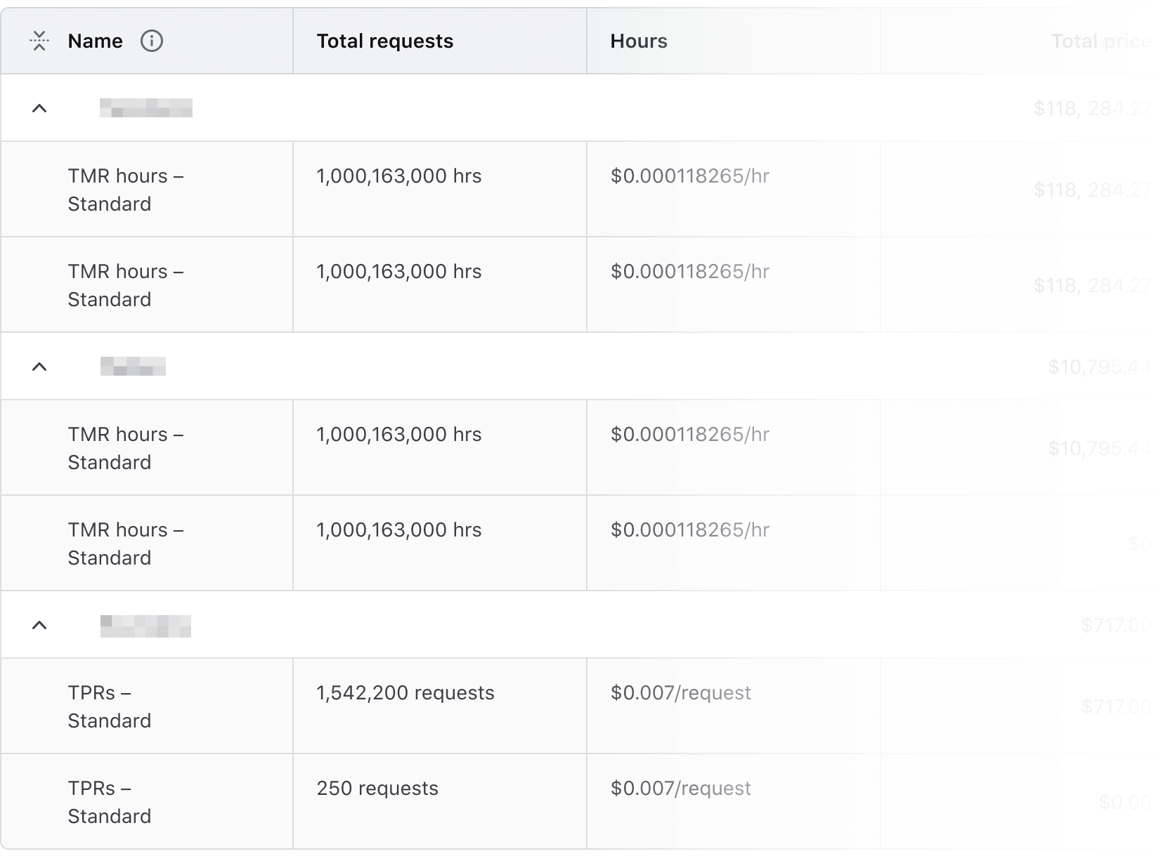
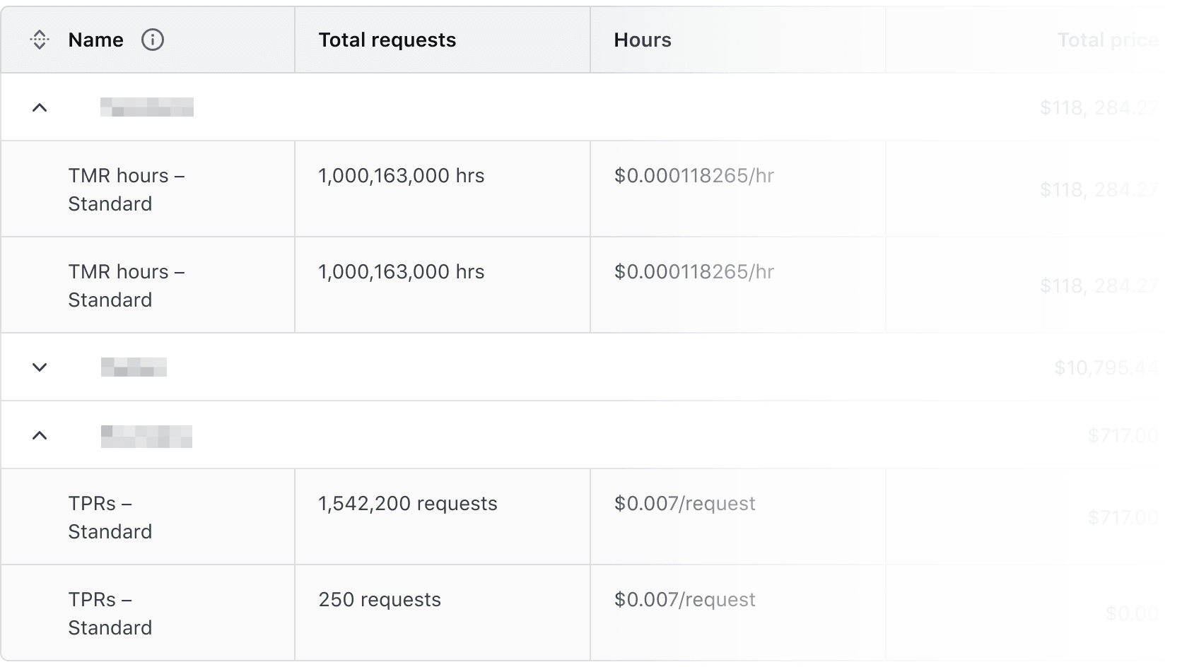
Expand/Collapse All Button
The Expand/Collapse All button allows users to expand or collapse all rows, including nested rows. It provides quick access to more content but may impact readability when content is long or detailed.
Interactions
Default state
The Advanced Table supports any combination of expanded or collapsed rows on load. The button reflects the initial state.


Collapsed state
Expanded state
Mixed state
Striping
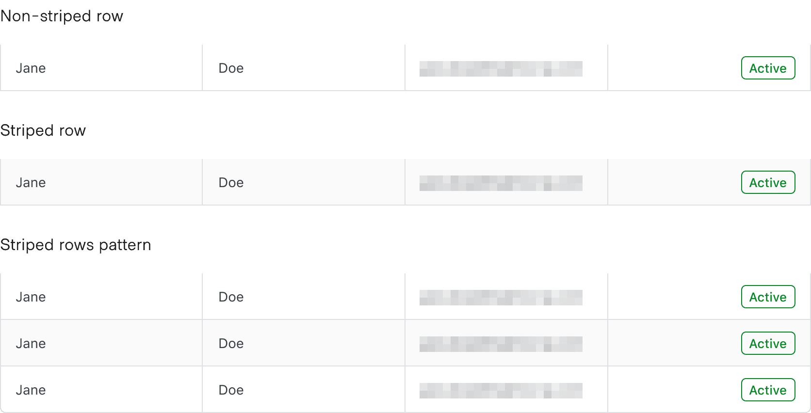
Striping enhances readability by alternating row colors, making it easier to scan tabular data.
- Non-Nested Advanced Tables: Striping starts with the second row, distinguishing it from the header.
- Nested Advanced Tables: Child rows are automatically striped, while parent rows remain unstriped to visually reinforce hierarchy. This behavior cannot be disabled.
Placement
The cells in the corners of the table carry its rounded corners; the cells between them are square.

Cells
For the user to scan, sort, and filter the table easily, each cell should contain a single piece of data. Having more than one piece of data in a cell makes it harder for users to navigate the relationships between headers and cells.
Density
- By default, use the
mediumdensity for balance and readability. - To fit more rows on a page, use the
shortdensity. Use this only for text-heavy tables, as it can make them harder to scan. - For a smaller dataset, e.g., basic user data, consider using the
talldensity to provide the content with more breathing room.
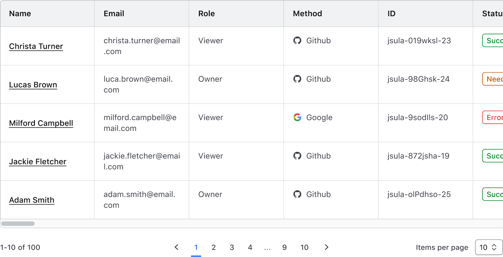
Horizontal scrolling
Use horizontal scrolling when the number of columns expands beyond the viewport or container.
Sticky headers and columns
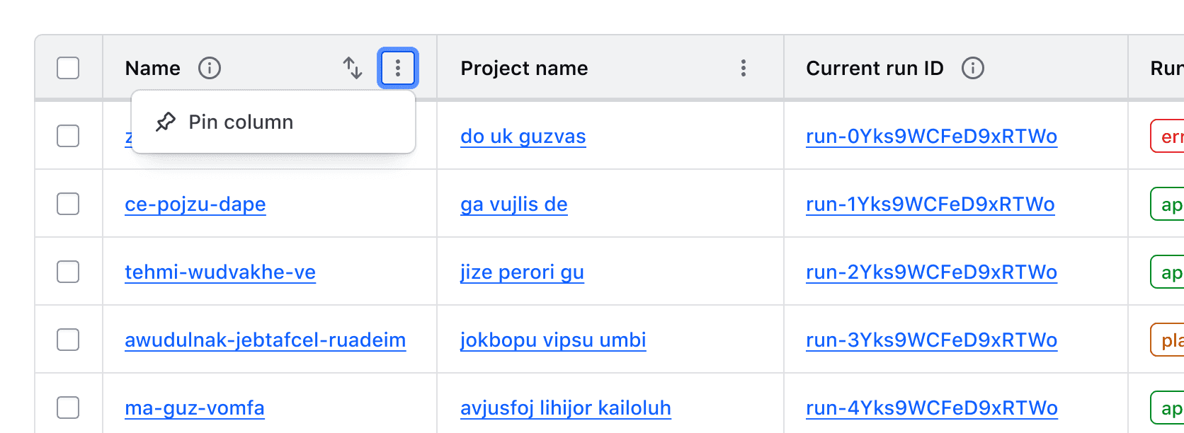
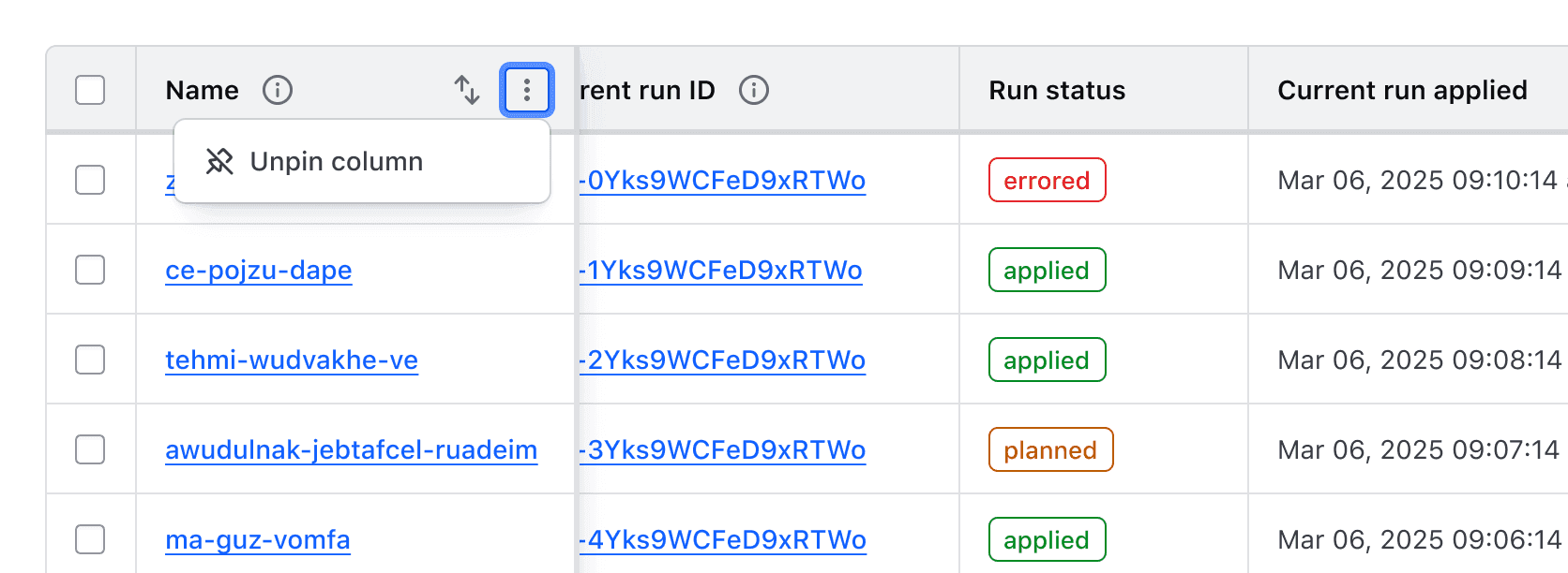
The header and first column can be pinned, helping users navigate large datasets while persisting key values, such as names or IDs.
There are a few things to consider when implementing a sticky header or column:
- Instances of the Advanced Table with nested rows, expandable rows, or cells that span columns or rows do not support a sticky column, because what counts as the first column then varies from row to row.
- Setting the first column as sticky in a table with multi-selection will couple the multi-select column and the first column of data together.
Where a sticky first column is enabled, the context menu offers a control to "Pin" and "Unpin" the first column.
Multi-Select
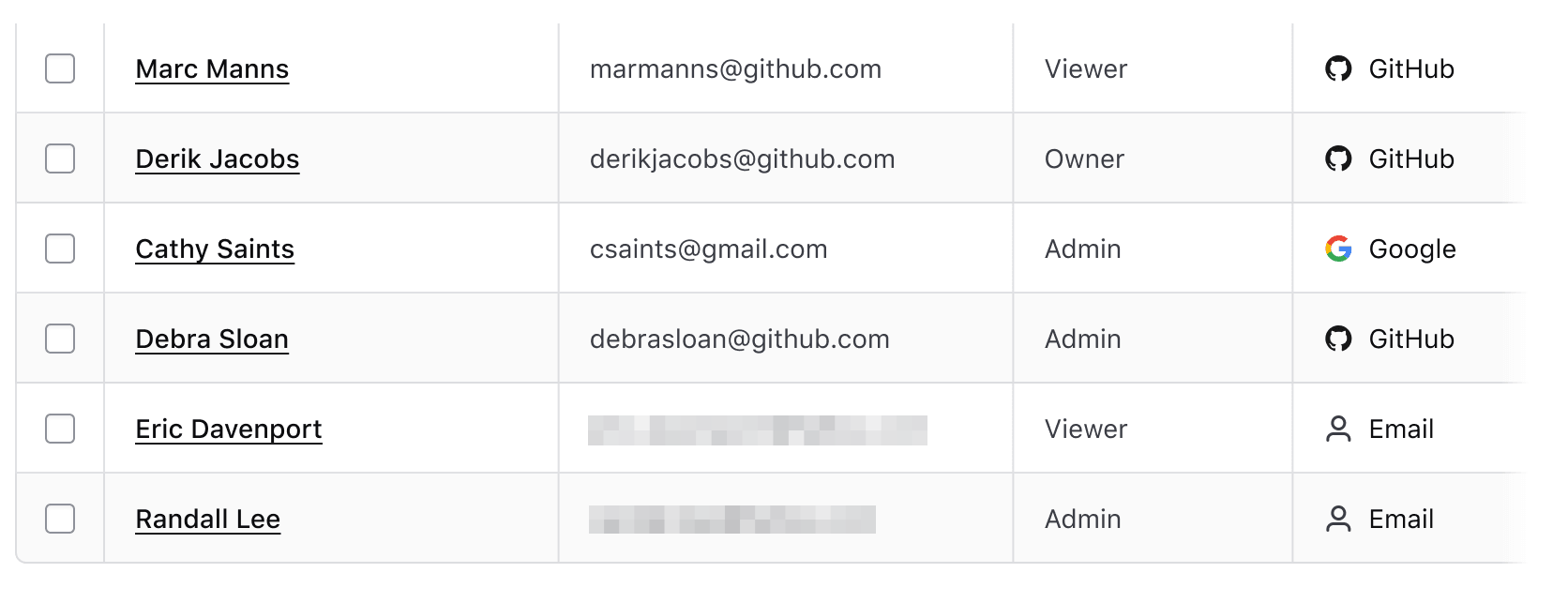
Multi-select allows users to select multiple rows to perform bulk actions, such as deleting or exporting data. Selection states are maintained across pagination and filtering.
A multi-select pattern consists of:
A "Select all" checkbox is used in the header row to allow the simultaneous selection or deselection of all child rows.

Individual checkboxes added to each row allow for the selection of that row.
For more details, see the Multi-Select Table Pattern.
Empty state
The Advanced Table supports displaying an empty state using the Application State component to display an informative message and prompt user action. There are several reasons an empty state may occur: the data set is empty, the applied filters return no results, etc.
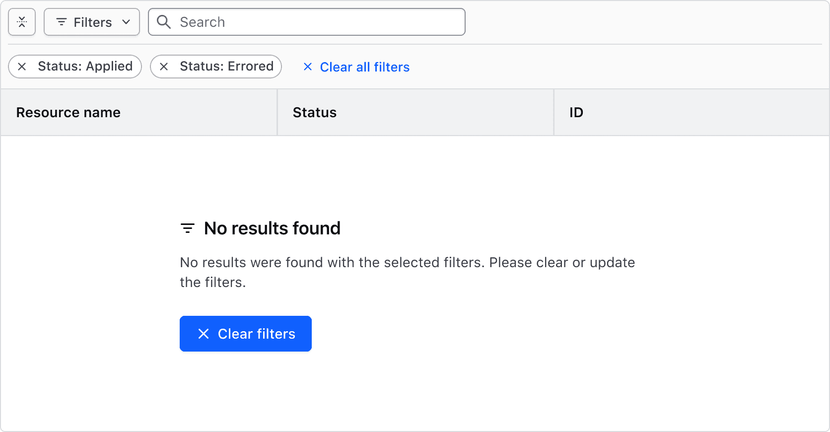
Show the empty state when there is nothing to list.
How to use this component
The Advanced Table is the Table with the features a large, structured data set needs: nested rows, row selection, a sticky header and resizable columns.
<i80-advanced-table> wraps a real <table>. You — or your server template — write the <thead> and every <tbody> row; the element styles them, adds the buttons and checkboxes the features need, and reads the shape of the table out of the markup. There is no column list to declare and no data model to hand over: the rows on the page are the data.
The styles lay the table out with CSS Grid, and display: grid drops the table semantics a browser derives from the tags, so the element writes those roles back onto the real elements: role="table" on the <table>, role="row" on each <tr>, columnheader, rowheader and cell on the cells. Until the JavaScript has run — or if it never runs — the markup is still an ordinary, readable table.
A basic table
Write the table and give the element a caption. The caption is read by screen readers and not shown; a <caption> you write yourself is kept and hidden the same way.
| Artist | Album | Year |
|---|---|---|
| Nick Drake | Pink Moon | 1972 |
| The Beatles | Abbey Road | 1969 |
| Melanie | Candles in the Rain | 1971 |
| Bob Dylan | Bringing It All Back Home | 1965 |
| James Taylor | Sweet Baby James | 1970 |
| Simon and Garfunkel | Bridge Over Troubled Waters | 1970 |
<i80-advanced-table caption="Folk albums">
  <table>
    <thead>
      <tr>
        <th>Artist</th>
        <th>Album</th>
        <th>Year</th>
      </tr>
    </thead>
    <tbody>
      <tr>
        <td>Nick Drake</td>
        <td>Pink Moon</td>
        <td>1972</td>
      </tr>
      <tr>
        <td>The Beatles</td>
        <td>Abbey Road</td>
        <td>1969</td>
      </tr>
      <tr>
        <td>Melanie</td>
        <td>Candles in the Rain</td>
        <td>1971</td>
      </tr>
      <tr>
        <td>Bob Dylan</td>
        <td>Bringing It All Back Home</td>
        <td>1965</td>
      </tr>
      <tr>
        <td>James Taylor</td>
        <td>Sweet Baby James</td>
        <td>1970</td>
      </tr>
      <tr>
        <td>Simon and Garfunkel</td>
        <td>Bridge Over Troubled Waters</td>
        <td>1970</td>
      </tr>
    </tbody>
  </table>
</i80-advanced-table>
Nested rows
For a data set where a row has children, render the children as rows too and say where each one sits with depth: a <tr depth="1"> is a child of the row above it, and is hidden until that row is expanded. A row is a parent because the row after it is deeper — there is nothing else to declare. expanded on a parent row starts it open.
Put expandable on the <th> of the column that should carry the expand button; without it the first column carries it. When that column is not itself sortable, its header cell also gets a button that expands and collapses every row at once.
To keep the table accessible, the cells of a nested row must line up with the columns of its parent. Otherwise the relationship between a parent and its children will not be clear to users.
| Name | Status | Description |
|---|---|---|
| Policy set 1 | ||
| test-advisory-pass.sentinel | Sample description for this thing. | |
| test-hard-mandatory-pass.sentinel | Sample description for this thing. | |
| Policy set 2 | ||
| test-advisory-pass.sentinel | Sample description for this thing. | |
| test-soft-mandatory-fail.sentinel | Sample description for this thing. |
<!-- A row's depth says where it sits in the tree: a <tr depth="1"> is a child of
     the row above it, and is hidden until that row is expanded. -->
<i80-advanced-table caption="Policy sets">
  <table>
    <thead>
      <tr>
        <th expandable>Name</th>
        <th>Status</th>
        <th>Description</th>
      </tr>
    </thead>
    <tbody>
      <tr expanded>
        <th>Policy set 1</th>
        <td><i80-badge color="success" icon="check">Pass</i80-badge></td>
        <td></td>
      </tr>
      <tr depth="1">
        <th>test-advisory-pass.sentinel</th>
        <td><i80-badge color="success" icon="check">Pass</i80-badge></td>
        <td>Sample description for this thing.</td>
      </tr>
      <tr depth="1">
        <th>test-hard-mandatory-pass.sentinel</th>
        <td><i80-badge color="success" icon="check">Pass</i80-badge></td>
        <td>Sample description for this thing.</td>
      </tr>
      <tr>
        <th>Policy set 2</th>
        <td><i80-badge color="critical" icon="x">Fail</i80-badge></td>
        <td></td>
      </tr>
      <tr depth="1">
        <th>test-advisory-pass.sentinel</th>
        <td><i80-badge color="success" icon="check">Pass</i80-badge></td>
        <td>Sample description for this thing.</td>
      </tr>
      <tr depth="1">
        <th>test-soft-mandatory-fail.sentinel</th>
        <td><i80-badge color="critical" icon="x">Fail</i80-badge></td>
        <td>Sample description for this thing.</td>
      </tr>
    </tbody>
  </table>
</i80-advanced-table>
Resizable columns
Add resizable-columns and every column but the last gets a drag handle on its right edge. The handle is a real slider: drag it with a mouse, or move focus to it and use the left and right arrow keys, which step the edge 10px at a time.
| Artist | Album | Release Year |
|---|---|---|
| Nick Drake | Pink Moon | 1972 |
| The Beatles | Abbey Road | 1969 |
| Melanie | Candles in the Rain | 1971 |
| Bob Dylan | Bringing It All Back Home | 1965 |
| James Taylor | Sweet Baby James | 1970 |
| Simon and Garfunkel | Bridge Over Troubled Waters | 1970 |
<!-- Drag a column's right edge, or focus the handle and use the left and right
     arrow keys. -->
<i80-advanced-table caption="Folk albums" resizable-columns>
  <table>
    <thead>
      <tr>
        <th sort>Artist</th>
        <th sort>Album</th>
        <th>Release Year</th>
      </tr>
    </thead>
    <tbody>
      <tr>
        <td>Nick Drake</td>
        <td>Pink Moon</td>
        <td>1972</td>
      </tr>
      <tr>
        <td>The Beatles</td>
        <td>Abbey Road</td>
        <td>1969</td>
      </tr>
      <tr>
        <td>Melanie</td>
        <td>Candles in the Rain</td>
        <td>1971</td>
      </tr>
      <tr>
        <td>Bob Dylan</td>
        <td>Bringing It All Back Home</td>
        <td>1965</td>
      </tr>
      <tr>
        <td>James Taylor</td>
        <td>Sweet Baby James</td>
        <td>1970</td>
      </tr>
      <tr>
        <td>Simon and Garfunkel</td>
        <td>Bridge Over Troubled Waters</td>
        <td>1970</td>
      </tr>
    </tbody>
  </table>
</i80-advanced-table>
Minimum and maximum column width
width on a <th> sets that column's starting grid track, and min-width and max-width bound how far a resize can take it. A column with no min-width stops at 48px; with no max-width it keeps growing.
| Artist | Album | Release Year |
|---|---|---|
| Nick Drake | Pink Moon | 1972 |
| The Beatles | Abbey Road | 1969 |
| Melanie | Candles in the Rain | 1971 |
| Bob Dylan | Bringing It All Back Home | 1965 |
| James Taylor | Sweet Baby James | 1970 |
| Simon and Garfunkel | Bridge Over Troubled Waters | 1970 |
<i80-advanced-table caption="Folk albums" resizable-columns>
  <table>
    <thead>
      <tr>
        <th sort>Artist</th>
        <th sort width="300px" min-width="200px" max-width="500px">Album</th>
        <th>Release Year</th>
      </tr>
    </thead>
    <tbody>
      <tr>
        <td>Nick Drake</td>
        <td>Pink Moon</td>
        <td>1972</td>
      </tr>
      <tr>
        <td>The Beatles</td>
        <td>Abbey Road</td>
        <td>1969</td>
      </tr>
      <tr>
        <td>Melanie</td>
        <td>Candles in the Rain</td>
        <td>1971</td>
      </tr>
      <tr>
        <td>Bob Dylan</td>
        <td>Bringing It All Back Home</td>
        <td>1965</td>
      </tr>
      <tr>
        <td>James Taylor</td>
        <td>Sweet Baby James</td>
        <td>1970</td>
      </tr>
      <tr>
        <td>Simon and Garfunkel</td>
        <td>Bridge Over Troubled Waters</td>
        <td>1970</td>
      </tr>
    </tbody>
  </table>
</i80-advanced-table>
Content wrapping
By default, content within the cells will wrap according to the browser’s natural reflow. This may result in the layout shifting as a column gets narrower.
How the cell content behaves is yours to decide — the element only sizes the column. Truncation with an ellipsis, for example, is a matter of styling the element inside the cell: text-overflow: ellipsis; white-space: nowrap; overflow: hidden;.
| Artist | Album | Release Year |
|---|---|---|
| Nick Drake | Pink Moon | 1972 |
| The Beatles | Abbey Road | 1969 |
| Melanie | Candles in the Rain | 1971 |
| Bob Dylan | Bringing It All Back Home | 1965 |
| James Taylor | Sweet Baby James | 1970 |
| Simon and Garfunkel | Bridge Over Troubled Waters | 1970 |
<!-- Cell content that should be cut off instead of wrapped when a column is made
     narrower: the truncation is yours to style, the element only sizes the column. -->
<i80-advanced-table caption="Folk albums" resizable-columns>
  <table>
    <thead>
      <tr>
        <th sort>Artist</th>
        <th sort>Album</th>
        <th>Release Year</th>
      </tr>
    </thead>
    <tbody>
      <tr>
        <td><span class="doc-truncate">Nick Drake</span></td>
        <td><span class="doc-truncate">Pink Moon</span></td>
        <td>1972</td>
      </tr>
      <tr>
        <td><span class="doc-truncate">The Beatles</span></td>
        <td><span class="doc-truncate">Abbey Road</span></td>
        <td>1969</td>
      </tr>
      <tr>
        <td><span class="doc-truncate">Melanie</span></td>
        <td><span class="doc-truncate">Candles in the Rain</span></td>
        <td>1971</td>
      </tr>
      <tr>
        <td><span class="doc-truncate">Bob Dylan</span></td>
        <td><span class="doc-truncate">Bringing It All Back Home</span></td>
        <td>1965</td>
      </tr>
      <tr>
        <td><span class="doc-truncate">James Taylor</span></td>
        <td><span class="doc-truncate">Sweet Baby James</span></td>
        <td>1970</td>
      </tr>
      <tr>
        <td><span class="doc-truncate">Simon and Garfunkel</span></td>
        <td><span class="doc-truncate">Bridge Over Troubled Waters</span></td>
        <td>1970</td>
      </tr>
    </tbody>
  </table>
</i80-advanced-table>

<style>
  .doc-truncate {
    width: 100%;
    overflow: hidden;
    white-space: nowrap;
    text-overflow: ellipsis;
  }
</style>
Sortable columns
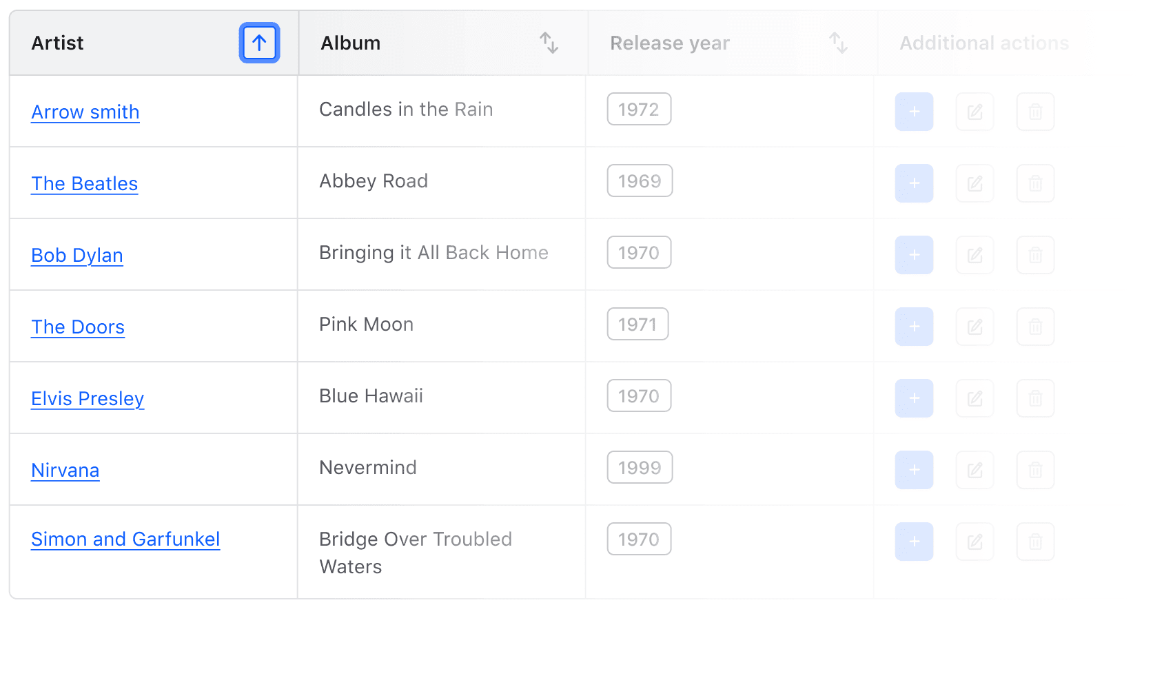
Add sort to each <th> whose column should be sortable. The header label becomes a sort button, clicking it sorts the rows in the browser, and clicking again reverses the order. Only one column is sorted at a time. A parent row moves together with its children, so the rows of one tree stay together.
Columns whose cells are all numbers are compared as numbers; everything else is compared as text, with digits inside the text read as numbers.
| Artist | Album | Release Year |
|---|---|---|
| Nick Drake | Pink Moon | 1972 |
| The Beatles | Abbey Road | 1969 |
| Melanie | Candles in the Rain | 1971 |
| Bob Dylan | Bringing It All Back Home | 1965 |
| James Taylor | Sweet Baby James | 1970 |
| Simon and Garfunkel | Bridge Over Troubled Waters | 1970 |
<i80-advanced-table caption="Folk albums">
  <table>
    <thead>
      <tr>
        <th sort>Artist</th>
        <th sort>Album</th>
        <th>Release Year</th>
      </tr>
    </thead>
    <tbody>
      <tr>
        <td>Nick Drake</td>
        <td>Pink Moon</td>
        <td>1972</td>
      </tr>
      <tr>
        <td>The Beatles</td>
        <td>Abbey Road</td>
        <td>1969</td>
      </tr>
      <tr>
        <td>Melanie</td>
        <td>Candles in the Rain</td>
        <td>1971</td>
      </tr>
      <tr>
        <td>Bob Dylan</td>
        <td>Bringing It All Back Home</td>
        <td>1965</td>
      </tr>
      <tr>
        <td>James Taylor</td>
        <td>Sweet Baby James</td>
        <td>1970</td>
      </tr>
      <tr>
        <td>Simon and Garfunkel</td>
        <td>Bridge Over Troubled Waters</td>
        <td>1970</td>
      </tr>
    </tbody>
  </table>
</i80-advanced-table>
Pre-sorted columns
sort="asc" on a <th> marks that column as the sorted one. It says which column carries the sort indicator, not what order to put the rows in: the rows arrive in that order from the server, and the element does not reorder them on load. The first click on such a column therefore reverses it.
| Artist | Album | Release Year |
|---|---|---|
| Nick Drake | Pink Moon | 1972 |
| The Beatles | Abbey Road | 1969 |
| Melanie | Candles in the Rain | 1971 |
| Bob Dylan | Bringing It All Back Home | 1965 |
| James Taylor | Sweet Baby James | 1970 |
| Simon and Garfunkel | Bridge Over Troubled Waters | 1970 |
<i80-advanced-table caption="Folk albums">
  <table>
    <thead>
      <tr>
        <th sort="asc">Artist</th>
        <th sort>Album</th>
        <th>Release Year</th>
      </tr>
    </thead>
    <tbody>
      <tr>
        <td>Nick Drake</td>
        <td>Pink Moon</td>
        <td>1972</td>
      </tr>
      <tr>
        <td>The Beatles</td>
        <td>Abbey Road</td>
        <td>1969</td>
      </tr>
      <tr>
        <td>Melanie</td>
        <td>Candles in the Rain</td>
        <td>1971</td>
      </tr>
      <tr>
        <td>Bob Dylan</td>
        <td>Bringing It All Back Home</td>
        <td>1965</td>
      </tr>
      <tr>
        <td>James Taylor</td>
        <td>Sweet Baby James</td>
        <td>1970</td>
      </tr>
      <tr>
        <td>Simon and Garfunkel</td>
        <td>Bridge Over Troubled Waters</td>
        <td>1970</td>
      </tr>
    </tbody>
  </table>
</i80-advanced-table>
Pre-sorting direction
By default, the sort order is set to ascending. To indicate that the column is pre-sorted in descending order, use sort="desc".
| Artist | Album | Release Year |
|---|---|---|
| Nick Drake | Pink Moon | 1972 |
| The Beatles | Abbey Road | 1969 |
| Melanie | Candles in the Rain | 1971 |
| Bob Dylan | Bringing It All Back Home | 1965 |
| James Taylor | Sweet Baby James | 1970 |
| Simon and Garfunkel | Bridge Over Troubled Waters | 1970 |
<i80-advanced-table caption="Folk albums">
  <table>
    <thead>
      <tr>
        <th sort="desc">Artist</th>
        <th sort>Album</th>
        <th>Release Year</th>
      </tr>
    </thead>
    <tbody>
      <tr>
        <td>Nick Drake</td>
        <td>Pink Moon</td>
        <td>1972</td>
      </tr>
      <tr>
        <td>The Beatles</td>
        <td>Abbey Road</td>
        <td>1969</td>
      </tr>
      <tr>
        <td>Melanie</td>
        <td>Candles in the Rain</td>
        <td>1971</td>
      </tr>
      <tr>
        <td>Bob Dylan</td>
        <td>Bringing It All Back Home</td>
        <td>1965</td>
      </tr>
      <tr>
        <td>James Taylor</td>
        <td>Sweet Baby James</td>
        <td>1970</td>
      </tr>
      <tr>
        <td>Simon and Garfunkel</td>
        <td>Bridge Over Troubled Waters</td>
        <td>1970</td>
      </tr>
    </tbody>
  </table>
</i80-advanced-table>
Sorting by a value instead of the cell text
Put a sort-value on the cells of a column and the column is sorted by those values instead of by the text in the cell. A sort-key on the <th> names the column in the i80-sort event, where the header's own text is used otherwise.
This is useful for cases where the cell text is not A-Z or 0-9 sortable, e.g., a status, and you’re otherwise unable to influence the shape of the data. In the example below the statuses are sorted by the rank given in sort-value, not alphabetically.
| Peer name | Status | Cluster partition |
|---|---|---|
| cluster-2-partition-2 | pending | cluster-2 / partition-2 |
| cluster-3-partition-3 | establishing | cluster-3 / partition-3 |
| cluster-4-partition-4 | failing | cluster-4 / partition-4 |
| cluster-5-partition-5 | active | cluster-5 / partition-5 |
| cluster-6-partition-2 | pending | cluster-6 / partition-2 |
| cluster-6-partition-1 | failing | cluster-6 / partition-1 |
<!-- The order of the statuses is not alphabetical, so each cell carries the rank
     to sort by. A server that knows the order renders it into sort-value. -->
<i80-advanced-table caption="Cluster peers">
  <table>
    <thead>
      <tr>
        <th sort>Peer name</th>
        <th sort>Status</th>
        <th>Cluster partition</th>
      </tr>
    </thead>
    <tbody>
      <tr>
        <td>cluster-2-partition-2</td>
        <td sort-value="3">pending</td>
        <td>cluster-2 / partition-2</td>
      </tr>
      <tr>
        <td>cluster-3-partition-3</td>
        <td sort-value="2">establishing</td>
        <td>cluster-3 / partition-3</td>
      </tr>
      <tr>
        <td>cluster-4-partition-4</td>
        <td sort-value="0">failing</td>
        <td>cluster-4 / partition-4</td>
      </tr>
      <tr>
        <td>cluster-5-partition-5</td>
        <td sort-value="1">active</td>
        <td>cluster-5 / partition-5</td>
      </tr>
      <tr>
        <td>cluster-6-partition-2</td>
        <td sort-value="3">pending</td>
        <td>cluster-6 / partition-2</td>
      </tr>
      <tr>
        <td>cluster-6-partition-1</td>
        <td sort-value="0">failing</td>
        <td>cluster-6 / partition-1</td>
      </tr>
    </tbody>
  </table>
</i80-advanced-table>
Sorting on the server
With sort-mode="server" the element leaves the rows alone: a click only moves the sort indicator and fires i80-sort, so your server can answer with the page sorted, or a script can fetch the sorted rows itself.
Density
To create a condensed or spacious Advanced Table, add density to the element. Note that it only affects the table body, not the table header.
| Artist | Album | Release Year |
|---|---|---|
| Nick Drake | Pink Moon | 1972 |
| The Beatles | Abbey Road | 1969 |
| Melanie | Candles in the Rain | 1971 |
| Bob Dylan | Bringing It All Back Home | 1965 |
| James Taylor | Sweet Baby James | 1970 |
| Simon and Garfunkel | Bridge Over Troubled Waters | 1970 |
<i80-advanced-table caption="Folk albums" density="short">
  <table>
    <thead>
      <tr>
        <th sort>Artist</th>
        <th sort>Album</th>
        <th>Release Year</th>
      </tr>
    </thead>
    <tbody>
      <tr>
        <td>Nick Drake</td>
        <td>Pink Moon</td>
        <td>1972</td>
      </tr>
      <tr>
        <td>The Beatles</td>
        <td>Abbey Road</td>
        <td>1969</td>
      </tr>
      <tr>
        <td>Melanie</td>
        <td>Candles in the Rain</td>
        <td>1971</td>
      </tr>
      <tr>
        <td>Bob Dylan</td>
        <td>Bringing It All Back Home</td>
        <td>1965</td>
      </tr>
      <tr>
        <td>James Taylor</td>
        <td>Sweet Baby James</td>
        <td>1970</td>
      </tr>
      <tr>
        <td>Simon and Garfunkel</td>
        <td>Bridge Over Troubled Waters</td>
        <td>1970</td>
      </tr>
    </tbody>
  </table>
</i80-advanced-table>
Horizontal alignment
To create a column that has right-aligned content, set align="right" on both the column’s <th> and its <td>s — the cell’s horizontal content alignment should be the same as the column’s.
| Artist | Album | Actions |
|---|---|---|
| Nick Drake | Pink Moon |
|
| The Beatles | Abbey Road |
|
| Melanie | Candles in the Rain |
|
<i80-advanced-table caption="Folk albums">
  <table>
    <thead>
      <tr>
        <th sort>Artist</th>
        <th sort>Album</th>
        <th align="right">Actions</th>
      </tr>
    </thead>
    <tbody>
      <tr>
        <td>Nick Drake</td>
        <td>Pink Moon</td>
        <td align="right">
          <i80-dropdown text="Actions" size="small" color="secondary" position="bottom-left">
            <i80-dropdown-item href="#edit" icon="edit">Edit</i80-dropdown-item>
            <i80-dropdown-item href="#delete" color="critical" icon="trash">Delete</i80-dropdown-item>
          </i80-dropdown>
        </td>
      </tr>
      <tr>
        <td>The Beatles</td>
        <td>Abbey Road</td>
        <td align="right">
          <i80-dropdown text="Actions" size="small" color="secondary" position="bottom-left">
            <i80-dropdown-item href="#edit" icon="edit">Edit</i80-dropdown-item>
            <i80-dropdown-item href="#delete" color="critical" icon="trash">Delete</i80-dropdown-item>
          </i80-dropdown>
        </td>
      </tr>
      <tr>
        <td>Melanie</td>
        <td>Candles in the Rain</td>
        <td align="right">
          <i80-dropdown text="Actions" size="small" color="secondary" position="bottom-left">
            <i80-dropdown-item href="#edit" icon="edit">Edit</i80-dropdown-item>
            <i80-dropdown-item href="#delete" color="critical" icon="trash">Delete</i80-dropdown-item>
          </i80-dropdown>
        </td>
      </tr>
    </tbody>
  </table>
</i80-advanced-table>
Tooltip
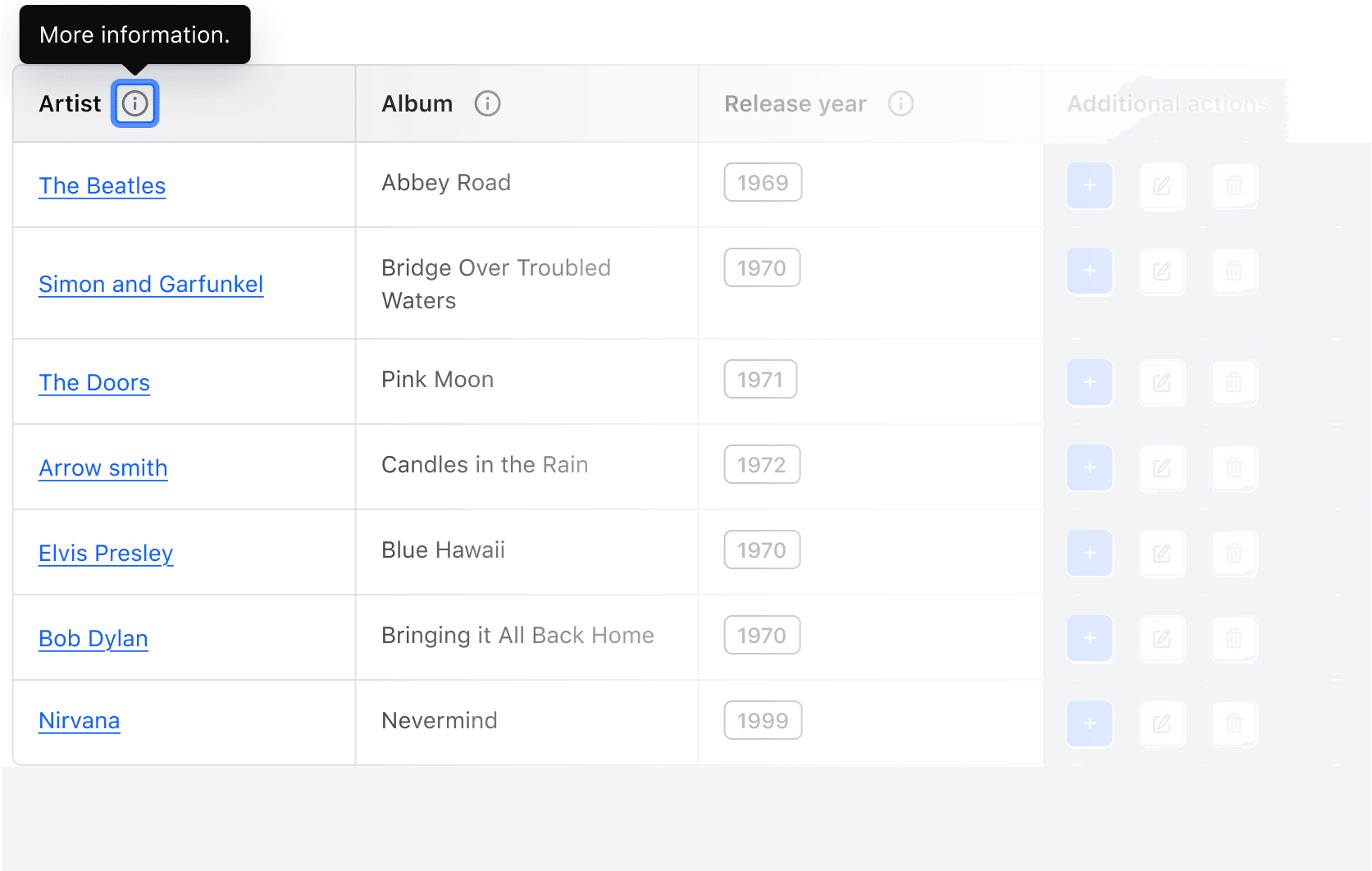
Header cells should be clear, concise, and straightforward whenever possible. However, there could be cases where the label is insufficient by itself and extra information is required. In this case, put a tooltip on the <th> to show an info button next to the label:
| Artist | Album | Vinyl Cost (USD) |
|---|---|---|
| Nick Drake | Pink Moon | 29.27 |
| The Beatles | Abbey Road | 25.99 |
| Melanie | Candles in the Rain | 46.49 |
| Bob Dylan | Bringing It All Back Home | 29.00 |
| James Taylor | Sweet Baby James | 16.00 |
| Simon and Garfunkel | Bridge Over Troubled Waters | 20.49 |
<i80-advanced-table caption="Folk albums">
  <table>
    <thead>
      <tr>
        <th>Artist</th>
        <th tooltip="Title of the album (in its first release)">Album</th>
        <th sort align="right" tooltip="Cost of the vinyl (adjusted for inflation)">Vinyl Cost (USD)</th>
      </tr>
    </thead>
    <tbody>
      <tr>
        <td>Nick Drake</td>
        <td>Pink Moon</td>
        <td align="right">29.27</td>
      </tr>
      <tr>
        <td>The Beatles</td>
        <td>Abbey Road</td>
        <td align="right">25.99</td>
      </tr>
      <tr>
        <td>Melanie</td>
        <td>Candles in the Rain</td>
        <td align="right">46.49</td>
      </tr>
      <tr>
        <td>Bob Dylan</td>
        <td>Bringing It All Back Home</td>
        <td align="right">29.00</td>
      </tr>
      <tr>
        <td>James Taylor</td>
        <td>Sweet Baby James</td>
        <td align="right">16.00</td>
      </tr>
      <tr>
        <td>Simon and Garfunkel</td>
        <td>Bridge Over Troubled Waters</td>
        <td align="right">20.49</td>
      </tr>
    </tbody>
  </table>
</i80-advanced-table>
Scrollable table
Consuming a large amount of data in a tabular format can lead to an intense cognitive load for the user. As a general principle, care should be taken to simplify the information within a table as much as possible.
We recommend using functionalities like pagination, sorting, and filtering to reduce this load.
Vertical scrolling
For situations where the default number of rows visible may be high, it can be difficult for users to track which column is which once they scroll. Give the element a max-height and the body scrolls at that height, with the header sticking to the top while it does, so the column headers persist as the user scrolls.
If you want the max-height but not the sticky header, add sticky-header="false". The header can only stick while something scrolls, so sticky-header on its own does nothing.
| ID | Name | Role | |
|---|---|---|---|
| 1 | Burnaby Kuscha | 1_bkuscha0@tiny.cc | Owner |
| 2 | Barton Penley | 2_bpenley1@miibeian.gov.cn | Admin |
| 3 | Norina Emanulsson | 3_nemanulsson2@walmart.com | Contributor |
| 4 | Orbadiah Smales | 4_osmales3@amazon.co.jp | Contributor |
| 5 | Dido Titchener | 5_dtitchener4@blogs.com | Contributor |
| 6 | Trish Horsburgh | 6_thorsburgh5@samsung.com | Contributor |
| 7 | Orion Laverack | 7_olaverack6@techcrunch.com | Contributor |
| 8 | Delly Moulsdale | 8_dmoulsdale7@sciencedirect.com | Contributor |
<!-- max-height makes the body scroll, and the header sticks to the top while it does. -->
<i80-advanced-table caption="Team" max-height="300px">
  <table>
    <thead>
      <tr>
        <th>ID</th>
        <th sort>Name</th>
        <th>Email</th>
        <th sort>Role</th>
      </tr>
    </thead>
    <tbody>
      <tr>
        <td>1</td>
        <td>Burnaby Kuscha</td>
        <td>1_bkuscha0@tiny.cc</td>
        <td>Owner</td>
      </tr>
      <tr>
        <td>2</td>
        <td>Barton Penley</td>
        <td>2_bpenley1@miibeian.gov.cn</td>
        <td>Admin</td>
      </tr>
      <tr>
        <td>3</td>
        <td>Norina Emanulsson</td>
        <td>3_nemanulsson2@walmart.com</td>
        <td>Contributor</td>
      </tr>
      <tr>
        <td>4</td>
        <td>Orbadiah Smales</td>
        <td>4_osmales3@amazon.co.jp</td>
        <td>Contributor</td>
      </tr>
      <tr>
        <td>5</td>
        <td>Dido Titchener</td>
        <td>5_dtitchener4@blogs.com</td>
        <td>Contributor</td>
      </tr>
      <tr>
        <td>6</td>
        <td>Trish Horsburgh</td>
        <td>6_thorsburgh5@samsung.com</td>
        <td>Contributor</td>
      </tr>
      <tr>
        <td>7</td>
        <td>Orion Laverack</td>
        <td>7_olaverack6@techcrunch.com</td>
        <td>Contributor</td>
      </tr>
      <tr>
        <td>8</td>
        <td>Delly Moulsdale</td>
        <td>8_dmoulsdale7@sciencedirect.com</td>
        <td>Contributor</td>
      </tr>
    </tbody>
  </table>
</i80-advanced-table>
Empty state
When the <tbody> has no rows, the element shows an empty state saying that there is no data available.
| Artist | Album | Year |
|---|
<i80-advanced-table caption="Folk albums">
  <table>
    <thead>
      <tr>
        <th>Artist</th>
        <th>Album</th>
        <th>Year</th>
      </tr>
    </thead>
    <tbody>
    </tbody>
  </table>
</i80-advanced-table>
To show something else, put your own element inside the tag with slot="empty". It sits outside the table and is taken out of the document as soon as there are rows. An Application State is the recommended content.
| Artist | Album | Release Year |
|---|
No results were found with the selected filters. Please clear or update the filters.
<i80-advanced-table caption="Folk albums" density="short">
  <table>
    <thead>
      <tr>
        <th sort>Artist</th>
        <th sort>Album</th>
        <th>Release Year</th>
      </tr>
    </thead>
    <tbody></tbody>
  </table>
  <i80-application-state slot="empty" title="No data to display" align="center">
    <p>No results were found with the selected filters. Please clear or update the filters.</p>
    <i80-button slot="footer" color="secondary">Clear filters</i80-button>
  </i80-application-state>
</i80-advanced-table>
Row selection
A table with row selection includes checkboxes enabling users to select multiple rows for purposes of performing bulk operations. Add selectable and the element adds the checkbox column: one checkbox per row, and a select-all in the header that goes indeterminate while only some rows are ticked. Clicking an indeterminate select-all ticks everything; clicking it again clears everything.
The checkboxes are real inputs. select-name gives them a name and value on a <tr> is what that row's checkbox submits, so inside a <form> the selection posts with the form — one name=value pair per ticked row — and no script is involved. selected on a <tr> starts it ticked, which is how a server renders a selection back. For a page that acts on the selection without a submit, there is the i80-select event.
Selecting rows
<!-- The checkboxes are real inputs with a name, so the selection posts with the
     surrounding form; the element also fires i80-select on every change. -->
<form method="post" action="/albums/archive">
  <i80-advanced-table caption="Folk albums" selectable select-name="album">
    <table>
      <thead>
        <tr>
          <th sort>Artist</th>
          <th sort>Album</th>
          <th sort>Year</th>
        </tr>
      </thead>
      <tbody>
        <tr value="1" select-label="row Nick Drake / Pink Moon">
          <td>Nick Drake</td>
          <td>Pink Moon</td>
          <td>1972</td>
        </tr>
        <tr value="2" select-label="row The Beatles / Abbey Road">
          <td>The Beatles</td>
          <td>Abbey Road</td>
          <td>1969</td>
        </tr>
        <tr value="3" select-label="row Melanie / Candles in the Rain">
          <td>Melanie</td>
          <td>Candles in the Rain</td>
          <td>1971</td>
        </tr>
        <tr value="4" select-label="row Bob Dylan / Bringing It All Back Home">
          <td>Bob Dylan</td>
          <td>Bringing It All Back Home</td>
          <td>1965</td>
        </tr>
        <tr value="5" select-label="row James Taylor / Sweet Baby James">
          <td>James Taylor</td>
          <td>Sweet Baby James</td>
          <td>1970</td>
        </tr>
        <tr value="6" select-label="row Simon and Garfunkel / Bridge Over Troubled Waters">
          <td>Simon and Garfunkel</td>
          <td>Bridge Over Troubled Waters</td>
          <td>1970</td>
        </tr>
      </tbody>
    </table>
  </i80-advanced-table>
  <i80-button color="primary" type="submit">Archive selected</i80-button>
</form>
Sorting by selection state
sort-selected gives the selection column its own sort button, which brings the ticked rows together. In i80-sort that column reports the key selected and the index -1.
| Artist | Album | Year |
|---|---|---|
| Nick Drake | Pink Moon | 1972 |
| The Beatles | Abbey Road | 1969 |
| Melanie | Candles in the Rain | 1971 |
| Bob Dylan | Bringing It All Back Home | 1965 |
| James Taylor | Sweet Baby James | 1970 |
| Simon and Garfunkel | Bridge Over Troubled Waters | 1970 |
<i80-advanced-table caption="Folk albums" selectable select-name="album" sort-selected>
  <table>
    <thead>
      <tr>
        <th sort>Artist</th>
        <th sort>Album</th>
        <th sort>Year</th>
      </tr>
    </thead>
    <tbody>
      <tr value="1" select-label="row Nick Drake / Pink Moon">
        <td>Nick Drake</td>
        <td>Pink Moon</td>
        <td>1972</td>
      </tr>
      <tr value="2" select-label="row The Beatles / Abbey Road" selected>
        <td>The Beatles</td>
        <td>Abbey Road</td>
        <td>1969</td>
      </tr>
      <tr value="3" select-label="row Melanie / Candles in the Rain">
        <td>Melanie</td>
        <td>Candles in the Rain</td>
        <td>1971</td>
      </tr>
      <tr value="4" select-label="row Bob Dylan / Bringing It All Back Home" selected>
        <td>Bob Dylan</td>
        <td>Bringing It All Back Home</td>
        <td>1965</td>
      </tr>
      <tr value="5" select-label="row James Taylor / Sweet Baby James">
        <td>James Taylor</td>
        <td>Sweet Baby James</td>
        <td>1970</td>
      </tr>
      <tr value="6" select-label="row Simon and Garfunkel / Bridge Over Troubled Waters">
        <td>Simon and Garfunkel</td>
        <td>Bridge Over Troubled Waters</td>
        <td>1970</td>
      </tr>
    </tbody>
  </table>
</i80-advanced-table>
Selection with pagination
This is a more complex example, where a table with row selection is associated with a Pagination element (a similar case would be a filter applied to the rows). In this case a subset of rows is on screen.
When a user selects a row and the displayed rows are then replaced with other ones — the “next” button, a different page number — there’s the question of what happens to the previous selection: is it persisted, or is it lost?
Because the checkboxes are part of the page, the answer belongs to whatever renders the page: keep the selected values with the page state and render selected back onto the rows that come round again, and a selection survives paging; render the new page without it, and the selection is gone.
| Artist | Album | Year |
|---|---|---|
| Nick Drake | Pink Moon | 1972 |
| The Beatles | Abbey Road | 1969 |
| Melanie | Candles in the Rain | 1971 |
| Bob Dylan | Bringing It All Back Home | 1965 |
<i80-advanced-table caption="Folk albums" selectable select-name="album">
  <table>
    <thead>
      <tr>
        <th>Artist</th>
        <th>Album</th>
        <th>Year</th>
      </tr>
    </thead>
    <tbody>
      <tr value="1" select-label="row Nick Drake / Pink Moon">
        <td>Nick Drake</td>
        <td>Pink Moon</td>
        <td>1972</td>
      </tr>
      <tr value="2" select-label="row The Beatles / Abbey Road">
        <td>The Beatles</td>
        <td>Abbey Road</td>
        <td>1969</td>
      </tr>
      <tr value="3" select-label="row Melanie / Candles in the Rain">
        <td>Melanie</td>
        <td>Candles in the Rain</td>
        <td>1971</td>
      </tr>
      <tr value="4" select-label="row Bob Dylan / Bringing It All Back Home">
        <td>Bob Dylan</td>
        <td>Bringing It All Back Home</td>
        <td>1965</td>
      </tr>
    </tbody>
  </table>
</i80-advanced-table>
<i80-pagination total="6" page="1" per-page="4" page-sizes="2,4" show-info show-size-selector
  aria-label="Pagination for multi-select table"></i80-pagination>
Usability and accessibility considerations
Since the “selected” state of a row is communicated with the checkbox selection, there are some important considerations to keep in mind when implementing row selection.
If the selection status of the rows is persisted even when a row is not displayed in the UI, consider what the expectations of the user might be: how are they made aware that the action they are going to perform may involve rows that were previously selected but not displayed in the current view?
Even more complex is the case of the “Select all” checkbox in the table header. While the expected behavior might seem straightforward when all rows are displayed, it may not be obvious what the expected behavior is when the rows are paginated or have been filtered. The element’s own select-all reaches the rows that are on the page, and nothing else.
Consider the experience of a user intending to select all or a subset of all possible rows:
If a user interacts with a “Select all” function or button, is the expectation that only displayed rows are selected (what happens in the example above), or that all of the rows in the data set are selected, even if not displayed in the current view?
In the first scenario, the “Select all” state changes depending on what rows are in view and can be confusing.
In the second scenario it might not be obvious that all of the rows have been selected and may result in the user unintentionally performing a destructive action under the assumption that they have only selected the rows in the current view.
Whatever functionality you decide to implement, be mindful of all these possible subtleties and complexities.
At a bare minimum we recommend clearly communicating to the user if they have selected rows outside of their current view and how many out of the total data set are selected. We're working to document these scenarios as they arise, in the meantime contact the Design Systems Team for assistance.
Visually hidden header labels
Labels within the header cells are intended to provide contextual information about the column’s content to the end user. There may be special cases in which that label is redundant from a visual perspective, because the kind of content can be inferred by looking at it (e.g. a column of menus).
In this example the label of the last column is hidden with hidden-label, so it is read by screen readers only:
| Artist | Album | Year | Select an action from the menu |
|---|---|---|---|
| Nick Drake | Pink Moon | 1972 |
|
| The Beatles | Abbey Road | 1969 |
|
| Melanie | Candles in the Rain | 1971 |
|
<i80-advanced-table caption="Folk albums">
  <table>
    <thead>
      <tr>
        <th sort>Artist</th>
        <th sort>Album</th>
        <th sort>Year</th>
        <th hidden-label width="60px">Select an action from the menu</th>
      </tr>
    </thead>
    <tbody>
      <tr>
        <td>Nick Drake</td>
        <td>Pink Moon</td>
        <td>1972</td>
        <td>
          <i80-dropdown text="Actions" size="small" color="secondary" position="bottom-left">
            <i80-dropdown-item href="#delete" color="critical" icon="trash">Delete</i80-dropdown-item>
          </i80-dropdown>
        </td>
      </tr>
      <tr>
        <td>The Beatles</td>
        <td>Abbey Road</td>
        <td>1969</td>
        <td>
          <i80-dropdown text="Actions" size="small" color="secondary" position="bottom-left">
            <i80-dropdown-item href="#delete" color="critical" icon="trash">Delete</i80-dropdown-item>
          </i80-dropdown>
        </td>
      </tr>
      <tr>
        <td>Melanie</td>
        <td>Candles in the Rain</td>
        <td>1971</td>
        <td>
          <i80-dropdown text="Actions" size="small" color="secondary" position="bottom-left">
            <i80-dropdown-item href="#delete" color="critical" icon="trash">Delete</i80-dropdown-item>
          </i80-dropdown>
        </td>
      </tr>
    </tbody>
  </table>
</i80-advanced-table>
Notice: keep hidden labels on non-sortable columns — a sort button with no visible label to sit next to reads as an unexplained control.
Events
Where another framework would take a callback, the element fires an event. All four bubble, and carry a detail:
| Event | Fired when | detail |
|---|---|---|
i80-sort |
a sort button is clicked | { key, order, index } — the column’s sort-key or, without one, its header text; "asc" or "desc"; the column’s position, or -1 for the selection column |
i80-expand |
a row is expanded or collapsed | { row, expanded, all } — the <tr>, or null when the header’s expand-all did it; whether it is now open; whether it was the expand-all |
i80-select |
a checkbox changes | { key, checked, all, selected } — the row’s value, or "all" for the select-all; the new state; whether it was the select-all; and the value of every ticked row |
i80-resize |
a column’s width changes, by drag or by arrow key | { index, width, widths } — the column, its new width in pixels, and the width of every column |
A server-rendered page can usually ignore all four. The browser does the sorting and the expanding by itself, and a selection posts with the surrounding form; the events are for a page that has to do something more — send the sort order to the server, enable a bulk-action button, remember a column width.
document.querySelector('i80-advanced-table').addEventListener('i80-select', (event) => {
  // { key: '2', checked: true, all: false, selected: ['1', '2'] }
  archiveButton.disabled = event.detail.selected.length === 0;
});
The element can also be driven from script: selectedRows and selectedValues read the selection, and toggleRow(), expandAll(), collapseAll(), selectAll() and sortRows() do what the buttons do.
What this element does not do
Four features of the original Helios component are deliberately not in <i80-advanced-table>:
- Column reordering. A column cannot be dragged to a new position.
- A pinned or sticky first column.
max-heightmakes the header stick; no column stays put while the table scrolls sideways. - Filtering. Filtering belongs to the page, not to the table: put a Filter Bar above it and render the rows that match — see filter patterns.
- Translated strings. The text the element writes is English. The parts worth naming can be set from the markup:
caption,select-label,select-all-label, and the whole empty state throughslot="empty".
There is also no “reset column width” menu on a header cell: a resized column keeps its width until the page is loaded again.
Attributes
<i80-advanced-table> renders this component. Everything it understands:
| Attribute | Values | Default | Notes |
|---|---|---|---|
density |
short · medium · tall · default | medium |
Row height. |
valign |
top · middle · baseline | top |
|
striped |
boolean | Alternating row background. Ignored on a table with nested rows, where it would fight the indentation. | |
caption |
text | Read by screen readers, not shown. A <caption> you write yourself is kept. | |
selectable |
boolean | Adds a checkbox column and a select-all that goes indeterminate. Off on a table with nested rows. | |
select-name |
text | The name of the row checkboxes, so the selection posts with the surrounding form. | |
select-all-label |
text | Select all rows |
The select-all checkbox's aria-label. |
sort-selected |
boolean | The selection column gets a sort button that brings the ticked rows together. | |
max-height |
CSS length | The body scrolls at that height, and the header sticks while it does. | |
sticky-header |
false | With max-height: keeps the header from sticking. | |
resizable-columns |
boolean | A drag handle per column, also driven with the left and right arrow keys. | |
sort-mode |
client · server | client |
server only fires i80-sort with {key, order, index}. |
th sort |
empty · asc · desc | Makes the column sortable and sets the starting order. | |
th expandable |
boolean | The column that carries the expand button of a row with children, and the expand-all in the header. | |
th tooltip |
text | An info button next to the column label. | |
th hidden-label |
boolean | The label is read by screen readers only (a column of buttons). | |
th width |
CSS length | auto |
The column's grid track. min-width and max-width bound a resize. |
tr depth |
number | 0 |
A child of the row above it: hidden until that row is expanded. |
tr expanded |
boolean | Starts with its children shown. | |
tr value |
text | What the row's checkbox submits, and what i80-select reports. | |
tr select-label |
text | row N |
Named in the row checkbox's aria-label: "Select <this>". |
tr selected |
boolean | Starts ticked. | |
th sort-key / td sort-value |
text | What i80-sort reports, and what to sort by instead of the cell text. | |
td align / th align |
left · center · right | left |
|
slot="empty" |
element | Shown instead of an empty body; without it, a plain "No data available" state. |
The tag keeps any native element you write inside it, so a server-rendered form, link or button works as it is. See Web Components for loading i80.js and the reference for these examples running.
Anatomy
Advanced Table headers
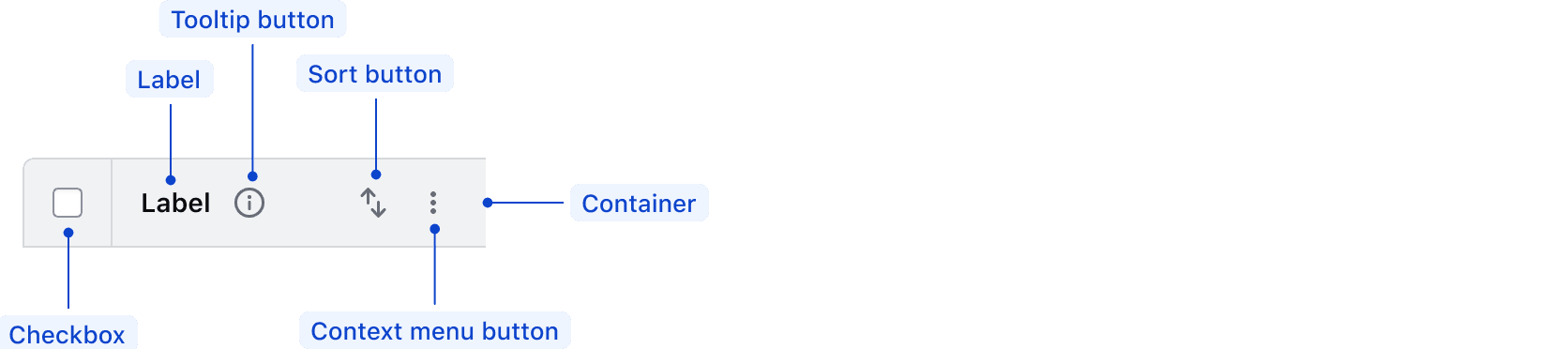
| Element | Usage |
|---|---|
| Checkbox | Optional, but required when cells contain a checkbox |
| Label | Required |
| Tooltip button | Optional |
| Sort button | Optional, Options: none, ascending, descending |
| Context menu | Shown where resizable columns are enabled. |
| Container | Required |
Context menu
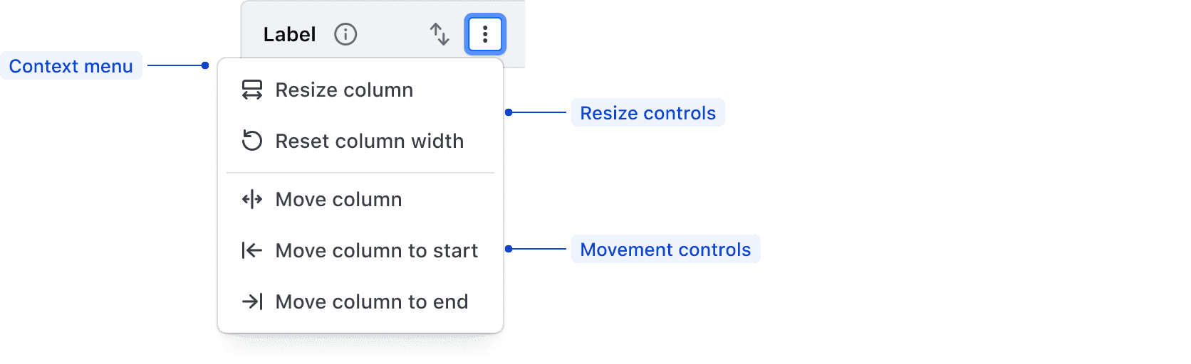
| Element | Usage |
|---|---|
| Context menu and actions | Optional, conditionally renders when a column has context menu actions available for interactions such as resizing, reordering, or pinning. |
Advanced Table cells
Expandable cell

| Element | Usage |
|---|---|
| Expand | Optional |
| Cell content | Required |
| Icon | Optional |
| Container | Required |
Nested cell

| Element | Usage |
|---|---|
| Nested | Required |
| Cell content | Required |
| Icon | Optional |
| Container | Required |
Selection cell

| Element | Usage |
|---|---|
| Checkbox | Optional, but required when the header contains a checkbox |
| Cell content | Required |
| Icon | Optional |
| Container | Required |
States
Advanced Table cells
Cells have a default and focused state. The focused state provides visual feedback for keyboard navigation.

Resize border
To indicate interactivity, the border on a resizable column has visual interactive states.
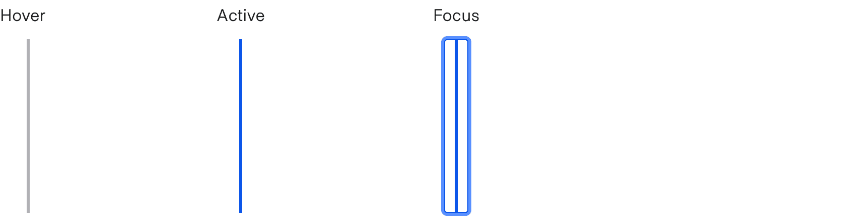
Drag handle
The drag handle is displayed either when hovering on a table header with a mouse, or when focus is moved to it from the context menu.

Overflow
The Advanced Table can overflow on the X and Y axes (horizontally and vertically). When the number of columns no longer fits within the viewport or container, a subtle shadow indicates where the overflow occurs. When paired with a sticky header or column, the “edge” where the overflow occurs uses the same subtle shadow.
For general content recommendations, refer to our Tables content guidelines documentation.
Conformance rating
When used as recommended, there should not be any WCAG conformance issues with this component.
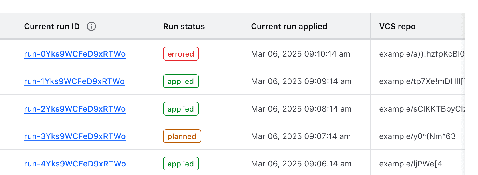
<i80-advanced-table> styles the <table> you (or your server) wrote. The i80 layout uses CSS grid, which would otherwise take the table semantics away from the browser, so the element writes them back onto the real elements — role="table", rowgroup, row, columnheader, rowheader and cell. A screen reader therefore announces rows, columns and header cells as it would for any other table.
Best practices
Interactive rows
A table row cannot receive interactions, meaning actions cannot be attached directly to a <tr>. If you need an interactive element, put it inside a cell in that row, e.g. <td><a href="somelink.html">Some link</a></td>.
Focus in Advanced Tables
Cells are not focusable, and there is no separate navigation mode: focus moves through the interactive elements in the table in document order, the same as anywhere else on the page. Everything the element adds is a real control with a name:
- the sort button in a
<th sort>header cell, which setsaria-sorton the cell, - the expand button of a
<th expandable>header cell or a parent row, witharia-expanded, - the row checkbox and the select-all checkbox, which are real
<input type="checkbox">elements — the select-all one goes indeterminate when only some rows are chosen, - the resize handle of a resizable column, which is a slider (see below),
- and whatever you put in the cells yourself.
Keyboard navigation
Tabbing into the table moves focus to the first control in it — for a sortable table, the sort button in the first header cell.
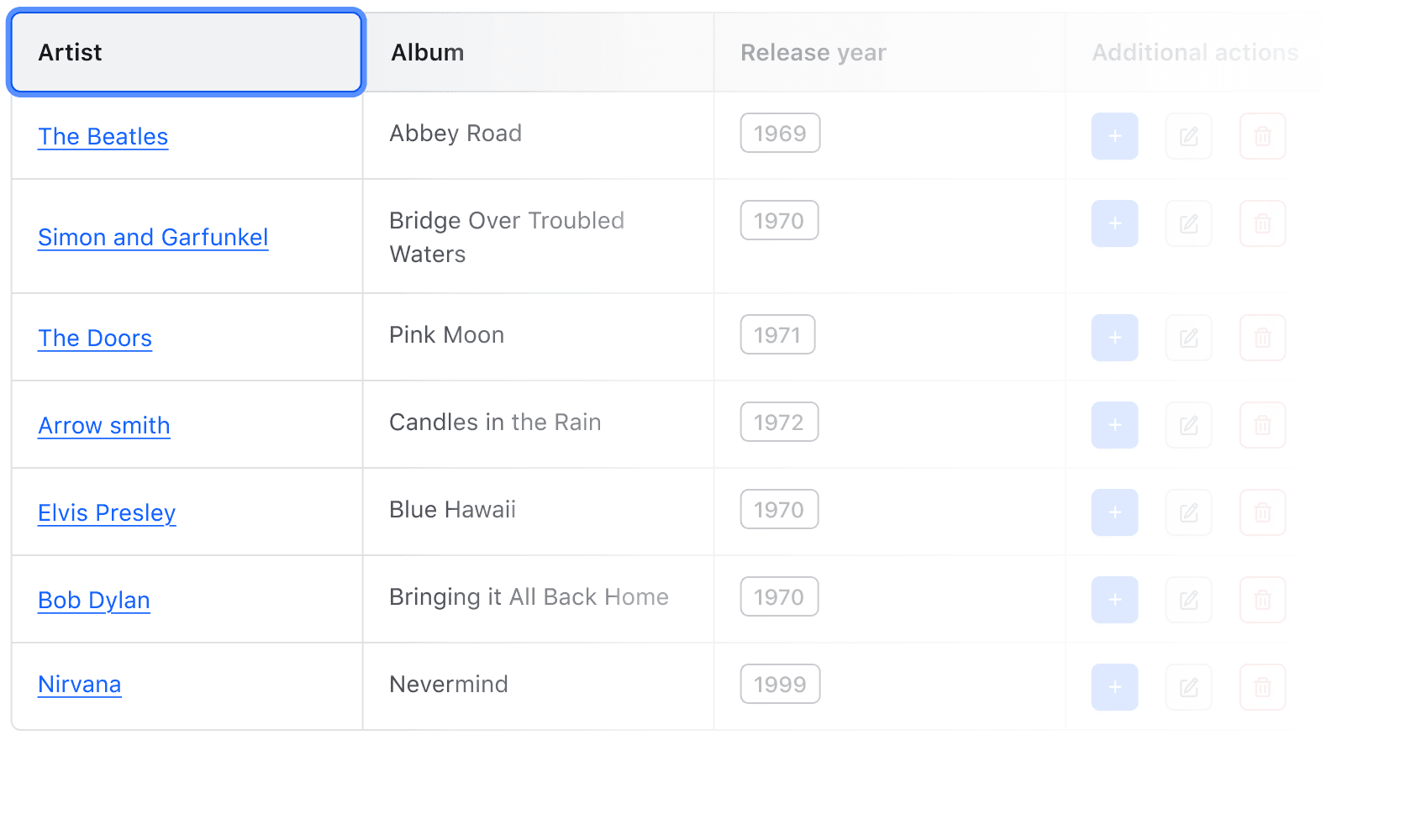
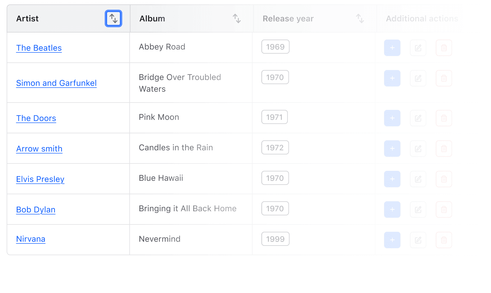
Sort by that column, or expand and collapse the related rows. Both are buttons, so both keys work.
Keep tabbing to reach the links, buttons and checkboxes inside the cells.
A header cell can carry a Tooltip. Its toggle is in the tab order too, and the hint appears on focus as well as on hover.
Resizing columns
With resizable-columns, each header cell ends with a resize handle. It is a role="slider" with tabindex="0", named after its column (“Resize Artist column”), and it reports its current width through aria-valuenow and aria-valuetext, so a screen reader reads the width out as it changes.
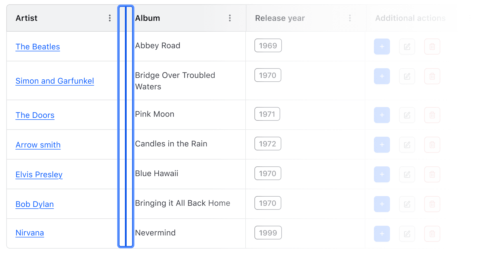
With the handle focused, the right and left arrow keys increase or decrease the width of the column in 10px steps, between the column’s minimum and maximum.
Row selection
You should clearly communicate to the user how many rows are selected and how many rows there are total outside of the Advanced Table. For additional considerations, read the Multi-select usability and accessibility considerations.
Applicable WCAG Success Criteria
This section is for reference only. This component intends to conform to the following WCAG Success Criteria:
-
1.3.1
Info and Relationships (Level A):
Information, structure, and relationships conveyed through presentation can be programmatically determined or are available in text. -
1.3.2
Meaningful Sequence (Level A):
When the sequence in which content is presented affects its meaning, a correct reading sequence can be programmatically determined. -
1.4.1
Use of Color (Level A):
Color is not used as the only visual means of conveying information, indicating an action, prompting a response, or distinguishing a visual element. -
1.4.10
Reflow (Level AA):
Content can be presented without loss of information or functionality, and without requiring scrolling in two dimensions. -
1.4.11
Non-text Contrast (Level AA):
The visual presentation of the following have a contrast ratio of at least 3:1 against adjacent color(s): user interface components; graphical objects. -
1.4.12
Text Spacing (Level AA):
No loss of content or functionality occurs by setting all of the following and by changing no other style property: line height set to 1.5; spacing following paragraphs set to at least 2x the font size; letter-spacing set at least 0.12x of the font size, word spacing set to at least 0.16 times the font size. -
1.4.13
Content on Hover or Focus (Level AA):
Where receiving and then removing pointer hover or keyboard focus triggers additional content to become visible and then hidden, the following are true: dismissible, hoverable, persistent (see link). -
1.4.3
Minimum Contrast (Level AA):
The visual presentation of text and images of text has a contrast ratio of at least 4.5:1 -
1.4.4
Resize Text (Level AA):
Except for captions and images of text, text can be resized without assistive technology up to 200 percent without loss of content or functionality. -
2.1.1
Keyboard (Level A):
All functionality of the content is operable through a keyboard interface. -
2.1.2
No Keyboard Trap (Level A):
If keyboard focus can be moved to a component of the page using a keyboard interface, then focus can be moved away from that component using only a keyboard interface. -
2.1.4
Character Key Shortcuts (Level A):
If a keyboard shortcut is implemented in content using only letter (including upper- and lower-case letters), punctuation, number, or symbol characters, then it should be able to be turned off, remapped, or active only on focus. -
2.4.3
Focus Order (Level A):
If a Web page can be navigated sequentially and the navigation sequences affect meaning or operation, focusable components receive focus in an order that preserves meaning and operability. -
2.4.7
Focus Visible (Level AA):
Any keyboard operable user interface has a mode of operation where the keyboard focus indicator is visible. -
4.1.2
Name, Role, Value (Level A):
For all user interface components, the name and role can be programmatically determined; states, properties, and values that can be set by the user can be programmatically set; and notification of changes to these items is available to user agents, including assistive technologies.
Support
If any accessibility issues have been found within this component, let us know by submitting an issue.
0.1.0
Første i80-version (fork af upstream, se core/UPSTREAM.md).
Related
-

Table
Used to display organized, two-dimensional tabular data.
-
Pagination
Used to let users navigate through content broken down into pages.
-
Filter Bar
A composition of I80 components to support filtering.
-
Filter patterns
Guidelines and best practices for filtering a data set using i80 components.
-

Table multi-select
Guidelines for selecting and transforming results in a Table.