We recommend using Carbon Design System's Carbon Charts for data visualizations in i80 products.
The Carbon Charts components are used as they come from Carbon.
To get support when using the Carbon Chart library, please message the Carbon Core team in the IBM Slack channel #carbon-charts-design or #carbon-charts.
Deciding how best to represent data
Consider whether a data visualization is actually appropriate for the type of data you wish to present or whether a table may be clearer or more appropriate. Data visualizations offer a quick way to identify trends or patterns or as a way to visually summarize data. Tables, on the other hand, are better for examining precise or multi-dimensional data. Carbon Charts components, in a way, allow you to do both. The built-in toolbar enables users to view a table of the presented data in the data visualization.
Considerations for using data visualization
- Information density: If a table requires too many columns to fit within a screen consider whether using a data visualization would make the information easier to consume.
- Frequency of outliers: If most data points are clustered but there are a few outliers, this is less apparent using a table so a data visualization may be clearer.
Carbon charts components
IBM’s Carbon Design System includes various chart components that we recommend using to create data visualizations. These components utilize Carbon Elements for font styles and color palettes.
Commonly used chart examples
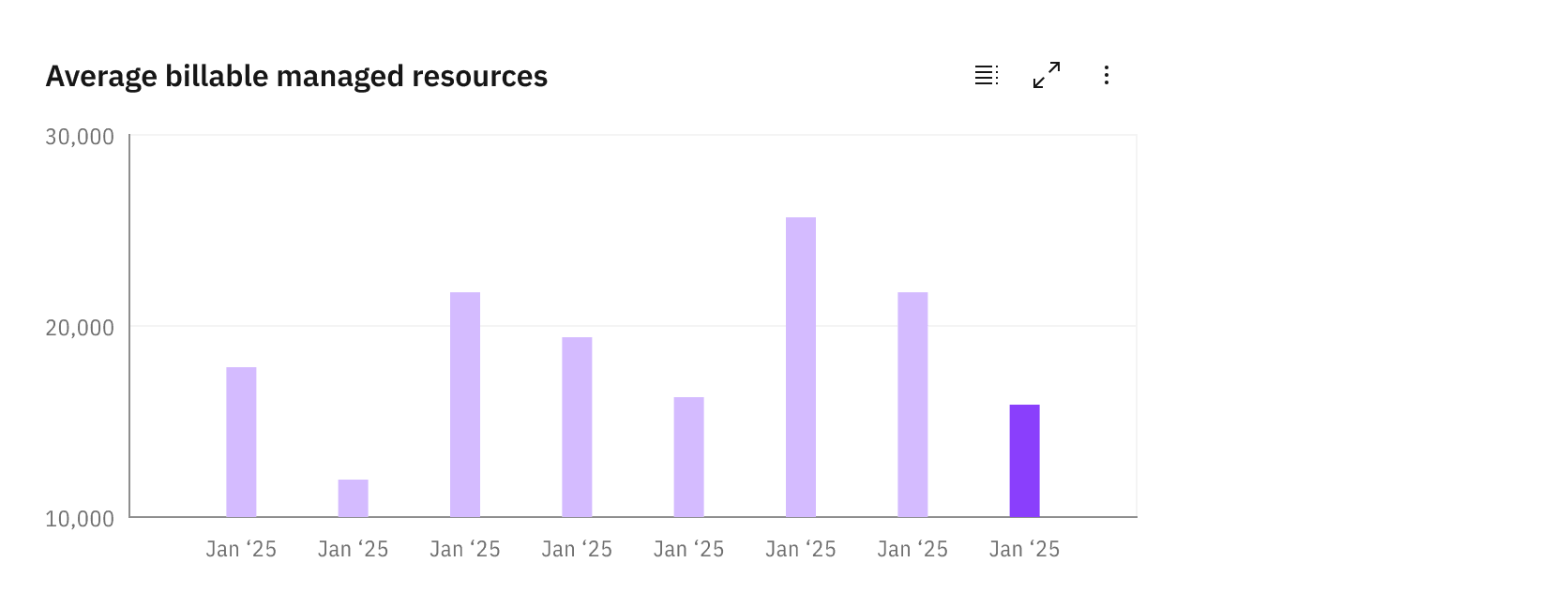
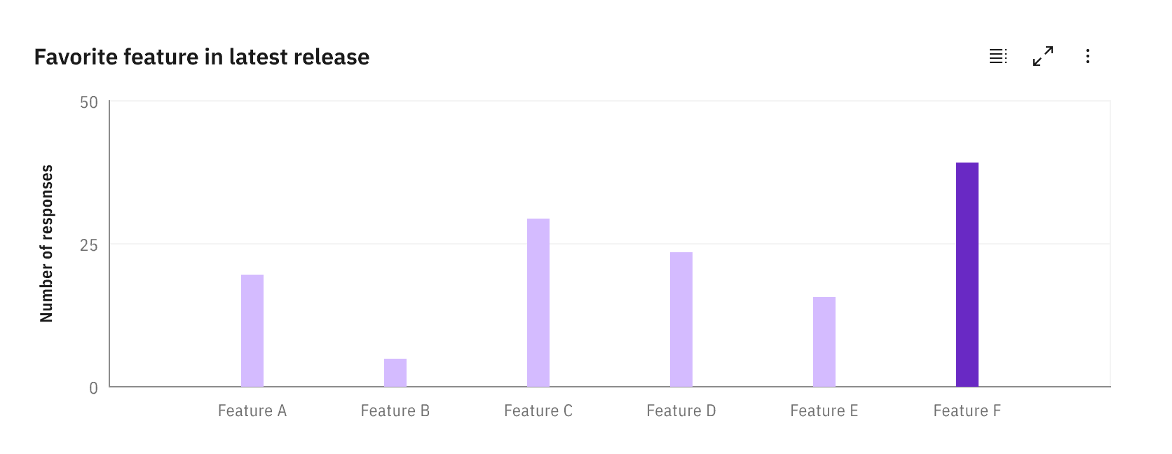
- Vertical bar charts are the most common representation of categorical data. They allow a user to quickly compare the amounts of a value based on the heights of the bars in the chart. Examples in our products may include displaying cost per month or resource use per quarter.
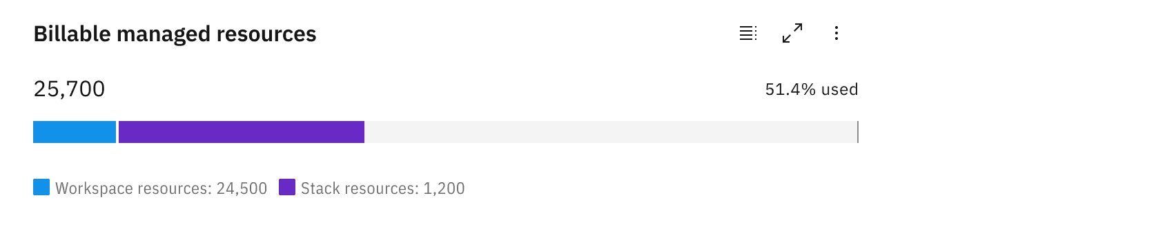
- Proportional meters are used to show the breakdown of categories within a bar that equal 100% of the bar. This is may be used in our products to show the health of a group of resources or the amount of resources used toward a specific cap.
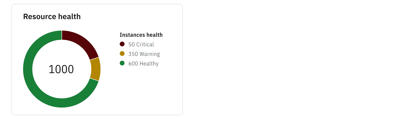
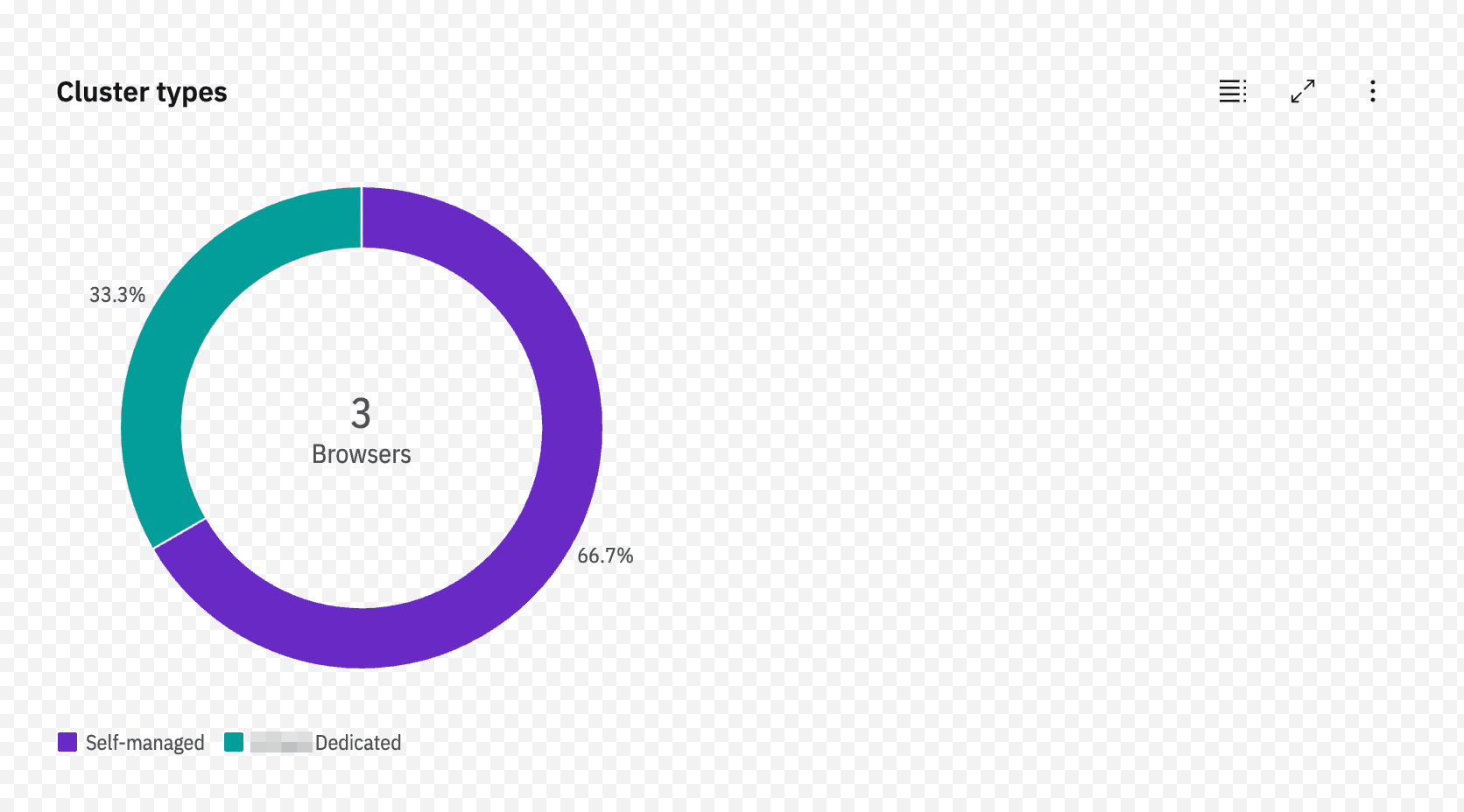
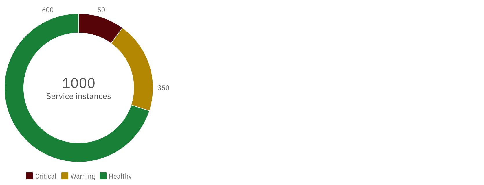
- Donut charts are circular graphs that display data as a portion of a whole divided into slices. This type of chart may be used in a similar way as proportional meter charts but offers a different presentation of the information.
Color palettes
When creating data visualizations, use the color palette created for the type of data being presented and consider that color choice can impact meaning. Carbon Charts offers preset color palettes for each type of data representation, making it simple to select appropriate and accessibility-compliant values.
There are three main types of color palettes used in data visualization:
- Categorical palettes
- Sequential palettes
- Diverging palettes
Carbon’s data visualization palettes include categorical palettes with one to five colors, a full categorical palette for needs requiring more than five distinctions, a sequential palette, a diverging palette, and a gradient palette.
Categorical palettes
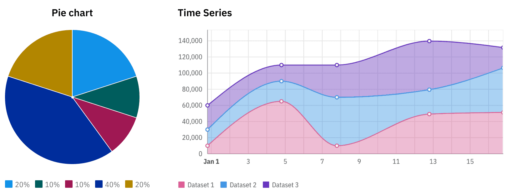
Use categorical palettes for presenting data that has no intrinsic order, such as in a pie or donut chart. They are also good for multi-line charts, area charts, stacked or grouped bar charts, etc.
Sequential palettes
Use sequential palettes for quantitative or ordered values in a continuum. This palette is useful for heat maps and grouped horizontal bar charts that compare sequential groups, such as age ranges, etc.
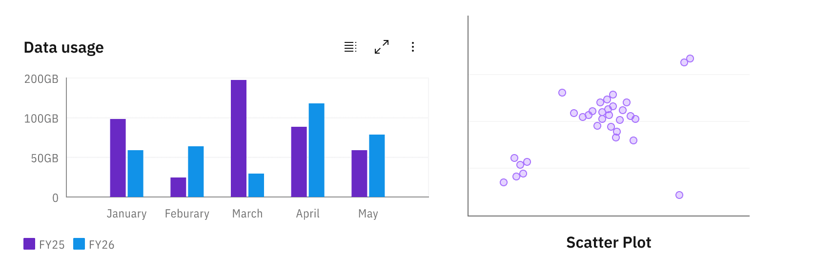
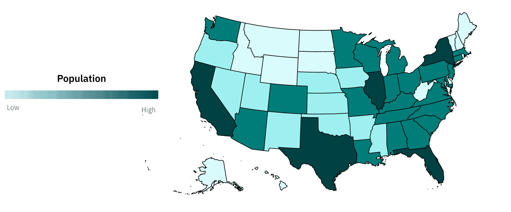
A gradient palette is a type of sequential palette that can be used to distinguish elements without inherent axes or directions, such as in maps or geographic representations.
Diverging palettes
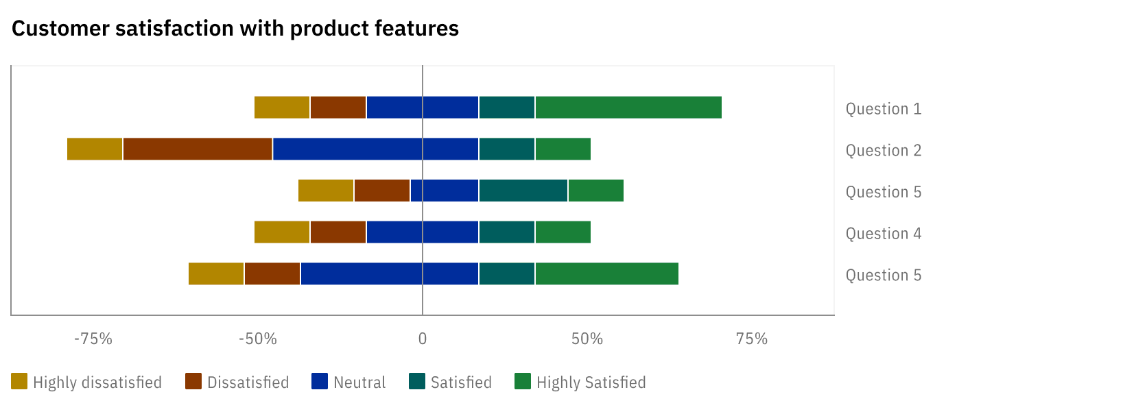
Use diverging palettes when presenting two sequences of ordered values that share a central value. This type of palette can be used for diverging bar charts, horizon charts, heat maps, etc.
How to use Carbon Charts components
Use the vanilla JavaScript build of IBM's Carbon Chart components. It is the right one for us: you give it a plain <div> and it draws into it, so it works the same in a server-rendered page as in anything else.
Helpful resources
Getting started
Refer to the Carbon Charts installation & setup page for more complete instructions.
Basic steps
- Install the vanilla JavaScript Carbon Charts library as a dependency.
- Import the chart you want, for example
DonutChart. - Create an options file if you want to keep your chart settings in one place.
- Make sure the charts look right by
- linking to the font definitions in your HTML document
- importing the chart styles
Importing files
In HTML:
<link rel="stylesheet" href="https://1.www.s81c.com/common/carbon/plex/sans.css" />
<link rel="stylesheet" href="https://1.www.s81c.com/common/carbon/plex/sans-condensed.css" />
In JavaScript:
import { DonutChart } from '@carbon/charts';
import '@carbon/charts/styles.css';
Example
A Carbon Charts Donut chart. Write the container in your page:
<div id="users-by-plan" style="max-width: 480px"></div>
and draw into it:
import { DonutChart } from "@carbon/charts";
import "@carbon/charts/styles.css";

import options from "./chart-options.js";
import USER_DATA from "./user-data.js";

new DonutChart(document.getElementById("users-by-plan"), {
  data: USER_DATA,
  options: { ...options, title: "Users by plan" },
});
If the page can render more than one chart, or the container arrives with an HTMX swap, draw each one as it appears:
for (const el of document.querySelectorAll("[data-donut-chart]")) {
  new DonutChart(el, { data: JSON.parse(el.dataset.donutChart), options });
}
An options file with example pre-set options
The chart options, such as the Donut Chart options, can be set according to your needs. Keep the settings that never change in a file like this one, and merge the ones that vary per chart on top of it.
export default {
  title: '', // set per chart when you create it
  resizable: true,
  legend: {
    position: 'left', // = position relative to chart, options: 'top', 'bottom', 'left', 'right'
    truncation: {
      type: 'none',
    },
  },
  donut: {
    alignment: 'center', // = alignment w/i container, options: 'center', 'left', 'right'
  },
  pie: {
    labels: {
      enabled: true,
      formatter: (data) => data.value,
    },
  },
  height: '175px',
};Application
Font definition links should only be included once within the HTML application page.
<html lang="en">
  <head>
    ...
    <!-- include the Plex fonts in the main application -->
    <link rel="stylesheet" href="https://1.www.s81c.com/common/carbon/plex/sans.css" />
    <link rel="stylesheet" href="https://1.www.s81c.com/common/carbon/plex/sans-condensed.css" />
    ...
  </head>
  <body>
    ...
  </body>
</html>
Rendered chart
This will render a chart similar to this one:
Conformance rating
Because this is an IBM Carbon component, please refer to their documentation for conformance information.
Accessibility considerations
Add labels to charts & chart elements
Text-based labels on charts and chart elements must be present. Text must not be truncated because keyboard-only users have no way to access truncated data. While the Carbon Charts components include truncation options for text, the value should be set to false in order to meet our conformance requirements.
Don’t rely on color only to convey information
Be sure to always add appropriate text, such as labels or descriptions of the visual information in the chart. Using patterns, in addition to (or instead of) color can enhance accessibility, although Carbon Charts components and palettes don’t include them at this time. A thin separating line between adjacent colors helps to visually distinguish chart areas.
Ensure charts are readable when resized
Always test that chart information is legible, even on smaller viewports, e.g., mobile devices. Per WCAG Success Criteria, users must also be able to zoom in on their browser (up to 400%) and also resize text associated with charts.
Use interactive elements appropriately
Interactive elements should have unique and clear labels to clearly differentiate them from one another and make their purpose clear.