The Filter Bar is used to apply and display filters to a data set. It is most often used with the Advanced Table, but is flexible enough to support the standard Table, lists, or a grid of cards.
Usage
When to use
- When displaying filters for a data set.
- As a replacement for the I80 Filter pattern.
When not to use
- For complex query builder features.
- For a search feature that doesn't require filters. Use the Search Input instead.
Type
The Filter Bar supports two visual presentations, attached and standalone, to be used in different contexts and with different types of data sets.
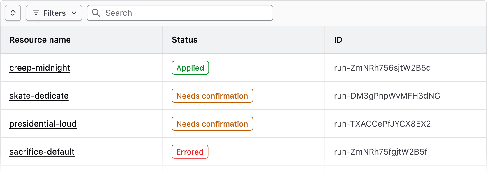
Attached
Use the attached variant with the Advanced Table to clearly associate the Filter Bar with the rendered data set and the table.
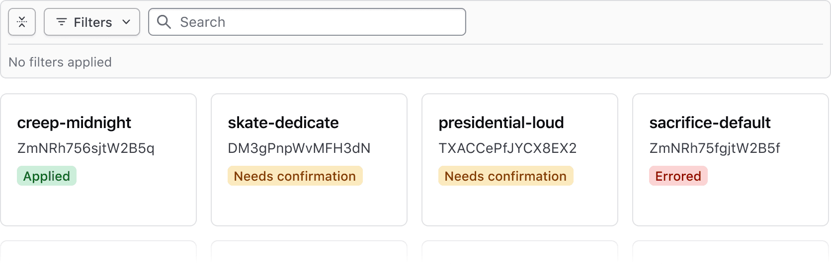
Standalone
Use the standalone variant when a data set is rendered in formats other than the Advanced Table, e.g., a standard Table, list, or grid of cards.
Applying Filters
Filters can be applied on a per-filter basis or via live filtering.
- Per-filter: filters are applied when the user confirms their selection with the "Apply filters" button in the dropdown. This is the most common method.
- Live filtering: filters are applied immediately upon selection.
Applied filters
Applied filters are represented by a Tag displaying the filter parameter (the category or column the filter corresponds to) and the filter value (corresponding with the specific cell content).

By default, the text rendered within the Tag uses a standardized format depending on the type of filter:
- Single and multiple selection filters group the parameter and value using a colon, e.g., "Region: AWS (us-east)"
- Numerical filters group the parameter and value with an operator symbols, e.g., "Modules > 50"
- Date and time filters group the parameter and value with natural language, e.g., "Created before 12:00 PM"
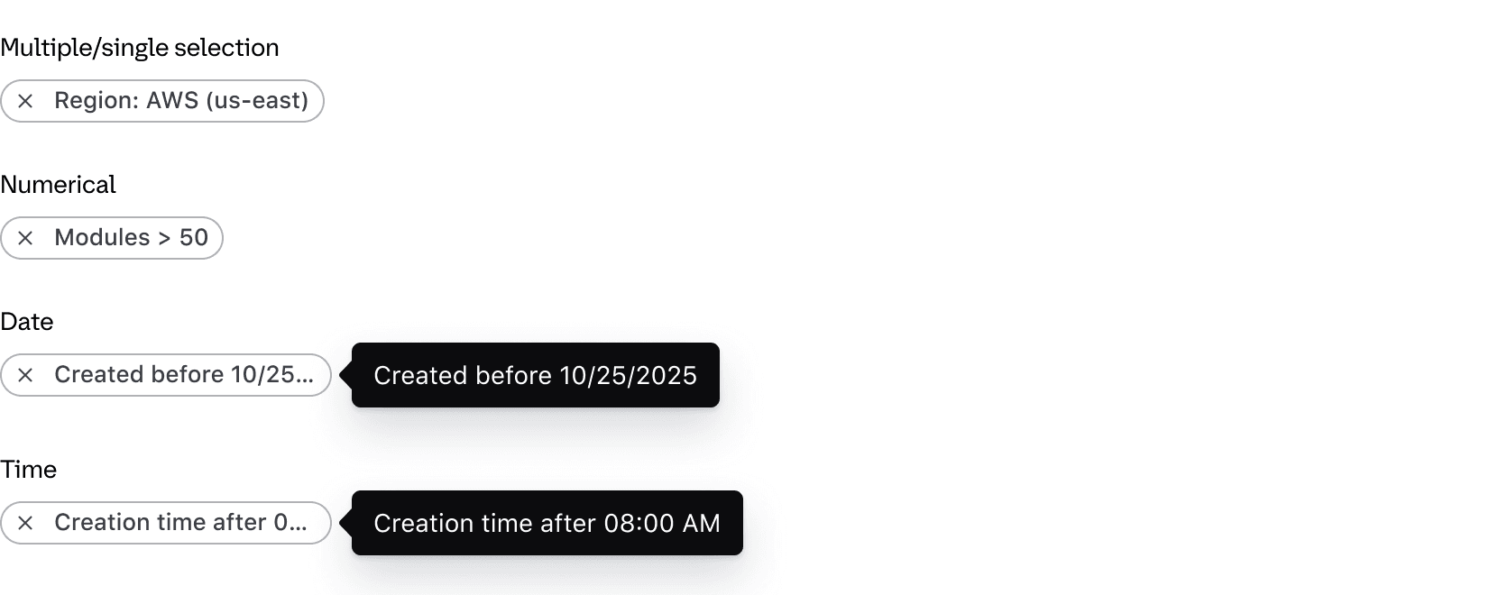
If necessary, the text can be overridden within the Tag. This can be useful if the parameter label is an irregular plural, if the parameter reads more naturally with certain punctuation or grammar, or for product-specific reasons.
The Tag component truncates at roughly 20 characters.
Expand & collapse
The applied filters section can be collapsed to simplify the UI or expanded to bring focus to the data. This is helpful when many filters are applied or when the data set is complex.

When no filters are applied, the applied filters section is collapsed by default and will display an empty state message when expanded.

When one or more filters are applied, the Filter Bar is expanded by default.

Clearing filters
All filters can be cleared in bulk using the "Clear All" button near the applied filters or in the dropdown footer.

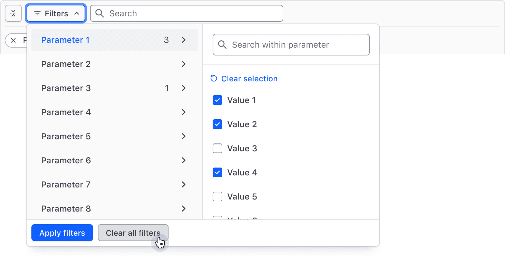
Filters can also be cleared individually via the Tag's dismiss button.

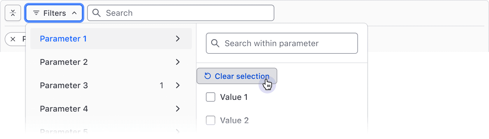
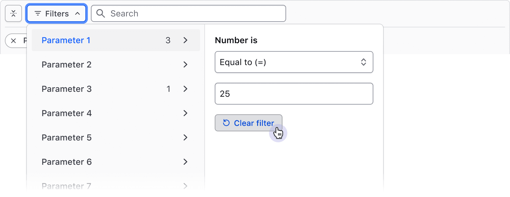
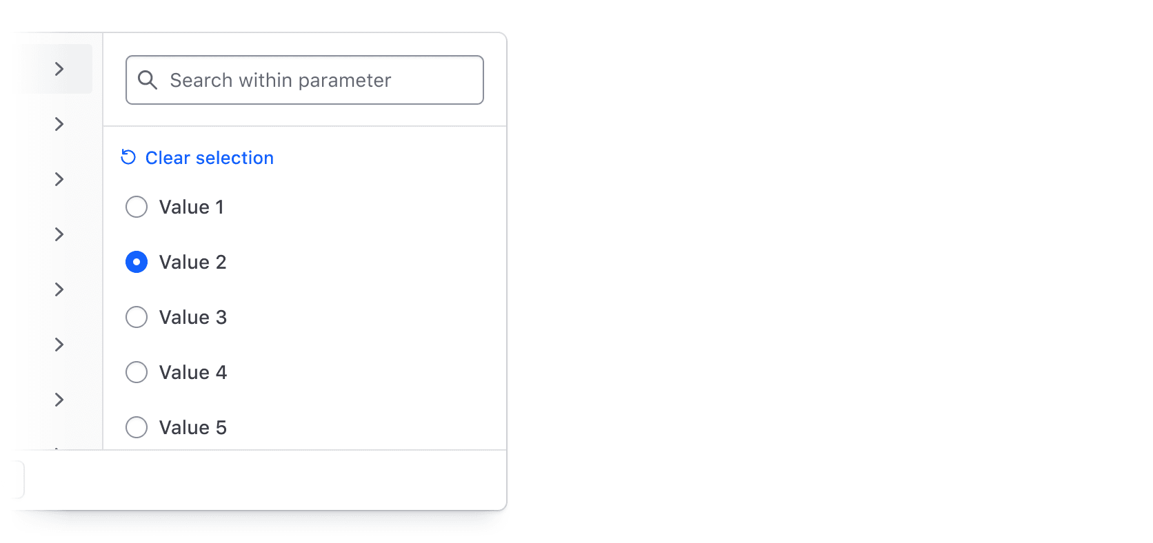
When multiple filter values are selected for a single parameter or input fields define the filter, the "Clear selection" button in the dropdown deselects all values for that parameter.
Integrating search
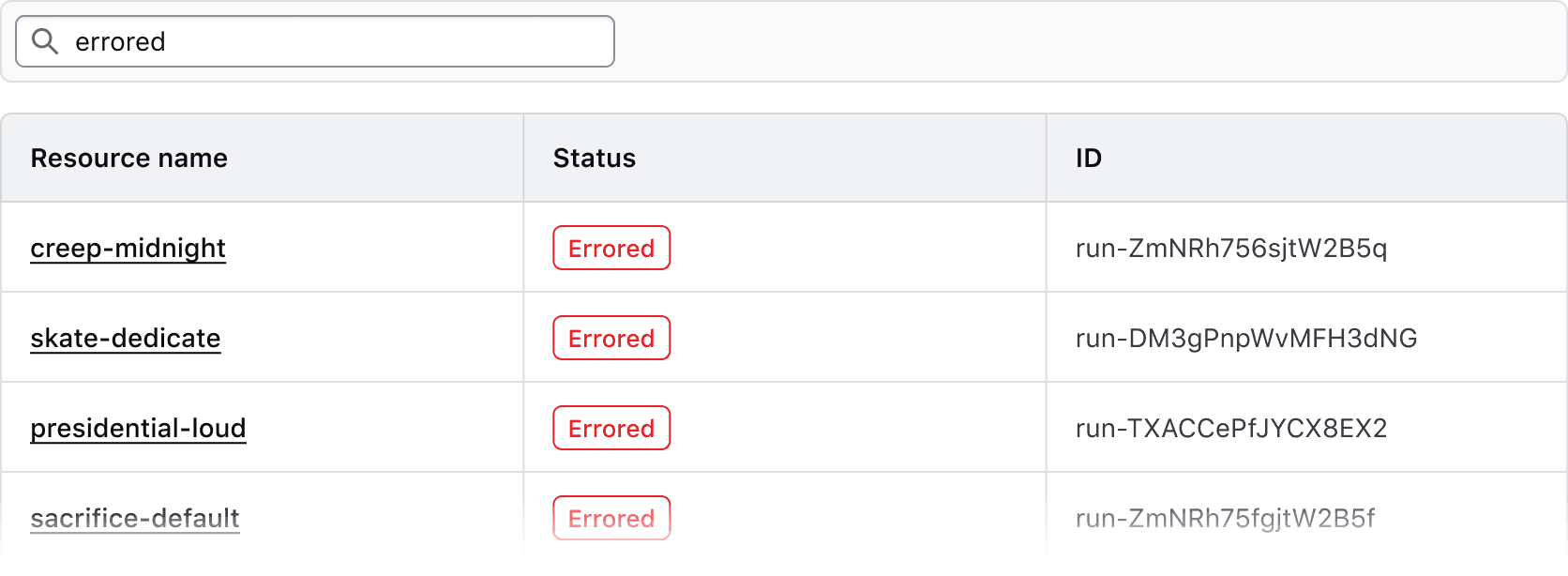
Search is an important part of a filtering workflow. When search is included in the Filter Bar, it narrows the dataset alongside any active filters, rather than overriding them.
Implement search alongside filters.
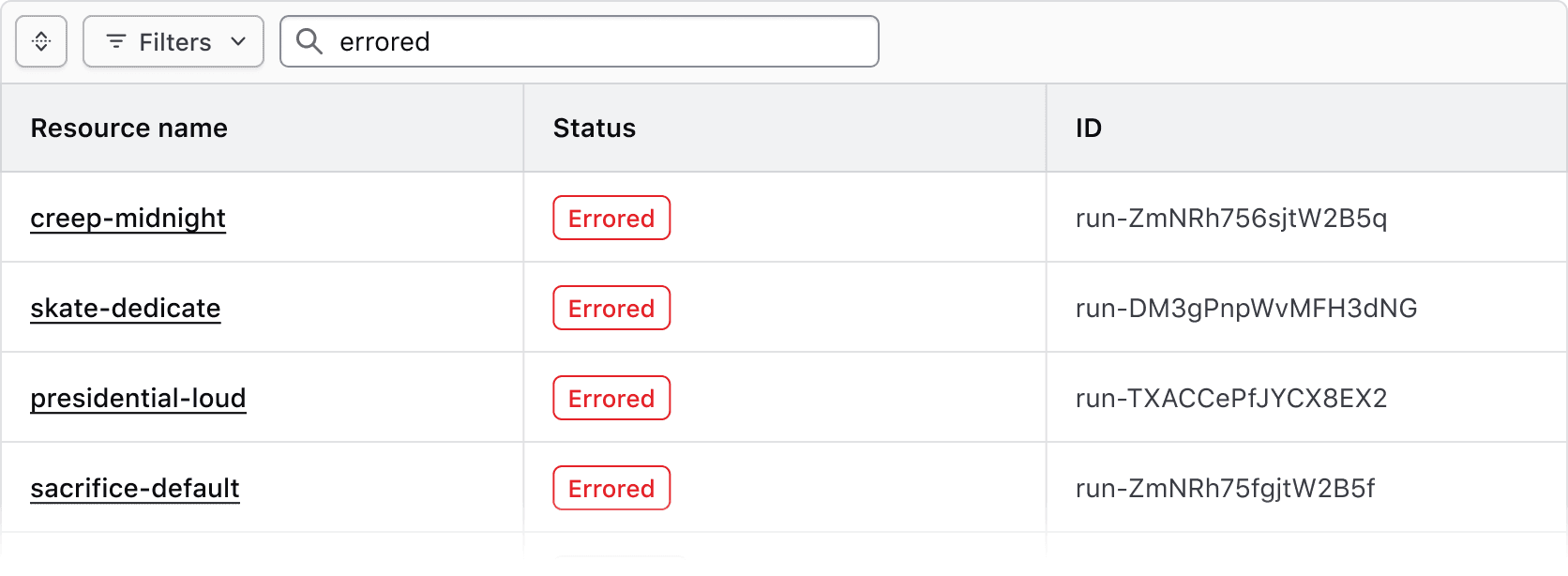
Don't implement search inside a Filter Bar without filters.
Bulk actions
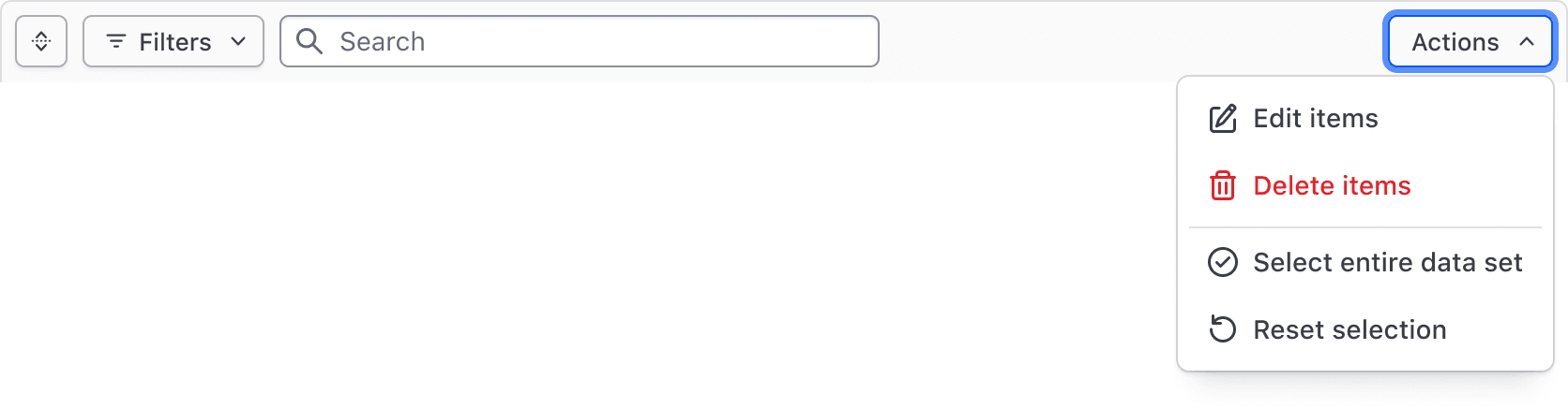
Bulk actions, corresponding to our recommendations for multi-select, can be used to perform actions across multiple results, such as editing, deleting, and selecting subsets of the data set.
Generic content
Custom functionality can be added to or replace the Bulk action dropdown. We recommend limiting this to actions or information that directly tie back to the data set.

Filter dropdown
The Filter Bar includes a complex dropdown menu that displays available filter parameters, the values within each parameter, support for numerical/date/time values, value ranges, and actions to apply and clear filters.
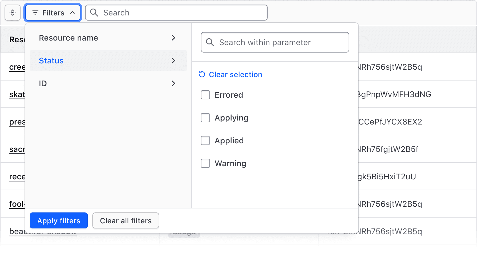
The Filter Dropdown is responsible for the selection and application of filters and is broken into two "panels":
- The left panel displays the list of parameters (categories) that can be filtered upon.
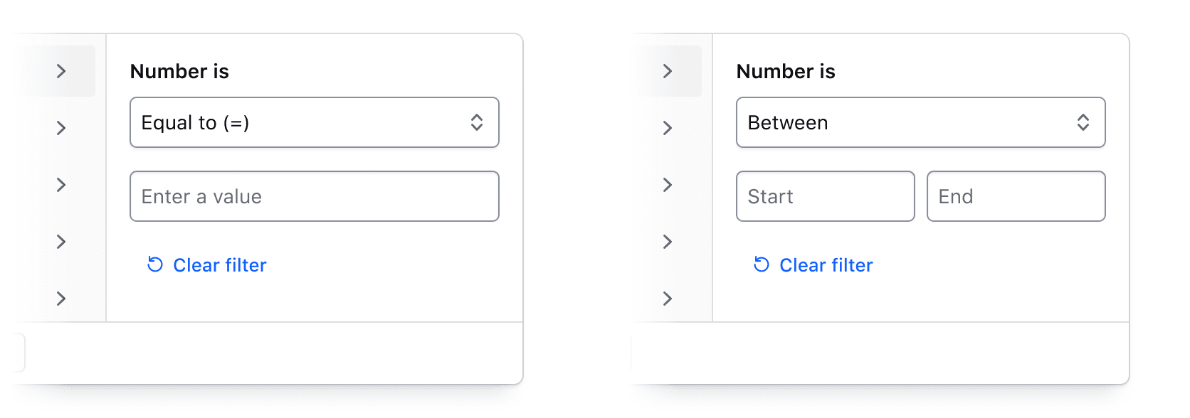
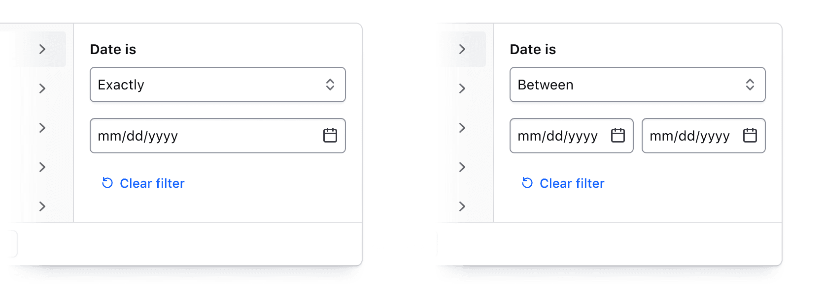
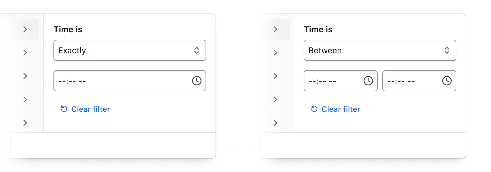
- The right panel displays a list of options or a group of input fields (for numerical, date, or time values).
Multi-selection
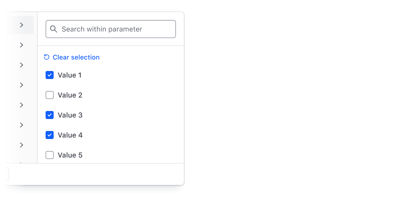
Selecting multiple values from a list of options is one of the most common filtering methods. It's best suited for categorical data like statuses, but can also be used more generally to filter by a handful of text or string values.
Single-selection
Selecting one value from a list of options is best suited for filter values that cannot be selected simultaneously, helping prevent an empty state.
Numbers, dates, times, and datetimes
By combining an operator (greater than, less than, before, etc.) with input fields, filtering by numerical values, dates, times, and datetimes can be handled. This filtering method is best suited for range-based filtering, i.e., filtering based on comparisons of values or ranges of values.
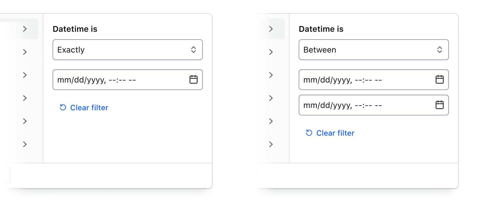
For a full list of supported operators, visit the specifications page.
Custom filtering
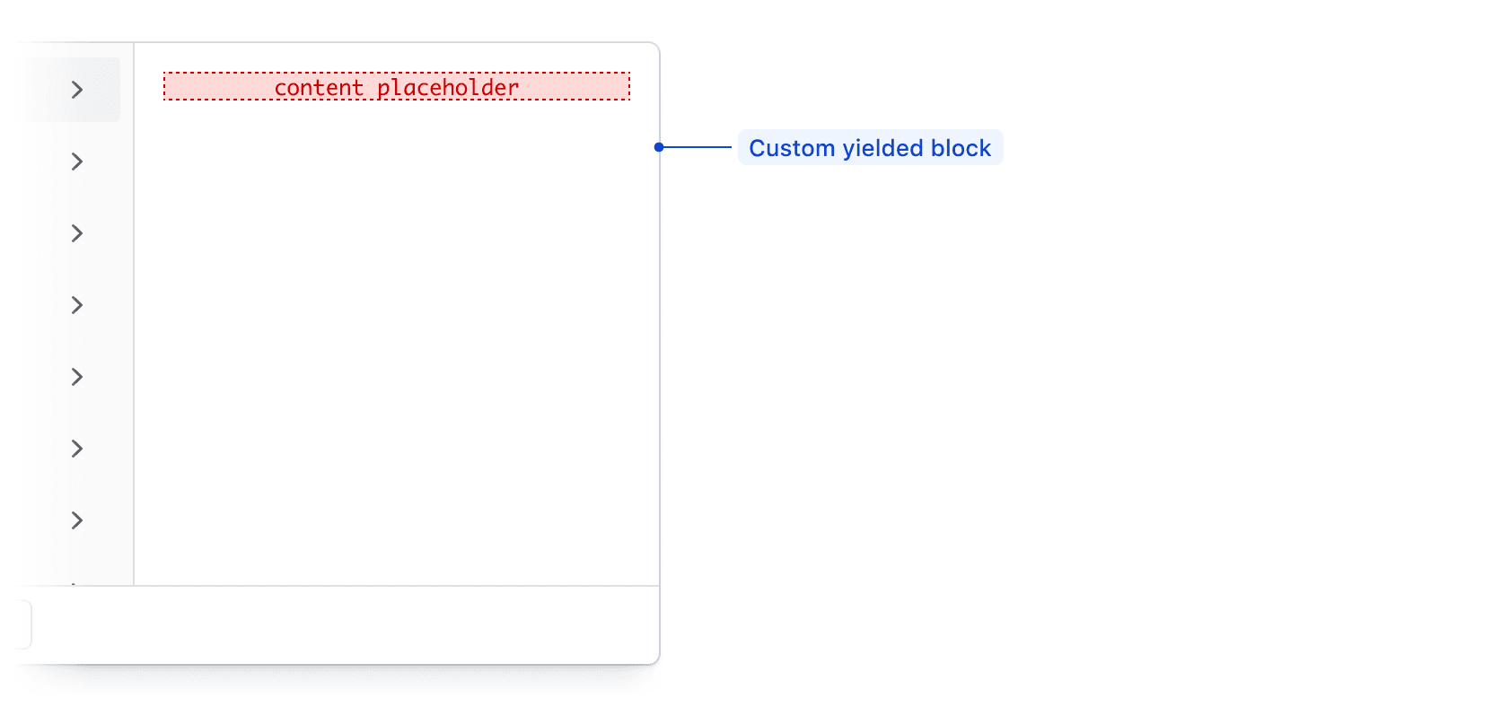
While the left panel should always display the list of parameters, the right panel can be customized to meet filtering requirements beyond the out-of-the-box methods.
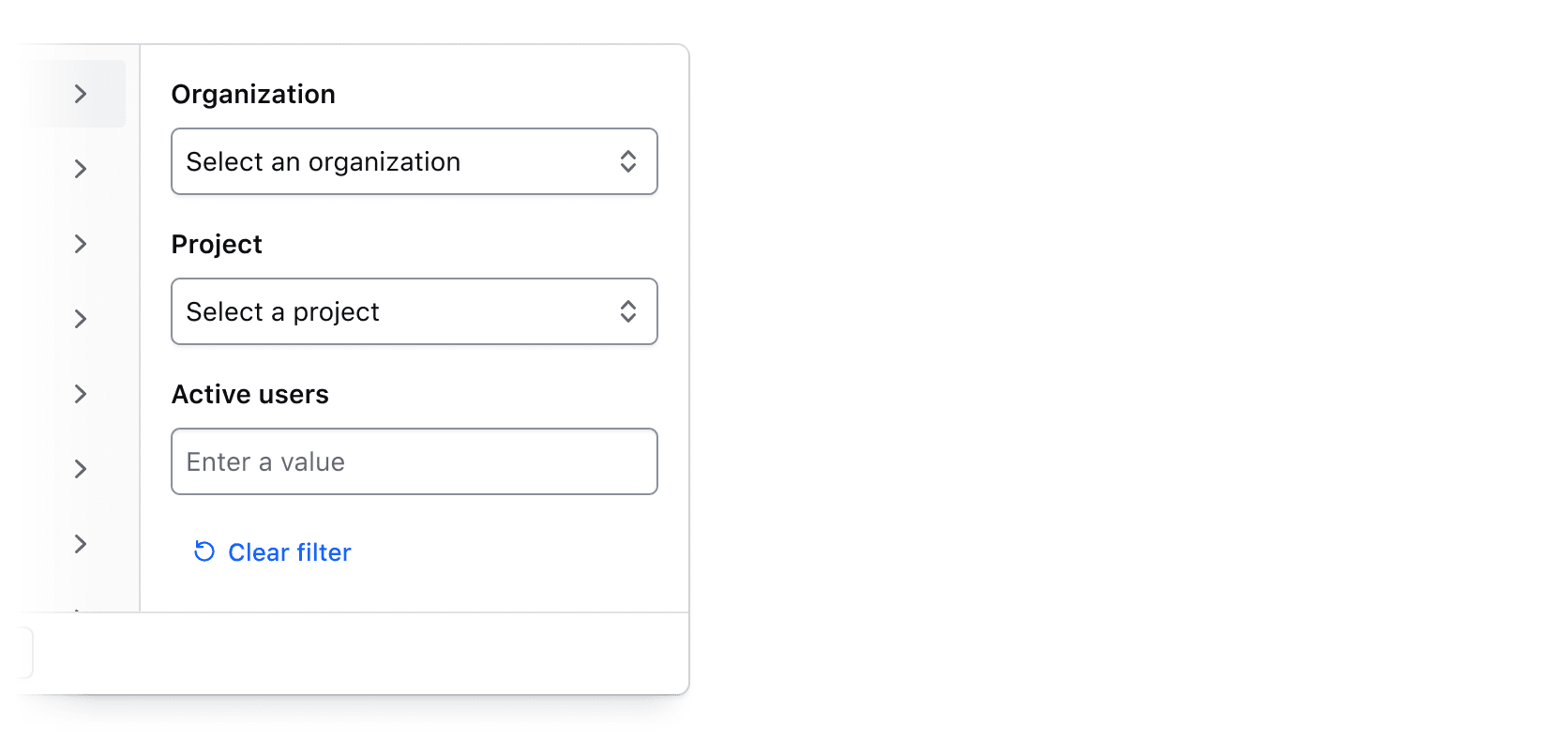
Search across filter values
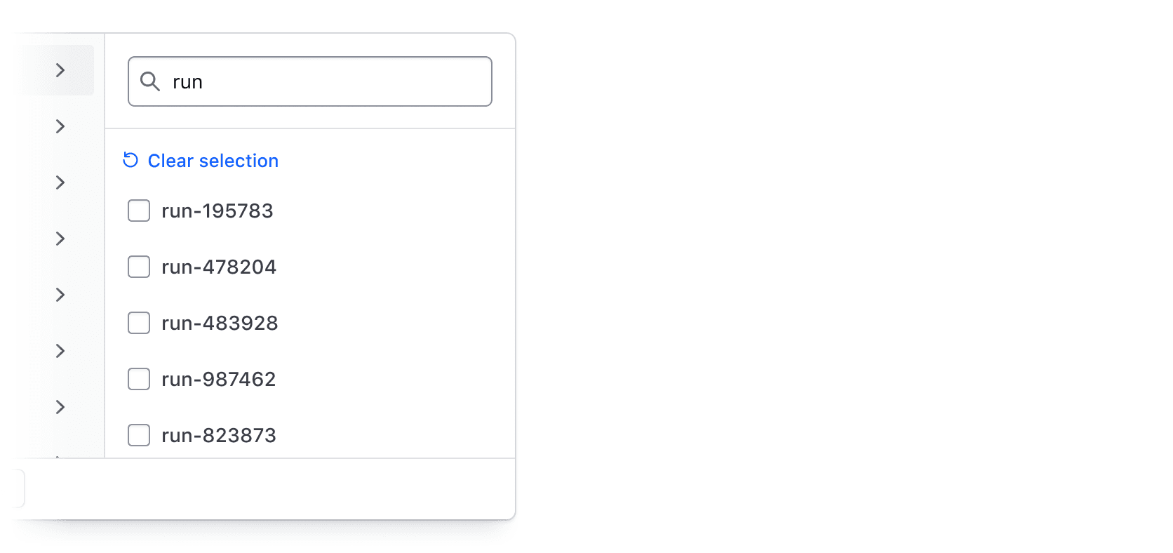
Users can search across all values within a selected parameter. While search is relevant only for single- or multi-selection, it can be especially useful when there are many values or when a unique naming convention is used.
How to use this component
The <i80-filter-bar> element is the row above a data set: a "Filters" dropdown, an optional search field, and the filters that are applied shown below it as dismissible Tags. It does no filtering itself — it collects what the user asked for and hands it to your application.
The state lives where HTML keeps state: in the controls. Each <i80-filter-group> becomes a tab in the dropdown, and every option in it is a real <input> named after the group's key. So the bar is a form, "Apply filters" submits ?project=project-1&version=1.0, and the server renders the page back with those controls set — the applied tags are read off the controls, so you never describe the same filters twice.
<i80-filter-bar>
  <i80-filter-group key="project" text="Project" type="multi-select">
    <i80-filter-option value="project-1" label="Project 1" checked></i80-filter-option>
    <i80-filter-option value="project-2" label="Project 2" checked></i80-filter-option>
    <i80-filter-option value="project-3" label="Project 3"></i80-filter-option>
  </i80-filter-group>
  <i80-filter-group key="version" text="Version" type="single-select">
    <i80-filter-option value="1.0" label="1.0" checked></i80-filter-option>
    <i80-filter-option value="2.0" label="2.0"></i80-filter-option>
    <i80-filter-option value="3.0" label="3.0"></i80-filter-option>
  </i80-filter-group>
</i80-filter-bar>
The filters dropdown
All filtering options live in the dropdown, one tab per <i80-filter-group>. A group needs three attributes:
keynames the controls it renders, and so the query parameter your server reads.textlabels the tab and starts the text of the applied filter tag.typechooses the kind of filtering; see filter types below.
The dropdown's footer has "Apply filters" and "Clear all filters", and each tab has its own "Clear selection" or "Clear filter".
<i80-filter-bar>
  <i80-filter-group key="demo-multi-select" text="Multi-select" type="multi-select">
    <i80-filter-option value="option-1" label="Option 1"></i80-filter-option>
    <i80-filter-option value="option-2" label="Option 2"></i80-filter-option>
    <i80-filter-option value="option-3" label="Option 3"></i80-filter-option>
  </i80-filter-group>
  <i80-filter-group key="demo-single-select" text="Single-select" type="single-select">
    <i80-filter-option value="option-1" label="Option 1"></i80-filter-option>
    <i80-filter-option value="option-2" label="Option 2"></i80-filter-option>
    <i80-filter-option value="option-3" label="Option 3"></i80-filter-option>
  </i80-filter-group>
  <i80-filter-group key="demo-number" text="Number" type="numerical"></i80-filter-group>
  <i80-filter-group key="date" text="Date" type="date"></i80-filter-group>
  <i80-filter-group key="demo-time" text="Time" type="time"></i80-filter-group>
  <i80-filter-group key="demo-datetime" text="Datetime" type="datetime"></i80-filter-group>
</i80-filter-bar>
Applying filters
Give the bar an action and it renders itself as a <form method="get">: "Apply filters" is a real submit button, so filtering works before (and without) JavaScript, and the browser's back button goes back to the previous filters. Without action the bar is a <div>, and a <form> you wrap around it submits it instead. A <form> written inside the tag is used as the bar, so CSRF fields and method="post" stay yours.
<i80-filter-bar action="/plans" search>…</i80-filter-bar>
Every change to the applied filters — applying, dismissing a tag, clearing — fires i80-filter on the bar first:
document.querySelector('i80-filter-bar').addEventListener('i80-filter', (event) => {
  // { filters: { project: ['project-1'] }, applied: [...], reason: 'apply', key, value }
  event.preventDefault();          // filter in the page instead of submitting
  refreshTable(event.detail.filters);
});
The event is cancelable: call preventDefault() and nothing is submitted, which is how an app that re-fetches by itself (HTMX, fetch) takes over. The bar also has filters, apply(), clear() and dismiss() for driving it from script.
Dismissing a tag unsets the control it came from, so the next submit simply leaves that value out. A filter the bar has no control for — one applied elsewhere — can still be shown with <i80-applied-filter>; give it an href and dismissing it goes to the URL your server wrote without that parameter.
Live filtering
By default a selection waits for "Apply filters". With live the bar applies as soon as a filter changes, drops the Apply button, and tells screen readers that filtering happens automatically.
<i80-filter-bar live>
  <i80-filter-group key="project" text="Project" type="multi-select">
    <i80-filter-option value="project-1" label="Project 1"></i80-filter-option>
    <i80-filter-option value="project-2" label="Project 2"></i80-filter-option>
    <i80-filter-option value="project-3" label="Project 3"></i80-filter-option>
  </i80-filter-group>
  <i80-filter-group key="version" text="Version" type="single-select">
    <i80-filter-option value="1.0" label="1.0"></i80-filter-option>
    <i80-filter-option value="2.0" label="2.0"></i80-filter-option>
    <i80-filter-option value="3.0" label="3.0"></i80-filter-option>
  </i80-filter-group>
  <i80-filter-group key="creation-date" text="Creation date" type="date"></i80-filter-group>
</i80-filter-bar>
Filter types
Single-select and multi-select
multi-select renders a checkbox per <i80-filter-option>, single-select a radio; both are named after the group's key, and checked says what is applied. search on the group adds a search field that hides the options that do not match.
The tag reads label, or the value when there is no label.
<i80-filter-bar>
  <i80-filter-group key="demo-single-select" text="Single-select" type="single-select" search>
    <i80-filter-option value="option-1" label="Option 1" checked></i80-filter-option>
    <i80-filter-option value="option-2" label="Option 2"></i80-filter-option>
    <i80-filter-option value="option-3" label="Option 3"></i80-filter-option>
  </i80-filter-group>
  <i80-filter-group key="demo-multi-select" text="Multi-select" type="multi-select" search>
    <i80-filter-option value="option-1" label="Option 1" checked></i80-filter-option>
    <i80-filter-option value="option-2" label="Option 2" checked></i80-filter-option>
    <i80-filter-option value="option-3" label="Option 3"></i80-filter-option>
  </i80-filter-group>
</i80-filter-bar>
Numerical
numerical renders the comparison operators and the value inputs itself, named key-selector and key-value — or key-between-start and key-between-end for the "between" operator. selector, value, value-start and value-end say what is applied.
<i80-filter-bar>
  <i80-filter-group key="demo-numerical-a" text="Numerical A" type="numerical"
    selector="less-than" value="10"></i80-filter-group>
  <i80-filter-group key="demo-numerical-b" text="Numerical B" type="numerical"
    selector="between" value-start="10" value-end="20"></i80-filter-group>
</i80-filter-bar>
Date & time
date, time and datetime work the same way with native date and time inputs, and also support "between". The tag shows the date in the reader's locale.
<i80-filter-bar>
  <i80-filter-group key="demo-date" text="Date" type="date"
    selector="before" value="2025-01-01"></i80-filter-group>
  <i80-filter-group key="demo-time" text="Time" type="time"
    selector="before" value="20:00"></i80-filter-group>
  <i80-filter-group key="demo-datetime" text="Datetime" type="datetime"
    selector="before" value="2025-01-01T12:00"></i80-filter-group>
  <i80-filter-group key="demo-date-range" text="Date range" type="date"
    selector="between" value-start="2024-01-01" value-end="2025-01-01"></i80-filter-group>
</i80-filter-bar>
Custom filtering
For anything the types above do not cover, type="generic" puts whatever you write inside the group into its panel. Any named control in there is a filter: it submits with the form and gets a tag of its own.
<i80-filter-bar>
  <i80-filter-group key="demo-generic" text="Generic" type="generic">
    <i80-text-input label="Name" name="demo-generic" value="Name"></i80-text-input>
  </i80-filter-group>
</i80-filter-bar>
Several controls in one generic group simply become several filters, each with its own dismissible tag.
<i80-filter-bar>
  <i80-filter-group key="demo-generic-array" text="Generic" type="generic">
    <i80-text-input label="Name 1" name="name-1" value="Name 1"></i80-text-input>
    <i80-text-input label="Name 2" name="name-2" value="Name 2"></i80-text-input>
  </i80-filter-group>
</i80-filter-bar>
Search
search adds a search field next to the dropdown, for searching across a data set rather than one column. It is a real <input type="search" name="search">, so pressing Enter submits the form; search-value is what the server searched for, and it gets a tag like any other filter.
<i80-filter-bar search search-value="Lorem ipsum">
  <i80-filter-group key="project" text="Project" type="multi-select">
    <i80-filter-option value="project-1" label="Project 1"></i80-filter-option>
    <i80-filter-option value="project-2" label="Project 2"></i80-filter-option>
    <i80-filter-option value="project-3" label="Project 3"></i80-filter-option>
  </i80-filter-group>
  <i80-filter-group key="version" text="Version" type="single-select">
    <i80-filter-option value="1.0" label="1.0"></i80-filter-option>
    <i80-filter-option value="2.0" label="2.0"></i80-filter-option>
    <i80-filter-option value="3.0" label="3.0"></i80-filter-option>
  </i80-filter-group>
</i80-filter-bar>
The field's placeholder and accessible name are both "Search" by default, and search-placeholder and search-aria-label change them. search-name changes the parameter.
<i80-filter-bar search search-placeholder="Search projects" search-aria-label="Search by project name">
  <i80-filter-group key="project" text="Project" type="multi-select">
    <i80-filter-option value="project-1" label="Project 1"></i80-filter-option>
    <i80-filter-option value="project-2" label="Project 2"></i80-filter-option>
    <i80-filter-option value="project-3" label="Project 3"></i80-filter-option>
  </i80-filter-group>
  <i80-filter-group key="version" text="Version" type="single-select">
    <i80-filter-option value="1.0" label="1.0"></i80-filter-option>
    <i80-filter-option value="2.0" label="2.0"></i80-filter-option>
    <i80-filter-option value="3.0" label="3.0"></i80-filter-option>
  </i80-filter-group>
</i80-filter-bar>
Bulk actions
Anything with slot="actions" goes to the right-hand side of the bar. A Dropdown there is the usual home for bulk actions on the data set.
<i80-filter-bar>
  <i80-filter-group key="project" text="Project" type="multi-select">
    <i80-filter-option value="project-1" label="Project 1"></i80-filter-option>
    <i80-filter-option value="project-2" label="Project 2"></i80-filter-option>
    <i80-filter-option value="project-3" label="Project 3"></i80-filter-option>
  </i80-filter-group>
  <i80-filter-group key="version" text="Version" type="single-select">
    <i80-filter-option value="1.0" label="1.0"></i80-filter-option>
    <i80-filter-option value="2.0" label="2.0"></i80-filter-option>
    <i80-filter-option value="3.0" label="3.0"></i80-filter-option>
  </i80-filter-group>
  <i80-dropdown slot="actions" text="Actions" color="secondary" size="small" position="bottom-right">
    <i80-dropdown-item icon="edit">Edit items</i80-dropdown-item>
    <i80-dropdown-item icon="trash" color="critical">Delete items</i80-dropdown-item>
    <i80-dropdown-separator></i80-dropdown-separator>
    <i80-dropdown-item icon="check-circle">Select entire data set</i80-dropdown-item>
    <i80-dropdown-item icon="rotate-ccw">Reset selection</i80-dropdown-item>
  </i80-dropdown>
</i80-filter-bar>
Its label and icon are the Dropdown's own text and icon.
<i80-filter-bar>
  <i80-filter-group key="project" text="Project" type="multi-select">
    <i80-filter-option value="project-1" label="Project 1"></i80-filter-option>
    <i80-filter-option value="project-2" label="Project 2"></i80-filter-option>
    <i80-filter-option value="project-3" label="Project 3"></i80-filter-option>
  </i80-filter-group>
  <i80-filter-group key="version" text="Version" type="single-select">
    <i80-filter-option value="1.0" label="1.0"></i80-filter-option>
    <i80-filter-option value="2.0" label="2.0"></i80-filter-option>
    <i80-filter-option value="3.0" label="3.0"></i80-filter-option>
  </i80-filter-group>
  <i80-dropdown slot="actions" text="Item actions" icon="outline" color="secondary" size="small"
    position="bottom-right">
    <i80-dropdown-item icon="edit">Edit items</i80-dropdown-item>
    <i80-dropdown-item icon="trash" color="critical">Delete items</i80-dropdown-item>
    <i80-dropdown-separator></i80-dropdown-separator>
    <i80-dropdown-item icon="check-circle">Select entire data set</i80-dropdown-item>
    <i80-dropdown-item icon="rotate-ccw">Reset selection</i80-dropdown-item>
  </i80-dropdown>
</i80-filter-bar>
Generic content
slot="actions" is not only for dropdowns: any markup of your own can sit beside the filters.
Generic content
<i80-filter-bar>
  <i80-filter-group key="project" text="Project" type="multi-select">
    <i80-filter-option value="project-1" label="Project 1"></i80-filter-option>
    <i80-filter-option value="project-2" label="Project 2"></i80-filter-option>
    <i80-filter-option value="project-3" label="Project 3"></i80-filter-option>
  </i80-filter-group>
  <i80-filter-group key="version" text="Version" type="single-select">
    <i80-filter-option value="1.0" label="1.0"></i80-filter-option>
    <i80-filter-option value="2.0" label="2.0"></i80-filter-option>
    <i80-filter-option value="3.0" label="3.0"></i80-filter-option>
  </i80-filter-group>
  <p slot="actions" style="margin: 0; padding: 4px 8px; background: #e4e4e4">Generic content</p>
</i80-filter-bar>
Attributes
<i80-filter-bar> renders this component. Everything it understands:
| Attribute | Values | Default | Notes |
|---|---|---|---|
search |
boolean | Adds the search field next to the dropdown. | |
search-name |
text | search |
The search field's name. |
search-value |
text | What the server searched for. | |
search-placeholder |
text | Search |
|
search-aria-label |
text | Search |
Falls back to the placeholder. |
action |
URL | Makes the bar a <form> with that action. Without it the bar is a <div> and an enclosing <form> submits it. A <form> written inside the tag is used as the bar, so CSRF fields and method="post" are yours. | |
method |
get · post | get |
For the created <form>. |
live |
boolean | Applies as soon as a filter changes: no Apply button, and a note for screen readers. | |
expanded |
boolean | Forces the applied filters open or closed; by default open when something is applied. | |
filters-text |
text | Filters |
The dropdown's label. |
apply-text / clear-text / no-filters-text |
text | Apply filters · Clear all filters · No filters applied. | |
dropdown-width / dropdown-height |
CSS length | 600px |
|
i80-filter-group |
key · text · type (multi-select · single-select · numerical · date · time · datetime · generic) · search | One tab in the dropdown. key names the controls, text labels the tab, search adds a search over the options. A generic group holds any controls you write in it. | |
i80-filter-group selector / value / value-start / value-end |
text | A numerical or date group: the operator and the values the server applied. | |
i80-filter-option |
value · label · checked · disabled · name | One checkbox (a radio in a single-select group), named after its group. An <input> written inside is used as it is. | |
i80-applied-filter |
key · value · text · href | A tag for a filter the bar has no control for. With href, dismissing it goes to that URL. | |
slot="actions" |
element | Anything else for the bar's right side: a Dropdown of bulk actions, a button, your own markup. | |
i80-filter |
event | detail: {filters, applied, reason (apply · dismiss · clear · change · search), key, value}. Cancelable: preventDefault() and the form is not submitted. Methods: apply(), clear(), dismiss(filter); property: filters. |
The tag keeps any native element you write inside it, so a server-rendered form, link or button works as it is. See Web Components for loading i80.js and the reference for these examples running.
Anatomy
Filter Bar
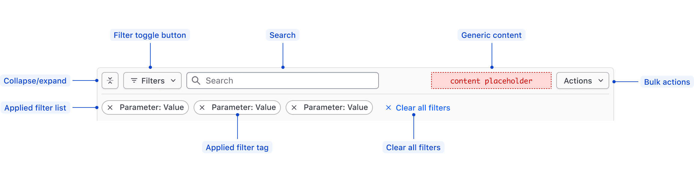
| Element | Usage |
|---|---|
| Collapse/expand | Required; Toggles display of the applied filters. |
| Filter toggle button | Required; Toggles open and closed the Filter Dropdown. |
| Search | Optional; Searches based on string matching across the entire data set. |
| Generic content | Optional |
| Bulk actions | Optional; Supports performing bulk actions on the data set. |
| Applied Filters List | Required; Displays either the filters that have been applied to the data set, or an empty state if there are none. |
| Applied Filter Tag | Required; Displays the filter as Parameter: Value within an I80 Tag. |
| Clear All Filters | Required; Clears all of the applied filters and sets the Filter Bar and the data set back to their default state. |
Filter Dropdown
The Filter Dropdown anatomy is dependent on the filter method:
- Selection: multi-selection using checkboxes or single selection using radios.
- Input: numerical, date, time, datetime values, or a range between a start and end value.
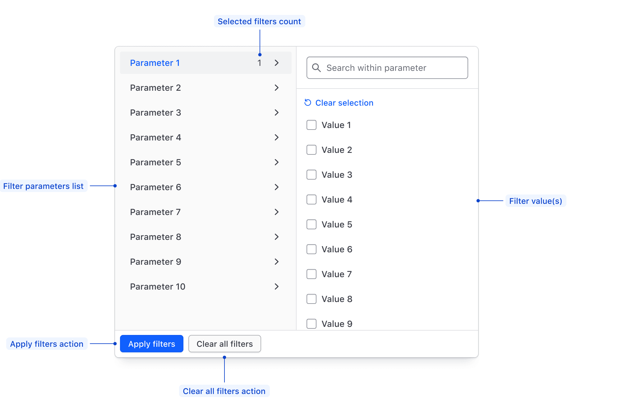
| Element | Usage |
|---|---|
| Parameters list | Required; Displays all of the available filter parameters, generally corresponding with columns in a table. |
| Filter value(s) | Required; Displays available values within a parameter for selection, or allows the input of custom values. |
| Apply Filters action | Required if the filtering method is "per-filter". Applies the filters selected in either the values list or the values input. |
| Clear all filters action | Required; Clears the selection of filters across all parameters. |
| Selected filters count | Displays the number of values selected in a parameter. |
Filter value selection
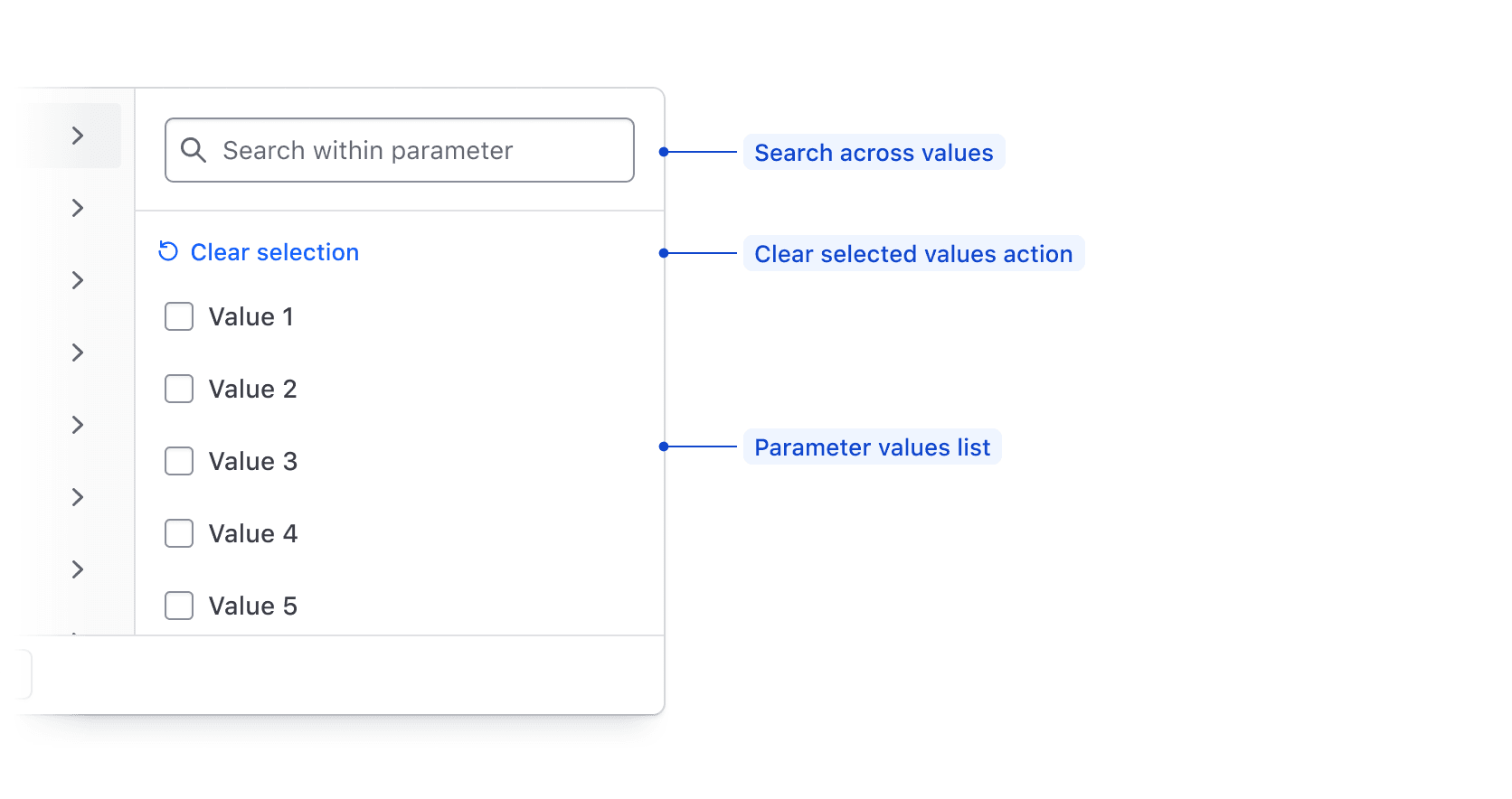
| Element | Usage |
|---|---|
| Search | Optional; Searches across available filter parameter values using string matching. |
| Clear selected values action | Required; De-selects all values in the list. |
| Value input | Required; Supports filtering on numbers, strings, dates, or times. |
Filter value input
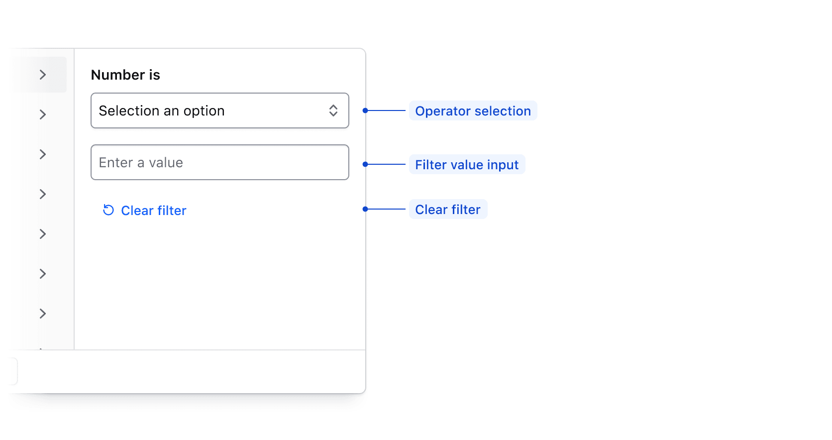
| Element | Usage |
|---|---|
| Operator selection | Required; Allows the user to select how the filter is applied. |
| Value input | Required; Allows the user to input a value to filter upon such as a number, string, date, or time. |
| Clear filter | Required; Clears the filter operator and input fields. |
Filter value range input
When applying a filter value via an input, if between is selected in the operator list, the input fields will be broken into a start value and an end value.
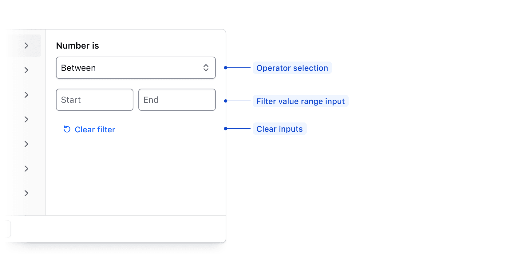
| Element | Usage |
|---|---|
| Operator selection | Required; Allows the user to select how the filter is applied. |
| Value range input | Required; Allows the user to input start and end values to filter upon. |
| Clear filter fields action | Required; Clears the filter input field. |
Custom filtering
The Filter Dropdown supports custom filtering: put your own elements inside it.
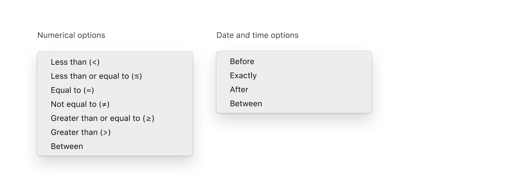
Value input operators
Available operators are dependent on the type of data being filtered upon, but are generally either numerical, or date/time based.
| Type | Options |
|---|---|
| Numerical | Less than (>), Less than or equal to (≤), Equal to (=), Not equal to (≠), Greater than or equal to (≥), Greater than (>), Between |
| Date and time | Before, Exactly, After, Between |
States
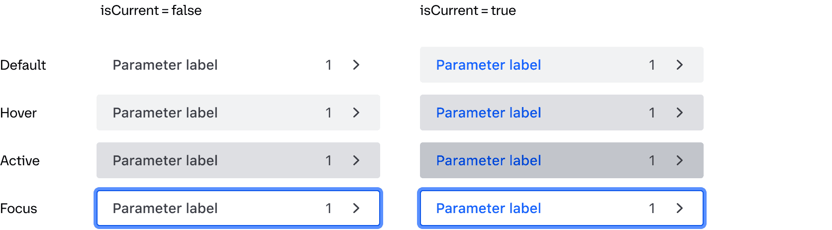
Parameter List Item
Conformance Rating
When used as recommended, there should not be any WCAG conformance issues with this component. You are responsible for the conformance of anything you write inside it.
Keyboard navigation
Accessing the dropdown menu
Focus on the dropdown toggle button.

Open the dropdown menu.
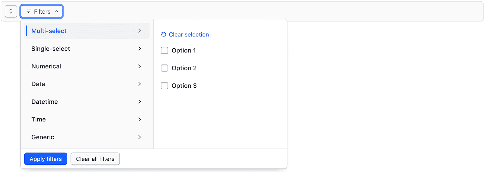
Focus on the selected tab.
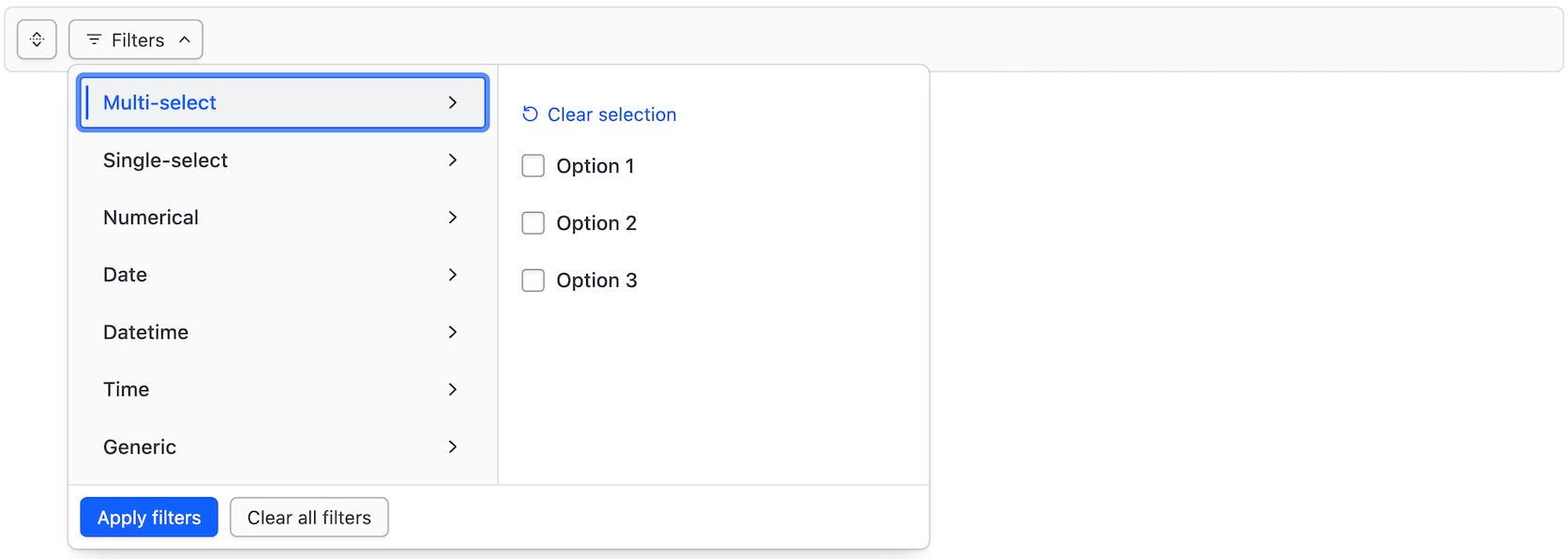
Move between tabs.
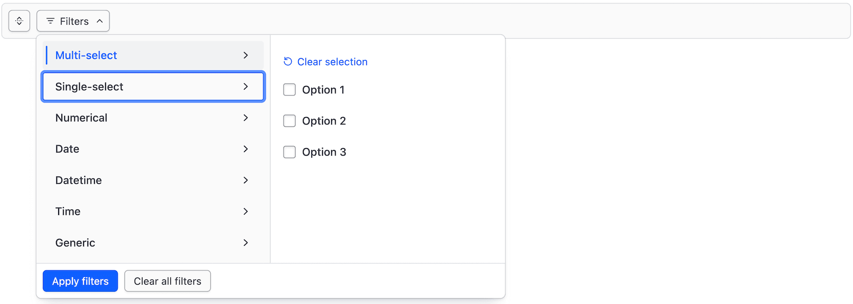
Select a tab.
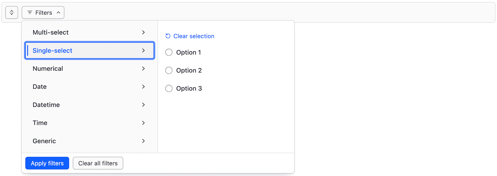
Move to the selected tab content.
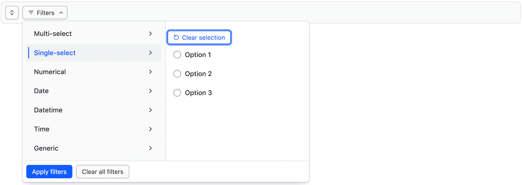
Close the dropdown.
Executing a search
Focus the search input.

Enter a search term into the input.

Execute the search.

Applicable WCAG Success Criteria
This section is for reference only. This component intends to conform to the following WCAG Success Criteria:
-
1.3.1
Info and Relationships (Level A):
Information, structure, and relationships conveyed through presentation can be programmatically determined or are available in text. -
1.3.2
Meaningful Sequence (Level A):
When the sequence in which content is presented affects its meaning, a correct reading sequence can be programmatically determined. -
1.3.5
Identify Input Purpose (Level AA):
The purpose of each input field collecting information about the user can be programmatically determined when the input field serves a purpose identified in the Input Purposes for User Interface Components section; and the content is implemented using technologies with support for identifying the expected meaning for form input data. -
1.4.1
Use of Color (Level A):
Color is not used as the only visual means of conveying information, indicating an action, prompting a response, or distinguishing a visual element. -
1.4.10
Reflow (Level AA):
Content can be presented without loss of information or functionality, and without requiring scrolling in two dimensions. -
1.4.11
Non-text Contrast (Level AA):
The visual presentation of the following have a contrast ratio of at least 3:1 against adjacent color(s): user interface components; graphical objects. -
1.4.12
Text Spacing (Level AA):
No loss of content or functionality occurs by setting all of the following and by changing no other style property: line height set to 1.5; spacing following paragraphs set to at least 2x the font size; letter-spacing set at least 0.12x of the font size, word spacing set to at least 0.16 times the font size. -
1.4.3
Minimum Contrast (Level AA):
The visual presentation of text and images of text has a contrast ratio of at least 4.5:1 -
1.4.4
Resize Text (Level AA):
Except for captions and images of text, text can be resized without assistive technology up to 200 percent without loss of content or functionality. -
2.1.1
Keyboard (Level A):
All functionality of the content is operable through a keyboard interface. -
2.1.2
No Keyboard Trap (Level A):
If keyboard focus can be moved to a component of the page using a keyboard interface, then focus can be moved away from that component using only a keyboard interface. -
2.4.3
Focus Order (Level A):
If a Web page can be navigated sequentially and the navigation sequences affect meaning or operation, focusable components receive focus in an order that preserves meaning and operability. -
2.4.7
Focus Visible (Level AA):
Any keyboard operable user interface has a mode of operation where the keyboard focus indicator is visible. -
3.2.1
On Focus (Level A):
When any user interface component receives focus, it does not initiate a change of context. -
3.2.2
On Input (Level A):
Changing the setting of any user interface component does not automatically cause a change of context unless the user has been advised of the behavior before using the component. -
3.3.2
Labels or Instructions (Level A):
Labels or instructions are provided when content requires user input. -
4.1.2
Name, Role, Value (Level A):
For all user interface components, the name and role can be programmatically determined; states, properties, and values that can be set by the user can be programmatically set; and notification of changes to these items is available to user agents, including assistive technologies.
Support
If any accessibility issues have been found within this component, let us know by submitting an issue.
0.1.0
Første i80-version (fork af upstream, se core/UPSTREAM.md).