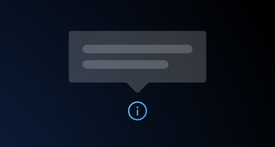
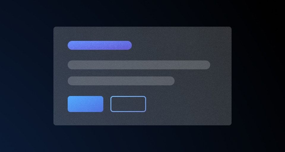
A Rich Tooltip displays extra supplemental information about a UI element. It's similar to the "standard" Tooltip but is intended to be used for more complex or structured content instead of simple text. More details are outlined in Rich Tooltip vs. Tooltip.
Usage
When to use
- For adding extra information, in the form of structured content, to a UI element.
- Use when content needs to stay visible so users can cross-reference it with other parts of the UI. The component remains open until dismissed by the user. See the interaction section for more.
When not to use
- For extra information that consists of basic text, consider using the Tooltip instead.
- For complex functions that change or alter the UI, consider a Dropdown instead.
- As a double-confirmation for destructive actions, use a Modal instead.
- If the information is essential to the user completing a task, consider placing this information within the page and associated with a specific UI element.
Rich Tooltip vs. Tooltip
While there is overlap with the Tooltip, the majority of use cases can be categorized one of two ways:
- Tooltip: simple, text-based content supporting basic formatting (italic, bold,
monospace, etc). - Rich Tooltip: relatively more complex, supporting temporary persistence and structured content, links, micro-interactions, diagrams, etc
View more detailed examples of the content the Rich Tooltip could contain in the content section.
Placement
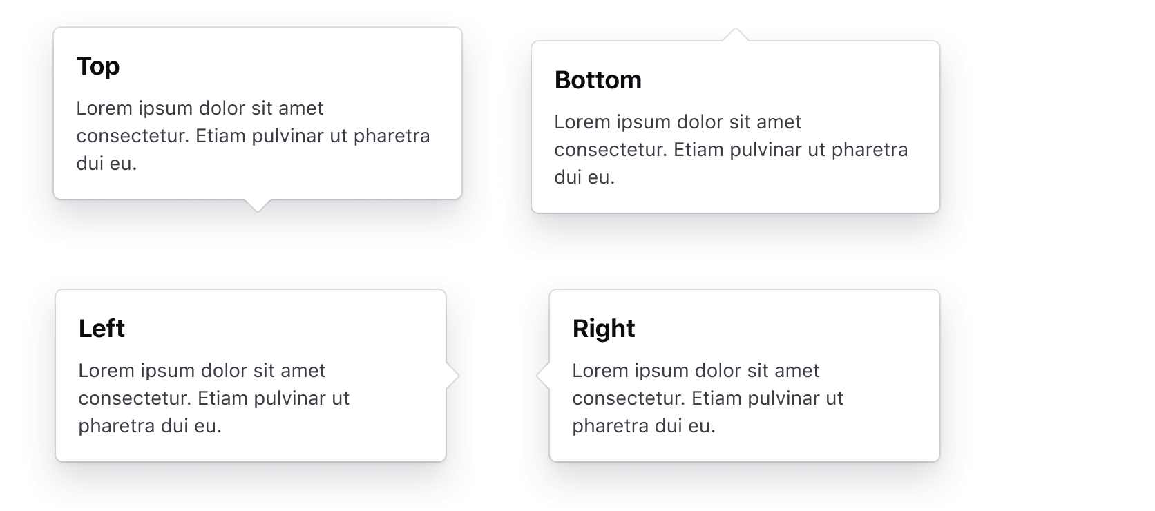
A Rich Tooltip can be placed in various positions relative to the UI element it is associated with.
The most common options are: top, bottom, left, right.
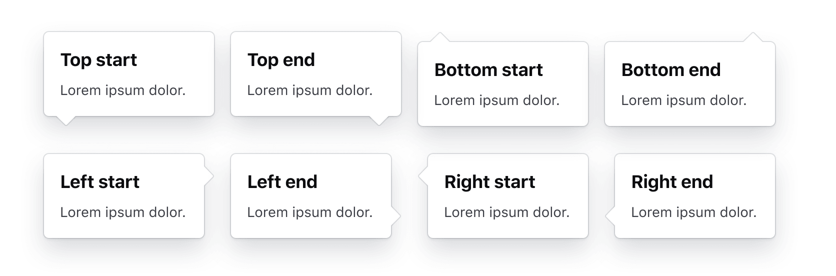
The Rich Tooltip supports additional placement options: top-start, top-end, bottom-start, bottom-end, left-start, left-end, right-start,and right-end.
Collision detection
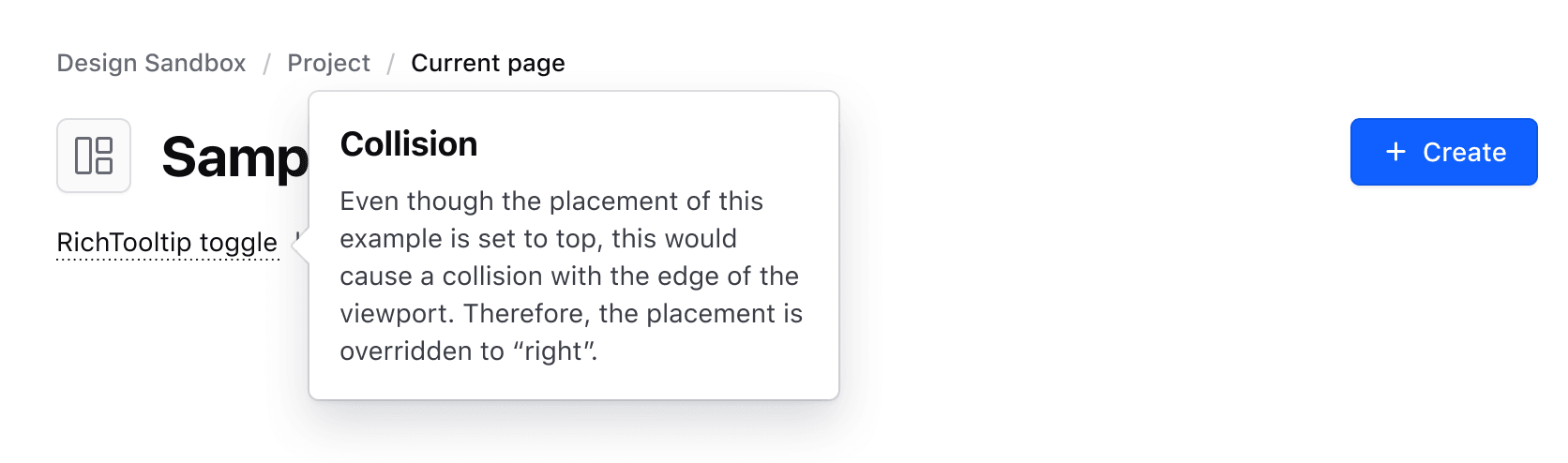
The Rich Tooltip supports collision detection, meaning the placement property might be overridden depending on the position of the component relative to the edge of the viewport. This ensures that the component doesn't extend outside of the viewport while still being associated with the toggle element.
Interaction
The Rich Tooltip supports two interaction methods: a On hover / On focus ("soft") interaction and a On click interaction. Which one to use depends on:
- The type and complexity of content displayed by the component.
- Whether temporarily persisting the content in the UI is necessary or beneficial to the user.
Independent of which interaction is used, the Rich Tooltip can be dismissed by clicking outside of the component or with the ESC key.
Toggle
Default
By default, we provide a Toggle component which should be used in the majority of cases along with the Rich Tooltip. This component ensures that the toggle is perceivable, visually consistent, and can be used inline with other content or standalone as part of the layout flow.
How to use
Consider these guidelines when using the default Toggle component:
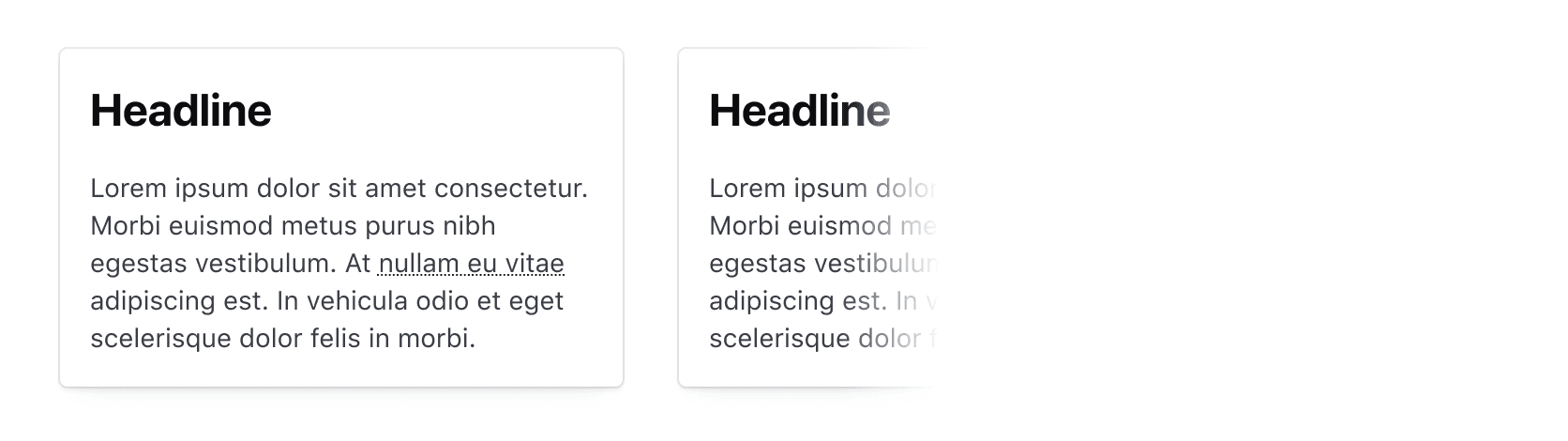
When used in a block of text, use the "text only"/"no icon" variant, as the icon can unnecessarily break the reading flow of the content.
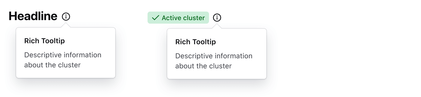
When using the "icon only" variant, ensure the component is paired with other textual elements (like a headline) or elements described by the Rich Tooltip. Don’t use it in isolation or on its own.
Size
The Toggle is available in small, medium, and large sizes. Inside a paragraph it inherits the size of the surrounding text.

Icon
An icon can be used in the Toggle in either the leading or trailing position, or on its own when paired with another element as a label.

Custom toggle
If absolutely necessary, toggling the Rich Tooltip using a custom element is supported but should be used sparingly and conform to the following usability and accessibility success criteria:
- Must have a minimum target area of 24x24 pixels.
- Must have a minimum contrast ratio between the background/surface color of 3:1.
- Should use actionable language or be paired with a label to communicate that additional context is hidden from the user.
More information about this success criteria can be found in the accessibility section.
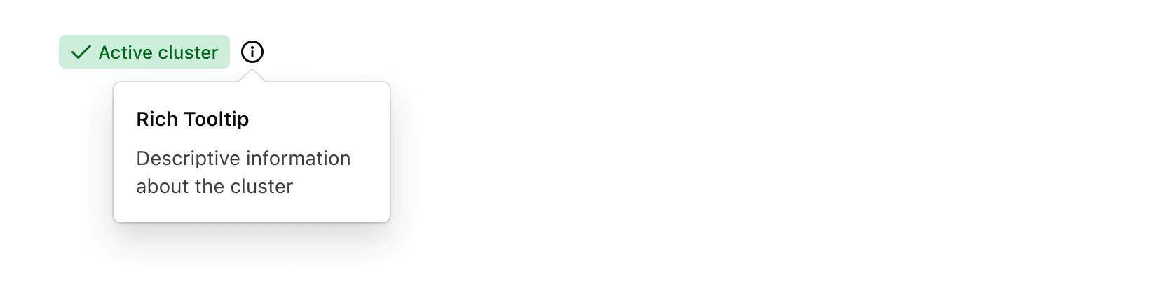
Don’t use a Badge or BadgeCount as the toggle for the Rich Tooltip, Badges are intentionally non-interactive elements and don't visually communicate that content is hidden behind a hover, click, or focus interaction.
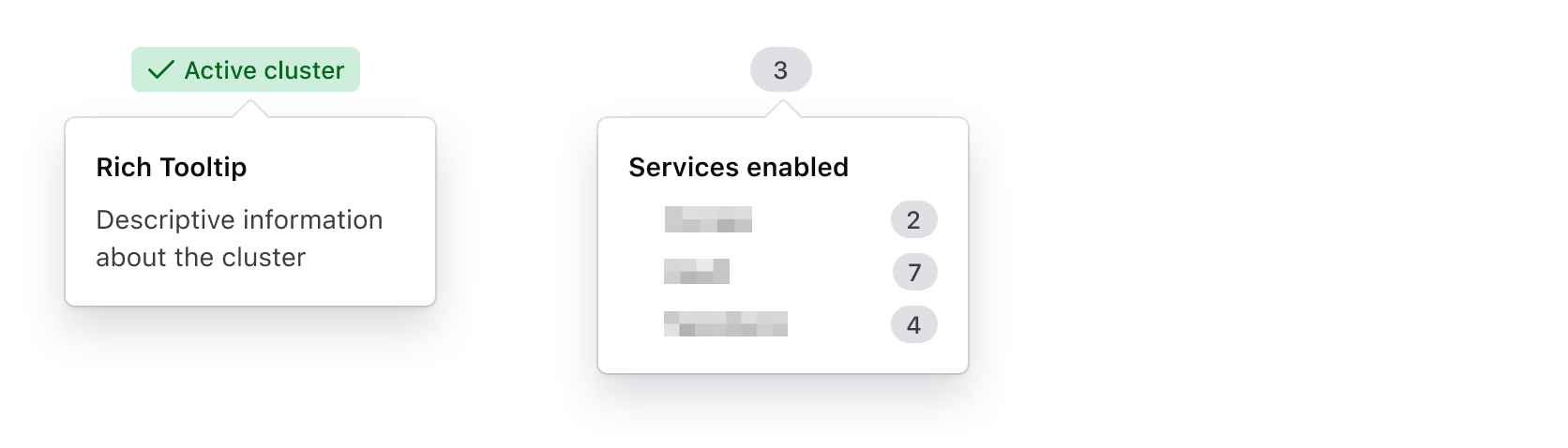
Instead, place the Toggle component inline with the Badge to communicate the existence of a Rich Tooltip.
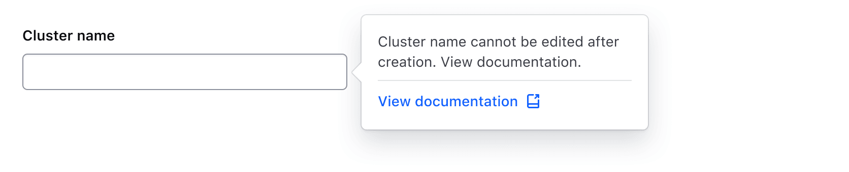
Don’t toggle a Rich Tooltip from a form element like a Text Input, Select, Textarea, or form primitive like a Label or HelperText.
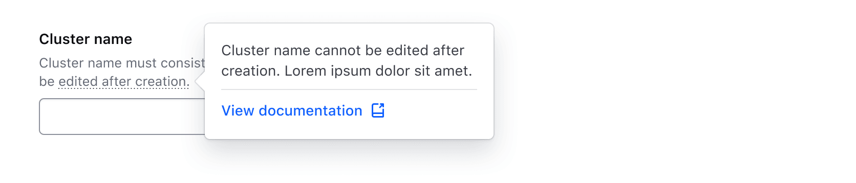
The following example using HelperText will not be read out as interactive to users with screen readers, only the text will be read. More details on this recommendation can be found in the Helper Text documentation.
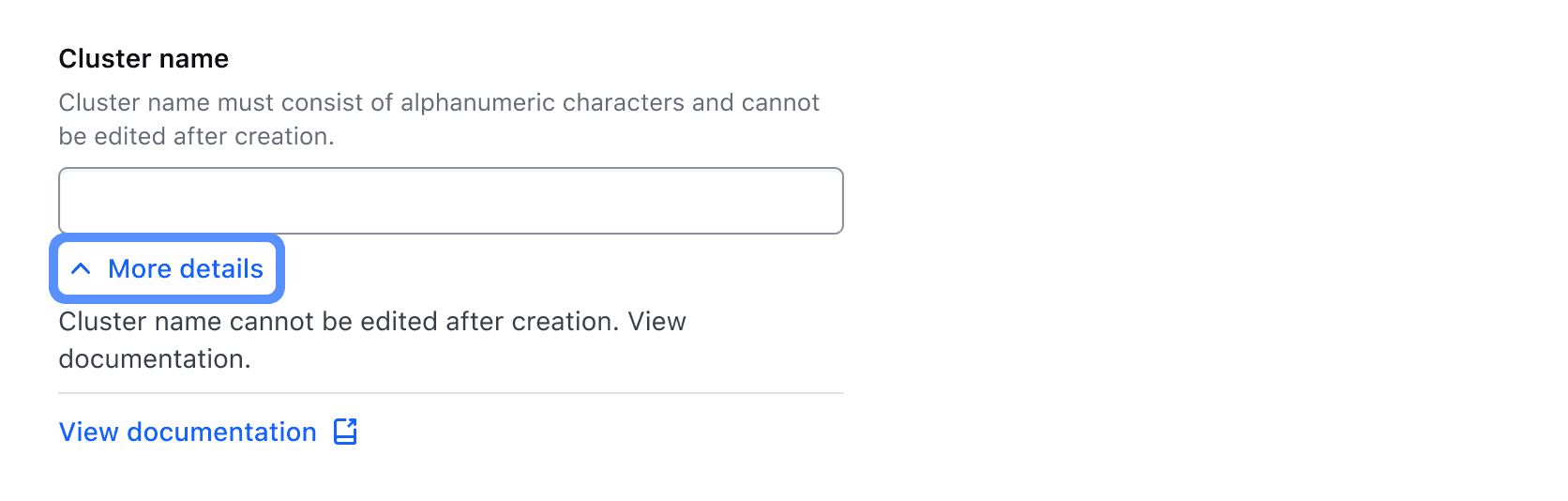
Instead, include additional details in a Reveal.
<i80-rich-tooltip> pairs a toggle with a tooltip that holds real content — a heading, a
paragraph, a link — rather than a string. The tooltip appears as a popover on top of the page,
and closes by triggering the toggle again, by clicking outside it, or with the esc key. For a
plain string of text, use the simpler Tooltip.
While the Rich Tooltip may seem to be a fairly simple component, there is a lot of complexity beneath the surface:
- It uses the native web Popover API to put the bubble on top of the page, which is where the
esckey and "click outside" come from. - Floating UI anchors the bubble to the toggle and handles the automatic positioning and collision detection.
As tooltips are notoriously difficult to implement in an accessible way, we have intentionally limited some of the ways in which the Rich Tooltip can be used, while still providing an alternative for the edge cases — in which case it is up to you to keep the result conformant and accessible.
How to use this component
When using this component, there are a few things to consider:
- what toggle to use; the standard toggle or a generic toggle
- if the toggle is a standalone element or instead lives inline with other text
- how the end-user should interact with the toggle to show/hide the tooltip
Standard toggle
The standard toggle ensures perceivability and accessibility out of the box. It is the text
attribute (with a dotted underline applied to it) and an optional icon. The icon can be leading
or trailing, and its size is always proportional to the font size of the text (1em).
Text and icon are rendered inside an HTML <button>, which is the control that toggles the
popover. For how the user interacts with it, see Interactivity below.
Everything else you write inside the tag becomes the content of the bubble. You can pass whatever you need, and you are responsible for styling and structuring it for your context.
As a standalone element
By default the toggle is rendered as a block, so it can be used as a standalone UI element.
<i80-rich-tooltip text="More info" icon="info">
  <i80-text tag="h4" variant="display" size="200">Some title</i80-text>
  <i80-text tag="p" size="200">Some descriptive information</i80-text>
</i80-rich-tooltip>
As one can see, by default the text of the toggle doesn't get a typographic style — it inherits it from the parent.
Size
To apply a predefined typographic style, pass a size:
<i80-rich-tooltip size="large" text="More info" icon="info">
  <i80-text tag="h4" variant="display" size="200">Some title</i80-text>
  <i80-text tag="p" size="200">Some descriptive information</i80-text>
</i80-rich-tooltip>
Visual organization
To align the toggle with other UI elements, use a parent element that wraps the content and provides the desired layout (e.g., using flexbox):
<div class="doc-rich-tooltip-standalone-block-flex-layout">
  <i80-button>Your action</i80-button>
  <i80-rich-tooltip size="medium" text="More info" icon="info">
    <i80-text tag="h4" variant="display" size="200">Some title</i80-text>
    <i80-text tag="p" size="200">Some descriptive information</i80-text>
  </i80-rich-tooltip>
</div>
Inline with other text
If the toggle needs to sit inline with other text, add inline:
Lorem
<i80-rich-tooltip inline text="ipsum dolor">
  <i80-text tag="h4" variant="display" size="200">Some title</i80-text>
  <i80-text tag="p" size="200">Some descriptive information</i80-text>
</i80-rich-tooltip>
sit amet consectetur adipiscing elit.
In this case it is better not to give the toggle a size, so its typographic style is the same
as the text before and after it.
To apply a typographic style to the whole paragraph, wrap it in a Text:
<i80-text tag="p" size="300">
  Lorem
  <i80-rich-tooltip inline text="ipsum dolor">
    <i80-text tag="h4" variant="display" size="200">Some title</i80-text>
    <i80-text tag="p" size="200">Some descriptive information</i80-text>
  </i80-rich-tooltip>
  sit amet consectetur adipiscing elit.
</i80-text>
Similarly, a typographic class (or a custom CSS class) can be applied to a parent container.
Interactivity
By default the tooltip opens on hover and on focus. To ask for a more explicit interaction — a
click, with hover and focus then doing nothing — set trigger="click":
<i80-rich-tooltip trigger="click" size="medium" text="More info" icon="info">
  <i80-text tag="h4" variant="display" size="200">Some title</i80-text>
  <i80-text tag="p" size="200">Some descriptive information</i80-text>
</i80-rich-tooltip>
Either way the tooltip can be dismissed by clicking outside of it or with the esc key (this
"light dismiss" behavior comes from the Popover API).
The tag fires i80-open and i80-close as this happens, and show(), hide() and the open
property do it from JavaScript.
Placement
By default the tooltip is shown below the toggle, visually centered. placement changes where it
starts: top, bottom, left or right, each also as -start and -end.
<i80-rich-tooltip size="medium" text="Lorem ipsum" icon="info" placement="top-start">
  <i80-text tag="h4" variant="display" size="200">Some title</i80-text>
  <i80-text tag="p" size="200">Some descriptive information that spans multiple lines</i80-text>
</i80-rich-tooltip>
Collision detection
The tooltip adapts its alignment to where it is in relation to the viewport, so that it avoids the window edges: as the page scrolls or the browser is resized, its position follows along both axes, main and secondary.
collision-detection="false" pins it in place, and these values narrow the behaviour down:
flip- adapts the position only along its axis of alignmentshift- adapts the position only along its side axisauto- uses the side where there is more space available (in relation to the viewport)
The default, true, is flip and shift together, and is the suggested one, but there may be
cases where another option works better in a specific context.
In the example below, we use auto: try scrolling and/or resizing the page and see how the
tooltip changes its position automatically:
<i80-rich-tooltip trigger="click" size="medium" text="More info" icon="info" collision-detection="auto">
  <i80-text tag="h4" variant="display" size="200">Some title</i80-text>
  <i80-text tag="p" size="200">Some descriptive information that spans multiple lines</i80-text>
</i80-rich-tooltip>
Fixed width/height
By default the bubble adapts to the size of its content, with a max-width of 280px. width
and height give it a fixed size instead:
<i80-rich-tooltip size="medium" text="More info" icon="info" width="450px" height="200px">
  <i80-text tag="h4" variant="display" size="200">Some title</i80-text>
  <i80-text tag="p" size="200">Some descriptive information</i80-text>
</i80-rich-tooltip>
Generic toggle
There may be special cases in which the standard text or icon toggle doesn't work in a context
or a design. A child with slot="toggle" becomes the toggle instead, but treat this as a last
resort, because it can easily end up inaccessible.
<i80-rich-tooltip>
  <i80-tag slot="toggle" text="My text tag"></i80-tag>
  <i80-text tag="h4" variant="display" size="200">Some title</i80-text>
  <i80-text tag="p" size="200">Some descriptive information</i80-text>
</i80-rich-tooltip>
Advanced options
Offset
The spacing between the toggle and the bubble, 12px, can be tweaked with offset:
<i80-rich-tooltip size="medium" text="More info" icon="info" offset="24">
  <i80-text tag="h4" variant="display" size="200">Some title</i80-text>
  <i80-text tag="p" size="200">Some descriptive information</i80-text>
</i80-rich-tooltip>
Open
The tooltip can start out open with the open attribute. The attribute is also written back when
the bubble opens or closes, so it always says what is on screen.
<i80-rich-tooltip open size="medium" text="More info" icon="info" icon-position="leading" placement="right">
  <i80-text tag="h4" variant="display" size="200">Some title</i80-text>
  <i80-text tag="p" size="200">Some descriptive information</i80-text>
</i80-rich-tooltip>
Attributes
<i80-rich-tooltip> renders this component. Everything it understands:
| Attribute | Values | Default | Notes |
|---|---|---|---|
text |
text | The toggle's text, underlined with dots. | |
icon |
icon name | An icon next to the text, at the text's size. | |
icon-position |
leading · trailing | trailing |
|
size |
small · medium · large | A typographic style for the toggle; without it the toggle inherits the surrounding text. Only applies when there is text. | |
inline |
boolean | The toggle sits in a line of text instead of on its own. | |
trigger |
hover · click | hover |
hover opens it on hover and on focus; click asks for a click. |
open |
boolean | Open on page load. It is also written back when the bubble opens or closes. Property: open. Methods: show(), hide(). Events: i80-open, i80-close. | |
placement |
top · bottom · left · right (each also -start and -end) | bottom |
Where the bubble goes when there is room. |
offset |
number | 12 |
Pixels between the toggle and the bubble. |
collision-detection |
true · false · flip · shift · auto | true |
How the bubble avoids the window edge: true is flip and shift together, auto picks the side with most room, false pins it. |
width |
CSS length | A fixed width instead of fitting the content (which caps at 280px). | |
height |
CSS length | A fixed height. | |
slot="toggle" |
on a child | That child becomes the toggle instead of the text and icon, and its accessibility is then yours. |
The tag keeps any native element you write inside it, so a server-rendered form, link or button works as it is. See Web Components for loading i80.js and the reference for these examples running.
Anatomy
Rich Tooltip
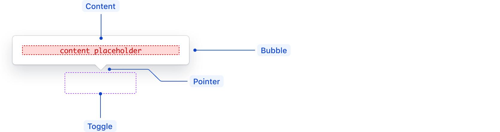
| Element | Usage |
|---|---|
| Bubble | Required |
| Content | Required |
| Pointer | Required |
| Toggle | Required; can use either the default Toggle or custom elements |
Toggle

| Element | Usage |
|---|---|
| Text | Optional |
| Underline | Required if including text |
| Icon | Optional; can be leading, trailing, or only. |
States

Spacing
The default recommended distance between the toggle and the Rich Tooltip pointer is 4px.

Don’t add extra offset if the Rich Tooltip would block important information, appear disconnected from the element it is meant to provide information for, or cause confusion for the user.
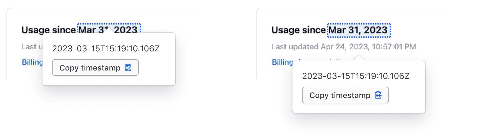
The Rich Tooltip is built to be flexible enough to support a variety of use cases and content. Consider these common examples when determining whether it's appropriate for your use case.
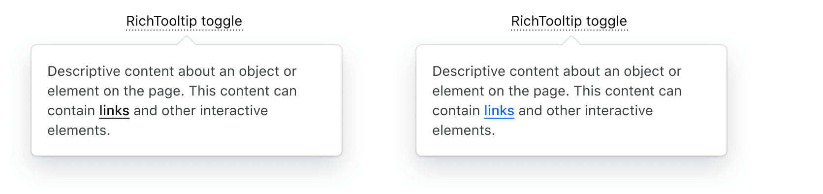
Text with links
This is a common use case for a Rich Tooltip due to the lack of support for interactive content in the Tooltip.
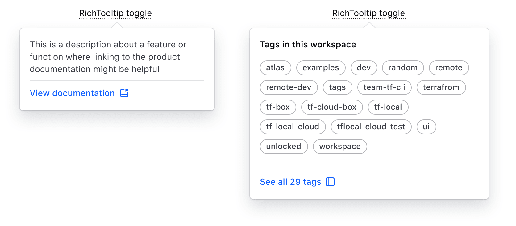
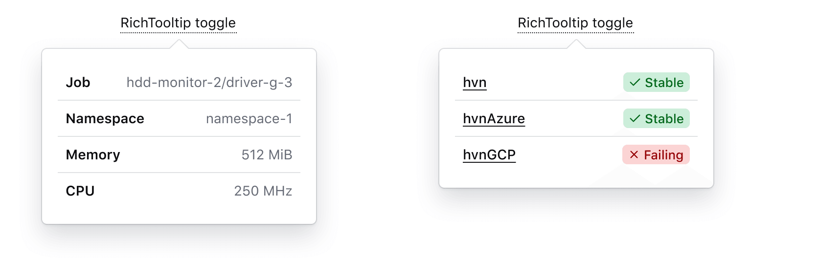
Structured content
Compared to the "standard" Tooltip, the Rich Tooltip supports more structure and layout methods to better organize the content hierarchically.
Key-value pairs
Use the Rich Tooltip to display supplemental key-value pairs or metadata related to an element.
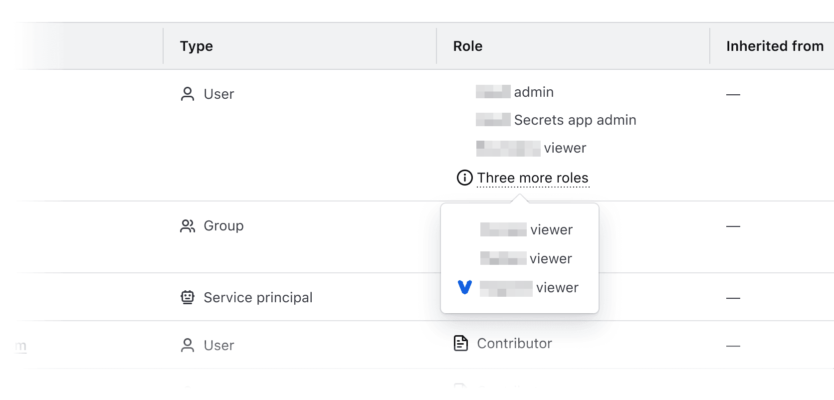
Overflow content
Conformance rating
To be accessible, the toggle which activates the tooltip must be a minimum of 24 × 24 pixels in dimension unless used within a full sentence or paragraph of text. Care must be taken to ensure there is enough space around the toggle so it does not overlap neighboring content.

Applicable WCAG Success Criteria
This section is for reference only. This component intends to conform to the following WCAG Success Criteria:
-
1.1.1
Non-text Content (Level A):
All non-text content that is presented to the user has a text alternative that serves the equivalent purpose. -
1.3.1
Info and Relationships (Level A):
Information, structure, and relationships conveyed through presentation can be programmatically determined or are available in text. -
1.3.2
Meaningful Sequence (Level A):
When the sequence in which content is presented affects its meaning, a correct reading sequence can be programmatically determined. -
1.3.5
Identify Input Purpose (Level AA):
The purpose of each input field collecting information about the user can be programmatically determined when the input field serves a purpose identified in the Input Purposes for User Interface Components section; and the content is implemented using technologies with support for identifying the expected meaning for form input data. -
1.4.1
Use of Color (Level A):
Color is not used as the only visual means of conveying information, indicating an action, prompting a response, or distinguishing a visual element. -
1.4.10
Reflow (Level AA):
Content can be presented without loss of information or functionality, and without requiring scrolling in two dimensions. -
1.4.11
Non-text Contrast (Level AA):
The visual presentation of the following have a contrast ratio of at least 3:1 against adjacent color(s): user interface components; graphical objects. -
1.4.12
Text Spacing (Level AA):
No loss of content or functionality occurs by setting all of the following and by changing no other style property: line height set to 1.5; spacing following paragraphs set to at least 2x the font size; letter-spacing set at least 0.12x of the font size, word spacing set to at least 0.16 times the font size. -
1.4.13
Content on Hover or Focus (Level AA):
Where receiving and then removing pointer hover or keyboard focus triggers additional content to become visible and then hidden, the following are true: dismissible, hoverable, persistent (see link). -
1.4.3
Minimum Contrast (Level AA):
The visual presentation of text and images of text has a contrast ratio of at least 4.5:1 -
1.4.4
Resize Text (Level AA):
Except for captions and images of text, text can be resized without assistive technology up to 200 percent without loss of content or functionality. -
2.1.1
Keyboard (Level A):
All functionality of the content is operable through a keyboard interface. -
2.1.2
No Keyboard Trap (Level A):
If keyboard focus can be moved to a component of the page using a keyboard interface, then focus can be moved away from that component using only a keyboard interface. -
2.4.7
Focus Visible (Level AA):
Any keyboard operable user interface has a mode of operation where the keyboard focus indicator is visible. -
2.4.11
Focus Not Obscured (Minimum) (Level AA):
When a user interface component receives keyboard focus, the component is not entirely hidden due to author-created content. -
2.5.8
Target Size Minimum (Level AA):
The size of the target for pointer inputs is at least 24 by 24 CSS pixels, with a few exceptions. -
4.1.2
Name, Role, Value (Level A):
For all user interface components, the name and role can be programmatically determined; states, properties, and values that can be set by the user can be programmatically set; and notification of changes to these items is available to user agents, including assistive technologies.
Support
If any accessibility issues have been found within this component, let us know by submitting an issue.
0.1.0
Første i80-version (fork af upstream, se core/UPSTREAM.md).