A dropdown is a flexible component that displays a list of actions or options to the user. It should not be confused with the Select, which is used in forms as a way for the user to make a selection from a list.
Usage
When to use
- To display a list of actions or links under a single button toggle.
- To allow singular or multiple selection outside of a form, such as within filtering.
- To provide the user with a way to easily switch context within the application.
When not to use
- In forms when providing the user with options to choose from, consider Select.
Toggle
Toggle types
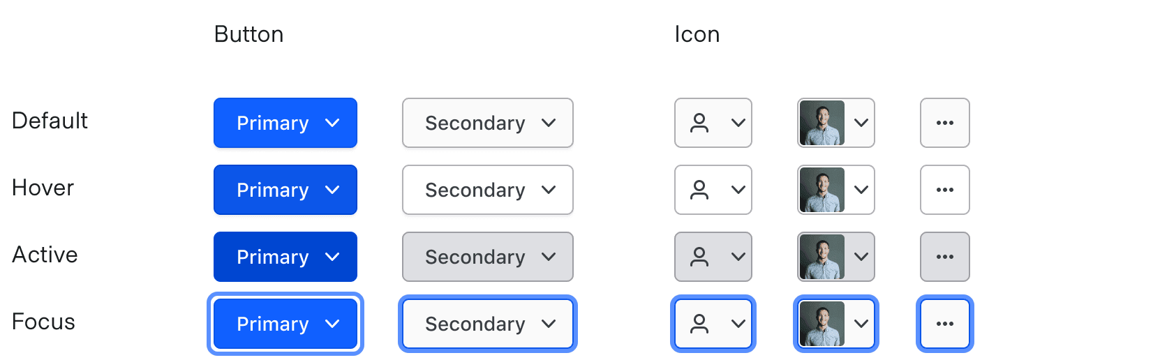
Toggles come in two variant types: button and icon.

Toggle size
ToggleButtons come in two sizes: small and medium. This allows for placement in ButtonSets with buttons of the same size.

ToggleIcons come in two sizes: small and medium.
While we provide a small size variant, we recommend only using this for the Overflow menu within Tables because the icons and images can become unrecognizable in smaller sizes.

Chevron usage
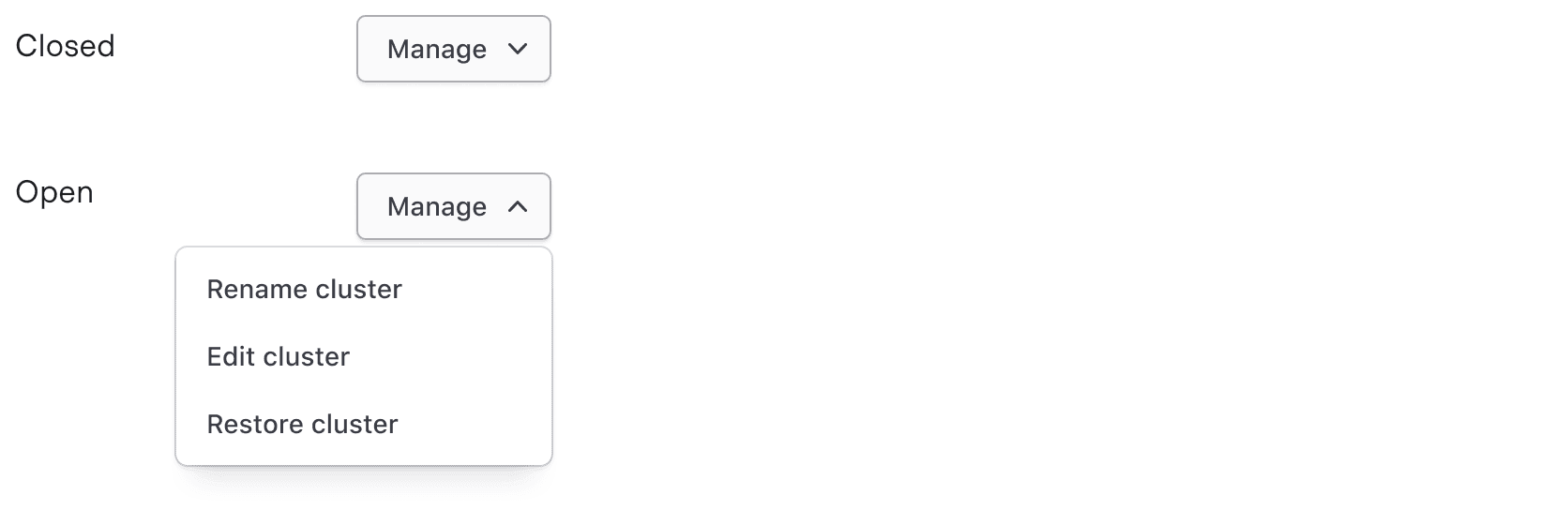
Open Toggles use icon chevron-up, while closed Toggles use chevron-down.
ToggleButtons require a visible chevron to indicate interactivity and provide distinction between Dropdowns and standard Buttons.
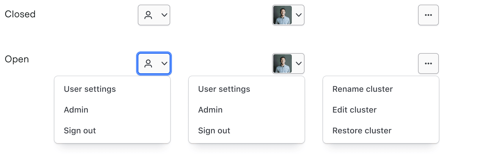
We strongly recommend providing visible chevrons on most instances of ToggleIcons to indicate interactivity. That said, it’s common to see ToggleIcons that use the more-horizontal icon without chevrons. Their placement, usually in the last column of a Table, is typically indicative of this type of interaction.
List
Placement
Lists can be positioned to the left or right of the Toggle, and above or below the Toggle to fit more appropriately within the UI. Lists do not currently have collision detection.
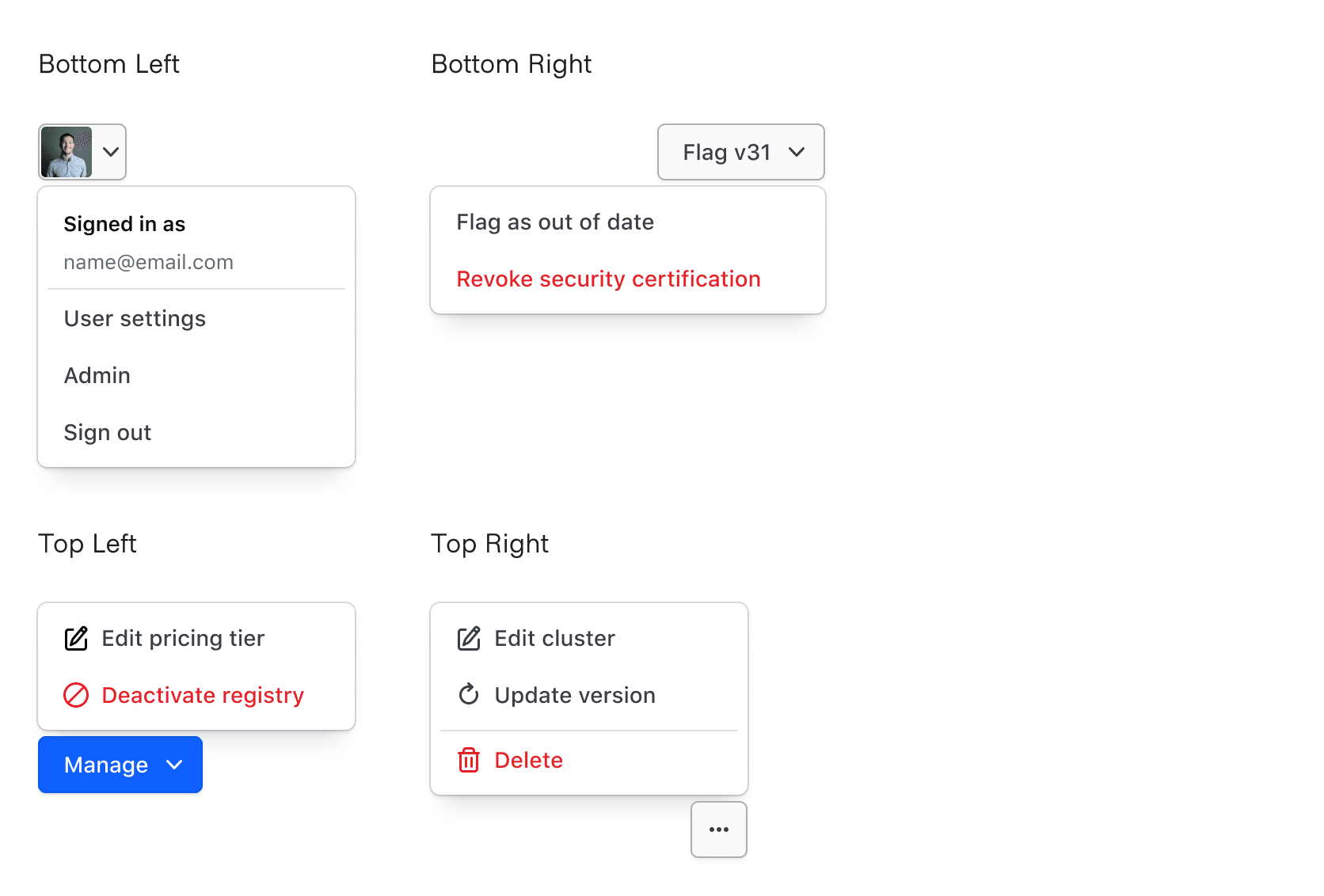
List size
Width
By default, Lists have a minimum width of 200px and a maximum width of 400px. This means if there’s a long string in a list item, the List will automatically expand up to 400px to accommodate the content before it wraps.
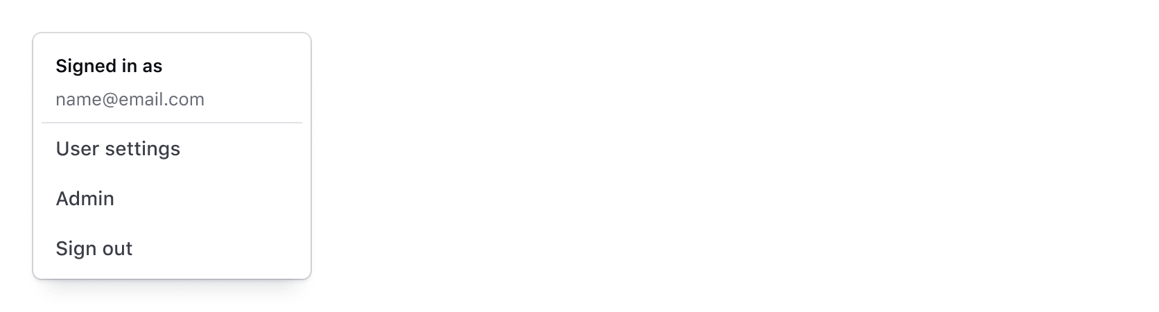
If you do not want the width of the List to expand automatically to accommodate the widest list item, you can indicate a specific width between 200px–400px.
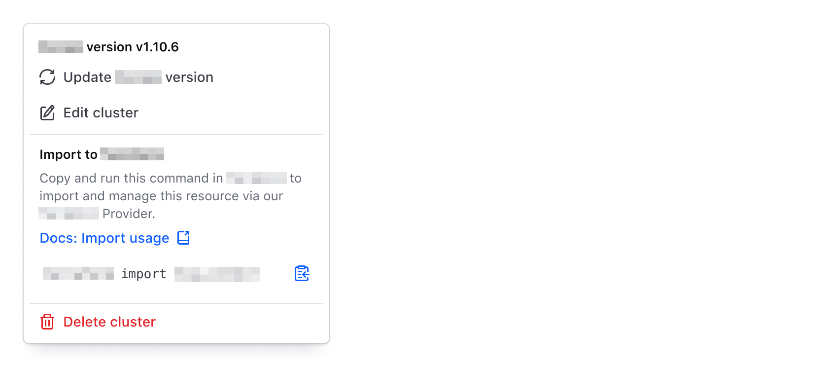
Height
The height of the ListContainer is automatically determined based on the contents, but the height can also be set manually. We recommend setting the height manually if you know the list will be long. In code, the @height property actually acts as a max-height.
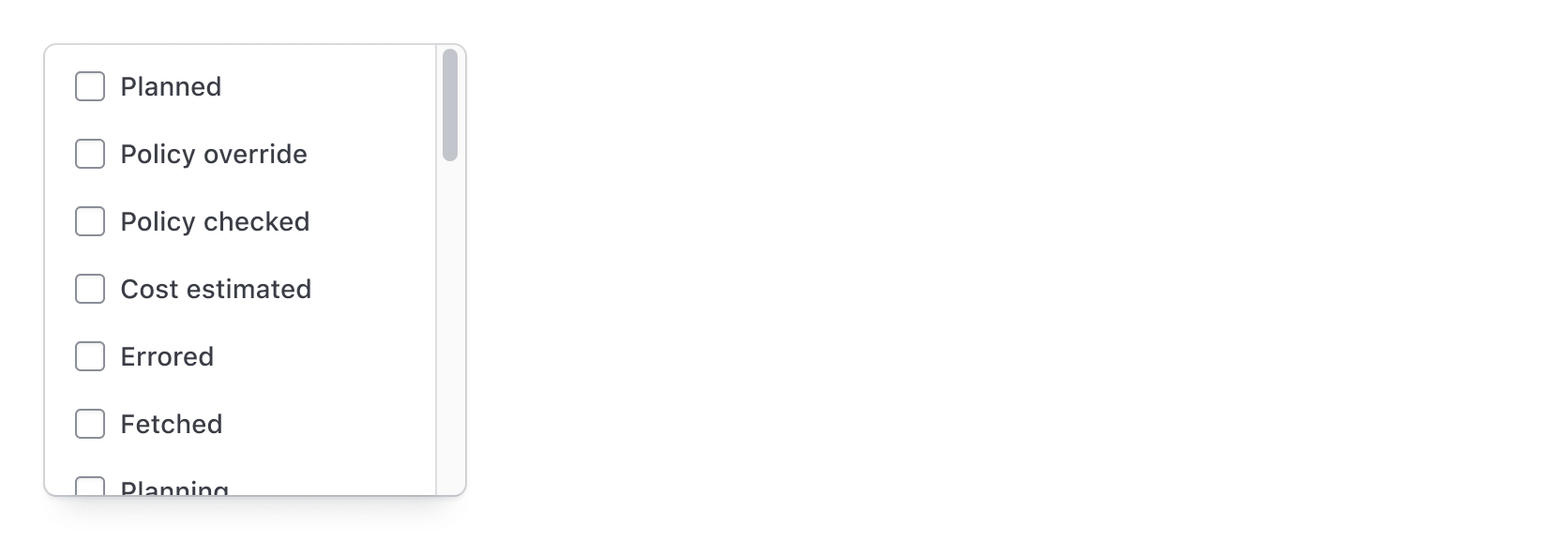
Header
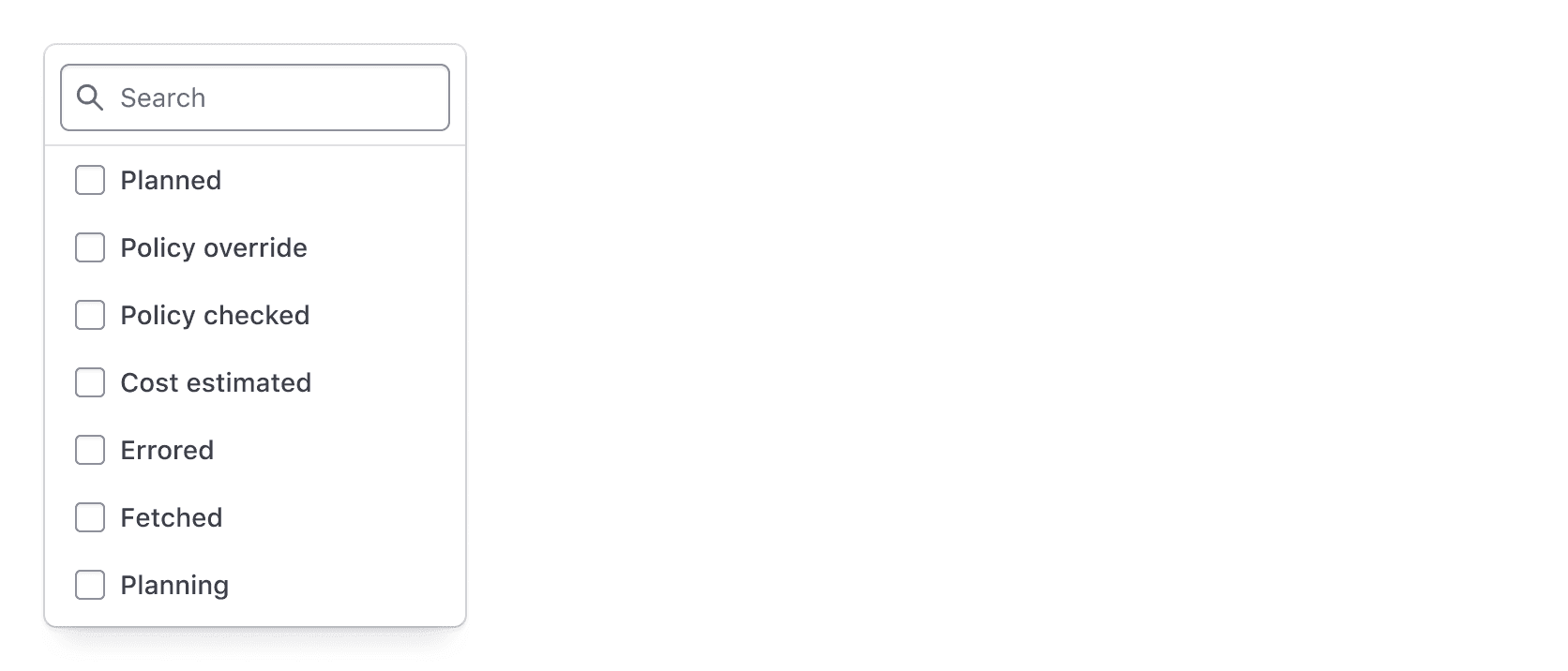
A Header provides a fixed space at the top of the List. Typically, Headers house a search feature that allows the user to search/filter through the available options in the list. This is great for really long lists when filtering on complex datasets.
Footer
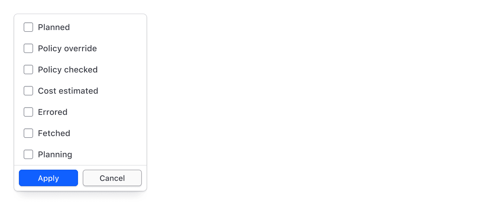
A Footer provides a fixed space at the bottom of the List. Typically, Footers house actions related to the list items, e.g., when found in a filtering pattern an "Apply" Button can be used to submit the selections.
List item
List item types
For maximum flexibility, we offer a variety of list items options.
Interactive list items
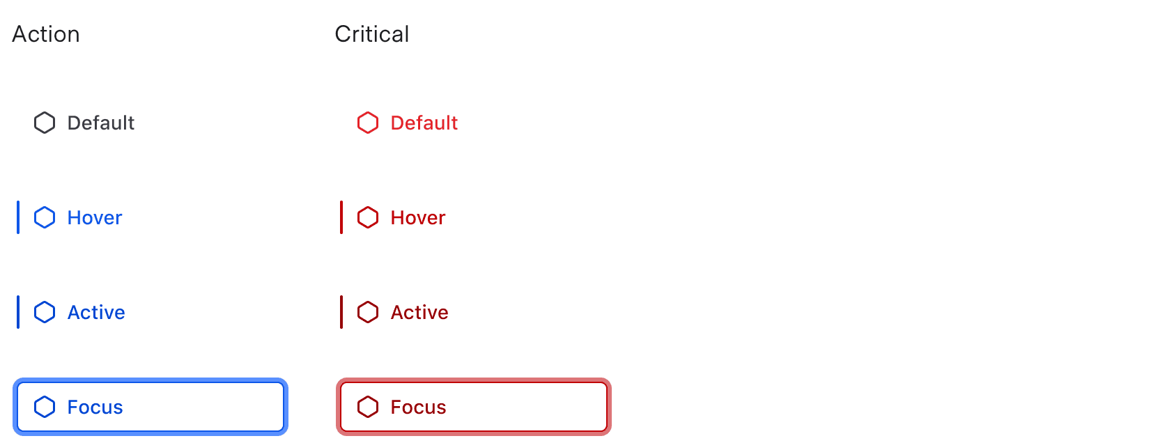
Use Interactive list items for actions (buttons) or links.
- Use
Interactive - Criticalfor destructive actions. - Use
Interactive - Actionfor everything else.

Selection list items
Selection list items allow the user to select one or more options within a Dropdown.
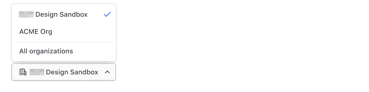
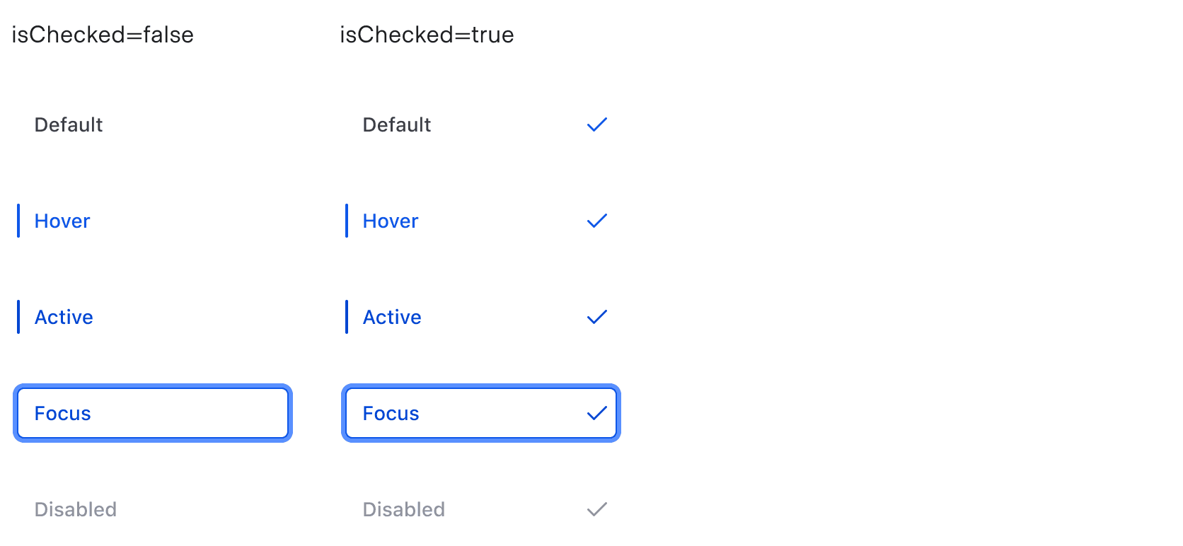
- Use a checkmark for switching context, e.g., organization switchers, project switchers, etc. Use it for single selection only, as it doesn't indicate clearly enough that multi-selection is possible. For multi-selection, use a checkbox.
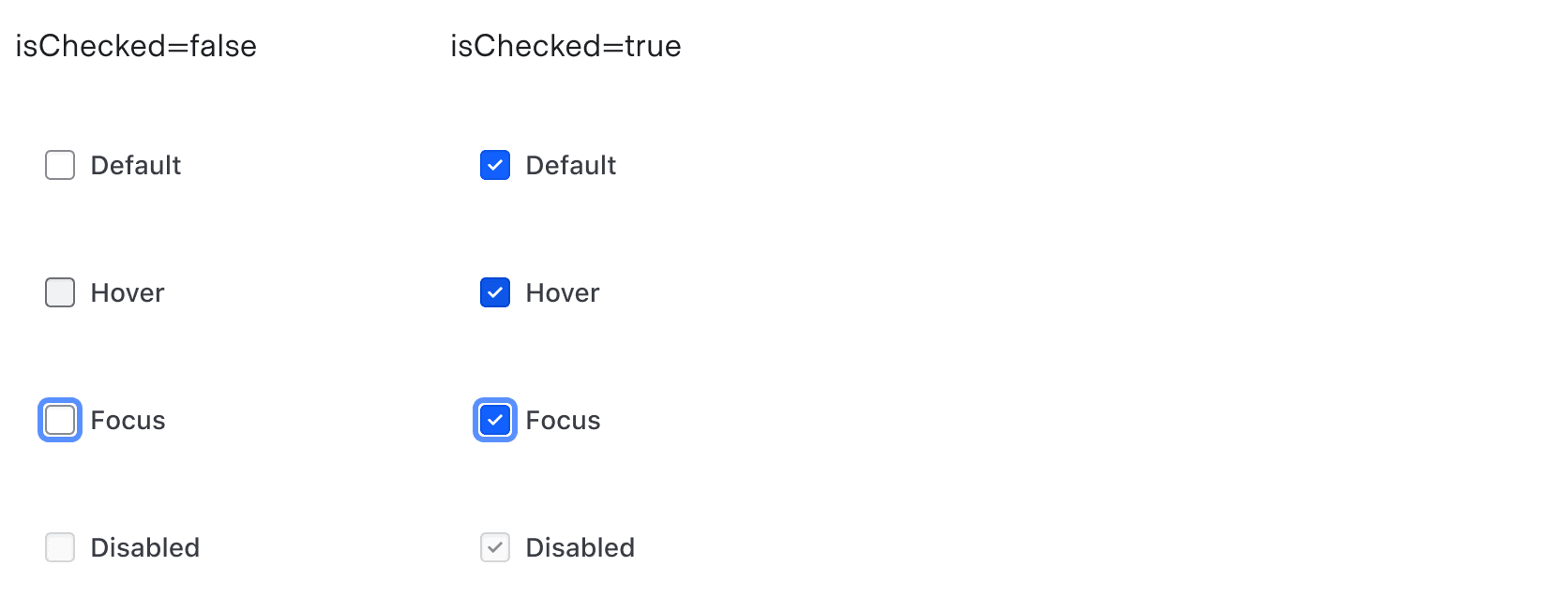
- Use a checkbox for multi-selection within a form or larger filter pattern.
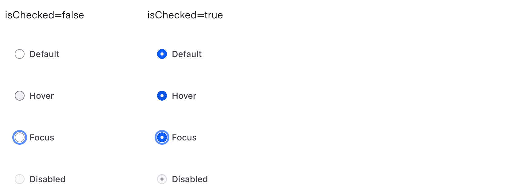
- Use a radio for single selection within a form or larger filter pattern.

Use a checkmark for context switching.
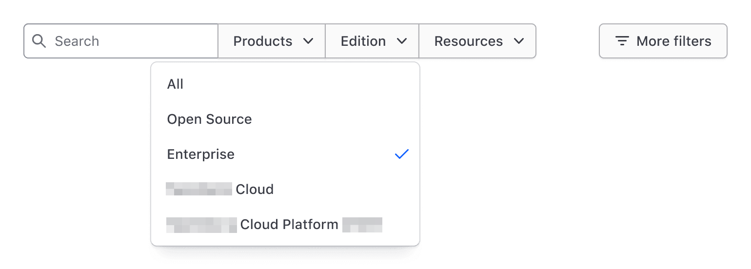
Don't use a checkmark instead of a radio in larger filter patterns.
Non-interactive list items
Non-interactive list items help provide structure and context to a Dropdown. Types include a description, a loading message, a separator, and a title.
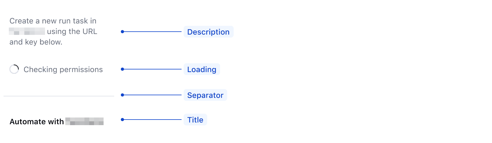
Users may not understand why something is taking additional time to load. If possible, determine what should be displayed prior to the user opening the dropdown (e.g., on page load). If that is not possible, provide an informative loading message.

Generic list items
The Generic list item allows you to add generic content in place of a list item. It includes predefined left and right padding to ensure proper alignment with other list items in the List.

Icon usage
Icons in list items are optional, and we generally recommend letting the text speak for itself.
However, icons can add value when they reinforce the content or indicate external links. When using Critical list items, icons may also improve how color blind users see critical actions.
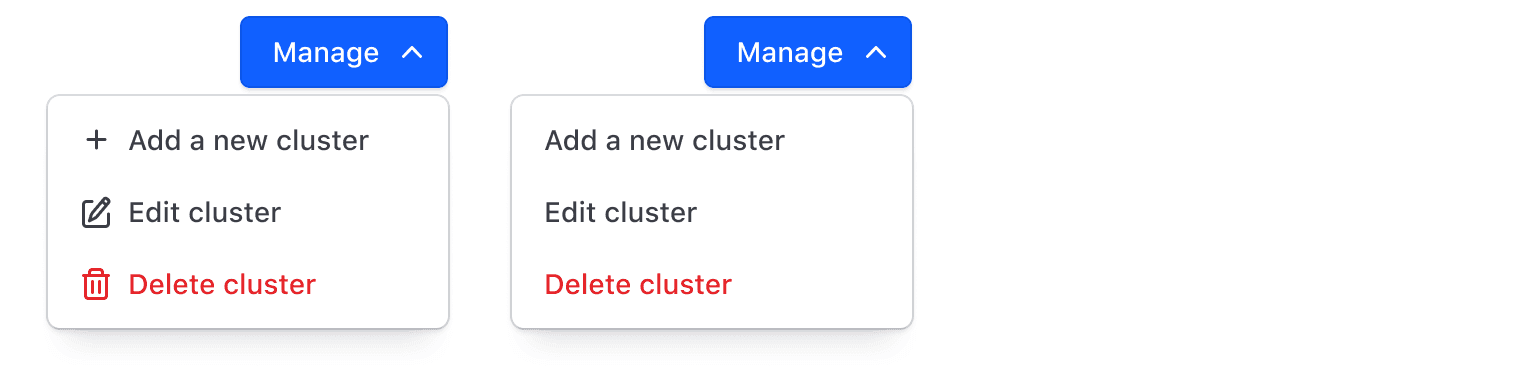
Avoid inconsistent icon use within the same List.
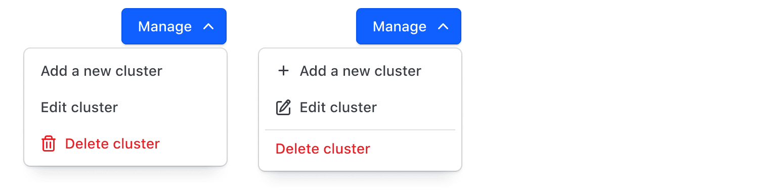
Use icons consistently. Doing so keeps the text aligned so the eye can scan the list of options more easily.
Badge usage
Badges in Interactive list items are optional. We recommend using only the small Badge option to align more closely with the text line height. Badges should be used sparingly and only when their use adds contextual value. Examples of appropriate use of Badge inside an Interactive list item include:
- When an item is in beta or behind a feature flag, i.e., a new item that users should be able to locate easily.
- When an item has vital information that users should be able to see at a glance, i.e., a unique status.
- When an item should be distinguished from others in the list, e.g., an item view is Public vs Private.
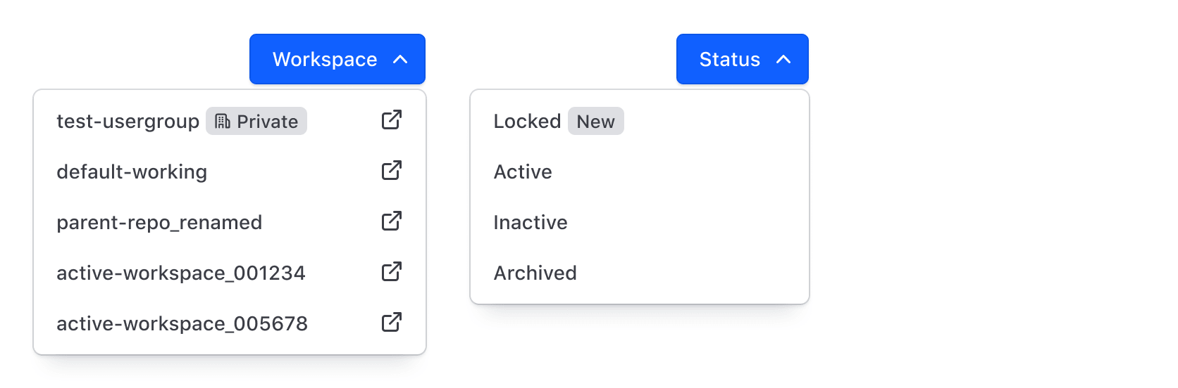
Refer to the Badge guidelines to help inform choices around color and icon use.
Critical action patterns
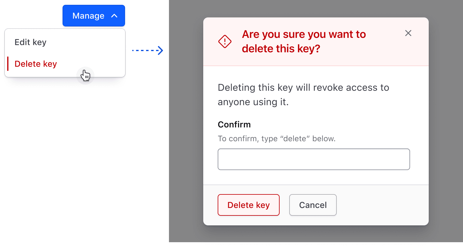
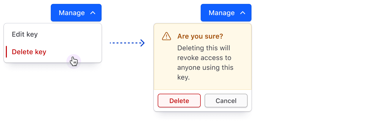
We recommend adding a second confirmation layer after the user clicks “Delete” (e.g., showing a confirmation Modal that requires the user to take another action before proceeding). This safeguards against accidental clicks by requiring users to confirm the destructive action.
How to use this component
The component uses the Popover API to display the dropdown list. A third-party library called Floating UI provides anchoring and positioning functionality.
The parts are elements written inside <i80-dropdown>: <i80-dropdown-item>, <i80-dropdown-title> and <i80-dropdown-separator>.
<i80-dropdown text="Menu">
  <i80-dropdown-title>Title Text</i80-dropdown-title>
  <i80-dropdown-item href="#">Add</i80-dropdown-item>
  <i80-dropdown-item href="#">Add More</i80-dropdown-item>
  <i80-dropdown-item href="#">Add Another Thing Too</i80-dropdown-item>
  <i80-dropdown-separator></i80-dropdown-separator>
  <i80-dropdown-item href="#" icon="trash" color="critical">Delete</i80-dropdown-item>
</i80-dropdown>
The toggle button
The toggle requires a label: the text attribute. By default, it renders a primary button with a chevron icon.
<i80-dropdown text="Text Toggle">
  <i80-dropdown-item href="#">Item One</i80-dropdown-item>
  <i80-dropdown-item href="#">Item Two</i80-dropdown-item>
  <i80-dropdown-item href="#">Item Three</i80-dropdown-item>
  <i80-dropdown-separator></i80-dropdown-separator>
  <i80-dropdown-item href="#" icon="trash" color="critical">Delete</i80-dropdown-item>
</i80-dropdown>
Alternatively, set color to secondary to display a secondary button with a chevron icon.
<i80-dropdown text="Text Toggle" color="secondary">
  <i80-dropdown-item href="#">Item One</i80-dropdown-item>
  <i80-dropdown-item href="#">Item Two</i80-dropdown-item>
  <i80-dropdown-item href="#">Item Three</i80-dropdown-item>
  <i80-dropdown-separator></i80-dropdown-separator>
  <i80-dropdown-item href="#" icon="trash" color="critical">Delete</i80-dropdown-item>
</i80-dropdown>
List placement
By default, the list is positioned below the button, aligned to the right. To change the list position pass bottom-left, top-left, or top-right to the position attribute on the Dropdown.
<i80-dropdown text="Text Toggle" position="bottom-left">
  <i80-dropdown-item href="#">Item One</i80-dropdown-item>
  <i80-dropdown-item href="#">Item Two</i80-dropdown-item>
  <i80-dropdown-item href="#">Item Three</i80-dropdown-item>
  <i80-dropdown-separator></i80-dropdown-separator>
  <i80-dropdown-item href="#" icon="trash" color="critical">Delete</i80-dropdown-item>
</i80-dropdown>
In contexts where the Dropdown needs to be inline, to inherit the alignment from a parent, you can use the inline attribute, and set position accordingly to your needs.
List size
You can explicitly control the height or width of a list. Any acceptable value (px, rem, em) can be declared.
The height attribute actually sets a max-height which prevents the list from growing past a certain height.
<i80-dropdown text="Text Toggle" width="250px" height="170px">
  <i80-dropdown-item href="#">Item One</i80-dropdown-item>
  <i80-dropdown-item href="#">Item Two</i80-dropdown-item>
  <i80-dropdown-item href="#">Item Three</i80-dropdown-item>
  <i80-dropdown-item href="#">Item Four</i80-dropdown-item>
  <i80-dropdown-item href="#">Item Five</i80-dropdown-item>
  <i80-dropdown-item href="#">Item Six</i80-dropdown-item>
  <i80-dropdown-item href="#">Item Seven</i80-dropdown-item>
</i80-dropdown>
You can also set the width of a list to match the toggle button.
<i80-dropdown text="Text Toggle" match-toggle-width>
  <i80-dropdown-item href="#">Item One</i80-dropdown-item>
  <i80-dropdown-item href="#">Item Two</i80-dropdown-item>
  <i80-dropdown-item href="#">Item Three</i80-dropdown-item>
  <i80-dropdown-item href="#">Item Four</i80-dropdown-item>
</i80-dropdown>
When match-toggle-width is set, the width value (if set) is overridden.
Items
An item — <i80-dropdown-item> — renders the correct element: a link when it has an href, a button when it doesn’t. An <a>, <button> or <form> you write inside the item is kept as it is, so a server-side delete form works as it stands.
Attributes
<i80-dropdown> renders this component. Everything it understands:
| Attribute | Values | Default | Notes |
|---|---|---|---|
text |
text | The toggle's label. | |
color |
primary · secondary | primary |
|
size |
small · medium | medium |
|
icon |
icon name | Icon before the text. | |
position |
bottom-right · bottom-left · top-right · top-left | bottom-right |
Where the list opens. |
width / height |
CSS length | Fixed width, maximum height. | |
match-toggle-width |
boolean | ||
inline |
boolean | Sits in a line of text instead of on its own. | |
open |
boolean | Open initially. Methods: show(), hide(). Events: i80-open, i80-close. | |
i80-dropdown-item |
href · icon · trailing-icon · color (action · critical) · disabled · keep-open | One entry. |
The tag keeps any native element you write inside it, so a server-rendered form, link or button works as it is. See Web Components for loading i80.js and the reference for these examples running.
Anatomy
Dropdown
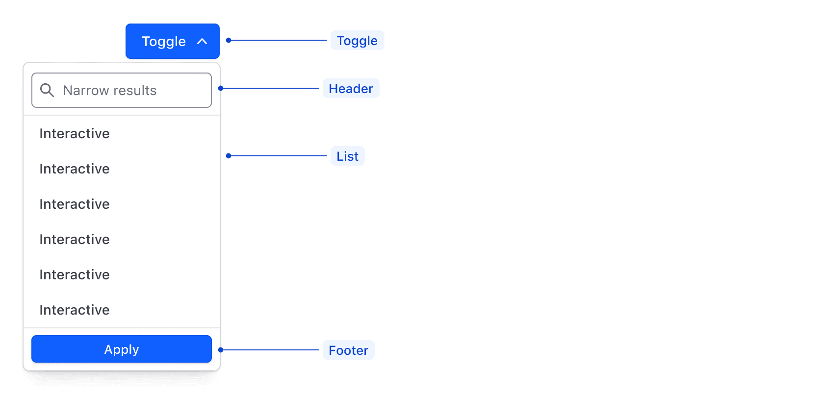
| Element | Usage |
|---|---|
| Toggle | Required |
| Header | Optional |
| List | Required |
| Footer | Optional |
Toggle
| Element | Usage |
|---|---|
| Text, Icon, or Avatar | One is required |
| Chevron | Required, except on the Overflow toggle |
| Container | Required |
List item

| Element | Usage |
|---|---|
| Text | Required |
| Icon | Required for Critical list items; Optional otherwise |
| Indicator | Visible in hover and active state |
| Focus ring | Visible in focus state |
States
Toggle
List item
Interactive
Checkbox
Checkmark
Radio
List item
While there are no character limits for list items, we recommend keeping them short and concise so the List is easy to scan.
Conformance Rating
When used as recommended, there should not be any WCAG conformance issues with this component. The toggle is a real <button> with aria-expanded and aria-controls, the list is a <ul> of real links and buttons, and it always carries the chevron that shows it opens something.
Best practices
Color blind users and critical actions
Color blind users, specifically those with Achromatopsia, may have a hard time perceiving critical items — <i80-dropdown-item color="critical"> — in a Dropdown.
Ensure you're using strong, clear language for the text, e.g., “Delete…”, “Revoke…”, etc.

To provide a more accessible experience, we recommend:
- Adding a relevant icon that indicates the action is destructive, e.g.,
icon="trash". - Moving the critical item to the bottom of the list or the section. Consider also adding an
<i80-dropdown-separator>above it to separate it from the other items. - Adding a second confirmation layer when the user chooses to delete an object, e.g., showing a confirmation Modal that requires the user to type “Delete” into a field before proceeding.

Keyboard navigation
The element does the moving for you: the down and up arrows open the list from the toggle and land on the first or last item, the arrow keys, Home and End move between items once it is open, Esc closes it and returns focus to the toggle, and tabbing out closes it too. An item is a link or a button, so Enter — and Spacebar, on a button — activates it.
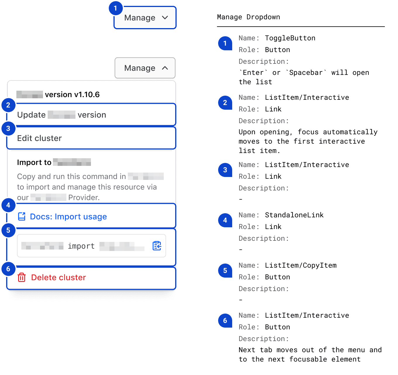
Long item text wraps rather than being cut off, so nothing is hidden from a keyboard-only user. If you set a height, the list scrolls to reach the rest.
Applicable WCAG Success Criteria
This section is for reference only. This component intends to conform to the following WCAG Success Criteria:
-
1.3.1
Info and Relationships (Level A):
Information, structure, and relationships conveyed through presentation can be programmatically determined or are available in text. -
1.3.2
Meaningful Sequence (Level A):
When the sequence in which content is presented affects its meaning, a correct reading sequence can be programmatically determined. -
1.4.1
Use of Color (Level A):
Color is not used as the only visual means of conveying information, indicating an action, prompting a response, or distinguishing a visual element. -
1.4.10
Reflow (Level AA):
Content can be presented without loss of information or functionality, and without requiring scrolling in two dimensions. -
1.4.11
Non-text Contrast (Level AA):
The visual presentation of the following have a contrast ratio of at least 3:1 against adjacent color(s): user interface components; graphical objects. -
1.4.12
Text Spacing (Level AA):
No loss of content or functionality occurs by setting all of the following and by changing no other style property: line height set to 1.5; spacing following paragraphs set to at least 2x the font size; letter-spacing set at least 0.12x of the font size, word spacing set to at least 0.16 times the font size. -
1.4.3
Minimum Contrast (Level AA):
The visual presentation of text and images of text has a contrast ratio of at least 4.5:1 -
1.4.4
Resize Text (Level AA):
Except for captions and images of text, text can be resized without assistive technology up to 200 percent without loss of content or functionality. -
2.1.1
Keyboard (Level A):
All functionality of the content is operable through a keyboard interface. -
2.1.2
No Keyboard Trap (Level A):
If keyboard focus can be moved to a component of the page using a keyboard interface, then focus can be moved away from that component using only a keyboard interface. -
2.4.3
Focus Order (Level A):
If a Web page can be navigated sequentially and the navigation sequences affect meaning or operation, focusable components receive focus in an order that preserves meaning and operability. -
2.4.7
Focus Visible (Level AA):
Any keyboard operable user interface has a mode of operation where the keyboard focus indicator is visible.
Support
If any accessibility issues have been found within this component, let us know by submitting an issue.
0.1.0
Første i80-version (fork af upstream, se core/UPSTREAM.md).