Usage
When to use
- To trigger an action or event, like a form submission.
- For links that require more prominence, such as CTAs (calls-to-action), see Links as Buttons.
- For links that are part of an inverse button group, see Links as Buttons.
When not to use
- For links that are not CTAs or part of an inverse button group, consider Inline or Standalone link.
- To display multiple actions under a single button, use Dropdown.
Sizes
Medium is the preferred size, but use a Button size that best fits the UI (e.g., don’t use a large button in a table).
Full-width buttons fill 100% of the parent container. Use full-width Buttons sparingly.
Colors
Primary
Use Primary for the most important action on a page, e.g., for submitting a form. Avoid using multiple Primary buttons on a single page.
Secondary
Use Secondary for less important actions or when multiple actions of the same importance are needed.
For example:
- for
Cancelnext to aSubmitbutton. - when needing to let the user do things like
DownloadorGeneratea report but neither are the primary focus or goal of the page.
Critical
Use Critical when users take an action that is potentially dangerous. For example, when deleting a cluster.
Tertiary
Use Tertiary for low-priority actions when lighter visual weight is required.
For example:
- for actions on a page that require even less visual weight or priority than a secondary button (our default for less important actions).
- for controlling form fields (such as adding an additional form field).
Icon position
Buttons are provided with flexible icon use; allowing for leading, trailing, or icon only buttons. Use icons intentionally and only when they provide the user with extra value. Do not create buttons with both leading and trailing icons. Tertiary buttons are required to have either a leading or trailing icon layout to be accessible.
Leading
In most cases, use leading icons. Choose icons that add meaning and clarity to the action described in the button’s text.
Use the leading position when creating or adding a new object.
Trailing
Consider trailing icons when guiding the user forward through the product.
Use chevron-right to indicate moving forward in a multi-step flow.
Use arrow-right when using the Button for internal links. In most cases, consider using a Standalone Link instead. For more details, please refer to the code documentation.
Use external-link when using the Button for external links. In most cases, consider using a Standalone Link instead. For more details, please refer to the code documentation.
Loading state
Showing a button in a loading state helps reinforce that an action is in progress. This is useful when the action’s completion will take a notable amount of time. The loading state is something the product puts on the button while the work runs.
Ensure that the button's loading state maintains the same width across all states to avoid layout shifts.

Avoid disabling a button in its loading state. This makes them inaccessible for people who rely on keyboards and assistive technology. Instead, keep the button enabled. Read more about this in our show, hide and disable documentation.

Links as Buttons
A Button with an href is a real link with the visual appearance of a button. While in general, we advise against this approach because it can cause confusion for keyboard-only users, there are a few instances where this may be appropriate for improved visual hierarchy, such as:
For links that require more prominence and CTAs (calls-to-action).
For links that are part of an inverse button group.
Learn more about how semantic use helps make our products more conformant.
Button set
A Button Set gives consistent spacing between several buttons in a row. It is a layout element, so it has no design of its own beyond that spacing.
More detailed examples and guidance on button organization can be found in the button organization pattern documentation.
How to use this component
The basic invocation requires text: write it inside the tag.
<i80-button>Basic button</i80-button>Add an icon
To add an icon to your Button, give the icon attribute any icon name:
<i80-button icon="plus">Create cluster</i80-button>Icon position
By default, if you define an icon, it is placed in the leading position (before the text). If you need to position the icon in the trailing position (after the text), define icon-position:
<i80-button icon="arrow-right" icon-position="trailing">Next step</i80-button>Icon-only Button
If you would like to create an icon-only Button, add the icon-only attribute. Note that you still have to define the text; it will be used as the aria-label attribute value on the button element.
<i80-button icon="plus" icon-only>Create cluster</i80-button>Color
There are four available colors for the Button: primary, secondary, tertiary, and critical. The default is primary. To use a different color, declare another value for the color attribute:
<i80-button color="secondary">Secondary</i80-button>
<i80-button color="tertiary" icon="bulb">Tertiary</i80-button>
<i80-button color="critical">Critical</i80-button>
Size
There are three sizes available for the Button: small, medium, and large. The default is medium. To use a different size, declare a value for the size attribute:
<i80-button size="small">Small button</i80-button>
<i80-button size="large">Large button</i80-button>
Full-width
This indicates that the Button should take up the full-width of the parent container. Add the full-width attribute; it’s off by default.
<i80-button full-width>Full width button</i80-button>Type
This is the native HTML button attribute, type. There are three possible values: button, submit, and reset. The default type for the Button is button. To submit form data to the server, set type to submit.
<i80-button type="submit">Submit</i80-button>Links
You can generate a link with the visual appearance of a button, by setting the href attribute. This generates an <a> link, not a <button>, so no type is needed.
href on its own makes an ordinary link. Add the external attribute when the link should open in a new tab: that applies the target="_blank" and rel="noopener noreferrer" attributes to the <a> element.
<i80-button href="https://i80.dk" icon="external-link" icon-position="trailing">Visit website</i80-button>Disabled Buttons
To disable a Button, manually add the native disabled attribute:
<i80-button disabled>Alert me</i80-button>Attributes
<i80-button> renders this component. Everything it understands:
| Attribute | Values | Default | Notes |
|---|---|---|---|
color |
primary · secondary · tertiary · critical | primary |
Visual weight. |
size |
small · medium · large | medium |
|
icon |
icon name | Flight icon, see the icon library. | |
icon-position |
leading · trailing | leading |
|
icon-only |
boolean | Shows only the icon; the text becomes the aria-label. | |
full-width |
boolean | Fills the parent's width. | |
href |
URL | Renders a link instead of a button. | |
external |
boolean | With href: opens in a new tab. | |
type |
button · submit · reset | button |
For the created <button>. |
disabled |
boolean | ||
inline |
boolean | Sits in a line of text instead of on its own. | |
opens |
id | Opens the <i80-modal> or <i80-flyout> with that id. | |
close |
boolean | Inside a modal or flyout: closes it. |
The tag keeps any native element you write inside it, so a server-rendered form, link or button works as it is. See Web Components for loading i80.js and the reference for these examples running.
Anatomy

| Element | Usage |
|---|---|
| Text* | Optional |
| Container | Required |
| Leading Icon* | Optional |
| Focus Ring | Focus state only |
| Trailing Icon* | Optional |
* One of these must be present.
States
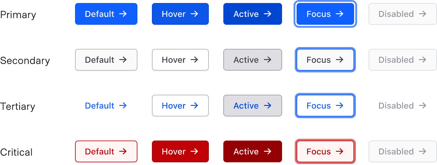
Disabled buttons should be used sparingly and with intention. Acceptable use cases for disabled buttons include:
- Incomplete flows (e.g., user has not yet completed a required action needed to move forward).
- Permissions restriction.
General recommendations
- Text should be short and to the point (~25 characters). Buttons should provide enough context to be useful; often a single verb will convey the action sufficiently.
- Language should be used consistently within each product (e.g., when using "Edit" on one page, use that same convention throughout the rest of the application, not "Change").
Conformance rating
When used as recommended, there should not be any WCAG conformance issues with this component.
Button vs. link
While buttons and links have been used interchangeably across the internet for years, understanding the difference between these two and striving for the semantic use of these elements can help make our products more conformant.
How to know which to use
- If it goes to a URL, use a Link.
- If it triggers an action (toggles a state, submits a form, etc.), use a Button.
- When submitting a form and redirecting the user to a different URL, use a Button.
Why strive for semantic use
Users with assistive technology (AT) or keyboard-only users rely on the semantic use of Buttons and Links to determine how to activate the element. Buttons are activated with the Enter/Return key or the Spacebar key, while Links can only be activated with the Enter/Return key.
Applicable WCAG Success Criteria
This section is for reference only. This component intends to conform to the following WCAG Success Criteria:
-
1.4.1
Use of Color (Level A):
Color is not used as the only visual means of conveying information, indicating an action, prompting a response, or distinguishing a visual element. -
1.4.10
Reflow (Level AA):
Content can be presented without loss of information or functionality, and without requiring scrolling in two dimensions. -
1.4.11
Non-text Contrast (Level AA):
The visual presentation of the following have a contrast ratio of at least 3:1 against adjacent color(s): user interface components; graphical objects. -
1.4.12
Text Spacing (Level AA):
No loss of content or functionality occurs by setting all of the following and by changing no other style property: line height set to 1.5; spacing following paragraphs set to at least 2x the font size; letter-spacing set at least 0.12x of the font size, word spacing set to at least 0.16 times the font size. -
1.4.3
Minimum Contrast (Level AA):
The visual presentation of text and images of text has a contrast ratio of at least 4.5:1 -
1.4.4
Resize Text (Level AA):
Except for captions and images of text, text can be resized without assistive technology up to 200 percent without loss of content or functionality. -
2.1.1
Keyboard (Level A):
All functionality of the content is operable through a keyboard interface. -
2.4.7
Focus Visible (Level AA):
Any keyboard operable user interface has a mode of operation where the keyboard focus indicator is visible. -
4.1.2
Name, Role, Value (Level A):
For all user interface components, the name and role can be programmatically determined; states, properties, and values that can be set by the user can be programmatically set; and notification of changes to these items is available to user agents, including assistive technologies.
Support
If any accessibility issues have been found within this component, let us know by submitting an issue.
0.1.0
Første i80-version (fork af upstream, se core/UPSTREAM.md).